
Tuesday, 7:58am
7 June 2011
Type Tuesday
Lust and likeability: an informal jury puts type into words: #1 Odile
Elegant, chunky, laugh-out-loud, nervy, bookish, perfumed … our informal jury puts type into words with a typeface critique by Jan Middendorp, John Belknap, Petra Černe Oven, Deborah Littlejohn and Mark Thomson. This is the first of several extracts from ‘Lust and likeability’, first published in Eye 67.
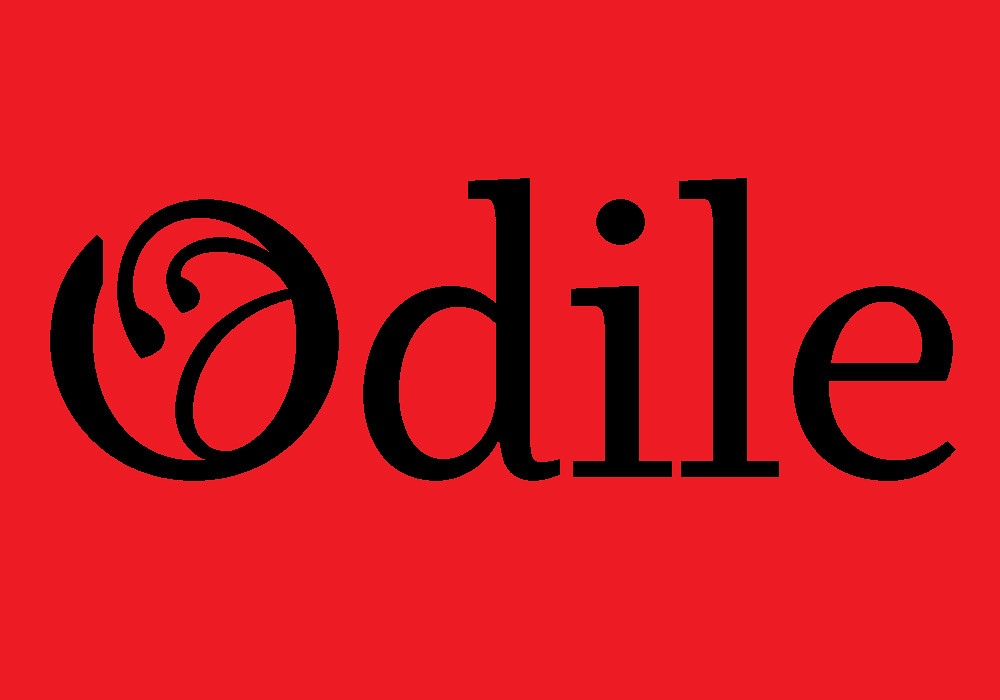
Odile, by Houston-based Swiss designer Sibylle Hagmann, is a free reinterpretation of one of W. A. Dwiggins’ famed experimental typefaces, ‘Charter’ (ca. 1937-55).
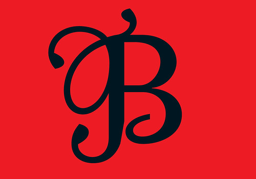
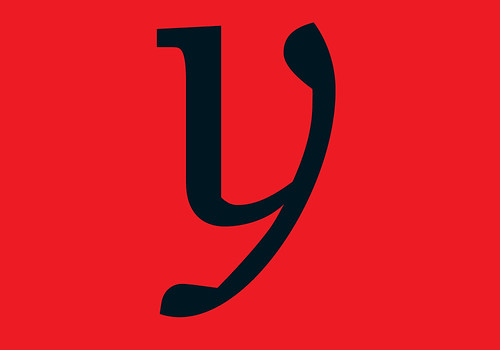
The typeface, designed as an upright italic lowercase with only a couple of uppercase letters, was never released. Hagmann, charmed by its unusual shapes, drew an extensive type family that matches the whimsicality of that original alphabet, adding a roman and italic suited for extended text setting, as well as decorative initials, small caps and ornaments.
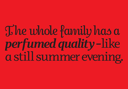
Mark Thomson: This is soft and full of wonder. The upright italic is a rare thing and very beautiful as an occasional type; the decorated initials, too. The whole family has a perfumed quality – not exactly flowing, more of a still summer evening.
Petra Černe Oven: I cannot detect any Basel influence in this typeface, but can see the connection with CalArts. This is an excellent example of a typeface which can be used for setting a long text, but what it really wants to do is shout in headlines with Initials and Deco Initials. It is the perfect typeface for spring: positive, full of energy and smart. Its historical elements are not stiff, but full of surprises. I might be partial here, but to me it has true feminine qualities.
Deborah Littlejohn: My favourite on the list, Odile, was placed in the top three by more respondents of both sexes (22 out of 39), and, of the six who ranked it as their number one choice, all were female (though one woman who ranked it low used the words ‘lovely and light but not light-hearted’). Odile is beautiful and so darn feminine and almost painfully sweet and decorative. I am naturally drawn to such fonts with funky quirks and delicate embellishments – must be a girl thing.
Jan Middendorp: In a world where hundreds of type designers seem to specialise in making more of the same, Odile is a breath of fresh air. As in Cyrus Highsmith’s Prensa, it was W. A. Dwiggins’ research that suggested a way out of the ordinary. Sibylle Hagmann studied, varied and expanded on Dwiggins’ Charter experiment with exemplary care and intelligence, making Odile infinitely more than a revival – and very usable, too. The essay she wrote about the process (published in Swiss Typographic Magazine) should be required reading for all budding type designers.
Visit Sibylle Hagmann’s website at kontour.com or you can buy Odile here.
Type Tuesday is our new weekly column on typography and type design, featuring a mixture of brand new articles and material from the extensive Eye archive. For more Type Tuesday articles, click here.
‘Lust and likeability’ was originally published in Eye 67, Spring 2008.
Eye is the world’s most beautiful and collectable graphic design journal, published quarterly for professional designers, students and anyone interested in critical, informed writing about graphic design and visual culture. It’s available from all good design bookshops and online at the Eye shop, where you can buy subscriptions, back issues and single copies of the latest issue. The latest issue is Eye 79, a type special.