
Thursday, 3:12pm
28 May 2009
TypoBerlin Day Three
Jan Middendorp goes into Space and returns to (Sol) Sender
Time for a roundup of TypoBerlin 09, the fourteenth edition of Europe’s largest yearly conference on type, graphic design and related matters, reports Jan Middendorp.
In fact, it is not quite correct to call the event a conference. At a conference, all delegates are equal, though some may be more equal than others: it’s a meeting of peers. In the very early days, this it what TypoBerlin was like. I remember edition number zero: FUSE 95, the Berlin edition of a series of events FontShop organized to complement Neville Brody’s FUSE project of experimental typography. Everyone who was anyone in digital typography was there, and they all discussed various aspects of one burning question: the days of deconstructive experimentation are over – what next? It was exhilarating; it felt as if something significant was happening.
That was then, this is now. Today, very few established type designers and graphic designers show up, unless they’re invited to speak. (Many of the German designers who were discussing the state of the craft on Friday weren’t even attending the conference.) The audience is young, with probably more than half of them still in college. To them, this may be as significant an event as those first conferences were to the participants then. It’s their first chance to catch a glimpse of their heroes – Alejandro Paul or Erik van Blokland to some, Joshua Davis or Chip Kidd to others. But there’s a big difference. For some years now, TypoBerlin has been a show, not a get-together. In spite of the workshops and small-stage interviews, most of the communication going on is one-way.
So what was on offer on day three? Again, the four-track programme made it impossible to take in the complete picture (fortunately, recordings of the programme’s high points are compiled on a reasonably priced DVD). The opening lecture by newspaper designer Roger Black, co-founder of Boston’s Font Bureau, was a reminder that type is serious business, and technically complex. Black and his colleague David Berlow are proposing new specifications to give users legal access to non-system Web fonts.
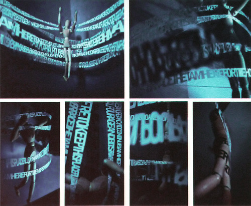
After that, it was all play again, with Brooklyn designer Ebon Heath presenting his three-dimensional typographic experiments which, while starting out as computer-generated models, result in hand-cut paper sculptures (above). What was most impressive about Heath’s presentation was his personal story: here’s a black designer who is successful at designing streetwise identities for fashion and music products but gives up that job because it doesn’t feel right, to cut paper all day long. To career-minded budding professionals it was a lesson of some sort, I guess. A similar enthusiasm for handcrafted type was displayed by a freshly graduated Australian designer who calls herself Mrs Eaves (real name: Gemma O’Brien). Her main claim to fame is to have covered her lean body in lettering with a black marker, capturing the process in a stop-motion video and having some success at YouTube. She showed wacky, intricate hand-drawn title pages as well as a short Helvetica-like documentary on the state of Australian typography – a well structured little piece. She’s obviously got talent, and the audience liked her; whether or not she’s important enough to fly in from Sydney is probably a futile question.
There were interventions by well-known type designers as well. Nick Shinn, an Englishman in Toronto, had chosen to leave type alone and stick to the conference’s theme (Space) by giving an erudite short history of perspective. He is a great researcher and had dug up material I’d never seen before; but I couldn’t help regretting he wasn’t there to talk about the history of lettering, at which he’s a crack.
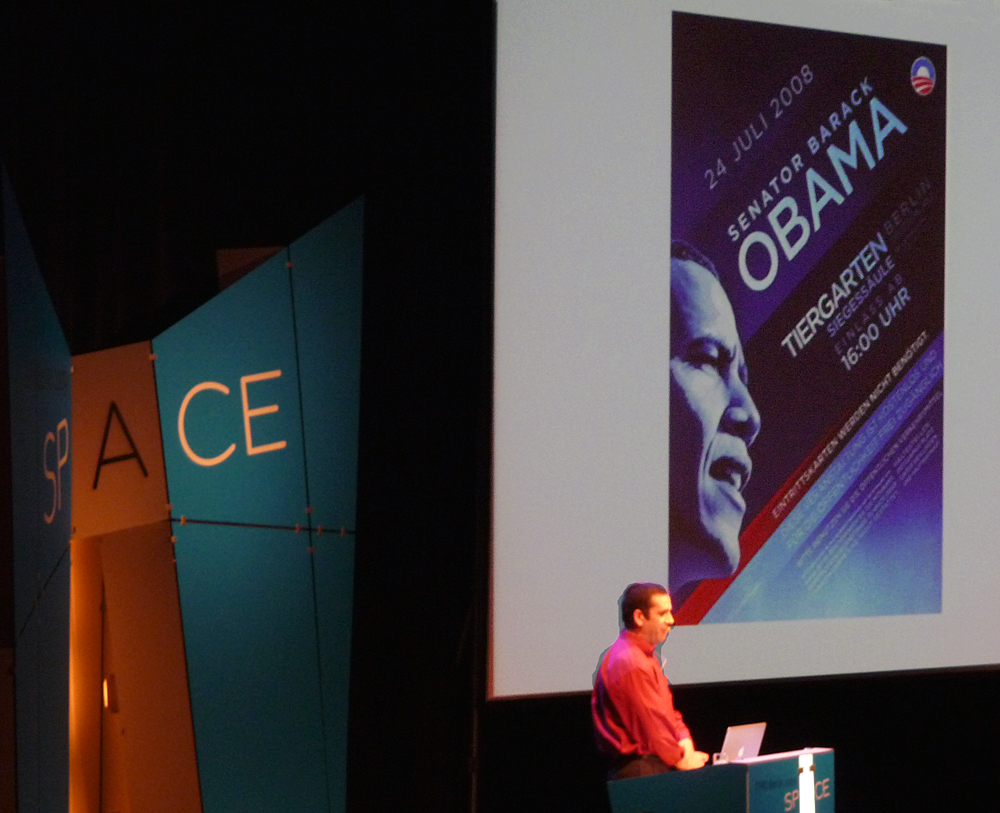
The last speaker was a masterstroke. It is an excellent idea to remind young audiences that graphic design is supposed to have a real function in the real world; that its purpose is to communicate, convince and unite. When this message is brought across by a designer who has been part of the most influential political campaign in recent history, that’s even better. Sol Sender and his team designed the ‘Rising Sun’ logo that was a central icon of Barack Obama’s campaign right from the start. The way in which Sender methodically explained the thinking and selecting process, and the way the logo was then professionally implemented as well as appropriated by the grass roots, was one of the best lessons in graphic functionalism I’ve ever witnessed. And man, those Americans know how to give a presentation.
All in all, I found this edition of TypoBerlin satisfactory, and instructive at times. But to me – and, I think, to many colleagues in Berlin and elsewhere – the event has outgrown its role as a meeting place for people involved in typographic communication. People find it expensive (yes, Jürgen, it’s reasonable to seminar standards, but a lot of money for struggling Berlin designers) or simply too big or not interesting enough. There have been vague proposals to set up a more intimate counter-event (Cheapo Berlin?) but there might be better options. This years’ meeting of the German graphic design world showed that TypoBerlin would like to play a role here; and yet it doesn’t. As such, it’s a victim of its own success. If the event wants to avoid getting stuck in its own formula, some serious rethinking will have to be done.
Jan Middendorp on TypoBerlin Day Two and TypoBerlin Day One
TypoBerlin video blog.
TypoBerlin 2009 on Flickr.
Eye is the world’s most beautiful and collectable graphic design journal, published quarterly for professional designers, students and anyone interested in critical, informed writing about graphic design and visual culture. It is available from all good design bookshops and online at the Eye shop, where you can buy subscriptions and single issues.