
Monday, 9:01am
17 May 2010
Visualising prose in all its complexity
Each of Stefanie Posavec’s pictures is truly worth a thousand words
By day Stefanie Posavec works as a book sleeve designer for Penguin Books. At night she judges books more deeply than by cover alone, writes Ralph Cowling.
The final year of her masters saw her take on the serially ambitious project of extracting complexities within prose literature and attempting to create visual representations and linkages that demonstrate how a book has been written, using painstakingly hand-marked text as data.
The project Writing Without Words sought to communicate the complexity found in literature, she explains, and has the potential to help any viewer see the text afresh. ‘I become excited by visual themes, words, or the author's writing style, which helps me select the most interesting data from the text.’
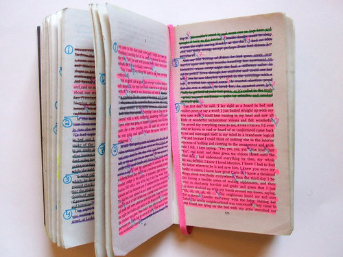
Few texts are so fundamentally defined by their rhythm as Jack Kerouac’s On the Road, and so made sense as the subject for the project, though choosing what is arguably the defining text of the Beat generation remains an ambitious undertaking. Though the scale of the project is perhaps defined by the method: ‘If I have time, I analyse the text by hand, using coloured markers and pens, according to syllables, parts of speech, words per sentence, or themes in the text.’
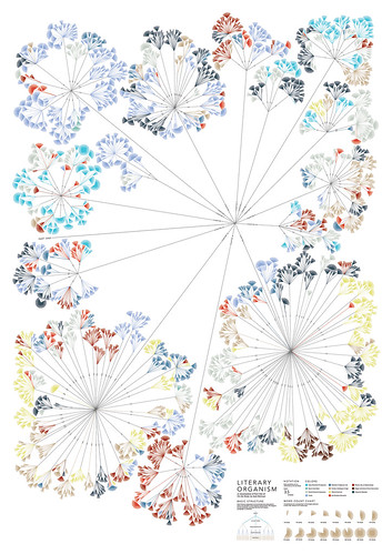
Above: Posavec uses coloured markers and pens to identify the themes that will be colour-coded in visualisations such as Literary Organism (top). This shows how Part One of Jack Kerouac’s On the Road divides into chapters, chapters divide into paragraphs, paragraphs divide into sentences, and sentences divide into words.
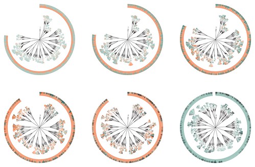
Though she worked alone on this project, it elicited the beginning of a collaborative process that involves her brother-in-law Greg McInerny (an ecologist at Microsoft Research, Cambridge) pushing her data through the R statistical data program.
Together, they analysed the form of Darwin’s The Origin of the Species through the six editions produced in his lifetime in their (En)tangled Word Bank visualisation. ‘Greg did all the coding and then I did the designing, and we worked together making aesthetic decisions.’ The result was specimen plates, like those below, that seek to analyse the text in a similar manner to Darwin’s enlightening realisation of previously ‘cryptic organisms’.
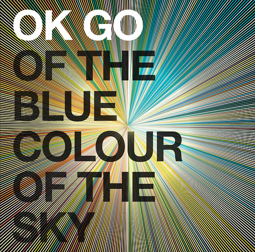
The thoroughly Web-viral band OK GO (check their videos on YouTube) asked Posavec to produce album artwork for them, using similar techniques (below). The band’s lead singer, Damian Kulash Jr, drew up a thematic dataset from the album and the book it was based on. While McInerny minutely scrutinised the data from each, Posavec refined the visualisations based on each update.
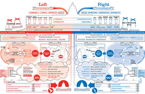
Below: Posavec collaborated with David McCandless of informationisbeautiful.net to produce the political concept map, Left vs. Right. This is available as a poster, with a percentage of the proceeds going to the Ganet’s Adventure School charity in Malawi.
Posavec’s work is available for purchase and download at her site itsbeenreal.co.uk.
Eye, the international review of graphic design, is a quarterly journal you can read like a magazine and collect like a book. It’s available from all good design bookshops and at the online Eye shop, where you can order subscriptions, single issues and classic collections of themed back issues.