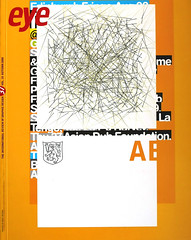
Autumn 2000
23 Envelope: ambience and inner space

Operating undercover, using the enigmatic title of 23 Envelope, Nigel Grierson and his partner Vaughan Oliver created designs of exceptional power. Their work inspired the next generation of image-makers. By Rick Poynor
23 Envelope were one of the most original and significant British design teams of the 1980s. Their record sleeves for the south London independent label 4AD had an enormous impact on a generation of younger designers who would go on to make their names in the 1990s – people like Graham Wood of Tomato and Jonathan Barnbrook. But while members of experimental design’s future cognoscenti knew the work, 23 Envelope, which disbanded in 1987, was never a household name within the design community. The first detailed article about the team did not appear in a design magazine – Emigre – until 1988, by which time more publicity-conscious and fashionable British designers such as Neville Brody and Peter Saville – their contemporaries – had received many column inches of coverage. Today, it is doubtful that many designers, especially younger ones, would have any idea who, or what, 23 Envelope were.
In fact, one member of the team – Vaughan Oliver – did go on to establish an international reputation after 23 Envelope ended. Oliver formed a new studio, V23, and forged creative relationships with a wide range of collaborators. He continued to work in-house at 4AD and as a result, 23 Envelope’s work, created from 1981 to 1987, became absorbed into his own back catalogue – quite literally. The actual catalogue for Oliver’s first retrospective, in Nantes, France, in 1990, compounded this impression. The book’s layout, by Oliver, mixes together work by 23 Envelope (which forms the bulk of the first edition) and V23, and does not display the projects in a clear chronological order, obscuring – doubtless unintentionally – the true sequence of events. It makes it look as though everything in the book issues from a single person’s vision: Oliver’s.
It subtracts nothing from Oliver’s achievement, however, to recall that 23 Envelope consisted of two people, friends and collaborators, working together in a spirit of close creative synergy. Reassessing their body of work at this distance it is quite clear that Nigel Grierson, Oliver’s partner, has not received anything like sufficient credit for his role in these seminal designs. I thought I knew these images well, but studying them again, in the course of writing a monograph about Oliver that addresses both phases of his career, I was amazed by their quality. In the US, April Greiman’s graphic achievement, from roughly the same period, is well known. She is widely understood to be an innovator, a designer who brought intense subjectivity and her own private symbolism to her designs and pushed graphic communication a step closer to fine art, making possible much of the most celebrated work of recent years. 23 Envelope can be seen as equivalent British figures. More than any of their contemporaries, with the possible exception of Peter Saville, they expanded the artistic vocabulary and ambient possibilities of the graphic image. Combining design, photography and later video, they are forerunners of Tomato and other teams that went on to defy graphic design’s conventional boundary lines in the 1990s. As many of 4AD’s original fans could testify, 23 Envelope’s sleeves for bands such as Modern English, the Cocteau Twins and This Mortal Coil are charged with a commitment, a depth of emotion, a lasting mystery and an electric power to make the viewer’s flesh tingle that marks truly exceptional work.
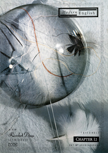
Chapter 12 by Modern English, 1984, 12-inch single front cover. Concept, art direction, collage and photography: Grierson. Design: Oliver.
Top. Echoes in a Shallow Bay by the Cocteau Twins, 1985, 12-inch EP front cover. Concept, art direction and design: Oliver and Grierson. Image construction and photography: Grierson.

Chapter 12 by Modern English, 1984, A3 poster. Concept, art direction, collage and photography: Grierson. Design: Oliver.
Oliver and Grierson met in their late teens, as schoolboys, at Ferryhill Comprehensive, County Durham. Their friendship began in the art room, chatting about their mutual passions for art and rock music. For both of them, designing album covers – the medium was then still a twelve-inch mini-canvas – was a natural ambition. ‘Record sleeves,’ says Grierson, ‘seemed like the greatest thing you could possibly do.’ In 1976, Oliver began a graphic design degree at Newcastle Polytechnic and, a year later, at Oliver’s suggestion – as Grierson recalls it – his friend decided to join him. Both came under the spell of Terry Dowling, a Royal College of Art illustration graduate, who ran the second-year design course. They still speak of him as their mentor.
In Oliver’s final year – Grierson’s second – they shared studio space, collaborated on design projects and experimented with photography. They were impressed by the American photographer Ralph Gibson, whose trilogy of books, The Somnambulist, Déjà-vu and Days at Sea, uses wordless sequences of black and white pictures of enigmatic fragments of bodies, buildings and figures in the landscape to evoke the logic of dreams. Other significant joint early enthusiasms were the British painter Francis Bacon and the American optician turned photographer Ralph Eugene Meatyard, a master manipulator of photographic blurring, who created uncanny atmospheres in his portraits of family and friends in Kentucky. Taking turns to use the camera, Oliver and Grierson shot a series of photographs of each other naked in the County Durham countryside, jokily titled Little Red Forearms and That. ‘We liked the idea of working together,’ says Oliver. ‘Gilbert and George – we were aware of them, though their outward image was a bit too strong for us as simple Northern lads.’
Grierson graduated a year after Oliver and, in 1980, they both moved to London. Oliver, a talented draftsman more comfortable handling imagery than type, planned to become an illustrator. Grierson had at first nurtured the same ambition, but in his final year he decided to pursue his growing interest in photography at the RCA. For three years, Oliver worked as a packaging designer, initially at Benchmark, then at Michael Peters & Partners, where for the first time, searching through old type encyclopedias for half-forgotten faces that evoked stimulating atmospheres, he became fascinated by typography. During this period, Oliver met Ivo Watts-Russell, founder of 4AD, and both he and Grierson undertook regular freelance assignments for Ivo (as he was known) until, in 1983, Ivo offered Oliver a full time job, as the tiny label’s only other employee.
The ‘Sleeve by 23 Envelope’ credit was a piece of deliberate mystification on their part. Oliver remembers it as being inspired by a pack of envelopes next to them when they were trying to think of a name. They hoped that a ‘company’ name would make 23 Envelope sound bigger than it was – Grierson’s student placement had been at Hipgnosis – and had vague plans to change it with each new release. The idea of this ‘self-sufficient unit’, as Oliver described it, was to allow them the freedom to avoid rigidly assigned roles and to merge initial concept, art direction, photography and design in a single, jointly authored and signed creative act. Such was their mutual understanding as artists and their closeness as friends and collaborators at this point that a piece could be credited to 23 Envelope even when only one of them had been involved in its creation.
In a television profile broadcast in 1985, on the Music Channel, the interviewer asked Grierson: ‘Is all the photography left to you?’ ‘Generally, yes,’ he replied, ‘but it isn’t as cut and dried as that. [With] some of the covers it would be hard to say whether it was fundamentally a design job, or a photography job. Some of the things which look quite photographic might have been basically a design piece which Vaughan might have worked on more than myself, or vice versa.’ To this, Oliver added: ‘It’s almost like one person coming up with the same ideas. He’ll have ideas about the design, the typography. I’ll have ideas about the photography. I wouldn’t necessarily split the way we work, as if he was the photographer, I was the designer. I think there’s a lot of cross-over between the two.’
By 1984, 23 Envelope’s use of the formal design term ‘corporate identity’ to describe the organic evolution of 4AD’s visual programme was explicit. Their aim, they explained in a fanzine, was to create sleeves that reflected the intentions of 4AD’s individual artists and the atmosphere of their music, while retaining a distinct visual identity for the label. The introduction to commercial design and packaging that Oliver had received as a fish out of water at Benchmark and Michael Peters would now be ‘perverted’ to interpret the vision of 4AD bands such as Xmal Deutschland and Colourbox. Inspired by the music, 23 Envelope would ‘project their own personal world of imagery in collusion with the artists they represent’. Sharing Ivo’s musical values and independent label ethic, they rejected the hard sell, the well trodden path, the merely fashionable, tedious pastiche and the banal overuse of the band photograph (many of 4AD musicians were equally keen to avoid anything as obvious as cover portraits). On no account, Oliver and Grierson felt, should the taste and discernment of the audience be underestimated. Record buyers should be seduced or challenged by visual landscapes as resonant as the soundscapes they expressed.
It’ll End in Tears by This Mortal Coil, 1984, front and back cover. 23 Envelope used an image originally shot for a Modern English sleeve. The model became the regular cover star for all the recordings by Ivo’s band. Concept: Grierson and Ivo Watts-Russell. Art direction and photography: Grierson. Design: Oliver.


Filigree & Shadow by This Mortal Coil, 1986, A3 poster. Concept: Grierson and Ivo Watts-Russell. Photography and art direction: Grierson. Design: Oliver.

The influences that helped to shape their shared sensibility mostly came from outside design. The atmospheres they admired in literature, music and film were dark, brooding, bizarre, enigmatic – images of the tormented self alone in the world. Grierson introduced Oliver to Beckett’s plays and prose works and they immersed themselves in classic outsider and existentialist fiction by Knut Hamsun (author of the extraordinary early Modernist novel, Hunger), Kafka, Camus and Sartre. This was the period of post-punk ‘industrial culture’ and British bands like Joy Division and the Cure provided a doom-laden soundtrack to their reading. Struggling to translate these intimations and forebodings into a new kind of graphic expression, 23 Envelope used blurred forms, abstract traces and an exquisite ornamental typography that felt strangely ‘out of time’ to conjure alternative worlds of deliriously intense feeling.
Their liquescent early covers for the Cocteau Twins, shot in a tank by Grierson, were prompted by a scene towards the end of Andrei Tarkovsky’s visionary film Stalker, where the camera looks down at a shallow pool in a flooded room deep inside the mysterious Zone and two fishes swim across broken tiles as the water darkens with ominous black fluid. On the paired Cocteau Twins EPs Tiny Dynamine and Echoes in a Shallow Bay (1985), they used coloured inks, which bubble and swirl and boil in the water like dense clouds of liquid gas, a fitting image for a form of rock music described by critics as ‘miasmic’ and ‘oceanic’. Precise editing of supplementary images – one cold and agitated (Dynamine), one warm and vaporous (Shallow Bay) – establishes a filmic tension in the contrast of visual moods and delineates the emotional range and tonal colour of the music.
23 Envelope wanted sleeves to have a strong ‘tactile’ presence, and lavish swathes of texture – ‘We express ourselves with textures,’ Oliver declared – soon became a favourite device. Mainstream design’s vision of reality was clean, brightly lit, direct and efficient. 23 Envelope’s underworld of texture was dirty, murky, ambiguous and uncertain. On the tenebrous cover of Xmal Deutschland’s Fetisch (1983), pieced together from fragments of Japanese rag paper held together by masking tape, Oliver dispensed with the expected cover image and succeeded in imbuing ordinary bits of paper with dark portents of existential menace. The sleeve for Richenel’s L’Esclave Endormi (1986) juxtaposes vertical bands of rag-paper texture with Oliver’s ethereal type choices and Grierson’s misty photographs of a youth’s torso to summon an atmosphere of languid sensuality and decadence worthy of a symbolist poet or painter.
By the time 4AD released the Lonely is an Eyesore compilation (1987) – a tour de force of dense textural abstraction – a concern with texture had become one of the defining styles of the decade, seen in illustration, photography, interior design and, increasingly, in graphics. It was the last significant project to which Oliver and Grierson jointly contributed as 23 Envelope, although their roles were now strictly defined. Oliver was responsible for all aspects of the artwork, while Grierson shot the video clips, including a superbly atmospheric narrative interpretation of Dead Can Dance’s ‘The Protagonist’. After receiving his photography MA, Grierson had begun a PhD in film at the RCA, and his other activities meant his involvement in 23 Envelope was always intermittent. Oliver, based full-time at the 4AD office, was the musicians’ usual first contact (after Ivo) and he would call in Grierson if a project lent itself to a photographic approach. As time passed, Grierson became increasingly concerned about the lack of explicit credit for his pictures. Oliver resisted, preferring to preserve the original 23 Envelope signature and ‘myth’. By 1986, however, sleeves had started to appear with Grierson’s name, though not with Oliver’s.
In the course of their collaboration, Oliver and Grierson had discovered some fundamental differences of approach. ‘Because I’m a photographer,’ recalls Grierson, ‘I always felt like we had to ‘get it’ in the photograph, whereas he didn’t feel you needed the ultimate photograph from a session. He could feel happier with the ‘idea’, because he would take that and use it in a graphic way and, through his manipulation of surfaces, see something that I didn’t, because I’m much more tuned into the photograph itself. I think Vaughan was sometimes frustrated when we worked together, especially if we got a really good photograph, because he would then have to treat that with more preciousness and reverence. It would hold him back.’
At the same time, as Grierson explained, his aesthetic was not always appropriate and he preferred to work with musicians with whom he felt a mutual empathy and understanding, rather than attempt to adapt his photographic style in a way that was untrue to his vision. Oliver, for his part, found this limiting. There were occasions, especially while creating covers for the Cocteau Twins, when his freedom to respond graphically was inhibited – as, for instance, with Victorialand (1986), where the photographs are unambitiously displayed like paintings on a gallery wall. He wanted to work in a wider range of graphic idioms and registers than Grierson’s photographic preferences could support. In 1987, he began to collaborate with other photographers and gave himself a printed art direction and design credit for the first time.
Victorialand by the Cocteau Twins, 1986, LP front cover and inner cover. Concept and art direction: Oliver and Grierson. Image construction and photography: Grierson. Design: Oliver.


Oliver succeeded in broadening his approach, but many of the most ravishing V23 designs for Lush and the Pixies, created in 1988-91 – the period of his growing international acclaim – have obvious roots in his earlier collaborations with his boyhood friend. Grierson, meanwhile, set out on a career as a promo-maker, working for labels such as Virgin, Sony and A&M, before moving into TV commercials, with occasional forays back into photography. In recent years, he has written several speculative screenplays. His visionary style has won respect from colleagues, but he has never received the degree of recognition given to Oliver. ‘He’s a home-builder and I’m a nomad,’ Grierson says. ‘He stays with one thing and makes the most of it, whereas I make a fire and then move on.’ The fire he made with Oliver, as 23 Envelope, still burns with a strange and spectral light.
Rick Poynor, writer, Eye founder, London
First published in Eye no. 37 vol. 10, 2000
Eye is the world’s most beautiful and collectable graphic design journal, published for professional designers, students and anyone interested in critical, informed writing about graphic design and visual culture. It is available from all good design bookshops and online at the Eye shop, where you can buy subscriptions and single issues.