Winter 1999
A virtual city in a global square

Reflections on a new project in Australia, where graphic elements provide the interface between the electronic world and the physical environment
Since January 1998, John Warwicker has been working with Lab Architecture Studio on Federation Square, the new cultural and civic centre for Melbourne in Australia. What follows is his personal report of this ‘work in progress’ which demonstrates his response – an integration of form, content and media – posing questions about the role and authority of architecture, as well as describing the response and the responsibility of the designer. ‘In this century,’ says Warwicker, ‘graphic registration in all its forms has been an addition to architecture. Within this project the graphic elements are an integral part of the site, its programming and its “architecture”. In the new electronic environment, culture and economics are inseparable, demanding a new response to the role of the designer: the site, its content (and the communication of its content) are more inter-related than ever before.’
We live in a world that is complex, but for centuries the institutions of power have imposed a simplicity that pins everything down to a single ‘ideal’ statement: the demonstration of authority. In the contemporary world this condition is no longer sustainable, relevant or desirable. Change is the only constant.
This essay is about the way the principle of change affects every aspect of every designer’s work and reconfigures every notion of theory and practice that has dominated design in the past century. A recurring problem has been the lack of understanding of the mechanics of the contemporary world among the higher echelons of the political and cultural institutions. This problem is not particular to this project or to Australia – it is the case everywhere.
The ramifications of new media technologies are having a profound impact upon our world. Gutenberg’s printing press brought about ‘the most radical alteration ever made in Western intellectual history’. [1] It also shaped the world we live in today, the way we learn, the way we think and the way that we express ourselves. Ever since McLuhan wrote about the ‘global village’ [2] in the mid-1960s we have begun to assimilate this idea. I think it is now time for all of us to appraise this situation in all its aspects. New technology is not about replacement but addition: hence the increasing complexity. Gutenberg’s invention led to the widespread dissemination of knowledge and information: it shaped identity and created a context for new means of authority. It also led to linearity and specialisation, to the idea of ‘progress’. The new technologies encompass all of that and place it in the context of ‘process’. Politics, economics and society (the sense of the individual) have changed. We are in a period of overlap between Gutenberg’s legacy and the new ‘physics’ of connectivity, relativity and pluralism.
I envisage Federation Square as part of the creation of a ‘new urban order’ that successfully adapts to changing activities and social programmes while maintaining real links to an existing metropolitan context, materialising the invisible connections so essential to any dynamic urban centre. The design is intended to form a complex ensemble based on the unique and the collective. The Federation Square project is designed to filter and intertwine recreational and cultural intensities across the site. ‘Environments are invisible. Their ground rules, persuasive structures, and overall patterns elude easy perception.’ [3]
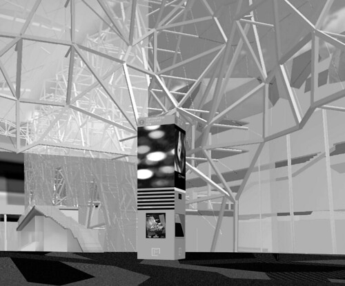
Federation Square atrium with information columns.
THE PROJECT
For the past two years I have been working with Lab Architecture Studio (Peter Davidson and Donald L. Bates) and their local partners Bates Smart on Federation Square, Melbourne’s new civic and cultural centre. The issues and conditions that it provokes and engages with are a useful counterpoint to the Bilbao Guggenheim and the strategy of the Guggenheim brand. Central to Federation Square is the contemporary context of the mediated world: it offers a shift in the methods and means of work for graphic designers in an architectural context.
Opening in May 2001, Federation Square is a complex site containing the Museum of Australian art (MOAA, Cinemedia (an organisation for the curation, promotion and production of screen-based culture), SBS (a multicultural TV and radio broadcaster), an extensive plaza with a large public screen at one end, an information centre (City Hub), numerous restaurants, bars and shops as well as a park (Riverside Park) and an all-hours glass atrium that bisects the site and connects the city centre with the park and the river (the Yarra). The project is funded by a mixture of Victorian and federal government money, and is managed by the Victorian government and the city of Melbourne. The budget is around £100 million (AUS$240 million) and the main tenants are publicly funded bodies.
I was brought into the project by Lab Architecture Studio officially to design the signage but also to debate what the project actually meant in the mediated context of the contemporary world. Two years into the project several crucial decisions are yet to made, and many questions have been raised by the conversation that Peter, Don and I have had between ourselves, the government departments and the teams of consultants on the project. We have revisited the brief in order to see whether it described the reality of the project: in the contemporary world, the cultural, economic, political, social, educational and artistic realms are all components of a rhizomatous matrix [4]. The existence and physics of the Web makes this complex relationship fact. Yet the new media’s structure, influence and enabling qualities are ‘invisible’.
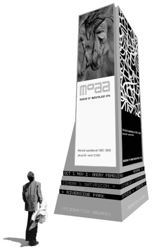
Information column incorporating moving type adds to the spectacle of the public square. 3D rendering by Sean Hogan, Cas Zdanius and John Warwicker.
SIGNS AND BRANDS
The graphic response to the complex context, and to the function and form of the communication within the site, was to make the signage electronic. This would facilitate the continuous programming of the site and make the multicultural dimension readable, allowing communication to be simultaneous in every principal language of the world.
Each tenant has a dedicated LED colour-coded ‘channel’ (embedded within the plaza floor, and the floors, walls and ceilings of each building), to enable the visitor to efficiently navigate the site. [6] The LED system also has technological and aesthetic synergy with the Web, which means that the experience is continuous between the physical site and the virtual realm .
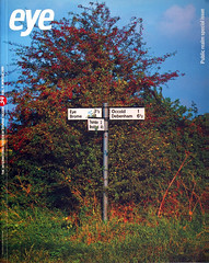
At strategic points across the site there are information ‘columns’ that perform as nexuses for the information matrix. These take their form from seventeenth-century signposts, the white wooden ones that still exist in the English countryside. Each channel points towards its destination relative to the position of the column, and within each column there are LED screens, interactive site and city maps, ticketing ATMS and advertising light boxes. The screens not only make the cultural programming more visible and legible for the site and its locale, but also increase the spectacle of the site. The signage is pre-emptive in the sense that you don’t have to be near to these columns or the LED channels to know where you are going and what will be there. [7]
Both the LED channels and the interactive maps will integrate the site’s programming with that of the city. This is rarely done: most cultural sites only point inwards. The electronic signage also allows the site to be occupied by temporary arts programmes. Within the Tomato proposal, each tenant has an identity created for it that maintains its individuality but also relates it to the site identity (see images of these identities). MOAA, while curating and showing traditionally produced artefacts, will increasingly be required to display electronic works. The Cinemedia complex is concerned with production and curation related to screen-based culture, while SBS produces content for television. In the case of Cinemedia, the context of its activities means that the ‘logo’ must be time based and mutable.
Each tenant will be ‘wired’ to make the most of contemporary content and its delivery. Federation Square may require an onsite creative studio to shape and coordinate the information flow within the space.
FOOTNOTES
1 James Burke, The Day The Universe Changed, BBC, 1985, p112: ‘Media, by altering the environment, evoke in us unique ratios of sense perceptions. The extension of any one sense alters the way we think and act – the way we perceive the world’.
2 Marshall McLuhan and Quentin Fiore, The Medium is the Massage, Touchstone Books, 1967.
3 Ibid.
4 Rhizome – an underground rootlike stem bearing both roots and shoots.
5. The signage typeface has characters for all European, Cyrillic, Latin, Nordic, Hellenic, Japanese (katakana) languages and the team is now working on Arabic, Chinese and Asian alphabets.
6. Research into the signage at Amsterdam’s Schiphol Airport shows that although users find it legible and articulate, many still get lost – the reason being that all the elements are reduced to a refined simplicity where the information conveyed is not distinct or memorable.
7. Effectiveness is only relative to context and the ‘appropriate response’. The great strength of Modernism was its analytical approach, its failure is that it quickly became a style and a method without regard to broader issues of context.
8. This has interesting ramifications for the idea of ‘logo’ in reference to brand. Many companies continue to have a graphic fixity within their identities but what value has fixity in a changing world? Doesn’t ‘fixity’ show a lack of intelligence on behalf of the brand and those who service it through advertising and media buying?
John Warwicker, Tomato, London and Melbourne
First published in Eye no. 34 vol. 9, Winter 1999, Public realm special issue.
Eye is the world’s most beautiful and collectable graphic design journal, published quarterly for professional designers, students and anyone interested in critical, informed writing about graphic design and visual culture. It is available from all good design bookshops and online at the Eye shop, where you can buy subscriptions, back issues and single copies of the latest issue.


