
Autumn 2013
An Atlas of Typeforms
As a sidebar to ‘Quiet man of letters’, Simon Esterson talks about his early encounters with this celebrated book by Alan Bartram and James Sutton
When I was twelve years old, writes Simon Esterson, my parents bought me an Adana handpress and I began setting type and printing little jobs by desktop letterpress. I became intrigued by type and typography. Just how different was Univers from Helvetica?
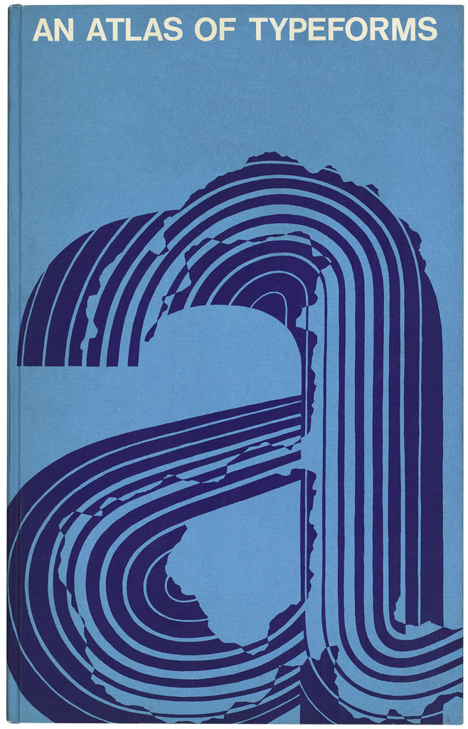
The book that taught me about these things was An Atlas of Typeforms, by Alan Bartram and James Sutton. My 1968 first edition, with its little book label from Foyles in London’s Charing Cross Road, is by the desk as I write this.
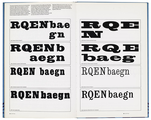
Inside, Bartram and Sutton reproduce many historical examples, and take the reader on the journey that is the history of type, from Roman carved letterforms to Helvetica.
Along the way, the book taught me a lesson about form and content. More than 40 years later I still find the design and physical production of this book an inspiration.
Its key quality – format – is difficult to convey here. The book has the dimensions of a geography atlas: 16 × 10 inches wide. It doesn’t fit on many bookshelves, but its proportions make it a thin giant. The examples and type specimens are big, but it keeps its own typography (in Univers) small and carefully restrained in grid-based white space. At the back is a four-page gatefold of specimen 10pt text settings arranged for comparison.
An Atlas of Typeforms was published and printed sheet-fed offset by Lund Humphries, one of the greatest British printers of the time. The binding is immaculate. This is a book for which the writing and design have been conceived to support and enhance each other, and produced in such a way that just picking it up is an exciting physical experience.
See ‘Quiet man of letters’ in Eye 86.
Cover and spread from An Atlas of Typeforms by Alan Bartram and James Sutton.
Simon Esterson, art director, Eye magazine, London
First published in Eye no. 86 vol. 22 2013

Eye is the world’s most beautiful and collectable graphic design journal, published for professional designers, students and anyone interested in critical, informed writing about graphic design and visual culture. It is available from all good design bookshops and online at the Eye shop, where you can buy subscriptions, back issues and single copies of the latest issue. You can see what Eye 86 looks like at Eye before You Buy on Vimeo.