
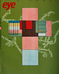
Summer 1998
Building a graphic language
From the 1930s to the 1960s, The Architectural Review's eclectic methods made it a landmark in magazine design
The Architectural Review is a landmark in the history of graphic design, for over a century the most influential journal of record for a profession whose methods have always been, essentially, graphic. Before the advent of the computer, sketches and annotated drawings were the principal means of expression and communication for architects – at the drawing board and working with colleagues, the industry and their clients. In its interests and obsessions, the Review combined the inclinations of a gentleman amateur with an intellectual’s curiosity for the new – a process that its editors described in 1947 as “hacking its own way up the ice-slope of modern experience.” For many years – particularly during the period from the 1930s to the late 1960s – the magazine’s typography and layout were a brilliant reflection of its many-sided and paradoxical attitudes and interests.
Visual re-education
The largest volumes in British art school libraries are bound periodicals, and largest of all are those of The Architectural Review. A complete set begins in 1896, but open any volume from the 1930s to the mid 1960s and you will see why this magazine, put together by a handful of architects and journalists, is a landmark in the history of graphic design. The Review’s pioneering importance is not only in the inventive use made of the print and reproduction techniques of its period, but in the functional Modernism of its means of recording and presenting ideas in architecture and environmental planning. Still published in London, the Review has survived depressions and slumps, two world wars, and endless skirmishes in support of both preserving a significant building heritage and promoting a humane Modernism. For many years, the typography and layout of the magazine were a reflection of its many-sided and paradoxical attitudes and interests.
The first issue of The Architectural Review appeared in 1896 as a magazine “for the artist, archeologist, designer and craftsman.” The Review quickly became influential, shaping opinion and sponsoring debate. In its consistent interests and obsessions, the Review combined the inclinations of an enthusiastic gentleman amateur, a conservationist and connoisseur, with an intellectual’s curiosity in what was new. It identified itself as a professional journal by demonstrating a practical interest in structural methods and materials. The Review had little in common with celebrated avant-garde journals such as L’Esprit nouveau in France, or De Stijl in Holland. Unlike its avant-garde contemporaries of the 1920s, the Review made no proclamation of its editorial aims; “For fifty years,” it was pointed out in 1947, “its policy has been not to discuss policy.” At this time there were four joint editors, but the strong-minded part-owner and editorial director, Hubert de Cronin Hastings, was the magazine’s creative drive and its aesthetic arbiter. He and his colleagues, finally, in 1947, summed up the journal’s continuing intentions as: first, to record contemporary buildings; second, to discuss the visual arts (architecture included). Meanwhile they insisted on the Review’s job to apply “the higher criticism in fields which are generally regarded as utilitarian – in the actual trades of which the building industry is made up.” Apart from the central topic of architecture and town planning, the editors were concerned with the less tangible aim of “visual re-education.” Architecture as a visual art was to come first, its sociological and technical aspects were firmly in second place. The editors took the opportunity to defend their apparent “preoccupation with frivolous subjects; with Victorian merry-go-rounds and rustic railway stations, lighthouses, gin palaces and nonconformist chapels, exotic villadom, cemeteries and monkey puzzles...” The “look and feel” of the magazine was a consciously deployed instrument in this “visual re-education.”
Handling copies of the magazine, turning its pages, is not an experience that can be reproduced. Big and thick and heavy, the Review is made up of sections of different papers, sometimes fat cream wove, sometimes a brilliant glazed white, dense with china clay, sometimes a thin tinted sheet made for typists’ copies. Measuring 355 x 280mm (14 x 11in), its page area is as large as the biggest popular illustrated weeklies of its day, such as Vu (see Eye no. 26 vol. 7) and almost as tall as the early issues of Emigre. Paper rationing forced a size reduction in 1948, cutting the margins. (The editors’ promise to return to the larger size as soon as possible was forgotten. Some readers wrote that they had disliked the vast page size because it made the magazine too awkward to read in bed. An equal number complained that it was so large that the only place they could read it was in bed). In 1969 the Review dwindled to 297mm, the same height as A4.
The Review had decided in Edwardian days on a “sumptuous form” in order to include a separate section of plates – half-tones on a very heavy smooth paper. This treated the Review, although it had the usual structure and sequence of a magazine, as a book. The idea of “plates” – photographic illustrations printed on a different paper to the text pages – belonged to books rather than to magazines. A separately printed section, finishing on a left-hand page, perpetuated for many years the idea of an article starting on the facing right-hand page, rather than as a double-page spread. Clear sections gave a physical, sequential structure to the Review. They also segmented the production schedule: each section, printed separately, would have its own deadline. Although the print-run was small, about 10,000 by 1950, this was an extravagant production: the binding-in of different papers (wallpapers included) or wrapping them round sections was work that had to be done by hand.
Eclectic mannerisms
A century ago, when the magazine was launched, the notion of graphic design had not developed much beyond its typographic roots. But in the sense that their medium is drawing, architects have always been graphic designers. They work with sketches. Before the computer, annotated drawings and sketches were the means of showing what the job would look like and of telling the typesetter, printer or process engraver what was wanted. These procedures were not so different to the working ways of an architect. Architects were used to communicating through drawings and standardised components: they talked the builder’s technical language; the typographer used that of the print trade. The journalists on the Review learned on the job. They relied on the print trade’s expertise, which they put under some strain, insisting, for example, that column widths were specified in inches, not typographical measurements.
Compared with now, a layman would have a lot to learn. A drawn layout was needed, however approximate. The writer’s typewritten copy had to be “cast off” – its characters had to be counted and tables consulted to calculate the amount of space it would take up using a given typeface and size. Once the type was set for the text, that was it, in metal. Once the blocks were made, they could be cut down. The same with building. Like a wall: once built, if you have made a mistake you have to pay to start again. Hastings, who had studied painting as well as architecture, could sketch layouts fluently and reduce the scale of photographs with the accuracy of a commercial artist.
Since the most successful days of the Review, the work of magazine design has been divided into specialisations. Picture editors, picture researchers, art editors, designers concerned with layout and typography, production managers are all responsible for what the magazine looks like now. The Review’s editor, J. M. Richards, claimed that for 30 years he was responsible for the design of every number. But Hastings’ taste (and interference) dominated. After the war he was brilliantly aided by a young architect, Ian McCallum, and from the early 1960s by William Slack, who remained until 1990. Occasionally experts were invited to lay out parts of the magazine; the most notable example was in 1937, when a section on the English seaside, with coloured paper and circular peepshow cut-outs, was designed by the exiled László Moholy-Nagy.
For its first three decades the Review’s production was distinguished more by its opulence than by its design. Typical of its time, it had few standardised elements. The type area would stay the same from issue to issue, but little else. Hastings began experimenting in 1927. As well as the variations in paper colour and texture, text and half tones were printed in inks ranging from black through warm brown to sepia, or in dark blue. Columns changed width and typefaces varied in style and size.
Layout in the 1930s was an elaboration of the simple, generous pages of the Review’s early issues. The text then was set in two columns of Old Style type, illustrated with wash drawings and photographs in dull half-tone and drawings reproduced by line block. Within a few years the photographs looked brighter, more appeared as vignettes, and there was an occasional colour reproduction tipped in.
The magazine’s patrician air disguised a developing curiosity in the new buildings of mainland Europe. An article on the buildings of the Bauhaus founder Walter Gropius appeared in 1923. The Review’s large pages of splendid white art paper made a brilliant display of the latest bright walls, but it was not until the 1930s that Modernism influenced the Review’s layout. In 1930 a special issue on the Swedish national exhibition introduced whole page half-tones, bled on three sides and printed in a greenish sepia. In October the same year a review of Russian films prompted a cinematic layout. Within five years the Review had laid the ground for its mature eclectic graphic manner – and mannerisms. In layouts, de Cronin Hastings was guided by his own maxim: “details big, general views small.”
Graphic innovations
Architects’ drawings are two-dimensional abstractions of what should become three-dimensional fact. Plan, elevation and section are a language for describing the enormous complexity of a building. When buildings were made of stone and brick their structure could be inferred from their appearance. Photographs did this well. But with frame construction, the structure was hidden, and even the look of materials could be deceptive. (What was glass, and what was cladding?) To make architects’ thinking more accessible, the Review needed to expand its graphic language. To record buildings, the Review enlarged the conventional vocabulary of photographed views (of the appearance) and elaborated the customary plans, elevations and sections to describe structure and details. Perspective using a horizon and vanishing points was replaced by the axonometric (parallel perspective). Information on their services, construction, materials and finishes was added: diagrams and sketches set out the relationships of parts, and explanatory drawings were superimposed on photographs. In one case, a diagram with numbered parts provided a key to the photograph of a bathroom wall to indicate the exact position of different finishes. Indeed, captioning was given special attention: it had to be, given that there might be as many as 30 half-tones on a double-page spread. The magazine’s graphic innovations were largely due to the architect Gordon Cullen, who was to become the magazine’s art editor in 1947. In the 1930s, Cullen had worked as an assistant, notably with Berthold Lubetkin’s Tecton office, on some of the best-known Modern buildings in England. Cullen’s talent for graphic exposition was first used conspicuously by the Review in an account of a Tecton-designed apartment block. To achieve his aim of clarity (for the reader) Cullen combined drawing, photograph and lettering – usually handwriting. He connected word to image directly, often using lines to link labels and captions precisely to their references. Over the war years the thin ink line slowly thickened to become an insistently black wax crayon in Cullen’s drawings of the 1950s.
Cullen integrated the graphic elements, the alphabetic with the linear and tonal image, into a seamless means of conveying a complex idea. He was not alone in using diagrams. In an article on colour by the French painter Ozenfant, Le Corbusier’s collaborator, interior walls were presented as if they had been folded outwards flat, like a paper cut-out model ready for assembly. The drawing was in black line, the colour added in flat patches. This line and colour method was used on several occasions, but quite differently, to record a disappearing England that included an interest in popular art, village life and what is now called “neo-romanticism.” Perhaps the best-known exponent of this technique was the artist John Piper, who also contributed to the magazine as a photographer. Cullen’s later drawings used the same technique, and became the weapon used by the Review in its campaign of visual re-education. Often exploiting the illustrational device of “before” and “after,” this visual shorthand contrasted the horrors of what they described as “subtopia” (suburb + utopia) with their vision of “townscape,” the Review’s concept of urban picturesque.
Although the sketch overlaid with handwritten comments was a powerful means of demonstrating town planning ideas, on its own (and as it became increasingly overblown in the perspective views by Kenneth Browne in the 1960s) it could become mere rhetoric. The Review’s more sober reporting style was marvellously demonstrated in analyses of the planning of small areas. As a rule, the text describes its past with engravings, and its present character – and even local “characters” – in photographs. There is often an aerial view, carefully labelled. The structure of an article and the sequence of its argument is articulated by bold headings. Typically, the “Problem” was described first, and the magazine limited itself to an “attempt to solve its visual side, leaving the question of statistics to those whose business they are.” Following “Problem” would come the headings “History,” then “Character” and finally, “Plan,” the argument presented more in images than in words.
Photographs carried the main weight of information in such area studies. To record buildings from the time of the Review’s launch the editors had photographs, which were seen as an objective recordings of appearance. Visually it was less impressive than an architects’ perspective drawing, and these were used until the 1920s, particularly to show proposals for buildings. For this purpose, photographs of models were unusual. In recording buildings, the black and white photographs taken by the Review’s own photographers, M. O. Dell and H. L. Wainwright, showed Modernism at its best. Orthochromatic film and yellow or orange filters darkened the sky and deepened the shadows, dramatising the pale planes and emphasising a building’s volume by rendering them in shades of grey. Dell, with only one eye and so without naturally stereoscopic vision, may have had a special sensitivity to implying the volume of a structure.
The editors showed their interest and understanding of photography by their commission of modern photographers, particularly François Bruguière and for a short time, Moholy-Nagy, and in technical demonstrations of, for example, the importance of lighting on seventeenth-century monumental sculpture. Colour photographs were technically possible from the 1930s onward. In 1932 the Review showed the interior of the new BBC building in London as single-page colour plates. But their reproduction was poor and expensive. It was only the advertisers’ demand and web-fed presses in the 1960s that made colour economically realistic. The editors had not been blind to the importance of colour, as the articles by Ozenfant made clear. “Architecture is light,” he wrote, “because it is through light that we see it. And light is colour.” By comparison with black-and-white, colour photography is less abstract. The huge increase in bits of visual information diminishes the viewer’s reading of space and form. The influence of the monochrome architectural photograph was commented on at length just after the Second World War by the artist Michael Rothenstein. He asked if the architect was “in danger of developing the Photographic Eye,” and pointed out that English architects’ ideas were influenced by Modernism, not by visiting the new buildings in continental Europe but by looking at photographs “that so often show us walls and window-openings bathed in clear sunlight. The relationship between different volumes is thus shown to great advantage; while in the cloudy light typical of our own weather, cast shadows rarely lend such vigorous character to the contrasting planes.”
Typographic expression
A tradition of the magazine lasting into the 1970s was that of making historical or illustrational links between headline typefaces and subject of the text below. The poet John Betjeman, on the staff of the Review in the early 1930s, sought out neglected typefaces to accompany articles on nineteenth-century architecture. This interest was taken up by Nicolete Gray in subsequent issues and was the origin of her two important books, XIXth-Century Ornamented Types (1938) and Lettering on Buildings (1960). It was natural that the magazine should be concerned with lettering on buildings and in street signs, but the Review was sensitive to letterforms in general. They reviewed new typewriter faces, attacked Cassandre’s Peignot for its “bogus simplicity” and criticized the lower case of Perpetua as “over delicate for Mr Gill’s violent opinions and bludgeoning phrases.” His Gill Sans design was a different matter. After testing it for a few pieces of text, well-spaced Gill capitals were adopted for headlines. In 1933, the Review enlisted Eric Gill in its campaign for better standards of lettering, arguing the case at length for its more considered application in public transport. Eclectic as ever, the Review, without abandoning a penchant for Caslon, introduced Bodoni, the standard text type in Modernist publications in mainland Europe. Typographic complexity in the Review often echoed the text’s polemic, switching from one (hugely wide) column to two for long extracts and references. The graphic and typographic expression of editorial ideas became further integrated when in the 1960s, photosetting and transfer lettering provided a much wider range of type for period-style headings. At this time the text was in Scotch Roman and headlines set in a small size of Clarendon enlarged to the size of poster type. With professionally trained art editor Wiliam Slack (who had previously worked at Picture Post and the Architects’ Journal) there were many innovations and experiments. These included a two-page editorial set entirely in condensed bold grotesque capitals. The most dramatic layouts at this period, typographically, were for articles by the architectural historian Peter Reyner Banham, on the staff in the 1950s and early 1960s. Only in the 1970s, in an issue on garden cities, was there a brief flourishing of international Modernism: designed by Geoff White and Michael Burke, these pages might well have originated in Basel, so un-English were the grid, the mannered headline setting and the cover.
In the 1930s the only exceptions to the magazine’s standardised covers were for nine special issues, among them designs by Eckersley/Lombers, the architect Raymond McGrath and McKnight Kauffer. In 1943 the editors announced that there would be a new design for each issue. The new photographs of baroque sculpture by the Warburg Institute in London were too important to be restricted to the editorial pages. Since the magazine was sold by subscription, the cover had no need of impact for newsstand display. A single illustration, often an engraving, established the issue’s chief editorial idea. To suit the image, the cover paper varied: a tinted laid stock for an engraving, heavy coated paper for a half-tone. Reproduced in miniature on the contents page with identifying captions and credits, the cover’s imagery was extensively explained. Later, covers were made up of two juxtaposed or overprinted images. With no need for a prominent masthead, the magazine title was at times almost invisible, although the initial letters were the basis of many designs in the 1960s.
The Review has changed with the times. It has been sold and bought more than once, and is now part of the professional world of four-colour trade monthlies. Its pioneering phase belonged to the age of the wireless rather than radio, let alone television; to an age when it was reasonable to believe that “visual re-education” could affect our lives or affect decisions about the way we live. The Review was a direct expression of the editors’ demandingly original aesthetic and journalistic ideas, conceived in the technology of the time, serviced by the craft skills of the printing trade. There was no profession to call on. The staff had to work at devising and organising the graphic needs of a trade journal. In describing the appearance and organisation of three-dimensional structures and in relating the elements in a coherent, clearly labelled sequence, The Architectural Review transcended stylishness. In the history of information design, its eclectic graphic methods, from the 1930s to the 1960s, can now be seen as one of the few consistent expressions of functionalism.
The author is grateful to the Sir J. M. Richards Library, Museum of Domestic Architcture and design, Middlesex University, and to the staff of The Architectural Review for their generous help.
First published in Eye no. 28 vol. 7 1998
Eye is the world’s most beautiful and collectable graphic design journal, published quarterly for professional designers, students and anyone interested in critical, informed writing about graphic design and visual culture. It is available from all good design bookshops and online at the Eye shop, where you can buy subscriptions and single issues.