
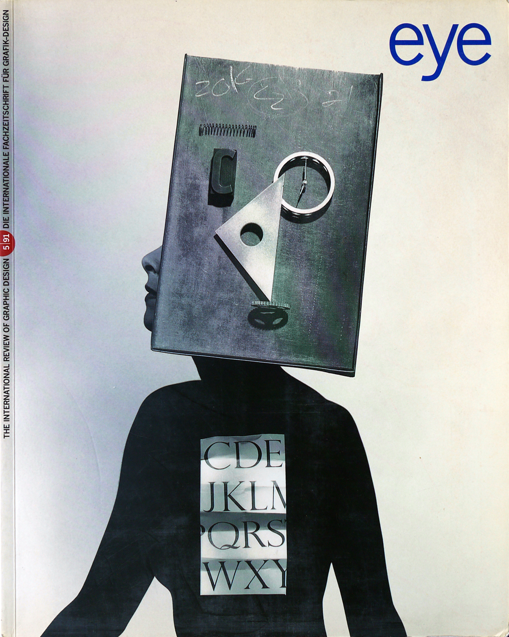
Winter 1991
Commercial Surrealist
Are the pictures of Dallas photographer Geof Kern postmodern retro or authentic art?
The problem with not being the first, second, to third to write about a hot young – or old – talent is that all the astute observations, great descriptions, meaningful platitudes, and clever buzzwords have already been used. Hence in this article on the American photographer Geof Kern, whose reputation has been rising on the United States and Britain for less than a decade, I will not cite Man Ray, Duchamp, Magritte, Dali or the entire Bauhaus photography workshop as being his historical mentors, nor will I follow other writers in referring to his assemblages and photographs as ‘hallucinatory’. Although these are the appropriate means to introduce Kern, such references are too simplistic now that he has received serious notice and completed hundreds of assignments.
Kern does owe something to the above-mentioned artists, but the connection actually began as a coincidence, and while there is a dreamlike quality to some of his pictures, the mystical implication of the word ‘hallucinatory’ is much less apt than it might appear on the surface. To describe Kern accurately it might be prudent first to dispel some easy assumptions. He does not revive modern ‘isms’. He does not follow current trends. He is not merely a good technician. Far from being a ‘quintessential post-modernist’, as one critic has described him, Geof Kern is simply a very skilled and talented commercial artist working in the current milieu. His medium is film; his vocabulary is an extension – not a reprise – of a classic twentieth-century visual language; and his method is problem-solving with ideas. While this is not enough to get the reader through a full-blown critical assessment of the artist and his work, it is good enough for Kern, who sees himself as both an individual and as part of a continuum. ‘I am a product of my times,’ he says. Actually, he is in the right place at the right time, and therefore may be one of a small group of artists whose work will define the times.
In recent years, Kern has become popular in both editorial and advertising markets, having emerged from an ever-expanding pack of commercial shooters and illustrators. These two generic groups are not usually discussed in the same breath since photography, no matter how stylised, is not considered by its orthodox adherents as illustrative, and illustration, no matter how realistic, is often thought of as a lesser craft than photography. In the tradition of American Surrealist photographers and storytellers such as Duane Michals and Jerry Uelsmann, Kern has wed the rationalism of photography with the conceptualism of illustration into a narrative style which, for different problems, involves montage, photogram, set-up and construction to convey simple and complex tales. He began working this way in the late-1970s as post-modernism hit the graphic design field like a Scud missile, randomly but with tremendous impact. It was a time when the forces of new technology and quaint nostalgia were beginning to define the graphic style of this (brief) age. Kern says he was not schooled in the histories of art or photography until three years ago when he was introduced to them by his new wife, a photography historian. Rather, he naively adopted the language of visual dislocation, known as Surrealism, when as a fashion photographer for the Dallas Morning News, he would set up his own shots using props and lighting with a nostalgic allure; he immediately realised this was not just a conceit but a voice.
Rolling Stone’s design director, Fred Woodward, then art director of the Dallas Weekly magazine and later Texas Monthly, encouraged Kern to direct his narrative inclinations to editorial illustration. Woodward’s nurturing allowed Kern to experiment with various techniques and ideas ranging from traditional collage to multi-negative layering of disparate and complementary images. Kern credits the commissions for Woodward as having having catapulted him into the national arena. Owing to the prevailing post-modern ethos for something borrowed and something new, his work was not simply welcomed because it conformed to a preference for things nostalgically modern, but because his distinctive graphic wit set his ideas apart from those who merely pilfer style.
This is an important distinction these days, since too much criticism (in the US, at least) is levelled against those branded ‘historicist’, implying that originality means being immaculately conceived. Some artists do flagrantly copy; others are, shall we say, the recipients of a tradition. Kern is the latter. In the early stages of creative development, Kern studied film-making in college and worked as a Navy photographer in Vietnam, where he acquired a keen sense of the absurd. It could even be argued that being the person assigned to photograph the ravages of war would force anyone into a dream-world for escape. While Kern does not admit to such a cause and effect, some of his collages and montages are reminiscent of the dislocations one might see in the wake of a bombing. As an artist – commercial or otherwise – Kern’s work must be affected by his environment and experience; the fact that he is a Surrealist may well be an involuntary response to his personal history. He admits that being a commercial photographer was a pragmatic decision since he has six children to support.
Once Kern was made aware of his spiritual ancestors, however, he did exactly what many adopted children do when told that somewhere their biological parent is alive and well: he searched for his roots. Kern’s first pilgrimage came out of a Bloomingdale’s commission for a store promotion and advertising campaign scheduled to coincide with the exhibition ‘Fashion and Surrealism’ (held in 1989 at New York’s Fashion Institute of Technology). The show, replete with the fashions, photographs, and magazine covers that helped transform Surrealist painting into haute couture, was a revelation for Kern – the family resemblance was indeed startling.
Bloomingdale’s creative director, John Jay, picked the right person for the store’s ‘The Subject is Roses’ campaign, for in the ads that resulted, Kern appeared to quote liberally from the masters of surreal fashion photography in exquisite pictures that made people stop and take notice of both store and photographer. But was this more complex than mere quotation? Kern has seriously proposed that the reason for such a close affinity with the past might have something to do with reincarnation. A more likely rationale is his appreciation of, and affection for, Platonic beauty. The original Surrealists were attracted to Greek busts and Corinthian columns for their classical attributes, and because they epitomised and symbolised Western culture in the same way other Surrealist visual props, such as flowers and butterflies, epitomised the superlatives of nature. For the same reasons that the Surrealists used clocks, mannequins, hat and glove moulds and other commercial ephemera, Kern finds beauty and symbolism in these everyday objects. The hypnotic power of classical forms, when correctly composed, is so strong that even the most orthodox modernists have refused to call them old-fashioned.
Kern continues the tradition but is not its prisoner. His work has evolved technically and conceptually from images that, when confronted by the casual viewer, might have a certain mustiness, to those in which there is no hint of nostalgic self-consciousness. While this claim might be disputed by critics who charge that Kern is exploiting the past for its elegance and marketability, his work has decidedly more resonance both in its ideas and technique than any cheap imitation. In fact, Kern has managed to transcend the constrictions of time and timeliness, for many of his assemblages and constructions are decidedly contemporary in theme.
Although time is not his jailer, trend and fashion are Kern’s tormentors, and always in hot pursuit. ‘Art directors will usually call and ask me to do the work I did two years ago,’ he laments. But such is the nature of this business. By the time his photographs are published in the anuuals, he is well into another phase and unwilling to return to his past. This problem cannot be taken lightly, for it underscores the difficulty that all commercial artists face when attepting to evolve or change skin. Kern rejected collage because in recent years too many bad illustrators have flooded the market, using the form mainly to compensate for a lack of ideas. He has also come to the sad realisation that one reason his montage is popular with magazine editors is due to the relatively large amount of information that can be stuffed into an image. Editors who are suspicious of economical illustration seem eager to cram as much meaning into a picture as possible, and Kern has tried to avoid such assignments. It is common practice for advertising art directors to sell an ad or campaign based on their interpretation of an artist’s work, and Kern is disappointed that American agencies too often expect the obvious. ‘The whole process is bad,’ he says, about having to sell himself on the strength of his published work. ‘My book goes out and someone gets excited about it and wants me to do that again. Then I have to convince them that maybe we should talk about some other solutions.’
Kern is a commercial artist, as well as a stylist, but style is his accent, not his language. Style is what gives his work its artifice, not its art. He is not selling style, but ideas. Yet the latter would not be possible without the former – it is all one seamless piece. The problem is that most art directors do not subscribe to this viewpoint. They think a stylist produces style – an artist art. So the bind for Kern is that when an agency want one thing, they do not want the other. For the weak or neophyte artist this is a tough dilemma, but Kern’s published work proves that he has been able to escape on more occasions than not. About his need to conceive and execute his own ideas, he has said: ‘Once I’m able to do the photograph, that’s when I become a complete pussycat.’ It is the tiger in him that makes Kern seem arrogant to the controlling (or insecure) art director, yet it is just that side of his personality that ensures he will remain a compelling artist for years to come, as waves of fashion drag the mere stylists out to sea.
First published in Eye no. 5 vol. 2, 1991.
Eye is the world’s most beautiful and collectable graphic design journal, published for professional designers, students and anyone interested in critical, informed writing about graphic design and visual culture. It is available from all good design bookshops and online at the Eye shop, where you can buy subscriptions and single issues.