Winter 2011
Crashing through the type

Time magazine infographics by Nigel Holmes 1970s
It was good luck, really (writes Nigel Holmes). Walter Bernard, Time’s art director, was looking for someone to do the magazine’s charts and diagrams when I walked into his New York office in September 1977, during a job-finding visit to the United States. I freelanced for Walter for a while, and in December he offered me a full time job.
It was an easy transition: Walter’s redesign of Time used essentially the same fonts – Franklin and News Gothic, plus a Times-like text face – that I had been working with in England, for David Driver at the Radio Times. Funny how type can help you feel at home.
At first, there was resistance from editors to my illustrative charts that accompanied their hallowed words. But Walter was a terrific champion and mentor. When many readers’ letters showed that they liked the stuff I was doing, editors became enthusiastic, too (though other readers suggested I stop and become a cartoonist). The freedom I was given led to a few illustrative excesses on my part but I knew that the general reader of Time was busy, and needed to be enticed to read stories, especially business stories, that might be thought boring.
Charts and diagrams had to be drawn at twice the reproduction size. That made for some large (and heavy) artwork, with as many as sixteen overlays on top of the key drawing, mounted on a thick cardboard base. There had to be three versions of each piece: one for the American edition (usually in full colour), and two for the international editions (printed in two colours in Europe; monochrome elsewhere).
I used Rotring pens and had a huge collection of plastic templates – ovals, circles and French curves – which meant that no line was ever drawn truly freehand. This was all pre-computer. The mechanical way that I drew things pre-Mac was good preparation for drawing with a mouse. When Macs arrived at Time around 1985 I used Freehand, and I still use it today (with difficulty, since Adobe won’t support it any more).
There were several things that made working at Time wonderful. The first was that [as graphics director] I had a great research staff dedicated entirely to the graphics.
The second was easy access to the writers and editors. I used my lack of knowledge about how things worked in the us to initiate discussions with the writers. Some of them had a hard time explaining the financial and business concepts they used, but in conversation they often spoke in metaphors, and that led to simple visual ideas that explained what they were talking about.
A third factor was Walter’s 1977 redesign. I had written a sort of fan letter to him from England, and it was on his desk when we met later that year. His format seemed so right for a news weekly in that era, and I loved being alternately bound by the rules around the page or literally breaking through them. In that, I was immeasurably helped by the page designers, who made the pieces crash elegantly through columns of type.
We had late nights but a shopping cart filled with bottles would wheel along the corridors every Thursday and Friday night, and we all had our fill of free wine, beer, whisky, vodka – you name it – to go with the catered three-course meal the magazine served up. It’s amazing that any work was ever done.
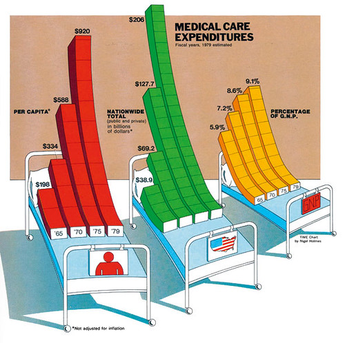
Holmes explains: ‘With the bars sitting up in bed, an immediate visual impression of … cost is given.’ Victorian style hospital beds are used symbolically: ‘It would have been … confusing to draw the kind actually in use,’ writes Holmes in Designer’s Guide to Creating Charts & Diagrams, 1984.
Top: Business page graphics, Time, 17 Dec 1975. Nigel Holmes’s charts and diagrams were made with as many as sixteen separate Amberlith or Rubylith overlays mounted on top of one sheet of Mylar that had the key drawing on it. The whole thing was mounted on a thick cardboard base, ready to be couriered to the main printer in Chicago.
Nigel Holmes, explanation designer and writer, Westport CT, US
First published in Eye no. 82 vol. 20 2012
Eye is the world’s most beautiful and collectable graphic design journal, published quarterly for professional designers, students and anyone interested in critical, informed writing about graphic design and visual culture. It is available from all good design bookshops and online at the Eye shop, where you can buy subscriptions and single issues.