Summer 2006
Crystal garden
Crepuscular and cool, the Nobel Field is a ‘living instrument’, played by its visitors
There are more than 300 peace prizes in the world, but the Nobel is the big one. When Swedish chemist Alfred Nobel died in 1896 he left most of his vast wealth (he invented dynamite, if you recall, and other weaponry) to fund five prizes, one of which was to be awarded annually to the person who ‘shall have done the most or the best work for fraternity between nations.’ The prize is chosen by a Norwegian committee, which is why the Nobel Peace Center is in Oslo (rather than Stockholm), in what used to be a bustling railway station.
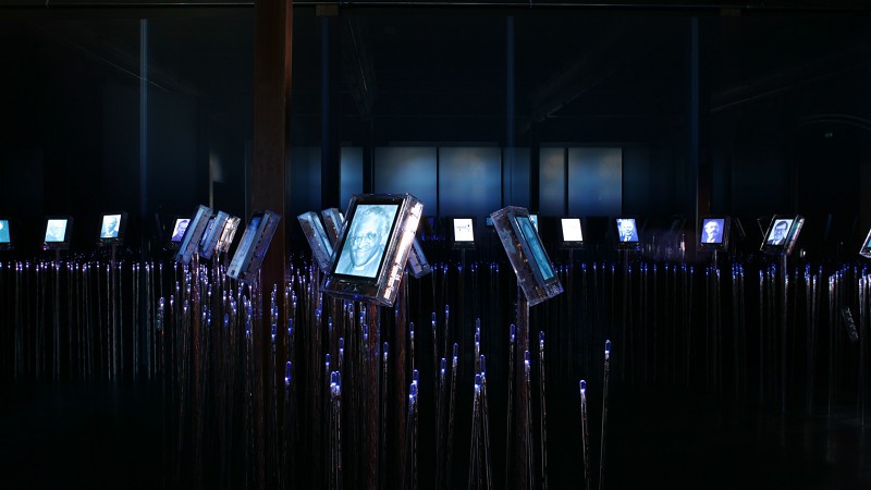
The Peace Center’s centrepiece is the Nobel Field, an installation described by its designers as ‘a garden of image, light and sound.’ A thousand LEDs twinkle at the tips of fibre-optic stalks while a hundred LCD screens pulse or ‘breathe’ gently. The location and tone of an ambient soundtrack is modified by visitors’ movements in the crepuscular space, as is the hue of the luminous displays. The effect is one of dignity without gloom. Each station displays a different laureate, whose portrait throbs until the approach of a viewer causes the screen fill with colour and the laureate’s name to appear, followed by texts.
The installation is a collaboration between Adjaye Associates (British architect David Adjaye), Small Design Firm (the US designer David Small) and the Norwegian-born artist and information designer, Timon Botez, among others. Directors Grete Jarmund and Paul H. Amble, describe the Nobel Field as a ‘living instrument’, played by visitors to the Center: ‘Rather than an honor roll, or worse a graveyard of names and faces, the Field should be seen as an organic, living, and evolving garden whose fruits are the ideas and ideals passed on to us by the Laureates.’
The ‘field’ or ‘garden’ metaphor is central to the conception. ‘A virtual garden grown from one hundred LCD displays planted among a thousand twinkling blades of LED grass’. In Leaves of Grass, Walt Whitman describes grass as ‘the flag of my disposition, out of hopeful / green stuff woven’ and ‘the beautiful uncut hair of graves’, images that resonate in a place designed to focus attention on the issues of peace, war and conflict-resolution. But there’s a mineral rather than vegetable feel to these hard-edged crystal cases, and the prevailing hue isn’t hopeful green but blue, the colour of melancholy. The hardness could symbolise commitment, I suppose. And as Alexander Theroux points out in The Primary Colors blue ‘is the only one of all the colors which can be … symbolic of dark and light both.’ Thinking of it like that, the ambiguous twilight the Nobel Field creates in this space seems entirely apposite.
Top: The Nobel Field, 2005. Nobel Peace Center, Oslo, Norway. Sonar below screens detects presence of viewer and releases information about the Nobel laureate. Photographs: Timothy Soar. Architects: Adjaye Associates. Information design: Eric Gunther, Timon Botez. Graphic design: Timon Botez. Software design: Small Design Firm. Hardware design: Small Design Firm, AMD Solutions.
Peter Blegvad, songwriter, illustrator, London
Eye is the world’s most beautiful and collectable graphic design journal, published quarterly for professional designers, students and anyone interested in critical, informed writing about graphic design and visual culture. It is available from all good design bookshops and online at the Eye shop, where you can buy subscriptions and single issues.