
Summer 2020
Fraser Muggeridge: The improviser
‘The role of printed matter has shifted from what it communicates literally to what it communicates subconsciously.’

Fraser Muggeridge attended the University of Reading in the 1990s and studied in the Department of Typography & Graphic Communication. He worked for Sara Chapman at The Letter g before establishing his own studio in 2001. In 2010 he founded the annual Typography Summer School as a way to introduce students to the instruction he had enjoyed at Reading. He established a New York Summer School (in collaboration with Other Means) in 2013, adding a Los Angeles version in 2019. Muggeridge teaches widely, with lectureships in India, Belgium, Canada and Iceland. His studio, with Katie Evans, Michael Kelly, Kate Morrell, Joe Nava, Simon Rogers and Michela Zoppi, is based in London. He is also known for his personal, experimental work, often derived from the systems, processes and constraints of print production.
Though Fraser Muggeridge rarely repeats himself, his work is easy to spot. There is something about the way his spare and rigorous approach to type collides with a dogged determination to do the ‘wrong’ thing right. This quixotic attitude, combined with an original and meticulous approach to the materials of design, has made friends and influenced people within a wide range of cultural contexts, from pop music to art catalogues to exhibition design.
The work can seem quite odd, quirky and ‘English’, yet it is light years from the UK design ‘wit’ that Muggeridge and many of his generation rejected as young designers in the 1990s. Unlike some contemporaries, he does not shy away from the term ‘graphic design’. He enjoys the chance to talk about it, frequently pulling out examples of graphic artefacts, magazines and books that demonstrate deep immersion in the culture of design and typography, discussing the details, the big picture and the business of running a design studio with a steady mix of confidence and self-deprecating humour. As both teacher and practitioner, he has a good sense of the way design and type have evolved over the past three decades.
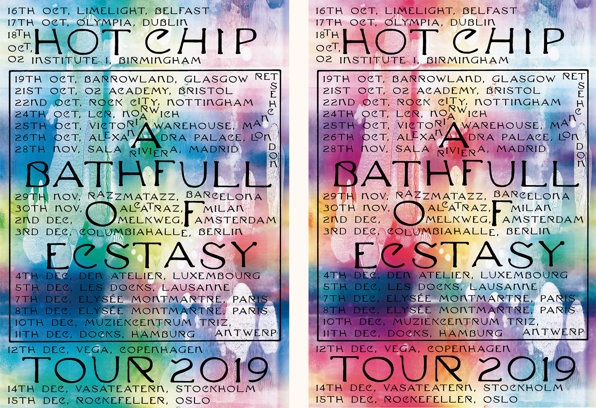
Posters for Hot Chip’s 2019 tour. The posters were screenprinted in Brighton by The Private Press, with an eccentric use of lettering designed in 1906 by German artist Max Klinger (1857-1920). Muggeridge discovered the letters in Nicolete Gray’s book A History of Lettering.
‘It’s quite easy to be an OK graphic designer now,’ says Muggeridge, happily settling down to a two-hour conversation about design, ‘with technology doing half the work and access to well designed fonts, but this has created a worldwide uniform blandness.’ Does this also mean less bad work? ‘Everyone is way more literate when it comes to fonts, which is generally a good thing. However it is interesting that basic skills have declined.’ For Muggeridge, the skills he looks for are not just in the craft of making and doing – they are to do with looking properly. Technology has made it possible – and sometimes necessary – for everything to be made at greater and greater speeds, which can make things more efficient, but reduces the time spent looking and thinking about design. He is, however, an enthusiast for technology of all kinds, from experiments in printing to the explosion of possibilities in digital type design. ‘There are more opportunities than 30 years ago,’ says Muggeridge. ‘It is common to work in super-interesting places – we just did a big project in Bangladesh. The advancement of global tech has made this possible.’
Our first conversation took place shortly before the global Covid-19 pandemic changed everything. Within days of the lockdown, Muggeridge was responding to the new normal with his customary energy. ‘All the projects are paused,’ he said, ‘but we are all connected. We will have to invent some things to do – it’s a good chance for creativity.’ By the following month, Muggeridge had collaborated with artist Jeremy Deller on a poster that raised around £50,000 for charities Refugee Action and The Trussell Trust. ‘Jeremy often sends messages or photos of his sketchbooks, and Thank God For Immigrants was something he had written. He sent the text on a Sunday. I designed it like those posters you used to see outside Methodist Churches.’ They had intended to do a run of 500, but within a few days Deller and Muggeridge had taken orders for 2000 copies. He printed the posters and mailed them out in late April 2020.
Jeremy Deller, Thank God For Immigrants, April 2020. ‘I designed it like those posters you used to see outside Methodist Churches,’ says Muggeridge. This A2 four-colour litho print was made by Deller and Muggeridge to raise funds for Refugee Action and The Trussell Trust.

A dialogue with the press
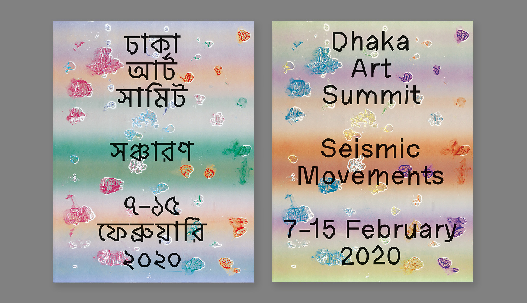
This year’s Dhaka Art Summit (DAS) in Bangladesh gave Muggeridge and his team the opportunity to work on every aspect of this summit including posters, guides, wayfinding, website and a custom dual-language typeface, made in collaboration with Universal Thirst. ‘We wanted to make a font that had the same stroke width, had the same spirit. It’s got these bits that wiggle around because it’s all about seismic movements. And then we made a Bangla version that does the same thing.’ When they started using the two languages in the same books and posters, they kept the stroke width the same, but used different leading to maintain the density of type. ‘If you made the leading the same, the Bangla would look too tight, because there are no ascenders and descenders.’
Design for ‘Seismic Movements’, the Dhaka Art Summit (DAS) in Bangladesh, 2020. All posters, books and banners made use of a custom typeface. The Bangla version was designed in collaboration with type foundry Universal Thirst. The litho printed materials were produced in four passes on a single-colour press in Dhaka.
The concept behind the face’s design was what Muggeridge calls ‘a way of
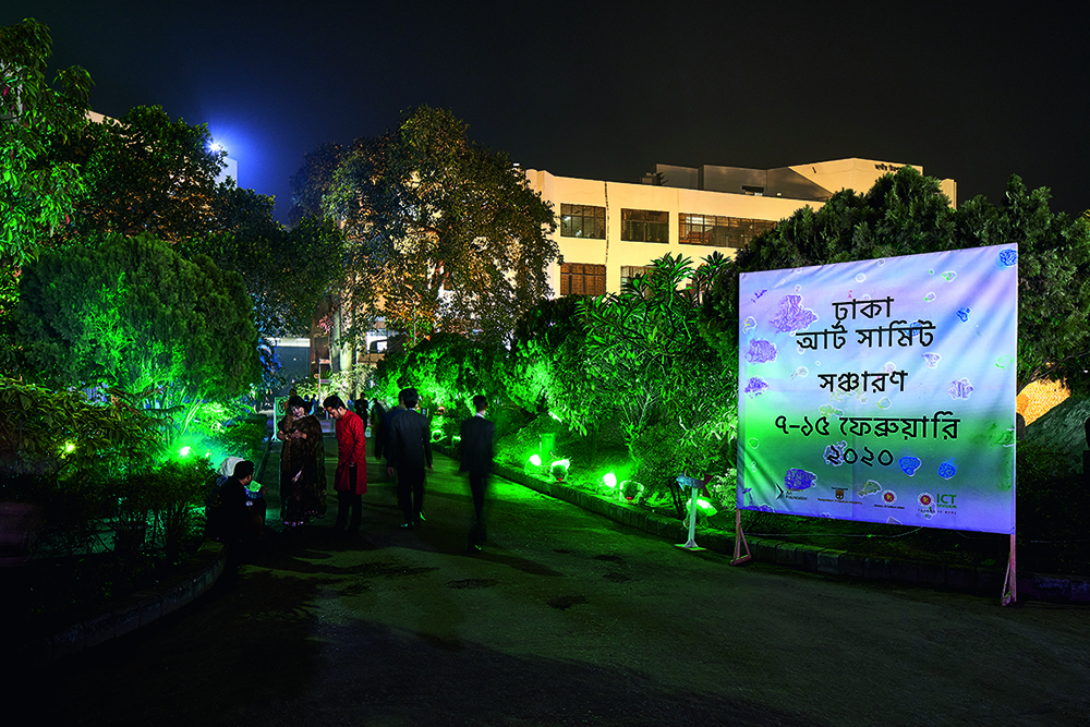
type designing without type design’, based on the skeleton of an existing font, Akzidenz Grotesk. The brief from DAS was to come up with a typeface that could represent seismic movements – earthquakes, political movements, colonial movements, shifting Tectonic plates, and so on, hence their ‘wiggle bits’, which they have varied to make contextual alternatives within the font. ‘We were embedded,’ says Muggeridge. ‘Joe Nava and I were in Bangladesh for about two and a half weeks, working with the organisation, with local printers and suppliers, setting up a little studio in Bangladesh.’ He shows me the DAS catalogue. ‘This was printed on a single-colour press four times. So you go to do a press pass and all you see is a Cyan plate. When they say, “It looks all right, yeah?”, I’m like, “I’ve got no idea.”’
Fabric entrance banner mounted on a wooden frame. All the artefacts were made in collaboration with local artisans and suppliers
Muggeridge sometimes deliberately makes life hard for himself: his catalogue for artists JocJonJosch features page numbers scratched by hand into the printing plates. The introduction of inevitable human error into an otherwise controlled process means you cannot always read the numbers. ‘It’s like you’re opening up a bit of chance, a dialogue with the press,’ says Muggeridge. The catalogue’s typeface is a scratchy version of Century, processed in Glyphs using a filter that mimics the effects of Beowolf (see Eye 7), the cutting-edge, late-1980s typeface (by Just van Rossum and Erik van Blokland) that introduced random elements by hacking the way PostScript fonts came out on laser printers. ‘It’s a kind of super-ugly font, but then typeset in a really nice way,’ says Muggeridge.
Printing, and the way type and image work on paper, are as fundamental to Muggeridge’s work as they are to any pre-internet designer. However, he is not only conscious of the possibilities of doing something new with print, he is acutely aware of the way that print affects the audience in a post-print era. He states: ‘The role of printed matter has shied from what it communicates literally to what it communicates subconsciously.’ Asked about the increased emphasis on ‘branding’ for graphic designers, Muggeridge says: ‘I think everyone does do the same thing. It’s just another word like “co-design” or “UX”. People come up with all these words. Often it’s just trying to find ways of keeping your validation alive. Now it’s a bit uncool to say identity. People are starting to say logos again. Which was really uncool ten years ago.’
He observes that there is often no proper brief. ‘Clients are more vague; the hardest part is getting the content.’ There is nothing new about this – graphic designers have long helped clients re-write and re-invent briefs. ‘There’s a chat, but usually briefs are just like some cut and pasted stuff from the client’s marketing spiel. Very rarely do you actually get a brief. I don’t see that as a bad thing, because then it’s up to you to define what you want to do.’
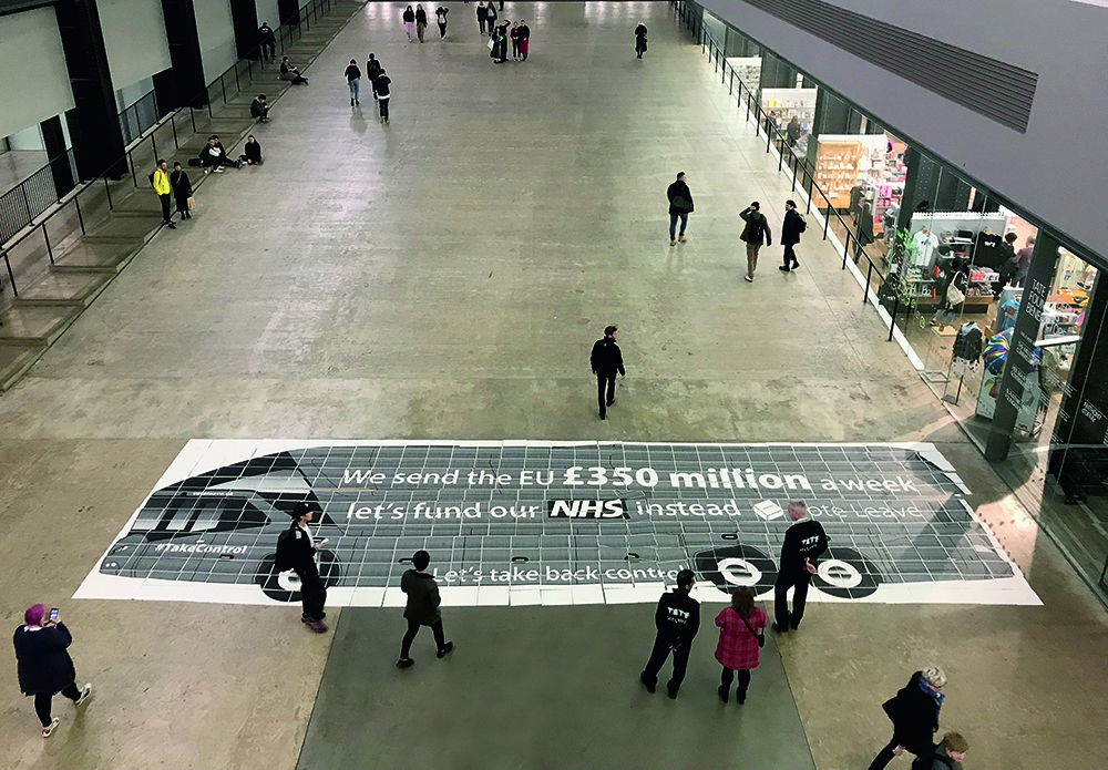
Brexit Bus (2019), a box containing 434 unbound A3 pages that can be laid out to make a 1:1 copy of the notorious propaganda bus used by the ‘Vote Leave’ campaign in the 2016 referendum to decide whether the UK should remain in the European Union. This ‘bus in a box’ pays homage to Mason Williams’ 1967 Bus. It was published by Arnaud Desjardin’s The Everyday Press in an edition of 100.
Playing games
Muggeridge appears to have built up a loyal and close-knit team. How does he go about recruiting staff? ‘I used to think I would look for people that were like me and I’d train them to be me,’ he replies. ‘Now, I think that maybe that’s not a great strategy. I’m trying to find people that care. And I’m trying to make them see, to make them look at what they’re doing.’ Gesturing to the small space occupied by Muggeridge and his six cohorts – no social distancing at that time – he says: ‘There’s no escaping in the studio. There’s no meeting room, so it’s very uncorporate. Everyone’s aware and dealing directly with a client. And if they ring you up and say, “We don’t like it”, you have to deal with it. For a young designer that’s often hard, because they will always be on the front line.’ How do Muggeridge’s clients react to some of his more extreme ideas – the ‘dialogue with the press’, the use of chance and experiments? ‘Sometimes it freaks clients out and we might get taken off
a job. I’m pretty good at justifying the work, but they can still say, “I don’t like it”. And that’s fine, too.’
Sometimes, Muggeridge’s answer to all pervasive, bland non-design is to make a job almost deliberately ‘bad’. The little zine / leaflet he made for UK rap artist Stormzy and YouTube is a case in point: the words were artlessly ‘poured in’ – in Arial – but with all the capitals changed to Copperplate Gothic. ‘This is a little freebie publication / zine,’ he explains. ‘They made a series of films which got together music videos from his last album. They gave us a load of images and a load of text and said, “Make something that looks cool”. That was the brief. So the typography is almost homemade. But it’s also not. That’s the weird thing. It’s knowingly done. I’m really interested in that whole world of nearly bad or nearly boring or really boring or not boring. I’m interested in playing all those games all the time, even sometimes on the same job.’
He sometimes compares what he does to ‘an improvisation orchestra’, but however wild and free the ideas, he remains a virtuoso. Things can appear random, but he is in complete control. One of Muggeridge’s methods of doing typography well is to print it out. He even made a booklet entitled Have You Printed It Out? In it, he explains that typography is about ‘training your eye’. He notes: ‘We are fully immersed in WYSIWYG (what you see is what you get) interfaces but, as screens get smaller and smaller, how can anyone see what they are doing or judge space relationships at the actual size? The answer is a printout at actual size, to evaluate one of the key principles of typography: the relationship between type size, line length and leading.’
Occasionally, the experimental side of Muggeridge’s work comes out in just one aspect. His approach to Art Monthly is at first glance quite traditional, efficient and printed on cheap white coated paper. The Muggeridge touch comes from the three-colour cover, for which he changes the colour profiles each month. ‘We hack the colour profile to create a full colour, three-colour image.’ Muggeridge likes finding out about new print techniques and printers. His spiral-bound specimen for Commercial Classics was another ‘hack’ that displayed the foundry’s typefaces [see Eye 98] on different-sized pages. ‘Paul Barnes, who I met as a student at Reading, had the idea of things interacting and overlapping in different page sizes. My contribution to that was to figure out a way of doing it and getting it actually produced. The specimen is made from three B1 [1000 707mm] printed sheets. One is pink, one is white, and one is coated paper. And all the pages come from those three sheets. So my first proposal wasn’t about all the type problems, it’s just about how they are all folded and collated to interact with each other. And then the cover is the overprint of all the three sheets together. Then we foil- blocked the title on that, so it means that all the covers are different. That’s hard to sell to a client. Paul asked: “What’s it going to look like?” and I said, “I don’t know, but it’s going to look great.”’
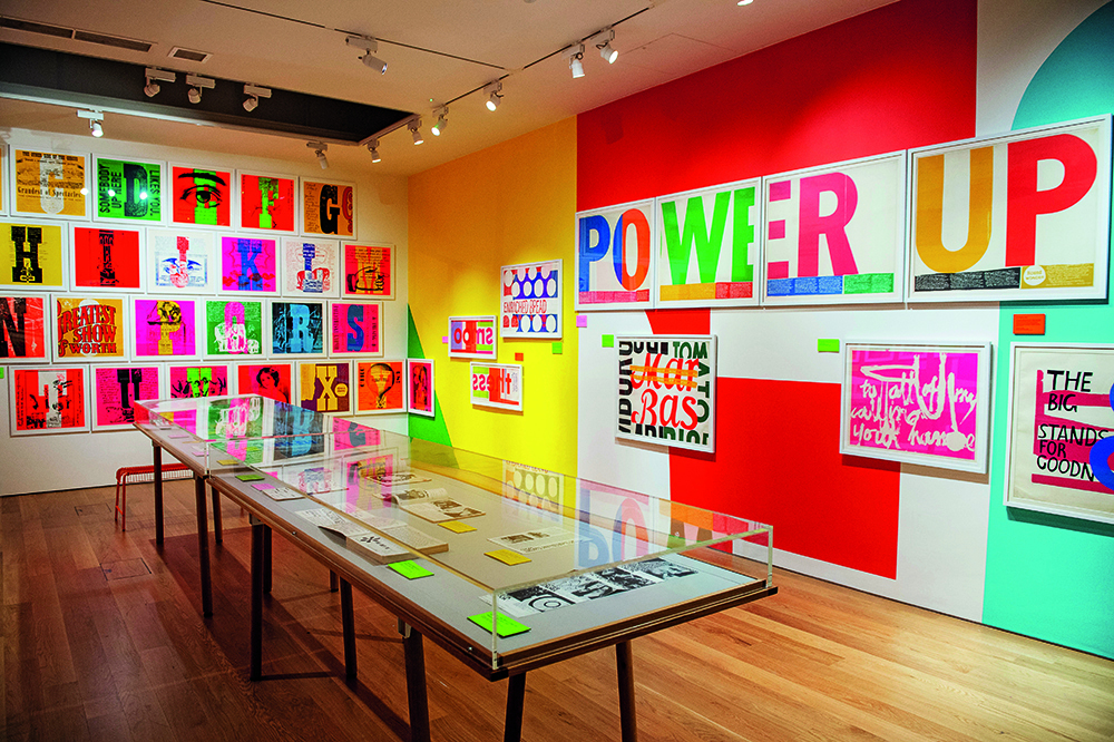
Installation view from the exhibition ‘Corita Kent: Power Up’, House of Illustration, London, 2019. For the text panels, Muggeridge used exposed silkscreen frames. The three-metre high backgrounds were enlarged from pages in Sister Corita’s book Footnotes & Headlines (1967).
Wonderful time on the internet
Muggeridge approaches website design in a way that is fresh and unclichéd, given the tight constraints of the medium. ‘We always did a few websites, but we always worked with an outside programmer and people would run out of time or money and then they’d be like, “that’s it”.’ Muggeridge’s solution was to hire Simon Rogers as an in-house designer / developer. The studio’s website design for architects AOC (Agents of Change) changes colour on each refresh, and the images are framed by different shapes suggested by the architecture, including a skirting board in the shape of a human profile. Rogers says: ‘It’s a return to that really wonderful time on the internet when everything was a bit more ad hoc.’ Muggeridge adds: ‘AOC really pushed us. We always need that in our work, an artist or a client to push us. If someone says: “Just do whatever you want”, I can’t do that. I almost like it when they say they don’t like it.’ The studio’s website marieneurath.org shows its thoughtful approach to a large amount of historical content. Made in tandem with the House of Illustration exhibition about Marie Neurath’s books for children, Muggeridge’s team worked with curators Sue Walker and Eric Kindel of the University of Reading.
Muggeridge enjoys the freedom of working with House of Illustration despite the budget limitations it has when compared to bigger institutions: ‘The HoI are doing museum-quality shows, but they are definitely more relaxed in terms of what you can propose. For Sister Corita we suggested the screenprint frame section panels.
For Tom of Finland we put the title “TOM” on a metal link chain curtain. I always want to have a good dialogue with a printer or supplier. In terms of clients, really it’s more about if people can understand what we’re trying to do. That doesn’t always happen. I don’t think we’re everyone’s cup of tea.’
For all that Muggeridge is a prolific individualist who works extensively in the art world, he is a graphic designer through and through. ‘I actually don’t have any content,’ he says – without false modesty. ‘So I’m always trying to get elements and remix them. I do not want to be political and I’m not a writer. If someone says, “Make a poster”, I don’t have anything I want to say. My content is always just other people’s content.’
Spiral-bound inner pages of a Commercial Classics type specimen, 2019. Muggeridge printed the job on three different paper stocks that could be trimmed and folded into different-sized pages.

John L. Walters, editor of Eye, London
Read additional articles in Eye no. 100 vol. 25, 2020
Eye is the world’s most beautiful and collectable graphic design journal, published for professional designers, students and anyone interested in critical, informed writing about graphic design and visual culture. It is available from all good design bookshops and online at the Eye shop, where you can buy subscriptions and single issues.