Autumn 2011
In the neighbourhood
John Ridpath profiles three design practices who work with local clients: Maddison Graphic; Mark Gowing Design; and Bigger Than Giants
‘Local’ has become a familiar term in many spheres, from politicians urging for decentralised, community-run government, to the farmers’ markets and ‘locavores’ trying to offset the environmental cost of food miles.
It is a less familiar word in the world of graphic design. Yet in their own unique ways, the three studios interviewed for this piece heartily embrace a sense of the ‘local’ in their work. Though all have experience of working further afield, locality informs their client relationships, working practices and visual style – whether acted out in the small town, strange city or alternative suburb.
To any young designer, the pull of the big design capitals – New York, London, Berlin, etc. – might feel irresistible, even inevitable. But Maddison Graphic, a practice based in the small English cathedral city of Ely, has deliberately kept the Big Smoke at a comfortable distance. Working for churches, beer festivals and local businesses, what could so easily feel ‘small time’ is carried by a forceful graphic voice.
Bigger Than Giants is based in Austin, Texas. Although it is the state capital, with a population of just 800,000, Austin is eclipsed by larger cities such as Dallas or Houston. But this self-proclaimed ‘weird’ city has its own peculiar energy, which the studio taps into, matching the craftsmanship of clients with a distinctive handmade visual style.
Though based in Australia’s largest city, Mark Gowing has deliberately avoided setting up shop in the parts of Sydney mobbed by other designers. Eschewing international – and even national – commissions in favour of clients closer at hand, he has grown to prefer working in face-to-face partnerships – and the spirit of a life more local.
The freedom of the small pond / Maddison Graphic, Ely, Cambridgeshire
When Edward and Alfie Maddison decided to start their own graphic design studio in 2006, moving to London seemed like the ‘inevitable thing’. But that is exactly what the brothers decided to avoid, opting instead to seek their fortune back in their home town: the cathedral city of Ely, Cambridgeshire.
‘If you’re a graphic designer in Ely, it’s a much smaller pond,’ says Edward, ‘but working local allows us to be quite free in what we do, and that’s been good for us.’ Being close to home has provided creative stimulus too: their mother, Jane Kennedy, is an architect and their father, John Maddison, is a painter and art historian. ‘We don’t know any other designers working in Ely, so it’s great to have someone to talk to about art and architecture.’
Ely’s own architectural landscape is dominated by its vast medieval cathedral, where, as it happens, Alfie once sang as a choirboy. These days, visitors to the historic building will find their way around with the help of wayfinding and information panels designed by Maddison Graphic.
Thanks to some time spent in another venerable institution – the local pub – the brothers were asked to design the posters and pint glasses for the eighth Elysian beer festival. The anecdotal feedback for this illustrative work was overwhelmingly positive among their CAMRA (Campaign for Real Ale) friends – most of the drinkers forwent their deposits and held on to their Maddison-decorated glasses after the event.
St Luke’s Church in Cambridge, a short drive from Ely, is also home to some graphic work by the brothers: a decorative glazed screen that separates the worship and community areas of this huge Victorian building. ‘We wanted people to be able to see from one side to the other, but it needed to act as soundproofing and a visual distinction,’ explains the church warden, Alison Taylor. Edward came up with an illustrative design based on the medieval ad quadratum grid system, incorporating foliage, an ox, fish, doves – and, despite some contention within the church committee, two dragons.
‘Working outside London, you treasure the fact there might be others around locally who might be really good,’ says Meredith Bowles, director of Ely-based Mole Architects. But as much as Bowles liked the idea of working with local people, it was the Maddisons’ previous work that won them the commission to design Mole’s stationery and a Christmas card.
As Edward is quick to point out, the brothers have not deliberately limited themselves to local work: ‘We take work where we get it – like most graphic designers!’ Other projects have ranged from stationery for writer Zoe Williams, to college wayfinding at Oxford University and graphics for Poly, a US music label.
In the not so distant future, the Maddison brothers will be looking to spread their wings. They are still resisting the pull of the capital, and have their eyes trained on Norwich, where Edward did his graphic design studies. But despite plans to move to a (slightly) larger city, they are not interested in changing how they work, or the kinds of people they like to work with. ‘We don’t want to be massive,’ says Alfie, ‘we just want to be on the doorstep of more people.’
maddisongraphic.com
Not ‘bonza’, more intimate and long-lived / Mark Gowing Design, Sydney
Mark Gowing estimates that 90 per cent of Sydney’s design business takes place in the affluent eastern suburbs and city centre. Yet he has chosen to base his studio in Newtown, a lower-income suburb in Sydney’s inner west: tougher, grubbier, slower-paced, and ethnically diverse.
‘Part of me being here is about not being in the eastern suburbs – not being the typical designer drinking lattes in Surry Hills,’ Gowing explains. ‘They’re nice folks, but I don’t want to be like that.’ His is a two-man studio, very much ‘all hands on deck’ and based at a separate studio in the backyard of his house.
This style of working – in the garden, hands on everything – is reflected in the type of clients the studio takes on – and the kinds of relationship that develop. ‘I guess it’s very easy to transfer to locally based work, it kinda makes sense. It’s not that I only seek out local clients but we tend to be like-minded.’
Gowing (aged 41) was born in Canberra, and raised about an hour north of Sydney in a town called Ourimbah. He got a very early start as a designer 24 years ago, working as an apprentice. In the past, Gowing has worked for clients all over Australia and overseas, but at the moment he is not working with anyone outside Sydney.
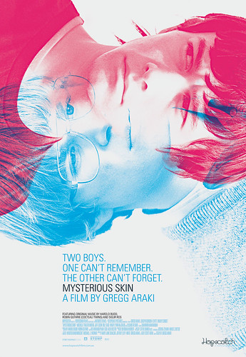
When we begin to talk about his local relationships, he immediately thinks of Hopscotch Films, an independent distribution and production company based in the city centre. He has worked with them for almost ten years, taking on their identity management and about twenty film release campaigns per year. While not averse to bigger clients and projects, Gowing is becoming increasingly interested in this kind of relationship: local, intimate and long-lived. ‘It’s a really sweet spot where there’s instinctive understanding – we barely need a brief any more.’
Other relationships have flourished with this kind of partnership, based on mutual understanding rather than brief-and-response. His studio has worked with Sydney’s Sherman Contemporary Art Foundation almost every day for the past five years, for instance. Other local clients range from the Sydney Opera House and University of New South Wales Press to the Inertia indie music label, the award-winning (Three Drunk) Monkeys ad agency and local architect TTBI.
His studio’s approach falls into a fairly broad range of techniques and styles, ranging from custom typography and the clean minimalism of grid-based design to photographing self-made models. ‘Universities here teach that you shouldn’t have a style, you should be flexible enough to do anything.’
Australian graphic design has a rich history from the 1970s onwards, he says. ‘But we don’t tend to celebrate it.’ Gowing is therefore a big fan of Re:collection (recollection.com.au), Dominic Hofstede’s growing online archive of Australian design. (See also Hofstede’s article about Les Mason in Eye no. 79 vol. 20.)
Hofstede’s archive is eclectic, exhibiting the kind of flexibility Gowing attributes to the education system – but that’s not to say there’s no such thing as an Australian visual style. Gowing points to the surfer fashion label Mambo (see Eye 47), whose graphic identity – painterly, sketched and loose – draws on artists such as Robert Klippel, Ken Done and Rolf Harris. That, and a particular irreverence and sense of humour that most people would recognise as uniquely Australian.
But Gowing keeps his distance. ‘I get inspired by not getting pulled into an Australian context. There are lots of Australians who aren’t like Australians –who don’t want to be like the laid-back “bonza” guy. We can be more sophisticated. There’s a lot of different cultures here.’ That diversity is just one of the reasons he’s chosen to set up a base in the culturally rich suburb of Newtown.
Gowing’s decision to keep his garden-based studio small, hands-on and busy with local work is very much a conscious one. ‘I’ve had numerous opportunities to become bigger, but we are comfortable financially … I have huge respect for what the earlier generations of designers did with their careers when they got successful. Their life was their work, and they lived it.’
markgowing.com
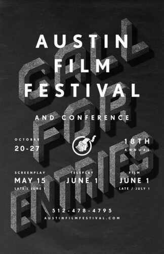
‘Call for entries’ poster, Austin Film Festival, 2011.
Strangely strange, oddly normal / Bigger Than Giants, Austin, Texas
Austin, Texas is a strange place – and the locals are keen for things to stay that way. The ‘Keep Austin Weird’ movement (slogan: ‘Collaborative fission of co-ordinated individualism’; charted in Joshua Long’s 2010 book Weird City) has spent the past decade fighting to maintain the city’s status as a stronghold for local business and cultural diversity, standing apart in a state considered broadly conservative, and famously redneck.
‘You’d think that Austin would be an easy place to be a designer,’ says Ryan Rhodes, ‘but it’s tough.’ Working under the Bigger Than Giants moniker (taken from a phrase his mother once used to express a measurement for love), the 31-year-old designer grew up in Corsicana, a small town an hour south of Dallas, went on to study design at Texas University, then moved to Austin after landing a job at agency McGarrah Jessee. After seven years working there, he decided to go it alone. ‘As a freelancer, I work a lot more and make way less,’ he continues. ‘But the freedom is worth it to me. I love this town and I’ve made a lot of great friends here.’
And many of these connections have blossomed into working relationships: ‘I’ve done a ton of local design, most of which came about via friends. I either work with friends on projects, take on projects that they may not have time for, or vice versa. There’s a small net of people I feel blessed to be around. Real folk who watch out for one another and just have fun together. It doesn’t feel competitive whatsoever.’
Bigger Than Giants’ work with ‘real folk’ has included branding and illustrative work for Smokey Denmark (a ‘salt of the earth’, family-owned sausage company), the Austin Film Festival and local ‘surfer-western’ musician Trey Brown – who called up Rhodes after seeing a T-shirt he did for a farmers’ market.
Rhodes is currently collaborating with Austin-based sign-painter and muralist Joe Swec on some work for Easy Tiger, a bakery and beer garden about to open in the city. For that project, Rhodes will be painting graphics on windows, vans, doors and glass. Looking to the future, he is hoping to set up a new creative partnership with fellow local designer – and friend – Caleb Everitt.
All these local connections go hand in hand with his peculiarly local-flavoured work, described by Design Bureau as having a ‘slightly off-kilter, Austin-centric “weird” aesthetic’. That weirdness found a natural home in the visual identity Bigger Than Giants produced for Johnson’s Backyard Garden (JBG), a community-supported farm owned by Rhodes’s landlords, Brenton and Beth Johnson. Rhodes’s illustrative artwork and lettering for JBG was constructed with shapes cut from pieces of wood, inked and printed. Their rough-hewn geometry evokes associations of handcraft and old-time production – a perfect match for the company’s organic food box service.
This interest in the handmade has always played a big part in the story of Bigger Than Giants: ‘I have always preferred work where I can see the hand in one way or another … If the project or client allows, I’ll try different media: scratchboard, signpainting, calligraphy pens, brush pens, anything I can get my hands on,’ Rhodes says.
‘If you can shed any reservations in confidence, it’s very freeing, less mechanical. But I honestly can’t sneer at computers, ever ... it’s the main tool in my shed for sure.’
A fair chunk of Bigger Than Giants work comes from more remote clients – mostly art directors, who encounter his work on image blogs. Whilst he isn’t currently actively approaching such clients, he suspects that could change – but not having to do too much chasing is very much a conscious choice: ‘Before I quit my last job, I tried to simplify my life down to necessity as much as possible, so I didn’t have to maintain any sort of lifestyle that would require constant hustling … My approach is less about being known and more about learning, experimenting, and pushing myself.’
Some of his more distant projects include T-shirt designs for clothing brand Vans, and posters for Baltimore-based ‘dream pop’ duo Beach House. Yet always the imagery manages to keep some of that handcrafted spirit.
But even if Rhodes’s not-so-local work retains the same graphic outlook, homegrown projects satisfy a particular creative mindset: ‘It’s nice to do local work for a couple reasons. You actually get to see them [the clients] in person as opposed to swapping emails, which gets me out of my cave. And you’re closer to the entire project, instead of just sending a file into outer space and maybe seeing it a year later. That’s still weird for me.’ Maybe too weird, even, for Austin, Texas.
biggerthangiants.com
John Ridpath, writer, developer, London
First published in Eye no. 81 vol. 20 2011
Eye is the world’s most beautiful and collectable graphic design journal, published quarterly for professional designers, students and anyone interested in critical, informed writing about graphic design and visual culture. It is available from all good design bookshops and online at the Eye shop, where you can buy subscriptions and single issues.