
Autumn 2018
Liberté, égalité, typography
Serge Ricco, creative director of l’Obs, has shown this word-driven, left-wing French weekly the power of expressive type and images
It is a hot morning at the end of July in Paris. Not the picture-perfect Paris of tourists, but business Paris, in the buildings around the neo-Classical stock exchange, the Bourse. Except that nobody is around. It’s the start of the French holidays, and the men with tailored suits and mobile phones who would normally be filling the traditional brasseries here in the 2nd arrondissement are all off at their second homes, relaxing (and plotting) before they return to the business battlefields in September.
Opposite the Bourse are the offices of Le Nouvel Observateur (commonly known as l’Obs) which used to belong to a merchant bank. Inside the staircases are grand, and somehow this weekly news magazine, the favoured publication of France’s left-wing intellectuals, has squeezed its liberal journalists into the old capitalist office spaces. Behind the strong-room doors in the basement vault, where gold was once kept, is the back issue archive.
I am in the equally quiet art department, in the office of Serge Ricco, creative director of l’Obs. His space is a perfectly organised temple to international editorial design. Early issues of New York magazine (when it was still a supplement to the Herald Tribune newspaper) and a whole run of bound volumes of Willy Fleckhaus’s Frankfurter Allgemeine Magazin are among the tempting delights. We could happily look through the shelves and discuss art direction all day, but actually we’re here to talk about l’Obs and Ricco’s major redesign, which put the magazine firmly on the graphic design map in 2014.
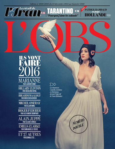
With its newly abbreviated name, the l’Obs titlepiece becomes bold and graphic: a building block around which to assemble text and images. On the cover of the 2016 New Year issue, singer Camélia Jordana poses as Marianne, that potent French symbol, holding a dove of peace rather than the tricolour of Delacroix’s original painting.
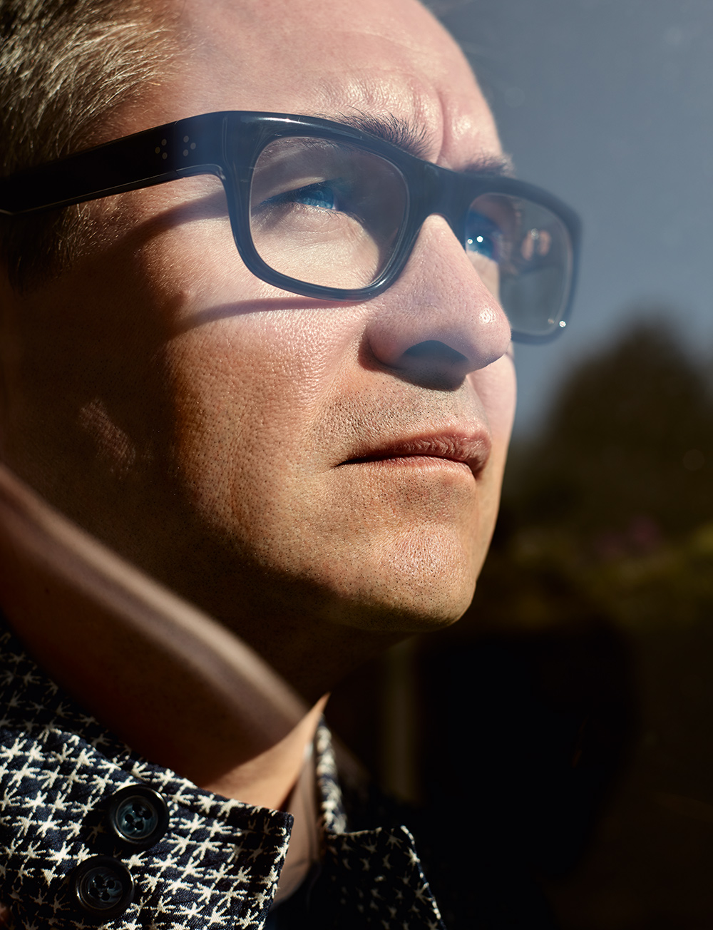
Top: Portrait by Eleonora Bravi.
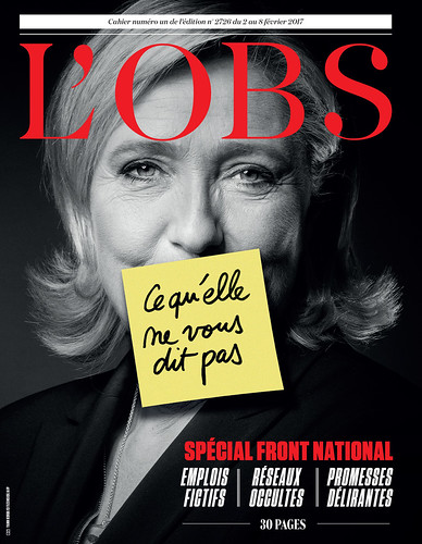
l’Obs cover, Feburary 2017.
The political news weeklies have survived better in France than in many countries and l’Obs is the best selling, but, like its more right-wing rivals L’Express and Le Point, all the titles are suffering from the onslaught of the internet and a failing news kiosk distribution system. Before Ricco’s arrival in 2010, successive refreshes of the magazine might have changed the typefaces, but they did not tackle the eternal problem of magazines filled with opinion and comment – they tend to have lots of text, often at the expense of clear, sequenced design and images. For that to change, it needs an editor who can work closely with the art director. Ricco found that figure in young editor-in-chief Matthieu Croissandeau. In his editorial for their redesigned nouvelle formule edition in 2014, Croissandeau wrote: ‘Fifty years after its creation, the magazine remains faithful to the spirit of its founders Jean Daniel and Claude Perdriel and their way of looking at the upheavals in the world and in society. L’Obs remains attached to the principles and values that made its history and its success: those of a magazine of the left, civic-minded, progressive, tolerant, engaged in the arguments but open to debate. L’Obs remains above all at the service of its readers.’
Ricco studied at L’École Estienne in Paris. His first job was at the TV listings magazine Télérama in 1990, and he moved to what was then called Le Nouvel Observateur in 2009.
Simon Esterson: Where is l’Obs positioned within French publishing and how is that world changing?
Serge Ricco: When I arrived, the owners were the founders. It was Jean Daniel and Claude Perdriel. Jean was a journalist, and Claude was the man who ran the money side of things. For them the Le Nouvel Observateur needed to be the best magazine in the world. And they would invest money on a long-term basis for that to be the case. Today all of that is changing. Most of the investors who buy magazines today come from the digital world. It’s people who have made their fortune with mobile phones and the internet, and so what they want is to have digital first, and they have turned their backs on the distribution of printed magazines in France.
SE: How many copies a week are you selling now?
SR: The total now is about 300,000 a week. Today the French press works like the US: subscriptions, not newsagents. Newsagents’ kiosks cost money and aren’t interesting to people any more. So the numbers have fallen. When I arrived, we sold between 60,000 and 80,000 through newsagents. Today it’s about 15,000-20,000. The difference is that at the time we sold 80,000, we were distributing 300,000. Today we only put about 30,000 into the classic kiosk distribution system.
SE: There’s a design, editorial and marketing concentration on the cover of any paid-for weekly magazine …
SR: I always take out the book by Raymond Loewy, La Laideur se vend mal [Ugliness Does Not Sell]. It’s a lie. Ugliness sells very well.
l’Obs cover, May 2017.

l’Obs cover, Feburary 2016.

SE: In what way?
SR: I always make the comparison with fishing. You can have a beautiful bait and not catch a fish; someone with a bad bait can catch two fish by chance! For me, newsstand sales have always been like that. You don’t know what’s going on in the head of the buyer. And it’s not just because the topic is good or not good. There’s something that you can’t pin down.
There are people who think you can predict newsstand sales: when I arrived at l’Obs, there was someone who worked with Perdriel who’d done a database. You would type in the topic and out would come the old sales figures for l’Obs and its competitors and they would see if these subjects would – in inverted commas – sell well or badly. That was an idea that made me faint! I think that to spot bad sales, it was useful. There are topics that don’t sell well. But for predicting good sales? What I would say is that the trick is, if you type in a topic and the machine doesn’t find it, that’s a good topic. Because no-one’s ever done it.
SE: When you’re selling less and less on the newsstand, is there much point in spending a lot of effort thinking about the cover, because most people get it in the post as a subscriber? Do you really need to design covers for the newsstand any more?
SR: In my head how it looks on the kiosk is an absolute. In this slightly artificial way, the idea of the buyer at the kiosk conditions how I approach the cover design. I always try to think, last week I did this, so this week I’ll try to do something different. I try to attract the eye in a different way. Often readers will say, ‘Oh, I’ve already bought that’, if it looks like something they’ve already seen. On the other hand, the marketing people tend to push you to do the same thing as you’ve done before.
SE: You can do anything you want for the cover?
SR: Yes. I can propose anything. But it has to be accepted by the editors. They don’t always choose the strongest covers.
SE: Is that because they are not choosing the strongest cover visually?
SR: Yes, I don’t think they’ve got a strong visual culture. For me it’s a constant fight. Each time I win a battle, but I never win the war.
SE: Are French readers generally more political?
SR: The older readers are. The young, such as the readers of Society [a less political weekly], are a lot less political.
SE: Which is a problem?
SR: Yes. The culture is changing.
I guess the danger with a political journal is that you’re always dealing with the same personalities. So currently in France you might end up with President Macron on the cover every week?
Above all, we know very well that the magazine sells very badly when we support the government. For example, my father, when he bought a paper, he always bought a paper of the opposition. And when the government changed, he changed paper. I think in France, lots of people do that. They don’t believe in the media. Before the election, we were pro-Macron. Now, what does one do? Is one for or against? If one is for, we get attacked for not being credible. And if you’re against, you’re shooting yourself in the foot, because you’re attacking your own core constituency of readers.
As soon as you are too far to the left, you lose readers who are in the centre. And when you are a bit further to the right, you start to reach other readers who can buy the right-wing press like Le Point. We are between the two. What I think today is that, 30 years ago, we separated off the two powers: political and media. Now we are in the same basket. For an average reader, media and politics are all the same thing [les médias et les politiques, c’est les mêmes. Pour eux, c’est bullshit].
SE: So you have to do political covers? You can’t do cultural covers?
SR: I counted all the l’Obs covers since we abbreviated the name, and half the covers we have done are political. After that it’s social issues, new technology and news topics. But that’s fewer political covers than it was before.
Special issue of l’Obs to celebrate the événements of 1968.


SE: Who was the art director before you?
SR: When I arrived the design hadn’t changed in 25 years. It was designed by Claude Maggiori, the man who did Libération [the much admired French left-wing tabloid newspaper]. And before Maggiori it was Bob [Robert] Delpire. Bob Delpire designed a cover format that always used a circle. And the first edition was designed by Pierre Faucheux.
SE: That’s a fantastic graphic heritage …
SR: When I got my first design job, at Télérama, I worked with Nicholas Thirkell of CDT, the English studio that was redesigning Télérama. And the first thing they taught me was: seize the archive. Look at the past. Try to understand what has gone on already.
It seems that in many ways, the things you’ve put into practice here at l’Obs are things you began at Télérama.
For me, Télérama was like London’s Time Out. Its original name was Télévision Radio Cinéma and it was the supplement to La Vie Catholique. It was distributed in churches in the 1960s. I realised that there was a Catholic culture – secular, but fundamentally Catholic. Le Nouvel Observateur is a Jewish culture.
SE: You arrived at Télérama as it was going through a redesign?
SR: It was 1990. I was a student at L’École Estienne, a printing and graphics college. At twenty I left the school. As luck would have it, when I was waiting for my results, to know whether I had my diploma / degree or not, there was a noticeboard with a Post-it that said: ‘Wanted, intern for Télérama.’ And I thought: ‘Well, I’m not a Télérama reader, but this is a way into magazines.’ So I did my fortnight’s internship at Télérama. I found it interesting. At the time they still had typewriters, cigarettes in the office … We had lightboxes … There were no computers. It was a start. I said to myself, this is work I can do … And in September they offered me a job as a designer. And two weeks later they fired the art director, who’d been there for a very long time. They were in the middle of working with CDT. So I found myself, at twenty years old, being a client of CDT. We spent six months going back and forth to London. They spent months working on the television grid. That’s the most complex thing. At the time we were just two designers at Télérama.
SE: And what did it look like before the redesign?
SR: There were still programme listings in black and white and the photos were in black and white because at the time that was cheaper. We went back and forth on day trips to London and it was magical – it’s not the same thing today, there isn’t that difference between London and Paris – but at the time, when I went into a supermarket, I saw all the packaging and I thought: ‘This is my country. Everything is well designed!’
SE: You said that CDT taught you to ‘seize the archive’. Is that what you did at l’Obs?
SR: When I arrived and looked at Le Nouvel Observateur I asked myself: what has happened over the last 25 years? At one point the magazine was strong visually. Was it just that era? And then I quickly understood that there was a whole group of circumstances there to stop a designer from doing his job.
Afterwards I had to fight to find the solutions, to try not to get caught by the weekly machine and to find things that were striking, and make some good covers. And after two years, things changed. We were able to do a first redesign that for me was coherent and that was better than before. As we worked on the first redesigned issue in 2011, Bin Laden was killed. Then in the third week, it was ‘L’affaire DSK’ [the French presidential hopeful Dominique Strauss-Kahn was arrested in New York after an alleged assault in his hotel room]. There were good sales, and they said, ‘good layout’. But it was not the design, it was the news.
SE: How good were the sales?
SR: The redesign period put 10,000 copies a week on newsstand sales.
SE: So suddenly you’re a magician?
SR: Voila! At that moment, co-owner Claude Perdriel said, well if it’s selling well, they don’t need my money. So he started to reduce newsstand posters and promotions. The sales went back down. Then he said, ‘It’s not working. Serge’s design isn’t working.’ Then there was a financial crisis at the magazine. Perdriel wanted to stop people taking holidays. So the magazine staff protested and said, we’re not in agreement with Perdriel.
Two months later, Claude Perdriel sold the magazine to Xavier Niel, Matthieu Pigasse and a group of investors also involved with the French daily Le Monde. When I was at Télérama it was bought by Le Monde. And now for the second time I’d been bought by Le Monde! And I knew that, in the coming weeks, there was a new formula coming. It’s like when you buy a house. You want to redecorate. And I represented the old magazine, so I knew I could be fired.
But at that moment, Matthieu Croissandeau, the new editor-in-chief said, ‘What you did at Télérama was great.’ And I said, ‘Well, I can do that, no problem. I’ve been prevented from doing that in the past.’ He loved New York magazine, which I adore.
SE: The idea of shortening the title to l’Obs with the 2014 redesign, was that your idea?
SR: Matthieu wanted the same thing. He said, everybody says ‘l’Obs’. I showed my first covers four years ago with the short title. For me it was a good idea because it signalled that everything had changed.
SE: With l’Obs, how much photographic and illustration commissioning do you do?
SR: When I arrived, there were no photographers. There was a contract with Agence France Presse and another agency, and you only used their images. My first task was to reactivate the picture desk. I said, even though we are a news magazine, you need to have photos. And what has remained in the new formula at l’Obs is the picture of the week and a commitment to publishing photo stories.
SE: You commission portraits and other photography?
SR: For me, what’s important is that Claude Perdriel was a friend of Robert Delpire … This was in the 1970s. There was a photographic culture at the magazine then. Why had it disappeared? They used to love photography! But, like design, they had completely forgotten about it.
So we tried to reactivate photography. And we saw, as with the redesign, there were two reactions. The older readers (who are very much text people) said, ‘You’d think it was Paris Match, too many images, it’s not good.’ But the vast majority of readers were happy.
SE: Let’s talk about the extra magazines with topics such as ’68 and Albert Camus. It looks like you get more control with them …
SR: For the first three issues of the 2014 redesign, it was me who mostly did the design. That was impossible to do every week, but I wanted to set the tone and say, afterwards, do it like this. For the specials, I’m alone with the project for a fortnight to design it.
Telerama spread and cover 2008.


SE: You did a special issue on the death of Johnny Hallyday – was that special feature waiting to go, or was it something that was done on deadline?
SR: During my twenty years on Télérama we did lots of what we call ‘des morts’. The photography director of Télérama’s big thing was to do ‘death specials’ in three or four hours. We tried to find images that you wouldn’t have elsewhere.
The problem today is that there’s Instagram. The person has died; in ten minutes, everyone has done the work. And I realised that each time we’re really pleased if we find a photograph that no one else has. I did a Gainsbourg special for Télérama. And there was an image that I knew, which was the cover of Télérama maybe twenty years earlier. And we couldn’t find it in the agencies.
And this is the crazy thing. We’re overflowing with images – and yet we forget many of them. I remembered this photo and I asked the agency. In fact, those images were never scanned. So they had to get in touch with the photographer, who was retired and we were able to reuse his images.
SE: How important is online for l’Obs?
SR: What’s very important (and I think it’s Francesco Franchi who says it), is that the internet has made a vital change: there are no deadlines any more. Before the internet, journalists were working to a press date.
The first site for l’Obs was in real time. Which was completely different from a weekly magazine. Today we are all on real time. Francesco said that until journalists realise that they have to think about the culture of instant news, journalism can’t be effective online or in print.
And then there is the design of the website. Unfortunately it tends to get designed by the programmers who build it. As designers, we are asked each time to just do something beautiful on top. But I say, ‘I’m a journalist, too.’ That’s to say, I understand the content. I see myself more as an architect, not a decorator.
Thanks to Jane Lamacraft
Simon Esterson, art director of Eye, London
First published in Eye no. 97 vol. 25, 2018
Eye is the world’s most beautiful and collectable graphic design journal, published quarterly for professional designers, students and anyone interested in critical, informed writing about graphic design and visual culture. It is available from all good design bookshops and online at the Eye shop, where you can buy subscriptions and single issues. You can see what Eye 97 looks like at Eye Before You Buy on Vimeo.