Autumn 2003
Malcolm, Peter … and Keith
The British New Wave was born at a boys’ school near Manchester
Over the years, Malcolm Garrett and Peter Saville have often mentioned in interviews that they studied together at Manchester Polytechnic in the 1970s.
Less well known, though it sometimes comes up in passing, is that they also attended the same school, St Ambrose College, an independent Catholic grammar in Hale Barnes, Cheshire. Barely remarked at all, however, is that Keith Breeden, a third, not so renowned contributor to Britain’s graphic ‘new wave’, was a member of the same A level art class. At school, as both Saville and Garrett affirm, Breeden was a significant influence on them. The only known photograph of the three fledgling designers in the school art room is printed tantalisingly small in Saville’s recent monograph, Designed by Peter Saville.
It’s odd, in a way, that more has not been made of this surprising confluence of talent. In a class of just six teenagers taking art, half of the group went on to devote their efforts to album cover design and two became leading figures with national and international reputations. Where many once-celebrated new wave design teams of the early 1980s – Rocking Russian, Shoot That Tiger, Town and Country Planning – are all but forgotten now, Saville and Garrett have stayed the course. The national press coverage generated by the Saville monograph and the Design Museum’s retrospective – even the ultra-highbrow London Review of Books was moved to break its usual silence on design – confirmed just how deeply his work affected those who consumed it at the time.
It’s still too early, though, to determine with any precision how significant the impact of Garrett and Saville was for British design. Saville’s book and exhibition excited impressionistic claims by journalists that his designs had ignited a taste revolution in the high streets of Britain and, not surprisingly, Saville was ready to agree. It would take a detailed examination of many kinds of evidence to ascertain whether this claim stands up and this is a task for future design historians. What can be said with more certainty is that many designers do acknowledge that they have been influenced by Saville – as much perhaps by his example as by his work.
With the passage of time, the details of Garrett’s role in the British new wave have become a little blurred. He used the visibility it gave him to evolve in other directions. He was an early advocate in Britain of the use of computers in graphic design and in 1994 he co-founded AMX to concentrate on design for new media. Garrett built the sort of bridges with the design industry that Saville has never seemed to value or want. He involved himself in design education and became a visiting professor at the RCA in London. In 2000, he received the ultimate sign of establishment recognition when he was made a Royal Designer for Industry, for his achievements in new media, alongside such long-serving stalwarts as Alan Fletcher, Derek Birdsall and Mike Dempsey.
Custom Painting No. 3, oil on canvas, 1965, by British Pop Artist Peter Phillips, whose graphic montages were a key early influence on Saville and Garrett.
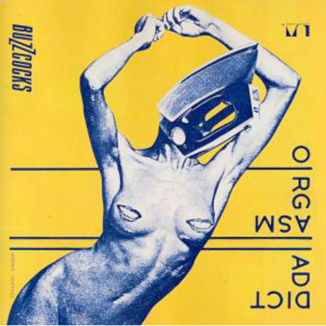
Top: Garrett photocopied a collage by a fellow student, Linder, selected by Buzzcocks’ manager Richard Boon and the band, for ‘Orgasm Addict’, the group’s first single on United Artists, 1977. The angled stencil lettering, so striking at the time of release, is a Bauhaus allusion.
Saville, for his part, is quite certain about what he owes to Garrett, often mentioning him in interviews about his early days. ‘I was definitely influenced by Malcolm,’ he insists. ‘Malcolm was my cultish muse and connection [with the esoteric] and he was so through college. Malcolm fed me. I was able to learn through his inquisitiveness.’ Their close friendship has clearly had a lasting impact on both.
A year older than Garrett and Breeden, Saville moved into the second year at St Ambrose College when they started in the first year of senior school, in 1967, at the age of eleven. St Ambrose was run by the Irish Christian Brothers and, as Saville recalls, in the early 1960s a new headmaster acquired the funds to extend it. Catholic schools draw in pupils from a large catchment area and the head realised that he would need more local boys to gain the support of local families. He canvassed the area for pupils of any faith, which is how Saville – non-practising Church of England – came to start at the St Ambrose prep school at the age of seven, rather than following his older brothers to boarding school.
While Saville lived locally in Hale, Garrett and Breeden, both Catholics, made the fifteen-mile trip each day by train from Northwich. There were other differences, too. Saville came from a well-off middle-class family. ‘I grew up with a lot of objets d’art around me. There were some paintings in the house. There was a lot of antique furniture.’ Garrett lived in a council house and Breeden lived a bike ride away on a Wimpey housing estate.
Poster by Garrett advertising the Buzzcocks’ single ‘What Do I Get?’, 1978.
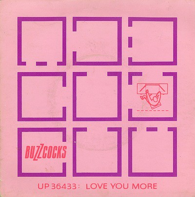
The front cover of the Buzzcocks’ single ‘Love You More’ / ‘Noise Annoys’, 1978, Garrett, as illustrator, drew on a book about amateur photography, showing how to light subjects, and Space in the Home (see Eye no. 31 vol. 8), an HMSO booklet for architects. The ‘Love You More’ side expresses the song’s theme of isolation: only one cell is occupied. On the other side, a battery of sound sources assault the noise-weary occupants.
It was several years before Saville and Garrett became friendly, and Saville and Breeden were never close. ‘He was an odd bod, to me,’ says Breeden. ‘He was a bit remote and distant.’ One point of contact, by the third or fourth form, was slot cars. Saville built and painted cars with designs inspired by pictures in custom car magazines and travelled around the country to race them. Garrett also built models and he and Breeden would watch motor races at the Alton Park track.
Rock music was an obsession, as it was for many teenagers in the early 1970s, to a degree that is hard to imagine now there are so many other competing forms of entertainment. Garrett and Breeden both describe playing truant so they could go to the back door of the Manchester Free Trade Hall and help the roadies carry in equipment for concerts by Free, Pink Floyd, Hawkwind and many other bands. ‘For me,’ says Garrett, ‘Barney Bubbles [Hawkwind’s designer] and the whole Hawkwind thing satisfied so many questions: interest in music and music as a lifestyle that embraced an understanding and control of your whole visual persona.’ They wore the rebel uniform of the time: school rule-flouting, shoulder-length hair and flares. ‘Malcolm was a show-off, really. Everybody had Afghan coats, but he had to have the king of Afghan coats,’ remembers Breeden. ‘I think Malcolm had more of a bent towards being controversial,’ says Saville. ‘Definitely a bit more angst than I had. My life was more comfortable and spoilt than Malcolm’s.’ Saville, too, was absorbed by his brothers’ rock records, but he didn’t buy an album of his own until Garrett – a ‘Krautrock’ fanatic – introduced him to Kraftwerk’s Autobahn in 1974.
All three were committed to art. ‘I always knew from before going to St Ambrose that my career was going to be in art somehow,’ says Garrett. ‘I assumed it was going to be architecture.’ Garrett, like Saville a year ahead of him, was an academically promising A-stream pupil, and both took their English and maths O levels a year early. At A level, Garrett studied art, physics and maths – subjects suitable for architecture – while Saville took art and, with dwindling levels of application, geography and English. Their art teacher, P. D. Hancock (usually known by his middle name, David), had arrived at St Ambrose in 1968, at the age of 22, after studying graphic design at Newport College of Art and secondary school teaching at Manchester University. He taught at the school for 29 years before retiring in 1997.
Today, Saville and Garrett seem to have forgotten Hancock’s design back-ground, or perhaps they were never fully aware of it, but it explains both the type of projects he gave them and his eventual suggestion, which Saville recalls, that they should study graphics. ‘As I did graphic design,’ says Hancock, ‘I geared the whole department towards that, whereas someone who’d done sculpture would have ordered kilns and done more 3D work.’ Saville realised just how open Hancock’s approach had been when he met other students during his foundation year and found they had never been allowed to do a piece of abstract work. ‘He was definitely pretty hip,’ says Saville, ‘so this was quite exciting, and he brought a lot of fresh and very liberal ideas to the art course.’ With Hancock, they produced collages, colour field paintings and other kinds of abstraction, as well as design projects incorporating hand-lettering and typography. Saville, inspired by airbrush illustrations he had seen in magazines, wanted to use an airbrush and Hancock bought one for the school. The A level syllabus was divided into still life, pictorial composition and history of architecture (rather than history of art), which introduced them to Modernism and the Bauhaus.
It wasn’t until the sixth form (now Years 12 and 13, the final two years of school) that Saville and Garrett began to spend a lot of time with each other. The upper and lower sixth – the group of six shown in the photograph – worked together. In addition to lessons, they would put in extra time doing art in free periods and after school. Saville broke his leg in a motorcycle accident and ended up repeating a year of the sixth form, so he took his A levels in 1974 at the same time as Garrett. Saville received an E pass, Garrett an A. Breeden, the most disaffected and rebellious of the three – Garrett remembers him as a ‘driven loner’ – left school early without taking the exams.
Pop Art was the single biggest influence on their visual aspirations, although it was an awareness filtered through other sources. For Garrett and Breeden, it was embodied above all in late 1960s psychedelia and rock record sleeve design. Both Garrett and Saville cite The Velvet Undergound & Nico (1967), with its vibrant stylised banana, signed by Andy Warhol, as a key image. Here was a band produced and presented by a visual artist as part of his own concept and show, The Exploding Plastic Inevitable. Saville recalls the importance of colour supplements as a source of information about Pop Art painters. Hancock didn’t like Pop Art much, so this was not something he encouraged, though he filled an art room cupboard with art books, which he bought for the department, and recalls showing them Warhol’s soup tins and Monroe screenprints, as well as other kinds of art. Garrett cites Lucy R. Lippard’s Pop Art (1967), borrowed from a friend at another school, as the first book he read about Pop. It contained a reproduction of Custom Painting No. 3 (1965) by the British pop painter Peter Phillips, and Phillips became the most significant influence on both Garrett and Saville, who later wrote his degree thesis about the artist. ‘We loved his hard edge,’ says Garrett. Phillips’ clinically graphic details of helmets, dashboards and car bodies made perfect sense to these racing car enthusiasts (Garrett later collected 1960s American cars). They were envious of Breeden’s ability to produce his own effortlessly accomplished versions of Phillips – ‘Whatever Keith was drawing or painting was topic of the week,’ says Saville – though a more inspirational figure for Breeden was American Pop artist James Rosenquist, painter of the 86-foot mural F-III (1965).
With the first Factory poster, designed in 1978 and delivered notoriously late, Saville’s work took a leap forward into a tightly focused industrial aesthetic.
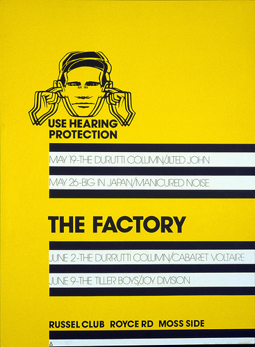
Saville applied the same noise protection theme and minimal layout to the first Factory release, A Factory Sample, two seven-inch EPs with tracks by Joy Division, Durutti Column, John Dowie and Cabaret Voltaire, 1978.

Neither Garrett nor Saville pursued their interest in Pop Art in an academic way, and they didn’t see any orginals until after they had left school. For Garrett, fine art was too closely identified with the establishment and he had little desire to venture into galleries. In 1974, he began to study typography and graphic communication at Reading University, while Saville stayed in Manchester to do his foundation year at Manchester Polytechnic before starting graphic design. For the first time, during that academic year, they separately visited Manchester’s Whitworth Art Gallery, where they discovered that ten Marilyn screenprints by Warhol had been near at hand all along. ‘I would have been less shocked if a UFO had landed,’ says Saville. ‘I was just absolutely stunned that they were there.’ Garrett, too, was overwhelmed. ‘That was my first real experience of the power of fine art in a gallery, but I was still anti-art and I was sort of anti-academia as well.’ In 1976, this time together, they visited an exhibition of prints by Peter Phillips at the Tate Gallery, London. (In 1982, art critic Marco Livingstone, in a nicely intuitive piece of commissioning, asked Garrett to design the catalogue for a Peter Phillips travelling retrospective, ‘Retrovision’.)
As Garrett and Saville now acknowledge, their reading of Pop was based on a fundamental misunderstanding. ‘We’ve talked about this, actually,’ says Saville. ‘We thought that Pop was the fine art endorsement of the aesthetic that appealed to us – as art. So Pop was saying that a custom car was art. Pop was saying that the iconography of consumerism that we liked so much was art. So a painting of an ice cream cone is art now; it was an ad or a poster and now it’s art.’ Garrett, too, came to realise that Pop, some of which set out to critique the graphic language of commercial culture, wasn’t the uncomplicated celebration they took it to be. Their early interpretation was, after all, based only on reproductions and a superficial sense of what these artists were about. ‘The reproduction of those paintings made them sharper and flatter coloured and more hard-edged and more graphic than they were,’ notes Garrett. Pop’s presumed endorsement of ‘graphics’ simply confirmed they were on the right path.
Breeden, meanwhile, was trying to escape from design. After a difficult foundation year at technical college in Northwich (‘I was a total waster,’ he admits, ‘I didn’t get on’), he applied, in 1974, to study fine art at Bath Academy of Art, Corsham. The work he presented was in a hyper-realist, Pop Art idiom and he was told that he could only be admitted to study graphic design. Breeden accepted the offer, but found the course ‘dull and pointless’ and left during the first year. He returned a year later, only to quit again. He drifted around, supporting himself with gardening, grave-digging and painting pictures of pubs and people’s houses, whenever anyone asked. It is clear that he had a talent for painting, but he lacked direction and had no idea how to apply it.
At Reading, despite his nail varnish and outré wardrobe – witnesses still recall his silver boots – Garrett’s development was taking a more rigorous course. He studied art history and psychology, learned how to use a library and started to read more seriously. He gained a practical grounding in typography, type design, book-binding and use of the darkroom, and sharpened his skills of observation and analysis using drawing. History of art bored him in the main, except for Pop, Dada and Surrealism. A friend studying French literature introduced him to Maurice Nadeau’s classic The History of Surrealism and he saw an exhibition of original Dadaist pieces around this time. Later he produced a series of Dadaist / Surrealist manifestos of his own. For one project, he wanted to redesign the inner sleeve typography of Bowie’s Ziggy Stardust, (1972), which he considered poorly done, but his tutor dissuaded him. ‘Michael Twyman [his professor] hated record sleeve design,’ Garrett says. ‘It wasn’t real design.’ He ended up failing art history. ‘I wrote “Dada” on my exam paper and I walked out after half an hour.’ He passed second time around, but he wasn’t inspired by the work he saw fourth-year students doing. Saville seemed to have more freedom to pursue their shared pop culture obsessions at Manchester Polytechnic.
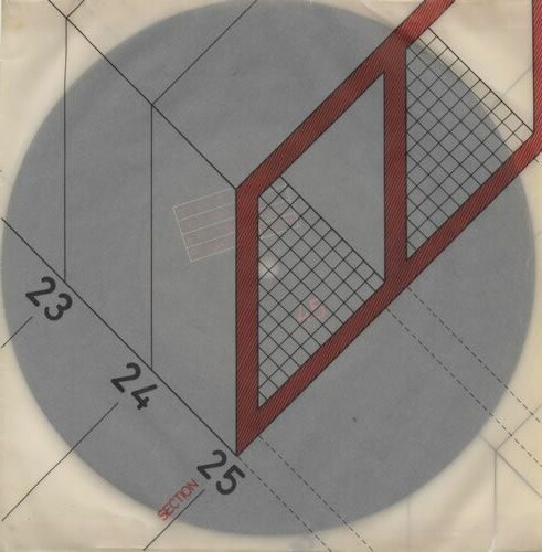
Saville asked architect Ben Kelly, a friend and regular collaborator, to draw an architectural section to illustrate Section 25’s ‘Girls Don’t Count’ single, Factory, 1980.
In October 1975, Garrett joined Saville for the first year of the graphic design course. At school, they had spent many hours talking about music, design, fashion and art, and the dialogue continued through their three years at the poly. ‘We’d sit outside my flat for an hour and a half or more in his car,’ says Garrett. ‘Those conversations just went on and on.’ As Saville describes it, they shared a vision of what might be possible in design. ‘Malcolm and I did have a masterplan,’ he says. ‘It was a very innocent, idealistic and naïve masterplan, probably the same masterplan that many young, hopeful designers have. There are periods when you love everything around you and want to be part of it, and there are periods when you don’t love what’s around you and you want to change it. We were lucky that the mid-1970s punk period was one of those moments and we wanted to change it.’
Even at school, Garrett explains, Saville displayed ‘this sense of where things were positioned, the sense that the time is right for something; this is how things should fit into the flow of things.’ Yet, despite Saville’s suggestion of a joint mission, Garrett has never possessed Saville’s single-minded focus and certainty. He has the more inclusive mentality of a curator or collector, but he has also retained the enthusiasm of the true fan. His attention is pulled in so many directions by competing alternatives that he can find it hard to make a choice. ‘I knew that my interests were many and varied,’ says Garrett, ‘and I was trying to find a vehicle that was making a statement, but I was also aware that this statement was a little bit scatter-gun, which is why I love the whole Dada thing.’ Saville recalls that when Garrett arrived back in Manchester, he was armed with avant-garde source material – a ‘secret weapon’ – that was unfamiliar to other students. ‘Malcolm had already looked at Dadaism and I hadn’t picked up on any of that yet.’ Garrett immediately made the running. He missed the Sex Pistols’ appearance in Manchester in July 1976 because he was working in London, but after ‘Anarchy in the uk’ was released in November 1976 he embraced punk rock.
Garrett was the first of the pair to find a way to connect with punk culture, and he did it by invoking the spirit of Dada, the Bauhaus and Pop in designs of tremendous freshness, energy and wit. His work for the Manchester band Buzzcocks, starting in 1977 while he was still a student, has been eclipsed by Saville’s highly publicised output for Factory, but it predates it by a crucial year or two and it adds up to a noteworthy episode in popular culture in its own right. The ribald Dadaist collages, mostly unpublished, that Garrett produced in response to the Buzzcocks’ lyrics in the course of this collaboration still look convincing. His smash-and-grab raids on trashy printed ephemera, lovingly filed away for later use in his scrapbook, have long since become routine among designers, but at the time his anarchically inventive use of both official and demotic sources was new and invigorating. In the early 1980s, during his appropriationist period, Saville repurposed his found material with greater aesthetic precision, but Garrett, already moving on by then, unquestionably did it first.
In 1978, shortly after graduating, Garrett moved to London to work for Andrew Lauder as freelance designer for Radar Records, where Barney Bubbles, Garrett’s design hero, was overstretched with work. Soon after arriving, he bumped into Breeden’s sister, who told him her brother was working as a cellarman in a casino in Berkeley Square. Garrett asked her to encourage Breeden to call and when he did, Garrett offered him a single sleeve to design – a re-issue of ‘I Had Too Much to Dream (Last Night)’ by the Electric Prunes. It was the first of many covers Breeden designed for bands such as Gang of Four, ABC, Fine Young Cannibals and Scritti Politti. In 1979, Garrett and Breeden moved into a studio in Tottenham Court Road and, in 1984, Garrett and his partner, Kasper de Graaf, suggested that Breeden become a formal partner in their company, Assorted Images. This disturbed Breeden, who had always been wary of anything that smacked of business, and he moved out. He continued designing sleeves until 1996, when he decided to give it up and concentrate on painting. Today, self-critical as ever, ambitious for his art yet also detached, he is a member of the Royal Society of Portrait Painters, with a studio in the seclusion of the mid-Wales countryside. He readily answers questions about his design days, but reserves his passion for discussions of painterly technique and the achievements of Holbein and Velázquez, Cézanne and Hopper.
It’s striking, listening to all their reflections, how true the three of them have remained to the essential aspects of their younger selves. ‘I am now a much better version of myself than I was then,’ suggests Garrett. ‘Peter is a much more accomplished version.’ Since leaving St Ambrose, Garrett, like Breeden, has never been back to the school. Saville stayed in touch with David Hancock, who saw their degree show, and in the mid-1990s Saville visited the school at Hancock’s request to help an A level student. ‘Now Peter had got the charm,’ remembers Hancock. ‘He’d really got the gift of the gab.’ He recalls one occasion when a senior teacher took Saville aside to chastise him for failing to work on his art A level project. ‘But about a quarter of an hour later they both came out laughing and joking,’ says Hancock. ‘Peter Saville had managed to charm him.’ It’s amusing to learn that Hancock thought both Saville and Garrett did too much copying at school of images and designs they liked and that he told them as much.
Despite their considerable achievements, there is no mention of any of them, as old boys, on the St Ambrose website, though Lonnie Donnegan, who started the skiffle movement in the 1950s, is noted. From Hancock’s point of view, Breeden – ‘talented, sensitive, very quiet, almost introverted’ – just slipped away. He seemed surprised to learn about his former pupil’s current activities as a painter. Garrett and Saville are in no doubt, however, about the subtle, ultimately indefinable influence that Breeden exerted on their early careers. ‘He was just so talented,’ Garrett enthuses. ‘He was brilliant. I so wanted to be as good as Keith.’
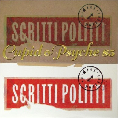
Album cover, with Green, for Cupid & Psyche 85, Virgin, 1985. The gold foil blocking of the title forms a luxurious, slightly decadent contrast with torn edges, taped elements and delicate painting, and with the franking mark that carries the band name on all three releases. Album cover design by Keith Breeden.
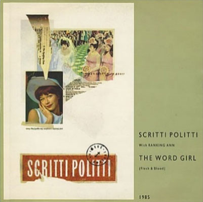
Twelve-inch single sleeve for ‘The Word Girl’, Virgin, 1985. Album cover design by Keith Breeden.
Rick Poynor, writer, Eye founder, London
First published in Eye no. 49 vol. 13 2003
Eye is the world’s most beautiful and collectable graphic design journal, published quarterly for professional designers, students and anyone interested in critical, informed writing about graphic design and visual culture. It is available from all good design bookshops and online at the Eye shop, where you can buy subscriptions and single issues.