
Summer 2020
Milton Glaser: Design eminence
‘Buttons, flyers, posters, postcards, T-shirts and books. How primitive are the means we have to dissent. And yet I believe these modest tools can help change history.’

Milton Glaser (born 1929 in the Bronx, New York), is synonymous with the eclectic, illustrative approach to American graphic design that emerged in the late 1950s. He was educated at New York’s High School of Music and Art and the Cooper Union School of Art. He received a Fulbright Scholarship and attended the Academy of Fine Arts in Bologna, Italy, where he studied with Giorgio Morandi. In 1954 Glaser co-founded Push Pin Studios with Seymour Chwast. In 1974 he co-founded New York Magazine with Clay Felker. He left Push Pin in 1968 and in 1974 he established his firm Milton Glaser, Inc., where he continues as proprietor. In 1983 he joined Walter Bernard to form the international periodical design firm WBMG. Glaser’s work is in many museum collections and has featured in one-man exhibitions at the Centre Georges Pompidou in Paris and the Museum of Modern Art in New York, among others. His work is archived at the Milton Glaser Design Study Center and Archives at the School of Visual Arts (SVA) in New York City (where he is also Chairman of the Board). Among his hundreds of logos and trademarks, Glaser’s ‘I (heart) NY’ is arguably the most well known (copied and parodied) in the world.
Milton Glaser, America’s best known graphic designer, could easily sit back in a comfy chair resting on his logos (and so much more). However, that is inconsistent with his grand plan. ‘If I don’t work, I don’t live,’ says Glaser, who at 90 years old (he turns 91 on 26 June 2020) draws every day and actively pursues artistic and social activism. He has reached an age where he only takes jobs with meaningful outcomes, both personal and commissioned. He believes that design, no less than art, can change the world.
Glaser is no johnny-come-lately to socially responsible design. He grew up at a time when our world was besieged in the maelstrom of war with demagogues on all fronts – even in the United States. As a child in the Bronx he was raised in the ‘Coops’, a socialist (‘red diaper’) housing project neighbourhood for mostly immigrant workers. He learned about social injustice when young and later, when starting his professional career, he became a fighter against exploitation, discrimination and political corruption.
The wall banner on the School of Visual Arts (SVA), New York, for Glaser’s art education initiative ‘Art For Life’, is a public art display designed to raise cultural and socio-political awareness in the city, 2019.
Top. Portrait by Maria Spann.

At a design conference a few years ago he announced to a decidedly stunned audience that ‘the world seems more fragile and imperilled than it did in the mid-1980s.’ Perhaps the world always seems at risk.
‘In my lifetime,’ declared Glaser, ‘I’ve witnessed a world war, the Holocaust, McCarthyism, Vietnam, Korea, the threat of nuclear annihilation, the Cold War – and in these times, AIDS, genocide in Africa and Bosnia, 9/11, global warming, the war on Iraq, the acceptance of torture, the Patriot Act, the tsunami, the devastation of New Orleans and the Gulf Coast, the emergence of international terrorism – overshadowing everything else in our minds – and now the retrogressive Trump regime.’ With each new spiritual and moral crisis, Glaser is often first in his field to apply his era-defining styles in the service of caution, commentary and commitment.
‘The Poison Pen’, 1965, poster for an exhibition featuring ‘viperous’ drawings by satiric illustrators and cartoonists. Glaser designed many posters for the SVA
Art Gallery.

In 2005 Glaser stated: ‘The political exploitation of the fear of terrorism is as alarming as terrorism itself. It has caused me to examine my role as a citizen and to think about whether designers as a group have a dog in this fight, to use a pungent down-home cliché. Our dog in this fight may be human survival.’ He added: ‘My personal response to this condition has led me to become more active in civic life. As designers, we’ve been concerned about our role in society for a very long time. It’s important to remember that even Modernism had social reform as its basic principle, but the need to act seems more imperative than ever.’
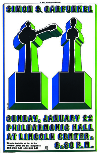
1967 poster for a Simon & Garfunkel concert at Lincoln Center Philharmonic Hall using Glaser’s bespoke Baby Fat typeface. The 2D silhouettes of the young duo are presented like additional glyphs in the font.
Do no harm
By the end of the twentieth century, Glaser was unequivocally at a point in his life where he no longer needed to take on just any client. ‘But from a slightly different point of view,’ he says, ‘the right client (or one that shares your view of the world) can be your greatest asset. The wrong client, who wants to use your skills to accomplish his sales objectives, can destroy your sense of yourself. Like good friends, good clients are hard to find.’
Glaser is the instigator of many designs that have been woven into our common consciousness and conscience, which is not to say he has not done successful commercial work. He’s done plenty, yet he insists that with age he’s found purpose that contradicts traditional service relationships between client and designer. This has been possible because he selects clients based on mutual respect rooted to a large extent on a strong dialectic of capitalism’s inherent vices. ‘We’re clearly at a point in human history where the idea of unrestrained competition and a “dog eat dog” atmosphere are no longer beneficial or relevant. This shift has certainly affected my view of a designer’s role in civilisation and culture, and made me more concerned about the consequences of my daily activity. My two prevailing beliefs are still: Do no harm. Do good work.’
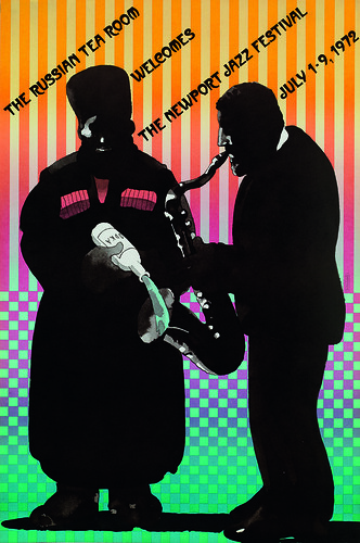
A master of many styles, Glaser’s illustrative figuration and decorative aesthetic come together in this poster for a jazz performance series at the legendary New York restaurant, The Russian Tea Room, 1972.
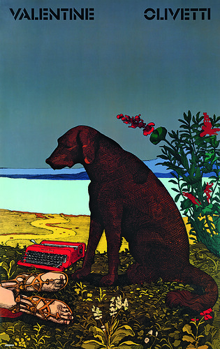
Poster for Olivetti’s Valentine typewriter, 1968. Glaser often referenced the art canon; this enigmatic poster was based on The Death of Procris (ca. 1495), attributed to Piero di Cosimo.
As his advanced age takes its inevitable toll on the body, Glaser’s mind continues to burn the rubber. His trigger project ‘Art For Life’ is what he calls ‘a collective response to spread by asserting the statement that art lets us understand reality’, its greatest function being to make things more comprehensible and less abstract. ‘The function of art was to preserve a sense of unity in the culture itself. Not as personal but with a social connection,’ he has said. His assumption was that art schools have common goals, and relationships with each other for the common good. However, in putting his concept to the test, he found that there was little interaction between the 35 New York art schools. ‘Instead, they were competing for business,’ Glaser observed. They were all vying with each other for the same students and for profitability rather than education. The result, as he sees it, was that ‘art as a civilising role becomes secondary’.
Always the visionary, Glaser conceived ‘Art For Life’ to make it possible for the city’s varied arts-based schools to be ‘one area we can agree on without politicising us and serve as a way to detoxify the selfishness that has engulfed America.’
He told me. ‘What I hope to do is try to create a common ground for all the art schools, in the sense that we have something in common [that] defuses the anger and rage for not achieving dreams that have replaced every other objective.’
Glaser designed the logo and packaging for Brooklyn Brewery, brewers of the borough’s first artisanal beer, co-founded by Steve Hindy in 1988.

Rallying power
Lately, Glaser has been shoring up his legacy, disseminating copies of his printed work (which had been stored in their thousands in the basement of his studio building) to art schools and design organisations, including the Milton Glaser Design Study Center and Archives at the SVA, where he has taught for more than 60 years. In November 2019, he sold his East 31st Street studio building and took offices at the SVA where he is the school’s putative designer-in-residence. He has just published a new book, Mag Men (Columbia University Press, 2019) with Walter Bernard, his editorial design partner at WBMG, and is working on three new books that address the consequences of art and design.
‘Buttons, flyers, posters, postcards, T-shirts and books. How primitive are the means we have to dissent,’ he says. ‘And yet I believe these modest tools can help change history.’ His words, like his work, have a rallying power. Glaser is an inspiration to designers or illustrators of all ages when most people are resting on their laurels (if they even have them). Ever the eminence, Glaser insists on something fresh: ‘My work today is my best ever,’ he says with deserved pride.
Concert poster for Mahalia Jackson, 1967, in which Glaser combines his Baby Teeth typeface and watercolour illustration with a vibrantly colourful design aesthetic.

The Dylan poster for Columbia Records (1966), so emblematic of Glaser’s 1960s style, made reference to a Persian miniature and Marcel Duchamp’s self-portrait silhouette.

Steven Heller, design writer and educator, New York
First published in Eye no. 100 vol. 25, 2020

Eye is the world’s most beautiful and collectable graphic design journal, published for professional designers, students and anyone interested in critical, informed writing about graphic design and visual culture. It is available from all good design bookshops and online at the Eye shop, where you can buy subscriptions and single issues.