
Winter 2017
Of two minds
Staying small, nimble and versatile has enabled Brooklyn-based design partnership Triboro to keep ahead of the pack. By Aileen Kwun
Examine the portfolio of the New York graphic design studio Triboro, and you would not immediately guess that it was produced entirely by a team of two. Its name (which typically refers to the three boroughs of the Bronx, Brooklyn and Queens) might suggest it to be a team of three, as it has sometimes been with an occasional intern. Triboro’s diverse work ranges from corporate identities to self-initiated projects, print to digital, hand-drawn and custom rendered, all with a refreshing lack of a dominating aesthetic.
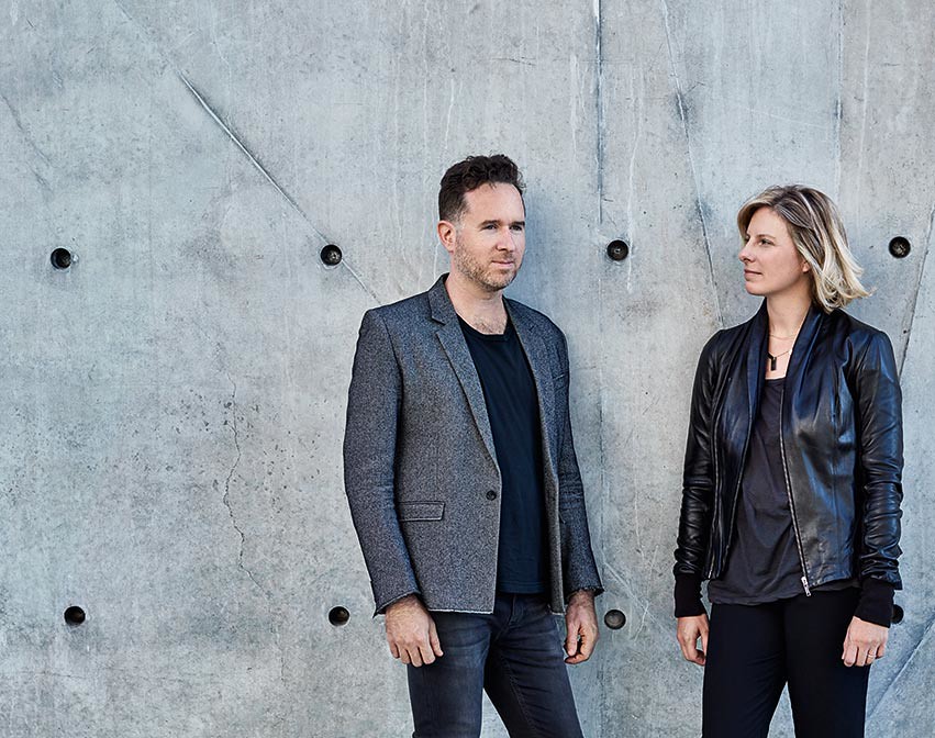
The story of Triboro began with a Manhattan encounter worthy of a feelgood movie script. Founders David Heasty and Stefanie Weigler were introduced thirteen years ago by designer Alexander Gelman, who typically works with his wife and only one or two assistants at his studio, Design Machine. Heasty and Weigler’s stints as assistants did not overlap – Heasty had moved on to magazine work by the time Weigler, a recent graduate just arrived from Germany, joined in 2004 – but they met at one of the studio’s parties. ‘I think you’ll like her,’ Heasty recalls being told, though Weigler says Gelman was surprised when they broke the news that they were a couple.
Triboro designed the identity for the 64th edition of the Type Directors Club annual competition in 2017.
Top: Portrait by Christopher Sturman.

Formed around the notion of a ‘cast of characters’, the TDC 64 identity centres on various statements set in a dozen bespoke typefaces — designed by Heasty and Weigler themselves — as a way of highlighting the nuanced character and personality of each.

A wedding, several agency and publishing jobs and a mounting list of freelance projects later, the couple launched Triboro on New Year’s Day 2008. ‘We were kind of trying different things to see what we wanted to do,’ Heasty says. ‘At some point, we became a bit frustrated by the possibilities, and it felt like the best thing to do would be to have a small studio.’ The Design Machine model appealed to them. Weigler says: ‘The idea of having this kind of environment where we could really just focus on design was key to us.’
They chose Triboro as their working moniker – a nondescript but wholly New York name shared by numerous industrial concerns in their North Brooklyn neighbourhood. ‘We also just didn’t want to be something like Heasty & Weigler,’ Weigler adds. They had a few more instinctual guidelines: avoid meetings as far as possible, or else conduct them via Google Hangout, to maximise time spent on design. Keep it lean, to avoid the tangled logistics of managing a staff and multiple salaries. Only take projects that are exciting and interesting – that will go far in creating an open yet self-selecting network of clients and peers. In short: say no to major time-sucks that could get in the way of spending most of the day designing.
Creating a series of exhibition posters for New York’s Roth Gallery was among Triboro’s first projects as a studio. Embracing the notion of an ‘anti-identity,’ the duo eschewed a fixed style or format and instead crafted highly customised designs for each show. For this mailer announcing a 2008 show of photographs by Lewis Baltz, ‘The New Industrial Parks Near Irvine, California’, the designers used lettering evocative of these sites.
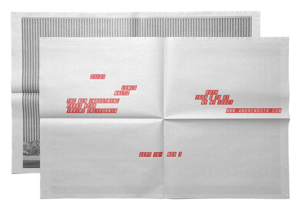
That direct and rigorous approach has allowed them to develop concepts thoroughly across a range of mediums and styles, and perhaps explains why Triboro has often been commissioned for projects in areas where they have no direct experience. The studio’s first big project was rebranding William Rast, the clothing line co-founded by Justin Timberlake – a fortuitous ‘sixth-degree connection,’ Heasty notes, which sprang from early work with the Roth Gallery, for whom they produced an array of experimental mailers and posters for exhibitions. ‘You may think you that have one client or no clients, but you don’t know the power of the connections you have.’
The diversity of Triboro’s portfolio has continued to grow steadily, thanks to the growing word-of-mouth capacity of the Internet beyond their personal networks, and, importantly, an innate desire to avoid monotony: ‘We just feel the need to try new and different things to keep it interesting, like, what else can we do that we haven’t yet?’ says Heasty.
Triboro’s brand applications for the Café Standard at the Standard Hotel East Village in New York (2014) feature a range of concrete poetry compositions, inspired by the neighbourhood’s colourful artistic history.


Heasty and Weigler created the compositions using a typewriter that they had sourced specially for the project.

The approach is apparent in their range of techniques. For their first restaurant identity, commissioned for Standard Hotels’ East Village location, the duo sourced a typewriter and created a system inspired by concrete poetry. Last year, they received a near carte-blanche brief to create an identity for the local French-New American eatery Sauvage: they responded to the name, ‘wild’ – and used paper and scissors to create a series of abstract cutouts inspired by organic forms. ‘They still felt a bit flat,’ Weigler says, so to add dimension they constructed and photographed brightly coloured paper sculptures, using strong imagery paired with handwritten letters to fill out the forms. The resulting digital visuals resonate with millennial fine-diners while recalling jazz record sleeves of the mid-twentieth century, or the vibrant palettes of New Wave and Tropicalia – Weigler and Heasty designed the menus on ten-inch-square cardstock reminiscent of an LP sleeve.
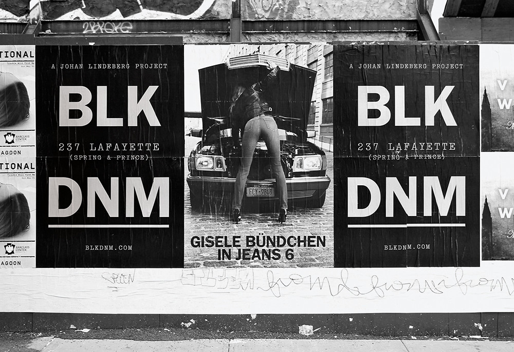
In conceiving the brand identity and campaign (2011-14) for the fashion brand BLK DNM, Triboro took to the streets.

Art directed in the manner of high-impact poster bills, a series of black-and-white advertisements conveyed label’s rock’n’roll ethos’ and started a trend for street-savvy fashion advertisements in downtown Manhattan.

Speaking at the ‘Here London’ conference last summer, Heasty talked about the difference between being a ‘graphic designer’ and being a ‘communicator’ – in today’s saturated media landscape, everyone is a communicator – and made the case that the former encompasses a wider range of work than simply conveying or disseminating a given message. While clients may request a discrete end-product, such as an identity or a poster, that sort of strategic thinking is made apparent in their execution, which can often generate a tactile and emotional response. Weigler says: ‘Design really depends on the project. It can create a world, a personality, and an experience of its own, or maybe it’s a visual puzzle, but it’s something you spend time with … We’re not interested in making things that are too straightforward, and without soul.’
Given almost total freedom to design an identity for a new Brooklyn restaurant in 2016, Heasty and Weigler interpreted its name, Sauvage (French for ‘wild’), through a series of what they refer to as ‘primal petroglyphs,’ each hand-cut from paper.


They then combined the free-form shapes with rich, saturated planes of colour that they had created by photographing a series of paper sculptures.


Perhaps for that reason, custom hand-lettering and typefaces are a Triboro speciality, used in projects ranging from record sleeves for the veteran New York indie band Blonde Redhead (for the British label 4AD), to a spare, type-driven identity for the minimalist clothing start-up Everlane that made tech-disrupted online shopping both accessible and exclusive. In a clever identity for Nike NYC, the studio formalised a street-clever, DIY approach by inking out portions of the text-and-swoosh logomark to transform the word ‘Nike’ into ‘NYC’. In a project they began for fun, the couple fastidiously redrew the entire NYC Subway map for improved legibility, recreating it in discordant, eye-popping neon and Dayglo colours. The Wrong Color Subway Map is available in RGB or CMY versions. More recently, the studio has been involved in more politically engaged work, in response to the growing social tensions in the United States and abroad.
For the Japanese glassware company Hikari’s introduction to the US market in 2015, Triboro created a set of animal glyphs to identify each of its collections visually. Its packaging and collateral materials feature a series of colourful, abstract images that the designers captured by experimenting with light and glass.


Heasty and Weigler’s hybrid, hands-on analogue-digital approach to design nods to their design education in the late 1990s and early 2000s. As they point out, they came of age before the rise of Twitter, Instagram and Pinterest, social platforms that have reoriented visual culture and its production to the screen, even if they have increased visual literacy and cultivated wider audiences for their work.
An embossed monogram (2015) for the lighting architecture firm L’Observatoire International, shortened to L’O, creates subtle play with ambient light as a reference to the client’s elusive and specialised craft.

Between the partners, there is a sense of companionship and mutual respect; having similar creative leanings, they claim to never have any design-related arguments. Talking with Heasty and Weigler, seated in a banquette at a local café, is a bit like watching one of the interspersed scenes in When Harry Met Sally, in which old couples recount how they met, finishing each other’s sentences. In the studio, Heasty and Weigler each tend to ‘own’ certain clients, simply based on personal chemistry; mutual feedback is constant and to the point; they rarely work together on a project.
Heasty and Weigler have frequently collaborated with the band Blonde Redhead to design various packaging and promotions, including the cover of their 2010 album Penny Sparkle (4AD), which features Weigler’s hand-drawn lettering.

While many of the local design studios have since closed or moved elsewhere, one New York decade later, Heasty and Weigler’s practice has flourished, sustained largely by word of mouth and a good track record. It is a milestone of resilience for which they are grateful and not keen to question or overanalyse. Their strategy of staying nimbly flexible and maximising their days around creative work – essentially, working hard on rewarding projects and playing it by ear – is what has kept them ‘futureproof’, Heasty says, even though ‘we’ve never had a five-year plan.’ And as the studio approaches its tenth anniversary in January, he wryly admits: ‘We still don’t.’
Revealing the letters N, Y, and C within Nike’s iconic logo through a simple act of erasure, the studio describes their 2013 concept for the clever Nike NYC identity as a ‘Just Do It meets D.I.Y.’ approach that invites user participation.


Aileen Kwun, writer, editor and author, New York
First published in Eye no. 95 vol. 24, 2018
Eye is the world’s most beautiful and collectable graphic design journal, published for professional designers, students and anyone interested in critical, informed writing about graphic design and visual culture. It is available from all good design bookshops and online at the Eye shop, where you can buy subscriptions and single issues. You can see what Eye 95 looks like at Eye Before You Buy on Vimeo.