Summer 2011
Out of hand
Robotlab
Marion Deuchars
Jon Gray
Alvin Lustig
Fiona Banner
Paul Rand
Jan Tschichold
LetError
Henryk Tomaszewski
Handwriting is a touchstone in the history of graphic design, where lettering meets the messy reality of the human body
In 2007, Robotlab, a group of artists based in the German city of Karlsruhe programmed a Kuka robotic arm – the kind that usually toils in a car factory – to write out the Bible. Performing for audiences throughout Europe, the Bibelschreiber (‘Bible Scribe’) turns the act of writing into a public spectacle. Hour by hour, neat blackletter script fills paper rolls in evenly spaced columns with large initial letters in the style of a medieval manuscript. Tooled with a nib, the Bible Scribe produces letters that are neither smooth nor absolutely uniform. Moreover, moving slowly and methodically, the robot arm pauses before starting each letter, as if deliberating before making its mark.
Robotlab’s Bible Scribe combines contemporary technology with much earlier inventions. It uses a variant of the Schwabacher typeface cut in the late fifteenth century to emulate the lettering used in medieval manuscripts. Letters once cast in lead are restored by the Bible Scribe to their origins in the ‘hand’. In this regard, Robotlab’s writing machine seems to reverse a pattern shaping the history of the written word. In The Spell of the Sensuous: Perception and Language in a More-Than-Human World, David Abram describes the 6000-year-old tradition of writing as a gradual divorce from its ‘natural’ origins in the human body and its environment. Until the invention of moveable type, writing retained a vestigial connection to the body as traced in the actions of the scribe and the illuminator. The price of the printing revolution launched by Johannes Gutenberg in the west, according to Abrams, has been a declining sense that a material, organic body is behind the writing. iPads and mobile phones would seem to be the latest stages in this long process of disembodiment of writing. The Bible Scribe seems to offer a historical kink in the straight path of progress.
In the beginning was the hand
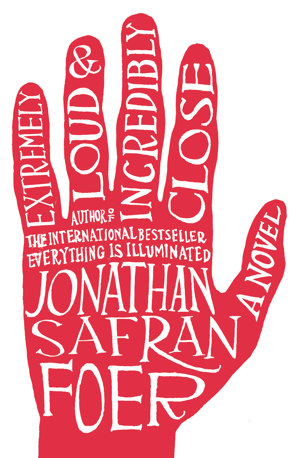
The readers of Eye hardly need to be told that in recent years there has been a ripple of enthusiasm for handwritten letterforms. Their champions usually set the natural and ‘personal’ qualities of penmanship against the cold precision of digital lettering. Many designers and illustrators, including current stars Jon Gray aka gray318, James Victore, Seb Lester and Marian Bantjes, employ the looping strokes of the kind of cursive ‘copperplate’ scripts that were once taught in the Victorian schoolroom by disciplinarians ready to train wayward hands with a swift swipe of a cane.
There is nothing new in this. Handwriting has long been a touchstone in the history of graphic design. In 1928 Jan Tschichold attacked the taste for self-expression among designers working in German publishing and advertising after the First World War. ‘Their common fault,’ he wrote, ‘was that they always made their own personalities or their “handwriting” an effective factor in their work.’ The ‘correct’ approach – according to Tschichold – was a rational application of the engineered forms of ‘the new typography’.
In the US a few years later, Paul Rand took a different view, combining his own lively penmanship with classic typefaces on book jackets, magazine covers and advertisements. Fancy, ornamental faces were ruled out: only handwritten letters could deliver both the authenticity and playfulness that he prized in equal measure. In the middle of the twentieth century, handwriting became a code for the modern individualism, allied to jazz and classical music in, for instance, Alex Steinweiss’s album sleeves for Columbia (see Reputations, Eye 76) and to the modern novel in book covers by Alvin Lustig and Paul Rand.
In the 1960s, one of the trademark features of the celebrated Polish poster was the use of handwriting. This was, in part, a matter of necessity: Polish designers had no access to the letterforms being issued for phototypesetting. At the same time, lettering in the posters and designs by figures such as Henryk Tomaszewski carried an implied critique of communist authority. In a bureaucratic world filled with forms, dockets and regulations, type was an ally of illegitimate power; whereas the spontaneous, uncertain, even shaky, hand-lettering accompanying Tomaszewski’s quick-fire drawings seemed to side with the ordinary man. During the 1980s, his calligraphic aesthetic became the house style of Solidarity, the anti-communist trade union in Poland.
Even in the early days of desktop publishing, type designers quickly identified both the potential and the limitations of perfectly scalable and mathematically accurate digital lettering. Early experiments with digital type design included Just van Rossum and Erik van Blokland’s digitised handwriting, JustLeftHand and ErikRightHand (1990), as well as their much reproduced ‘randomfont’ Beowolf (1990). Promoting their ideas in an occasional magazine with the title LettError, they pointed to the innately human quality of imperfection.
These various uses of handwriting are rooted in the belief that the hand can express individuality. This idea is written deeply in our culture. Graphologists, for instance, tell us that true character is betrayed in the angle of a pen stroke or the way a loop is closed. If handwriting can be interpreted as a trace of the mind, it is also an index of the body. A signature on a document has a legal force that other forms of handwriting do not possess, because it stands in for a person. A line of ink pressed into paper is evidence of the will, and an index of the presence, of an individual. For instance, a forensic document analyst (the better regarded cousin of the graphologist) verifying signatures looks for sprezzatura, the visual signs of nonchalance, which perfect forgeries lack. This points to a key difference between the signature and other forms of handwriting. In order to communicate, ‘good’ handwriting tends to conformity. By contrast, a ‘good’ signature is distinct and so difficult to reproduce.
The signature joins other actions of the hand that – according to the philosopher Martin Heidegger – distinguish mankind: ‘Through the hand occur both prayer and murder, greeting and thanks, oath and signal, and also the “work” of the hand, the “hand-work”, and the tool. The handshake seals the covenant. […] No animal has a hand, and hand never originates from a paw or a claw or a talon.’ Writing about the development of writing machines in the late nineteenth century, Heidegger lamented the way in which writing was increasingly torn from ‘the essential realm of the hand’.
Typewriters bothered Heidegger (who liked to write long-hand). Had he lived in an earlier age perhaps other writing machines might have perplexed him. In 1804 Thomas Jefferson, for instance, acquired a mahogany, brass and green baize ‘polygraph’, a kind of pantograph that allowed the US president to make an exact copy of his writing. Two pens were fixed into a frame over matching pieces of paper. The movement of the pen in his hand – including its regular journey to refill at the inkwell – was reproduced by a ‘slave pen’. In this way, two identical letters could be produced, one for dispatch and the other kept for the president’s records. A keen champion of innovation and an industrious letter-writer, Jefferson lauded it as ‘the finest invention of the present age’.
Master and servant
Today, historians and collectors fret over the status of Jefferson’s facsimile letters: are they copies or originals? After all, the moment of composition and the moment of reproduction were one. The slave pen was controlled by the same action of the hand as the other pen. These doubts persist for much the same reasons that we distrust the scanned signatures that appear on junk mail and other unsolicited correspondence. They seem to point to the absence of the signatory rather than vouching for his or her presence.
Unusually, Rand and Lustig sometimes lent their own signatures to the vibrant book covers that they created for publishers such as Vintage and New Directions in the 1950s. The coincidence of two ‘signatures’ – those of the book’s author and its designer – had an unsettling effect. In ‘handwriting’ author Crane Brinton’s name on The Anatomy of Revolution, Rand made it evident that he was engaged in an act of graphic ventriloquism. Brinton was being lent someone else’s graphic character. The same minor deception is, of course, made in most contemporary uses of handwriting by graphic designers and illustrators working to commission today.
There are reasons to see handwriting not as the expression of character but as its suppression. In the United States in the nineteenth century, for instance, different styles of penmanship vied for the hand of the nation. By the end of the century this prize was won by the Palmer Method of Penmanship. Students were taught – in business colleges and through best-selling manuals – to write flowing cursive script according to a method developed by Austin Norman Palmer while working as a clerk in the Iowa Railroad Land Company in the early 1880s. Eschewing the flourishes and virtuosity encouraged by other systems of handwriting, Palmer set clarity, plainness and speed as priorities.
Writing in the Palmer method meant never lifting the pen off the page, except to recharge the nib. Letters and words were not produced in the hand – according to Palmer – but shaped in the forearm and propelled by the shoulder. Denied a pen, the left hand was given the sole role of feeding the paper. Efficient writing could be produced only by a well trained body with the correct posture and wearing the right clothes. Palmer’s students were not learning how to form words but how to manage their bodies.
Palmer’s method brought a kind of masculine industry to the business of writing. Like the ‘time and motion’ studies of factory workers widely promoted before the First World War, his aim was to produce regular and ‘efficient’ actions. Money would be saved if wasteful strokes of the pen by book-keepers, secretaries and clerks could be eliminated. Writing was not a matter of expression but of utility.
If the Palmer method pointed to any kind of personality, perhaps it was a national one. The Palmer style – which became America’s handwriting in the early twentieth century – is readily distinguishable from its contemporaries elsewhere like the rather decorous graphisme and the angular Sütterlinschrift taught in French and German schools. It was the product of new world ideals about the discipline and control needed to be a self-made man.
Automatic writing
The Palmer method represents the high point of automation in the history of handwriting. Mastering the technique, the writer came to regard the motor control needed to produce the strokes, bars and loops of the cursive lettering as innate or natural. Thought was hardly needed, or so it seemed. Disciplined penmanship was ‘automatic writing’, albeit not in the Surrealist sense.
For André Breton, writing in his 1924 ‘Manifesto of Surrealism’, ‘l’ecriture automatique’ – whether stimulated by drugs, hypnotism or chance – promised to reveal an authentic self usually inhibited by culture and civilisation. ‘Write quickly, without any preconceived subject, fast enough so that you will not remember what you’re writing and be tempted to reread what you have written,’ Breton urged. ‘The first sentence will come spontaneously, so compelling is the truth that with every passing second there is a sentence unknown to our consciousness which is only crying out to be heard.’
Automatic writing – like Surrealism – fell out of fashion in western Europe and North America in the middle of the twentieth century. Nevertheless, the method has enjoyed occasional revivals (though stripped of any grand claims to what Breton called ‘the truth’).
Over the past few years, British artist Fiona Banner has explored the relations of the hand, mind and body in her ‘Performance Nudes’. Working within the classical tradition of the life-drawing, Banner does not actually draw her models: she describes them in hand-rendered capital letters. Treating her canvas like a sheet of paper, she starts at the top left and fills its white surface with floods of words. Seemingly lacking formal syntax or eschewing any principles of aesthetic calligraphy, these texts depict the model’s body in a series of sharply observed moments. Banner has the eye of a forensic pathologist, pointing, for instance, to ‘knees bumpy and worn red’ and ‘fringe of lashes on parchment lids’. Written in the present tense and in direct prose, these artworks offer an intimate experience of following the artist’s eye and mind as a very real and palpable body emerges. Banner’s undisciplined handwriting amplifies this effect.
Bodies are always invoked by handwriting, even when prostheses like the Bibelschreiber robot arm are employed or when the script has been digitised. This is what makes this 6000-year-old technology so current and, literally, ‘near at hand’. What is less certain is whether handwriting on the page or on screen is ‘authentically’ autographic. Handwriting has become code for the individual, rather than evidence of an individual hand. And even when we can be certain that the writing is ‘authentic’, perhaps the hand was being steered by the discipline of good penmanship.
First published in Eye no. 80 vol. 20.