Autumn 2004
Penguin crime
Romek Marber’s 1960s paperback identity is a landmark of independent British design
It has long been accepted that Penguin books were a landmark of British cultural life in the twentieth century. For several generations of reader, they played a vital role in education and self-education. ‘When you look at the whole Penguin achievement you know that it constitutes, in action, one of the more democratic successes of our recent social history,’ noted Richard Hoggart, whose classic study The Uses of Literacy was published by Penguin as a Pelican in 1958. Penguin was a synonym for ‘significant’ and ‘worthwhile’ and the books’ covers, which projected a consistent, authoritative identity, were an essential aspect of their impact and of the pleasure of collecting them.
As art director at Penguin from 1960 to 1972, Germano Facetti (see Eye no. 29 vol. 8) must take much of the credit for the restyling of Penguin books during that decade, but the story is a little more complicated than that. The essential look of the new, more modern Penguins – still evident in my 1970s edition of The Uses of Literacy – was the work not of Facetti, but of Romek Marber, a freelance designer born in Poland in 1925, who arrived in Britain in 1946 after World War II.
In 1961, impressed by Marber’s covers for The Economist, Facetti commissioned him to design covers for Simeon Potter’s Our Language and Language in the Modern World. He then asked Marber to propose a new cover approach for the Penguin Crime series. Derek Birdsall and John Sewell (who died in 1981) were also asked to make proposals. Marber’s solution was accepted and he went on to design dozens of crime fiction covers. Seen as a series, these emerge as one of the outstanding achievements of British book cover design. Marber’s basic design was so successful that Facetti applied it, effectively unchanged, to the blue Pelicans and to the orange covers of Penguin fiction. Before long, its spirit pervaded the entire list.
Marber’s contribution is known, but from the outset it has never received as much acknowledgement as it deserves. In 1962, Herbert Spencer researched and wrote a sixteen-page article for Typographica magazine tracing the history and development of Penguin cover designs. Although seven of Marber’s Penguin Crime covers were shown and credited to him as individual designs, the new format devised by Marber was attributed to Facetti. After some deliberation, and having taken advice from colleagues, Marber sent a brief note to Spencer pointing out the oversight. He recalls that Spencer contacted former art director Hans Schmoller at Penguin, who confirmed that the new design was Marber’s work. In the following issue, Spencer went to the unusual length of publishing a two-page correction, which included copies of Marber’s handwritten proposal and cover grid, and a letter from Facetti. ‘There is an omission in your otherwise admirable piece on Penguins in Typographica 5 which I should have hastened to amend at proof stage,’ writes Facetti. ‘I should be grateful if, in fairness to Marber and for the historical record, you could print a correction …’
Marber’s design has an impeccable logic. It is based on a careful analysis of what needed to be retained and replaced. Penguin’s Mystery and Crime series, which followed Edward Young’s famous typographic design based on Gill Sans, had remained largely unchanged for 25 years. Even when Schmoller made some small adjustments around 1960, increasing the size of the title and author’s name and ranging them left, the three horizontal bands survived. Penguin had made a previous attempt to introduce pictorial covers. As consultant art director from 1956 to 1958, Abram Games designed a series of illustrated covers with a white band at the top carrying the title, author’s name and the Penguin colophon, but the publisher did not pursue it.
Two key observations guided Marber’s proposal. First, that ‘The Penguin identity is synonymous with the goodwill to Penguin which has been created over many years.’ Second, that Penguin Crime books are an integral part of this identity. For this reason, Marber decided to retain green as the series colour, though he chose a fresher shade, and he kept the horizontal banding. The image occupies just over two-thirds of the space, while the title section at the top is divided into three bands carrying colophon / series name / price, the title and the author’s name, with the type ranged left. Marber planned to use white at the top of the cover, referring to the central white title panel on Young’s design, before introducing all-green covers at a later date. In practice, though, both white-topped and all-green covers were published from 1961 until what is probably Marber’s final crime cover, for Ellery Queen’s The Scarlet Letters, in 1965. In either case, the author’s name is in white reversed out of green. Rules are used as needed to divide the bands. Marber chose the sans serif Standard (Akzidenz Grotesk), to preserve continuity with the earlier use of Gill. Setting the titles in all-lowercase after the initial cap, except for proper nouns, added to the books’ modernity. Marber was conscious of the Swiss Style, to which his typography is clearly indebted, but a visit to Switzerland, he says, ‘put me off Swiss design slightly’. He felt that the imposition of Swiss grids led to a lack of vitality.
Marber’s grid allows for different placements of title and author’s name depending on the length of the title and the needs of the design as a whole. There are small inconsistencies in some of the vertical measurements on a few of the books, probably due to printer’s error, but the basic design is sufficiently robust that it does not matter. Marber says that he received no brief from Facetti for the redesign. ‘It had nothing to do with him. He was only the person who actually commissioned me to do it.’ His proposal, which included five cover designs, was accepted as submitted, with no request for further refinements. Facetti then asked him to design twenty covers and all of these were accepted. Once printed, they were tested at airports and railway stations, which led to retailers sending the old designs back and requesting copies of the new covers instead.
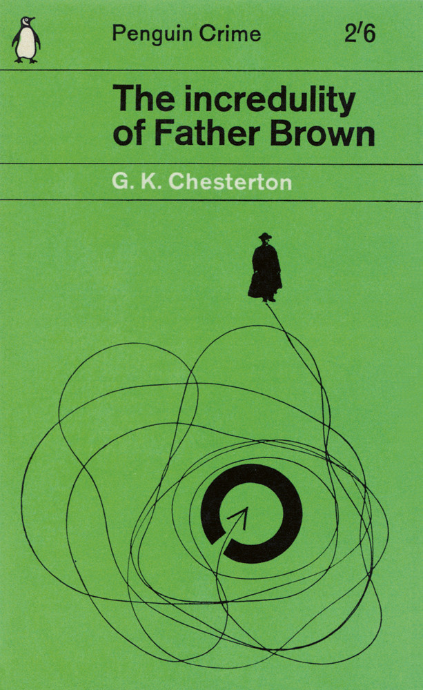
With the typographic structure in place, Marber could concentrate on producing images that reflected the atmosphere of the books, which he read with relish from cover to cover. He was a graphic image-maker of great versatility, able to sum up the stories with motifs and ciphers that contrived to be both playful and threatening. Many of these whodunnits were decades old, but his interpretations gave them a contemporary allure. Four covers for Dorothy L. Sayers’ novels about aristocrat detective Lord Peter Wimsey, first published in the 1920s and 1930s, encapsulate his range of approaches. For the base images Marber uses photography, energetically stylised drawing, collage with painted elements and flat geometrical pattern. In each case, this is accented by a small, white cut-out representing a murder victim. Other covers explore various kinds of photographic distortion. For the typographic illustration on Bruce Buckingham’s Boiled Alive, featuring Mexican detective Don Pancho, Marber reflected the type and image in a metal glazing plate used for glazing photographs, then photographed it. ‘I wanted to get the feeling of water and make it quite sinister.’ He also employed a form of symbolic reduction that is rarely attempted on book covers now. For a Father Brown cover, Marber diagrams the ecclesiastical sleuth’s path, represented by a coiling thread, which he photographed, towards the solution of the mystery symbolised by a broken circle. Sometimes he used himself as model – as, for instance, in the multiple profiles on Simenon’s Lost Moorings and swathed in bandages on The Case of the Substitute Face.
Devising these covers, Marber enjoyed an exceptional degree of freedom. He recalls that, in the time he worked on the books, he visited the publisher’s offices in Harmondsworth only once or twice. He didn’t meet the editors and his only point of contact was Facetti, who would send him the manuscripts. The artwork, too, was often returned by post. Sometimes they would meet in the French House in Dean Street, Soho. Marber was paid 30 guineas (£31.50) per cover. No brief was ever given and most of the covers were accepted by Penguin as designed. ‘I don’t recall any occasion when they actually rejected a cover, although looking at them I know that some possibly should have been,’ he says. The designs were usually created in batches of ten and Marber was not precious about them. ‘When you do a lot of covers it stops being a matter of life and death. You are not so tight about them that you want to make every cover a masterpiece.’
Marber kept no record of all the Penguin Crime covers he designed, but he can account for at least 71. Other designers such as George Mayhew, John Sewell and Facetti produced designs for the series following Marber’s format. Marber also created advertising and display material. After Alan Aldridge joined Penguin as art director of fiction in 1963, there was a move away from Marber’s identity and, by 1964, he was designing fewer Penguin Crimes. He continued to produce covers for other Penguin titles, but his last commissions, a series of Angus Wilson novels published in 1968-69, were spoilt by insensitive lines of type applied to his designs by the publisher.
Looking back on the project today, Marber gently resists the idea that his cover designs might be viewed as personal expression. He describes his reading of crime fiction as a form of escapism and says he never gave much thought to it. ‘Reading the books was in itself a relaxed diversion and doing a cover was the excitement of trying to get across what I had just read in a single image.’ Seen as a series, though, Marber’s images add up to a multifaceted graphic response to the darker side of human behaviour. If his grid represents an attempt to maintain social order, the images held in place below it express what happens when the criminal impulse goes unchecked. These classic covers functioned as an exemplary Modern identity, while embodying our conflicting urges towards order and chaos. Forty years later, they have lost not an iota of their power.
Romek Marber’s Penguin Crime covers are included in ‘Communicate: Independent British Graphic Design since the Sixties’ at the Barbican Centre, London, 16 September 2004 to 23 January 2005.
Rick Poynor, writer, Eye founder, London
First published in Eye no. 53 vol. 14 2004
Eye is the world’s most beautiful and collectable graphic design journal, published quarterly for professional designers, students and anyone interested in critical, informed writing about graphic design and visual culture. It is available from all good design bookshops and online at the Eye shop, where you can buy subscriptions, back issues and single copies of the latest issue. You can also browse visual samples of recent issues at Eye before You Buy.