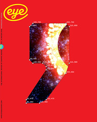
Winter 2008
Play and playbill
Theatre programmes present designers with a challenge that can be turned into a dramatic opportunity
Theatre programmes present designers with both an opportunity and a challenge. An opportunity, since the cover gives them a chance to show how imaginative they are. The challenge lies in the inside pages. This is where so few designers succeed in providing clear typography and in organising the material with a coherent structure and sequence. It is not easy. The variety of text and images is as unpredictable and changeable as is the number of advertisements.
Of the programme’s ingredients, the cast list comes first; then the actors’ portraits and their stage history. As a rule there are photographs of rehearsals, illustrated essays on the present and past productions by the director and writer, followed by a list of their past achievements; and at the end, credits for backstage staff and property suppliers. Many designers forget that the programmes should be conveniently sized, readable in the dim light of the auditorium, and yet also be an attractive souvenir.
The designer’s task may be to ‘brand’ an individual production – to give it a unique, memorable image. Or it may be the more exacting job of establishing a theatre’s house style, as was achieved by subsidised theatres such as the National in the 1960s. Not only does this give a theatre an identity, but standardisation makes it easier for the designer, by reducing the number of fresh decisions to be taken with each programme. It can even make printing cheaper.
London playgoers are divided as to what they want from a programme. At one extreme they want just a free cast list; at the other the whole ‘playtext-as-programme’. Sometimes, thanks to an enlightened management and an intelligent designer, they may be offered a programme filled with well edited, relevant background text and imaginatively chosen illustrations, with legible typography and a clear layout. More likely, they are asked to pay several pounds for a shoddily laid-out, hard-to-read booklet – often ‘not just oversized but overblown’, as these were described on a recent theatre blog (‘Theatre programmes: don’t you just love ’em?’, Lyn Gardner, 23 June 2008).
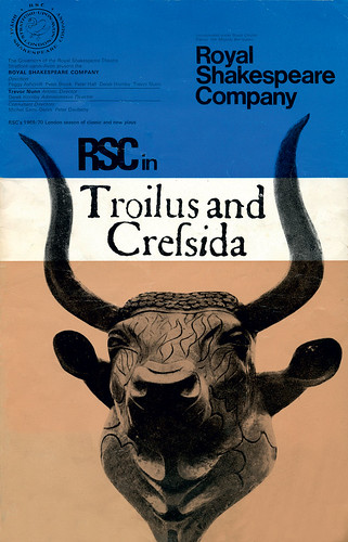
A large sixteen-page souvenir programme for the Royal Shakespeare Company, designed by George Mayhew in 1968. Without advertisements, it sold for two shillings and sixpence.
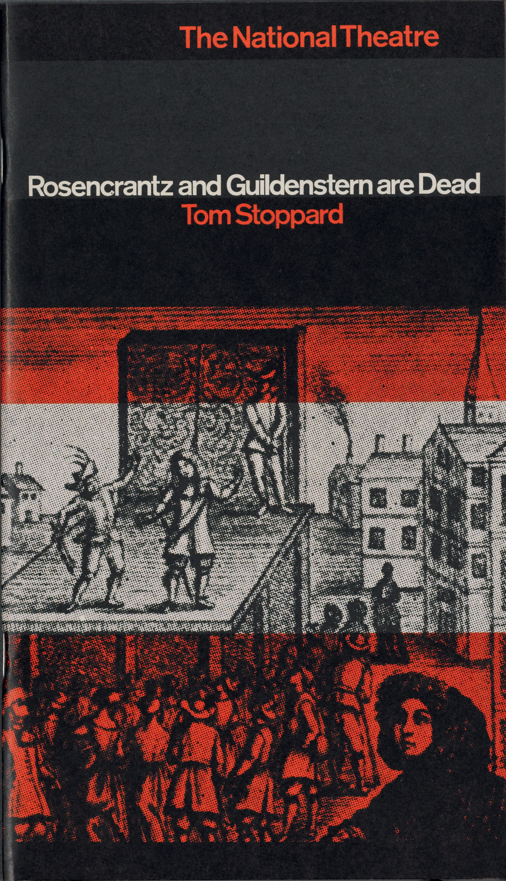
Top: National Theatre programme designed by Ken Briggs for the 1967 production of Stoppard’s first play, printed letterpress in red and black.
Origins of the theatre programme
The theatre programme’s origin lies in the playbill. From the seventeenth to the nineteenth century these small posters were used to advertise a coming performance. Posted up in the street or delivered to likely houses, they displayed the title, author and players. Taken inside the theatre, they were a handy identification of the players and a key to the action: a simple programme. This format changed little until the 1960s, and survives today as the centre spread of many programmes, a thin filling in a sandwich of advertisements.
In Victorian London the programme, as elaborate as the theatre’s gilt and plush interior, and sometimes even perfumed, became essential to the evening’s glamour. At first, they were simple. Printed in black on both sides and folded in half, they made four pages: on the front, a title page; on the two inside pages, the cast list and synopsis. Advertisements were on the back or fitted into panels on the centre spread. Typefaces, from plain jobbing grotesques to the hectically decorated, varied wildly within one design. Page sizes, too, were diverse, some only six inches high and four inches wide (150 x 101mm). Paper was often in pastel tints. Coloured ink, sometimes gold, replaced black. Less elaborate programmes were sold for the cheaper seats.
Old programmes record innovations in print technology: from single-colour letterpress and half-tone photo-engravings to colour lithography, and, more recently, to full-colour web offset. Victorian theatres welcomed technical advances and were fortunate to have a sophisticated printing trade in the centre of the city. For example, in 1879 one D’Oyly Carte light-opera programme credited its process as ‘photolitho’, printed by ‘Clement Smith & Company, The Granville Steam Works, Carey Street’. Thanks to the impresario Richard D’Oyly Carte in the 1870s and 80s, programmes developed into a minor art. Some were chromolithographed in more than seven colours; despite the obvious cost of production, D’Oyly Carte insisted: ‘Programmes are provided and wraps and umbrellas accepted free of charge.’
Apart from occasional contemporary influences, from neo-Gothic enthusiasm or Whistler’s asymmetrical typography, there was nothing avant-garde about London programme design. Pre-Raphaelite artists such as Ford Madox Brown and Edward Burne-Jones designed settings and costumes but made no contribution to the programmes. Where Paris had programme covers illustrated by artists such as Toulouse-Lautrec, Munch, Bonnard and Vuillard, in London only the grand actor-manager Beerbohm Tree showed an interest in graphic quality. Before the First World War he developed a sober Arts and Crafts influenced design typeset in Caslon in black and red on cream laid paper for Her Majesty’s Theatre. Souvenir programmes for special occasions, larger in format and on thicker paper, emphasised the theatre’s royal connection by printing in gold and purple ink. Tree was also interested in engaging the audience. His editorial innovations, such as ‘Producer’s Note’, ‘The Play’s History’ – even ‘Archaeologica’ and ‘Music’ – were to become familiar a century later, at the National Theatre.
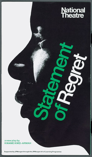
Recent National Theatre programmes have kept obvious aspects of its 1960s style. Picture research and editing have been as sharp as ever, but the typography has coarsened and the careless mannerism of type set on the diagonal (Helvetica rather than Akzidenz) can produce unfortunate effects, few as insensitive as this ‘branding’ of a black actor in 2007.
Between the wars
Between the two world wars, programmes were simple, poorly typeset and put together by the printer. One exception was the Gate, under the arches of Charing Cross station, which was the first to employ prominent commercial artists. Both Edward McKnight Kauffer and Ashley Havinden designed covers and typography, and the wood engravers Robert Gibbings and Blair Hughes-Stanton provided illustrations. The Gate looked at function as well as style. Stuck into the pages was a sheet of translucent paper. Reversed out of a solid black panel was the message: ‘To read this programme when the auditorium is darkened unfold it and hold it up to the light.’
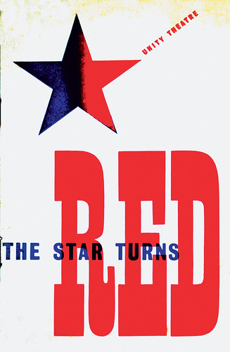
The other exception was the left-wing Unity Theatre. The first theatre in Britain to produce a Bertolt Brecht play, it showed a rare awareness of Continental Modernism in its use of photomontage on covers in the 1930s, throughout the war and beyond.
Long after the period of postwar austerity, programmes in every type of theatre remained small: eight or sixteen pages letterpress-printed on art paper, and sealed with the price, preventing its resale. Advertisements, most often for cigarettes or whisky, faced the title page and were placed in two or three pages at the back.
Unknown designer used type and an existing printer’s ornament in two-colour letterpress to produce an economical cover, 1940.
Innovations and revisions
It was the theatres subsidised by the state (through the new Arts Council) that challenged the dismal tradition of typography and layout. First among these was the National Theatre, which, from its opening in 1963, quickly became not only the most significant theatre but the most notable for its programmes. According to the programmes’ designer, Ken Briggs, this was due to the literary director, Kenneth Tynan. Before the National opened, several designers had been asked to submit ideas for publicity, but none appealed to Tynan or the director, Laurence Olivier, nor to Stephen Arlen, the theatre manager. However, Arlen had worked with Briggs at Sadler’s Wells, and trusted him to produce an advertising strategy that would show each play, production and cast. Six-week booking periods were arranged as a seasonal calendar, colour coded red for winter, green for spring, blue for summer and ochre for autumn.
Influenced by Brecht’s Berliner Ensemble, Tynan wanted informative programmes, and he wanted them to be free with the ticket. He had, however, little idea of costs, and even raiding the general publicity budget would not pay for the printing. Briggs pointed out that there could be income from advertisements. Tynan was opposed to anything commercial but was persuaded that advertising could be hidden in a separate section. The programmes were to be illustrated, with informative and – in the case of historical revivals – contemporary texts, images, and details of earlier productions. In general, photographs of the current production (difficult to arrange with costumes) were excluded, although rehearsal shots might be used. The cast list, liable to change, could be printed very late, and was given away free. These programmes sold for a pound.
What was the best size for a programme? Briggs and Tynan wanted something that the audience would take away, and even treasure. By examining evening handbags in John Lewis and taking into account the size of dinner-jacket pockets, Briggs arrived at a tall narrow format, about 230 x 130mm, which would be economical to print.
The National’s programmes of the 1960s and early 70s ranged from 32 to 64 pages, printed mostly in two colours, to contrast with the brilliantly black-and-white photographs. Pages of tinted paper separated the programme component from the advertisements in the front and back. Consideration for the reader was from time to time compromised by text printed on a solid colour. But they were meant for reading at home, even to be collected as sets: smart boxes were made to house a year’s programmes. Not so usual for the time, the layouts were tightly organised on a grid. The typography was ‘Swiss style’, the text in Univers with headings in Akzidenz Medium. Briggs coaxed the printers and photoengravers to produce work fully up to Swiss standards, the illustrations having the dense shadow of unlit depths of the stage, sometimes achieved by printing black on black.
Although based in Stratford-upon-Avon, the other large subsidised theatre, the Royal Shakespeare Company, also had a London base – at the Aldwych Theatre in the 1960s and 70s (and later, until 2002, at the Barbican). It was soon to rival the National in the elaborate content of programmes. The first of the programmes designed for the rsc by George Mayhew (a member of one of the first British design groups, BDMW) used a standard Mondrian-influenced cover, with space left for the changing play titles. Clear but undistinguished typography of inside pages was less disciplined than cast lists, printed in a narrow vertical format on tinted paper.
By the end of the 1960s the Aldwych playgoer had the choice of a free cast list or a programme costing one shilling (5p), produced as Playbill magazine. Only two of its 24 pages were given to the production; the rest was advertising and features, including restaurant reviews and a gossip column. Mayhew went on to develop large-format programmes, typical of 1960s graphic design: Letraset rub-down lettering or photoset headings, Univers for text, cut-out half-tones on areas of flat colour. These were advertised in a smaller, cheaper programme. The Aldwych’s standardised cover with space for the production’s name was not a new idea. The pre-printed ‘blank’ was a common method for theatre posters, used in the late 1930s by the Gate, for instance. In the 1950s bdmw’s George Daulby had reversed the Sadler’s Wells name out of a purple square on its programme covers, in a script as elegant as the typography within. Such sober design recognised that unlike a book cover the front of a programme is not competing with others. Yet more design effort continues to be expended on covers than on the inner pages: the present designer of the English National Opera programme covers, for example, is allowed no input into the layout of the content.
At the non-commercial Royal Court Theatre, a venue for progressive productions since the 1950s, programmes only occasionally matched the management’s enterprising policy. But the Court did experiment. In 1962 a large programme for three plays, with documentary text, included photographs of London life. Finding or commissioning illustrations to reinforce a play’s contemporary setting was to become an occasional feature requiring more imaginative effort than sourcing historical images.
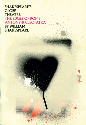
One of ‘The Edges of Rome’ season at the Globe, 2006. Graphic Thought Facility’s design deals with many of the problems of reconciling ideas of the past with contemporary imagery. Albertus type in capitals provides a classical overtone.
The contemporary programme
Evidence of London’s current graphic vitality is rarely seen in its theatre programmes. However experimental it may be in stage design, the London theatre has been timid in its graphic design, seemingly unaware that the city is a flourishing centre of the visual arts. Bold, creative and informative programme design is the exception rather than the rule.
The reasons for this are not hard to deduce. Theatre directors come and go. Designers come and go with them. Established formats are abandoned, then re-introduced. Standards of design at the National faltered after it became the Royal National in the late 1980s. For the past 30 years Michael Mayhew (George Mayhew’s son) has been responsible for its programmes, now designed in-house. The page is slightly larger, the imaginative picture research of historical images remains and, while the make-up of the programmes has changed, something remains of the ‘Swiss’ style introduced by Ken Briggs. Whereas Briggs had separated the advertising from the editorial content relating to a single production, today the editorial material – at least 32 pages of it – is folded inside a further 32 pages on the season, the theatre’s history, its list of services and advertising.
Not that all the National’s programmes have followed its own conventions. The most remarkable and brilliant exception was that for The Oresteia by Aeschylus, designed by the photographer Stephen Cummiskey in 1998. Typewriter setting, enigmatic photography and a fold-out genealogical tree displaying the relation of gods to mortals, gave ancient Greek a postmodern dress. Another, in 2001, for Patrick Marber’s Howard Katz, had photographs of the main character and London townscapes, as if the play were a documentary.
Such deviations make clear the limitations and difficulties of a house style. The search for a graphic identity has occupied Shakespeare’s Globe since it opened in 1997. Design groups, among them Pentagram and Graphic Thought Facility, have strained to match the theatre’s historical associations: textured, tinted paper; foil-blocked symbols; stencilled images; tiny text, often in colour. Tasteful mementos, yes – but fit for reading in the unlit Globe? This is a need which Kerr / Noble’s recent designs have gone some way in addressing.
The Lyric Hammersmith has been more successful in its graphic identity: brush lettering for logo and headings in squareish, full-colour programmes. This followed years of changes of style; many of them could have survived, and were interspersed with individual pieces of design enterprise, such as a mock contemporary newspaper to describe gang rivalry in Romeo and Juliet.
The Young Vic has replaced its well designed, scaled-up versions of the National’s style with lively and individualistic small-scale booklets, generally audience-friendly, but with no standard identity.
Time and again, a considered house style might have prevented inside pages of blinding dreadfulness. The Almeida, for example, exchanged its convenient, vertical format of the early 1990s for a larger format, but the originality and quality of the covers have been no compensation for the crude banality of the interior layouts. And the Almeida is a subsidised theatre. So are the Royal Court and the Bush, which have struggled to produce coherent designs – some successful, economically produced and, in the case of the Bush, without advertising.
Fringe theatres with stretched budgets have tried every kind of format and folding: single sheets of A4; tiny booklets fit for a doll’s house; gate-folded cards very tall or wide. Some standardised for several productions, others one-off. The Arcola, Battersea Arts Centre, Jermyn Street Theatre, Riverside Studios, The Roundhouse, Southwark Playhouse, Theatre Royal Stratford East, Tricycle: all have at times produced well thought-out and inventive programmes. The most obviously ‘designed’ programmes, which inventively exploit their constant formats, are for BITE (the Barbican International Theatre Event) and for English National Opera. These are matched professionally by the Cornwall-based Kneehigh Theatre, which varies their programmes in size and paper, gives them legible, well organised typography, and sees them finely printed.
The commercial theatre knows that giving a venue a consistent style of programme is less important than branding a production, even with a logo. The Lion King, Les Misérables and Hairspray are examples. Popular theatre needs popular literature in the foyer, and some programmes – most are designed by the agencies John Good and Dewynters, who advertise their production of ‘quality programmes and souvenir brochures’ – successfully emulate the brash excesses of celebrity gossip magazines. The idea of quality suggests a showbiz opulence, which the agencies achieve with great skill and a kind of fairground exuberance in large-format brochures.
‘Whoever designs the leaden bland and dull stuff for [the National] nowadays should have their eyeballs rinsed,’ wrote one splenetic blogger. This could be said, and more fittingly, of too many London theatres. But then programmes haven’t had much attention from designers. Given the chance, a few designers have served the interests of the production, the aspirations of the director, and the vanity of the actors, without forgetting the audience.
The most enthusiasm shown in comments on Gardner’s blog was for the Donmar Warehouse’s programmes, designed by Dewynters. The cover is standardised, the type always Futura, simply laid out in a vertical format, convenient to handle. Other theatres could learn from their unpretentious clarity, which takes us back, almost, to the early playbill.
The author is grateful for research assistance at the V&A Theatre Collections and at the Raymond Mander and Joe Mitchenson Theatre Collection at the Jerwood Library of Performing Arts, Greenwich.
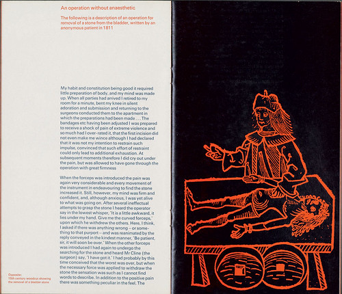
The National Health, 1969 designed by Ken Briggs. Printed letterpress in red and blue throughout (overprinted, this makes a near-black). Text is typeset in the National Theatre’s consistent style: Univers. The staple ingredients of National programmes are here: essays, production shots, historical documents. With a contemporary play there are contemporary illustrations.
Richard Hollis, designer, writer, London
First published in Eye no. 70 vol. 18 2008
Eye is the world’s most beautiful and collectable graphic design journal, published quarterly for professional designers, students and anyone interested in critical, informed writing about graphic design and visual culture. It is available from all good design bookshops and online at the Eye shop, where you can buy subscriptions and single issues.