
Summer 2008
Prototype propagandist
Rivadulla’s revolutionary poster art avoids socialist cliché. By Jan Middendorp
Colourful, silk-screened Cuban posters from the 1960s and 1970s by designers such as Alfredo Rostgaard, René Azcuy and Antonio Fernández Reboiro have become part of the collective consciousness, thanks to the many catalogues, exhibitions and websites. Yet the technique behind these works was pioneered in the 1940s and 50s by a designer who has remained in the shadows – Eladio Rivadulla.
Born in 1923, Rivadulla began creating silk-screened movie posters in 1942 and subsequently became the most prolific poster designer of the pre-Castro period. He developed the Cuban strand of a genre that was ubiquitous across the western world, combining dramatic realist imagery with lively hand-lettered type in a wide array of styles.
On 1 January 1959, the day that the US-sponsored President Batista fled from Cuba, Rivadulla created the country’s very first revolutionary poster. With its strong contrasts and stylised portrait of Castro, the poster was a prototype, of sorts, of Cuba’s revolutionary graphic design. But although Rivadulla became a technical adviser to the Cuban Film Institute (ICAIC) and remained active well into old age, he was somehow omitted when the international design scene began to recognise the work created by younger colleagues, inspired by Pop art, from the mid-1960s onwards. Maybe curators felt nervous because of his pre-revolutionary past, feeling he wasn’t as ‘pure’ as the others.
Yet several of Rivadulla’s propaganda posters designed in the early 1960s for the Castro regime certainly merit a place in design history. Beautifully drawn and impeccably produced, they explore a visual language that is innovative and striking in its own restrained way. They represent as idiosyncratic a view of revolutionary poster art as do the psychedelic works of Cuba’s younger generation.
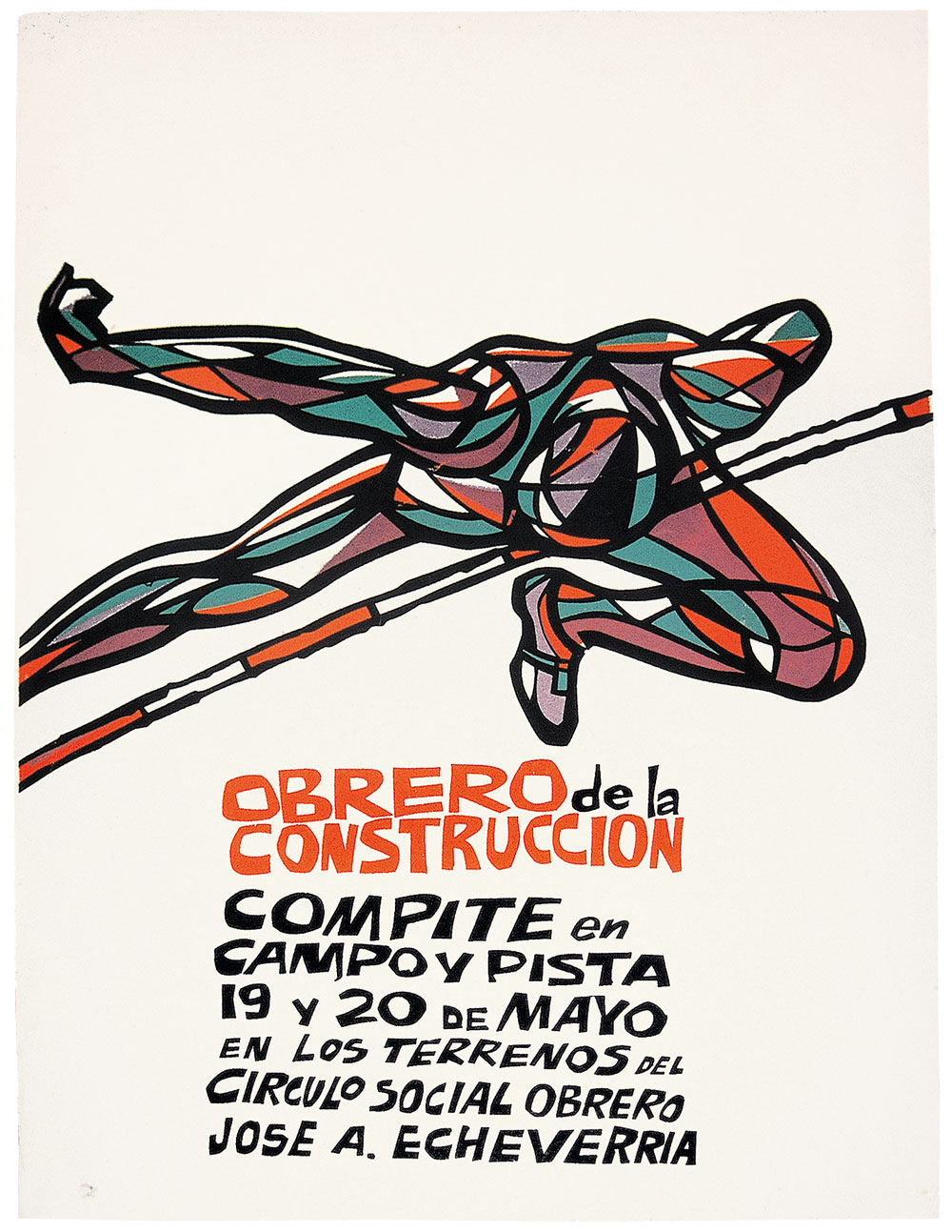
So here is my nomination for the extended canon of graphic design: Rivadulla’s poster for what is apparently a construction workers’ sports tournament. In its abstraction, the futuristic, Spiderman-like figure is unlike any socialist cliché. The composition is brilliant. When compared with Rostgaard’s or Reboiro’s late-1960s posters, brimming over with colourful enthusiasm, this piece of graphic design, with its sophisticated aesthetics and ample use of white space, seems to come from a wholly different world.
Top: poster for the sports tournament. The text says, ‘Construction worker - compete in field and arena’. Design: Eladio Rivadulla, early 1960s. Photographed in the designer’s living room.
Jan Middendorp, designer, writer and author of Dutch Type, Berlin
First published in Eye no. 68 vol. 17 2008

Eye is the world’s most beautiful and collectable graphic design journal, published for professional designers, students and anyone interested in critical, informed writing about graphic design and visual culture. It is available from all good design bookshops and online at the Eye shop, where you can buy subscriptions and single issues.