
Autumn 1999
Punk uncovered: an unofficial history of provincial opposition
British punk gave a sound, a voice and a visual currency to the disenfranchised and remote. Overlooked, uncelebrated and difficult – the output of the anonymous artworkers who packaged the vinyl spewed out by punk’s first waves captured the oppositional (and occasionally political) spirit of the time. By Russell Bestley and Ian Noble.
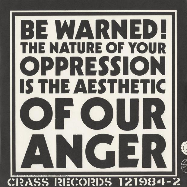
Above: Reverse of sleeve for ‘Yes Sir, I Will’ by Crass (Crass, 1983). Designed by G. Sus [Gee Vaucher].
Most visual histories of punk rock have emphasised the work of now famous graphic designers, such as Malcolm Garrett, Peter Saville, Barney Bubbles, Russell Mills and Jamie Reid. [1] Yet the greater impact of punk on the hearts, minds and attitudes of the youth at that time was through a provincial second wave, or the beginnings of the ‘punk diaspora’ [2] as Jon Savage has called it, more related to the suburbs and towns of Great Britain. Provoked by the received view of punk via the sensationalised reporting of the mainstream press, local scenes grew up across the nation, each with highly individual interpretations of the music and variations in attitude and approach.
Far from the metropolitan / London axis, this provincial interpretation of punk, as fashion, as music and as graphic output, adopted a range of individual approaches based on the part played by the music press – in particular the NME (New Musical Express) – the airplay given by Radio One DJ John Peel, the national press, and local cultural history and aspirations.
The mainstream press, almost entirely opposed to the movement, played a large part in the way punk was to be adopted and re-interpreted in regions geographically too distant from the major cities to have a direct connection or a word-of-mouth familiarity. More difficult to define, but no less significant, were those deep-seated feelings of frustration and rebellion reflected in the local culture – a regional fan base was established which took a distinctively parochial reading of the genre. [3] This is significant – for local history, provincial attitudes, and a distinctly popular culture played an equal part in the construction of this ‘second wave’ as did the suggested (‘serious’ or ‘art-house’) influences of the official history of the genre (Velvet Underground, Stooges etc.). Outside the larger metropolitan areas of the big cities, deep-seated conservative attitudes were rife – following the recession of the mid 1970s under a failed Labour administration, Margaret Thatcher was elected prime minister to a far-right Conservative government in the Autumn of 1979. In smaller communities across Britain, this reflected a return to more hardline Victorian values. Though punk was becoming a fashion cliché in London, being a provincial punk was a political statement – a ‘leap of faith’. [4]
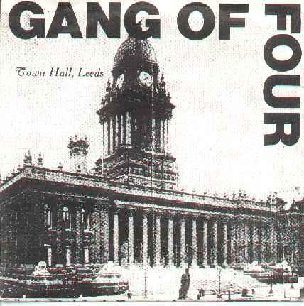
Below: sleeve for the Gang of Four’s ‘Outside the Trains don’t Run on Time’ (EMI, 1980). A provincial publicity photograph dominates the sleeve, defiantly placing the band in a specific place outside the London scene, and offers a sarcastic comment on public representations.
For punk to have survived it needed to react to a particular social and political climate. Worsening unemployment, Northern Ireland, [Ronald] Reagan, Thatcher, the nuclear threat and the resurgence of CND (the Campaign for Nuclear Disarmament), the emergence of gay rights, the undermining of the trade unions and later the jingoism of the Falklands war, all contributed to the climate of engagement. Some bands became identified with single issues, such as TRB (the Tom Robinson Band), whose ‘Glad To Be Gay’ (EMI, 1978) became an anthem for gay liberation. The Au Pairs, comprising two men and two women, became associated with a newly defined approach to the concerns of women and the feminist movement, particularly with the release of the single ‘Diet / It’s Obvious’ (021 Records, 1980). Though the group achieved some success in the post-punk independent market, they were to be defined by this early approach in all their later work. The Slits and the Raincoats established a new position for women in the male-dominated rock music scene. The period also marked a new range of interpretations of punk’s employment of shock tactics, challenging middle-class norms and values. The earlier knowing dumbness of, for instance, the wearing of swastikas by Sid Vicious and Siouxsie Sioux had been balanced by the proactive movements within the scene: Rock Against Racism and the Anti-Nazi League. With the right wing appeased by a sympathetic government, the more political sections within the scene were forced to fragment their activities to address specific issues. A range of tactics were adopted by the new generation of oppositional groups, and the employment of visual codes became more critically targeted.
The geography of the UK meant that punk was able to spread quickly and found a sympathetic audience already inclined towards the feelings of rejection and alienation that characterised much of the music. More local aspirations and interpretations of the punk ethos were played out in smaller towns and cities across the country, deeply affecting many of the people involved – bands, fans, designers. This led to a resurgence of the cottage industry, the skills-building of independent businesses and many innovations in marketing and production. This significant but largely undocumented influence spawned a large number of smaller-league bands, labels and networks of activity. Bands from these towns were part of extended local networks and often toured together to other towns, pooling resources and equipment. In this way an alternative version of punk was propagated and local exchanges were built up. [5]
The look of much of this recorded work in the form of twelve-inch LP and seven-inch single and EP sleeves, and echoed in fanzines, advertisements and flyers, was often anonymous or uncredited, and a celebration of the low-tech production values of necessity. The output of many of the untrained or non-professional artworkers, band members or friends of the band (often at local art colleges) produced unusual collaborations. The Human League’s line-up involved at least one band member who did not have a musical role: Adrian Wright originally provided slide projections on stage, an integral part of the Human League’s early live appeal. This also reflected an attempt to create multidisciplinary live performances in the true punk spirit – filmmaker Mick Duffield provided projected backdrops for live performances by the band Crass. Many other groups (notably Wire) incorporated poetry and performance art into their live shows.
The grassroots approach centred on the relationship between the audience and the groups – often the fans were the bands and the bands were the fans. The spirit of ‘everyone can be in a band’ grew into ‘everyone can release their own record’ and ‘everyone can have their own label’ and this extended to the production of the sleeve artwork. The (initial) rejection of the large or major record labels as possible benefactors is exemplified in the impossibly uncommercial nature of the record sleeves.
This activity involved design strategies that, although based on limited budgets, were in many cases inventive, sophisticated and engaged in deliberate decisions concerning the ‘hard-edged’ employment of particular images, anti-typography and production processes. These attempts to capture, and communicate, the aggressive or discordant tone of the lyrics and music position much of the work as important examples of how a surface may indeed capture the experience or emotion of a musical form. Importantly, these could not have been produced by anyone other than those directly involved in the scene.
The subcultural codes contained within the sleeves and band ‘identities’ acted as factors in defining the sense of belonging and membership both in a local and national sense. These codes often took the stereotypical devices of punk – hand-rendered and stencilled typefaces, ransom-note typography and photocopied imagery, often borrowed from newspaper stories of the day and related to the topical nature of the lyrics. In other cases the look or feel was less deliberately DIY [do-it-yourself] and employed images of local significance and genuine low-tech production such as the use of typewritten text and crudely rendered images. This approach exemplified a persistent refusal to engage in sophisticated design values despite subsequent commercial success. These designers and artists went on to produce work that refined the style of earlier production, but maintained its raw disregard for more mainstream commercial aesthetic values.
Some independent labels became very successful, often making use of innovative marketing strategies and corporate styles. Early leaders in the independent sector, including Chiswick and Stiff, both born out of the pub-rock scene in London, were to figure less prominently as tastes changed rapidly in the late 1970s, and the search for a genuine ‘alternative’ scene exemplified by the likes of Rough Trade, Mute and Cherry Red records in London, or by Factory in Manchester, FAST Product in Edinburgh [see sidebar, below], Zoo in Liverpool and Crass in Essex [see sidebar, below] took hold.
By this time, many of the major record labels were heavily involved in marketing punk acts and fashions (and, in particular, what was to become defined as New Wave). Demand soon outstripped supply, with labels scrambling to sign bands with some sign of ‘street cred’ and bands becoming ‘punk’ virtually overnight to cash in. Small independent labels were often subsidised – whether in terms of studio time, record manufacture or distribution – by larger production / distribution agencies. Several of the more proactive new labels (including FAST Product, Crass and Rough Trade) took distribution back into their roster of activities as this became a key defining factor in the independent scene.
Rough Trade was perhaps the most successful of this new breed of independents, at least in the early years of its existence, following the establishment of a distribution network and label from the shop set up by Geoff Travis in Notting Hill, London. The label’s chaotic, disparate roster was held together by a sense of individuality of purpose and the idiosyncratic tastes of Rough Trade management. Fiercely independent, this network sought to promote individual voices outside the mainstream, and maintained a utopian vision through the establishment of the Cartel, a wider grouping of independents from across the UK grouped together loosely in a spirit of mutual co-operation. [6]
The transition for many bands from small independent outfits to the major labels and their subsidiaries proved a difficult one – on the one hand, budgets were significantly greater for the manufacture of both audio recordings and sleeve artwork, but this often entailed the use of the company’s in-house design and production teams, which could be at odds with – or simply did not understand – the aims of the original producers. This was coupled with an exploitation and progressive dilution of the visual codes signifying ‘punk’ and New Wave by the major labels, in an attempt to profit from a fast-growing new market.
VISUAL CONTRARINESS
Where it is possible to trace elements of a more considered design sense in earlier punk sleeves, we find that this is still employed to ironic or knowing effect. The sleeve front for the Human League’s single ‘Being Boiled’ (FAST Product, 1978) (see GTF’s Visual Essay, Eye no. 31 vol. 8) and the reverse side of the Normal’s ‘Warm Leatherette’ (Mute, 1978) make use of the ‘sophistication’ of Letraset’s rub-down illustrations. Architectural and interior design reference figures of happy, bland, carefree couples – dancing, watching TV – are juxtaposed with typefaces from the catalogue that dominated graphic design departments of art colleges during that period. Before the Macintosh, this provided an alternative to expensive phototypesetting and time-consuming letterpress production. The more deliberate use of typefaces suggests some knowledge of the design business. The Mute Records logo itself was taken directly from architectural reference images (see Archive, Eye no. 31 vol. 8) supplied by Letraset. The use of a similar visual repertoire (or codes) extended to other groups such as Cabaret Voltaire and defined the styling of the punk sub-genre of electronic music, providing an instantly recognisable visual hook when leafing through the latest unknown releases. [7]
The impact of available and affordable Xerox copies should not be underestimated as a design tool during the late 1970s both in the art colleges and outside. The outer sleeve for the Adicts’ Lunch with the Adicts (Dining Out Records, 1979) is a simple photocopy cut down to size and folded in half. Inside and loose with the disc itself is another photocopy with sleeve notes. This approach can be seen again on the packaging for the ‘O’ Level’s ‘We love Malcolm’ (Kings Road, 1978) – a blank labelled disc with no details, in standard factory white slip cover. The only information is provided by a stark black and white photocopied and hand-rendered illustration of three about-to-be-executed prisoners, which is cut (for no apparent reason) with dressmakers’ pinking shears at an angle on the bottom edge.
Like the ‘O’ Level single, the TV Personalities’ ‘Where’s Bill Grundy Now?’ EP reflects ironically on the growth of the punk movement, and the ‘selling out’ of the scene to safe public consumption. The EP lists hand-written financial details of recording and production, including the note ‘Sleeves 2000 £110 by delga, Kent. We didn’t want to, but what else do we do?’ Exemplifying the democratic spirit of DIY production embraced by punk’s breaking down of band / audience barriers, this deliberately amateur production aims to be the antithesis of the slick production values that were beginning to affect many of the more successful punk bands as they were taken under the banner of the major labels and the so-called New Wave.
This unique period of activity documents a rare period of British social opposition to, and engagement in, the politics and values of the day. Punk’s alternative to the mainstream production of both music and graphic design traces a connection to a canon of ‘visual contrariness’ that persists (and inspires) to this day. [8]
FOOTNOTES
1. Many of these designers have been featured separately in Eye: Malcolm Garrett (Eye no. 12 vol. 3), Peter Saville (Eye no. 17 vol. 5), Barney Bubbles (Eye no. 6 vol. 2), Russell Mills (Eye no. 5 vol. 2).
Note also ‘Destroy: Punk Graphic Design in Britain’, Royal Festival Hall, London, 1998 (reviewed Eye no. 28 vol. 7 1998).
2. Jon Savage, England’s Dreaming. Faber and Faber, 1991, p.594.
3. ‘Locally, punk as cultural production was a crossover between media representation of punk fashion, the commercial clothing available and the Do It Yourself, jumble sale, make-and-mend philosophy.’ Frank Cartledge, ‘Distress to Impress?’ in R. Sabin, ed. Punk Rock: So What? Routledge, 1999, p.144.
4. Paul Cobley, ‘Leave the Capitol’ in R. Sabin, ed. Punk Rock: So What? Routledge, 1999, p.171.
5. Greil Marcus observed, when meeting the Gang of Four in Portsmouth in 1980: ‘The shows on this tour had two things in common: the first act was a kindred band from Leeds (or Birmingham) or Rough Trade or both (Scritti Politti [see ‘Pop Music Art’, Eye no. 33 vol. 9)], the Mekons, Delta 5, Au Pairs, Red Crayola – save [for] the all-male Scritti, each had male and female members), and the venues were tiny.’ Greil Marcus, ‘It’s Fab, It’s Passionate, It’s Wild, It’s Intelligent’, In the Fascist Bathroom. New York: Viking Penguin, 1993, p.112 (originally published in Rolling Stone, 24 July 1980).
6.’The Cartel came into being in the late 1970s to provide a distribution network for the massive surge of records and labels that the “new wave” engendered. Existing structures proved unable and unwilling to take on the new music. Being regionally based, and composed of companies already involved in the new music explosion, the Cartel was uniquely placed to provide, by linking resources and already organised local networks, a national distribution system that remained in touch with the sources of the music.’ From the introduction to Look, Hear. Cartel Independent Product manual, 1986.
7. The work of this period is significant in that it marked the end of a particular tradition of large format picture sleeves. Prior to the introduction of the compact disc, and with it the return of greater market control by the major record labels, this period saw the last celebration of seven inch single and twelve inch LP artworks. It would be wrong to suggest that the CD format has not produced equally innovative and challenging responses from designers (see ‘Pop Music Art’, Eye no. 33 vol. 9) but the traditional pop format of the seven inch single now appears somewhat historical. Die-hard collectors persist and to some extent have become the only custodians of this reassuringly familiar past. Also significant are the DIY productions of many of the bootleg cassette tapes of live performances which were available nationally. Often the sleeves were photocopied on garish stock papers and were embellished with similar but derivative graphics, from original sleeve productions.
8. See ‘Cult of the Ugly’, Eye no. 9 vol. 3 1993. See also ‘I like the vernacular NOT!’ by Jeff Keedy in Lift and Separate: Graphic Design and the Quote Unquote Vernacular, ed. Barbara Glauber, published by the Herb Lubalin Study Centre, 1993.
FAST PRODUCT: interventions in any media.
Bob Last, former road crew technician with Scottish punk band the Rezillos, started the FAST Product label in 1978 in response to the growing punk / independent record scene as it became more firmly established. Based in Edinburgh, the label became notable for a roster of artists from the north of England and Scotland, including the Mekons, Gang of Four and the Human League. FAST also produced ‘The Quality of Life’ – a visual package that was catalogued in a similar fashion to the records in an attempt to make what their first flyer described as ‘interventions in any media’. This was not an unusual approach during that period. In Manchester, Tony Wilson began setting the scene for Factory Records, planning to include a variety of both audio and visual products in their output, and the fanzine culture linked many bands with visual producers (ATV and Sniffin’ Glue fanzine, for instance). The logo for the FAST label, a hand-rendered italic typeface, originally drawn and pasted on the first flyer, features prominently on all the sleeves, and an obsession with exposing the mechanics of the communication process can be seen in much of Bob Last’s artwork. This mirrors the punk spirit and attitude of ‘anyone can do it’ exemplified by the bands themselves. The label was later taken over by EMI, but FAST Forward (Communication), the distribution company spawned by the label, went on to become a significant partner in the Cartel distribution network. Although FAST Product was short-lived as an independent label, the new bands on its roster made a significant impact in the early 1980s, and their new strategies in defining post-punk styles, both musical and visual, were to have a lasting effect.
CRASS: Do they owe us a living?
Crass records was a vehicle for the recorded output of the anarchist collective group of the same name, based in a commune in Epping Forest. In the late 1970s, the members of this loose-knit, strongly ideological group formed a punk band to relay their anarchist message following the networks established by Rock Against Racism and a wide base of support for CND (the Campaign for Nuclear Disarmament). Their media interruptions made use of records, books, films, events, concerts, posters, etc. All employed a distinctive visual style and an anarchist political rhetoric, paving the way for an entire sub-genre of anarchist punk bands. They had a huge influence on the growing traveller movement, and their utopian visions of the future, coupled with an aggressive refusal to co-operate in the mainstream, saw them frequently in confrontation with authority. A successful ‘marketing’ strategy resulted in the band’s name and logo being stencilled on walls across the country: records employing variations on the band’s distinctive logo and photomontage collages display their strong sense of visual identity and anarchist ‘corporate branding’. The designers used a strategy of (low) maximum price details on the sleeves, and the visual devices centred on a heavy black circle, the anarchist symbol, and (usually) a fold-out poster based on contemporary news stories and black and white photomontage to make strong political messages. The group’s visual work was self-produced, with art direction credits going to Crass and G. Sus [aka Gee Vaucher], who also sang in the band. The peak of the group’s activity coincided with the rise of Margaret Thatcher, then prime minister, and the ensuing economic polarisation brought about by her government’s right-wing policies.
First published in Eye no. 33 vol. 9, Autumn 1999.

Eye is the world’s most beautiful and collectable graphic design journal, published quarterly for professional designers, students and anyone interested in critical, informed writing about graphic design and visual culture. It is available from all good design bookshops and online at the Eye shop, where you can buy subscriptions and back issues.