
Autumn 2013
Quiet man of letters
Alan Bartram brought a perceptive eye to alphabetic detail in public spaces. Catherine Dixon pays tribute to the co-author of An Atlas of Typeforms
Alan Bartram, who died earlier this year, is a quietly important figure in the development of British book design and typography. He wrote and designed significant books that have inspired subsequent generations of graphic designers. With a sharp eye for lettering, he opened up to new audiences the particular world of everyday alphabetic detail in public spaces.
Bartram was identified by historian Alex Seago (see Eye 16) as part of a ‘group of young visual revolutionaries’ who ‘transformed the face of British art, fashion, film, television, advertising, newspapers and magazines’ between the mid-1950s and early 1960s. 1 Bartram, originally trained in painting, was taught typography by his brother Harold, a teacher at the London School of Printing (now the LCC) and an advocate of a Continental model of graphic design training he himself had received as a pupil of Anthony Froshaug and Herbert Spencer at the Central School of Art and Design in London.
On his arrival at the Royal College of Art in 1955, Bartram joined a generation of designers who reset the design agenda, shifting focus away from nostalgia and Victoriana towards the experimental and the avant garde. This can be seen in Ark magazine, the RCA’s in-house journal. Ark 20 (Summer 1957) was co-art-edited by Bartram and the designer David Collins (who later featured in 17 Graphic Designers London, Balding & Mansell’s celebrated showcase of the UK design scene in 1963).
The Swiss design influence was significant, though, as with many of his (postwar era) contemporaries, it was the panache of contemporary Italian design that Bartram fell for. Beguiled by its inventiveness and energy, he set off on his own graphical tour of Italy to learn more, his notes chronicling stimulating encounters with magazines, logos, catalogues and packaging of every kind. 2
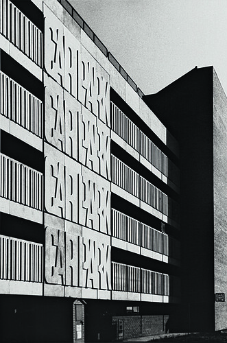
Concrete lettering from the 1974 High Cross multistorey car park in Truro, Cornwall, shown in Bartram’s Lettering in Architecture (1975).
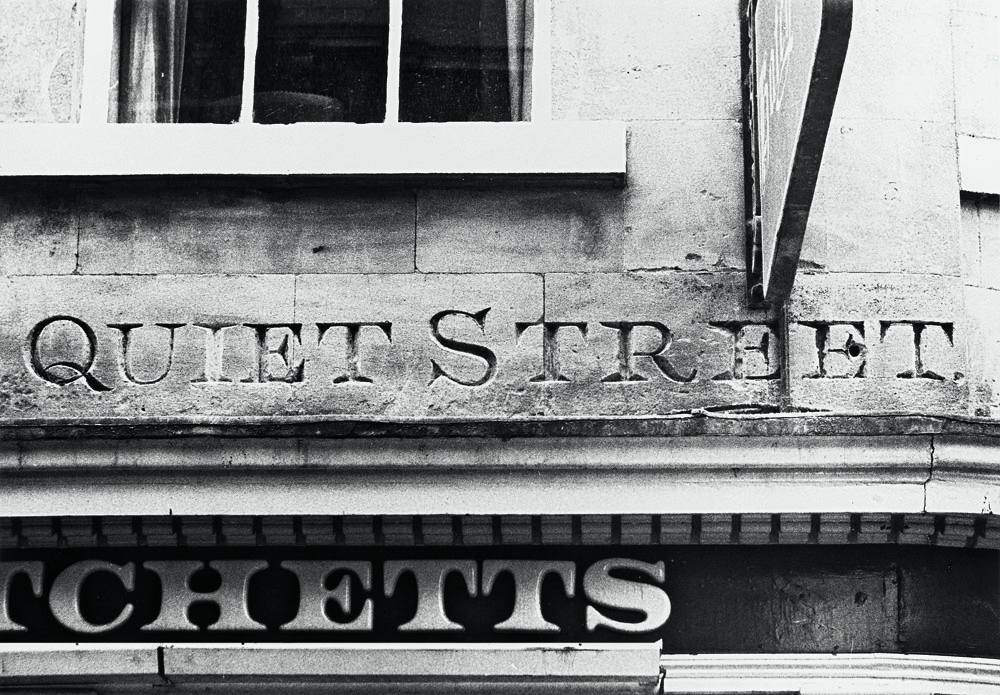
Top: carved street name, Bath. Collectively, Bath’s street lettering showcases the basic form of the so-called ‘English letter’.
A modest proposal
With his education complete, Bartram took his first job as design assistant to Herbert Spencer, founder and editor of Typographica magazine (see Eye 31) and editor of the Penrose Annual (1964-73, see Eye 60), both of which were printed and published by Lund Humphries. In 1967 Bartram, together with lettering designer and LCP teacher James Sutton, pitched a rather extraordinary project to John Taylor, director of Lund Humphries, whom he had met through Spencer: ‘We explained that our ideas required a format of 16 10 inches [406 254mm] … John barely blinked. In those days there was no need to consult ‘Marketing’ or ‘Production’ … It eventually resulted in the notorious An Atlas of Typeforms, which fitted nobody’s bookshelves and which booksellers hated for its size. Yet it became a classic …’ 3
Bartram needn’t have feared. The Atlas remains a classic, uneclipsed by his own attempts at a successor two decades later.
The working relationship with Taylor was to prove fruitful and enduring. Between 1975 and 1986, Lund Humphries published Bartram’s series of books on lettering: first Lettering in Architecture, (quarto hardback, 176pp), followed in 1978 by three smaller volumes (octavo paperback, 96pp) exploring in turn Fascia Lettering, Street Name Lettering and Tombstone Lettering in the British Isles, before his convincingly broad documentation of The English Lettering Tradition (quarto hardback, 180pp). All are densely illustrated, mostly using Bartram’s own black and white photography.
Bartram took pictures of lettering on the many cycling trips he shared with his brother Harold. The photographs are now housed within the Central Lettering Record at Central Saint Martins in London. Most of the images are from the UK, but there are many from Italy, Spain and Eire.
He was able to take advantage of the benefits brought to book design by the use of offset lithography, which allowed for images to be integrated alongside text. Bartram wrote: ‘My lettering books … were integrated and could not have been done any other way. I first organised the sequence of photographs, grouped them into thematic pages, then wrote the captions. These referred directly to the illustrations I was showing on each spread, but they ran on from page to page to form a continuous text. Although picture-led, the text is equally important, the design in my mind as I was writing it: the advantage of being a designer-writer is that text and page layout can be organised together to fit.’ 4
Public lettering had previously been addressed in the writing and images of authors Nicolete Gray and James Mosley (who continues to write at typefoundry.blogspot.co.uk), and by others in the pages of Typographica, but Bartram brought a new visual richness to the field.
After Spencer, Bartram worked for IBM, designing booklets and other printed material, eventually taking on his former employer’s design role at Lund Humphries when Spencer left the publisher in 1986. His writing also shifted towards a greater preoccupation with the design of books. Of these, Typefaces for Books (1990), again with James Sutton, is notable for its careful illustration of the interrelationship between typeface, size and line-spacing on the typographic ‘colour’ of text, though it was scarcely current upon publication, given the rapid digitisation of font libraries then underway. Later books indulge his early love of the Modernist avant-garde.
Recording the vernacular
Bartram did not embrace the digital. Anyone visiting his West London flat would be impressed by the ordered lines of pens, brushes and jars of black and white gouache required for manual artworking. Letters from him were always written on a typewriter, hand-corrected with brown ink. The significance of his legacy lies in his very particular interpretation of a design atlas and his contribution to the recording of the British lettering vernacular. Long out of print (though widely available second-hand), such books are still packed with rewarding contents for the novice and the knowledgeable alike.
Footnotes
1. Alex Seago, ‘Seize the sans serif’, Eye no. 16 vol. 4, Spring 1995.
2. Alan Bartram, ‘British Graphic Design, The formative years’, privately distributed essay, 2009.
3. Lucy Myers, ‘In Memory of Alan Bartram, 1932-2013: Writer, book designer and artist’, modernbritishartists.wordpress.com
4. Lucy Myers, ibid.
See ‘An Atlas of Typeforms’ in Eye 86.
Cast-iron street nameplate from Bristol, described by Bartram in Street Name Lettering in the British Isles as being rather the worse for wear. The Egyptian form letters, unlike many cast letters, are not in relief but impressed into the surface.

Catherine Dixon, designer, writer, lecturer in typography, Central Saint Martins, London
First published in Eye no. 86 vol. 22 2013

Eye is the world’s most beautiful and collectable graphic design journal, published for professional designers, students and anyone interested in critical, informed writing about graphic design and visual culture. It is available from all good design bookshops and online at the Eye shop, where you can buy subscriptions, back issues and single copies of the latest issue. You can see what Eye 86 looks like at Eye before You Buy on Vimeo.