
Spring 1996
Remove specifics and convert to ambiguities
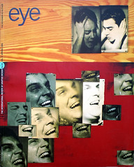
As designer, writer and educator, Jeffery Keedy is a committed proponent of postmodernism
Jeffery Keedy may be the first graphic designer to try to transform himself into a brand name. In the cantankerous guise of “Mr Keedy”, as he has signed himself on and off since the mid-1980s, the Los Angeles-based California Institute of the Arts instructor has earned a reputation as a pugnacious, entertaining and rarely less than controversial observer of the contemporary graphic design scene. Lately, Keedy has begun to travel outside the US, with thoughtful appearances at the Fuse conference in London and Berlin. In Europe, through, his is still probably best known for his Fuse magazine typeface LushUS – “more is not a bore” – and for Keedy sans, an increasingly popular post-modern chameleon that basks with equal assurance on the cover of a book about underground film or emblazoned across a billboard for Colgate toothpaste.
Mr Keedy is an educator with attitude, a critic of waspish insight, and an apologist for the uncertainties of post-modernism who publicly chastises the faint-hearted with unflagging conviction and zeal. Where most in his tenured position would proceed with some caution, Keedy has chosen time after time to “stick my neck out”, naming names, telling it like he sees it, and enraging the opposition. “This was the most immature and ridiculous article I have read by someone professing to be an academic,” was one reader’s response to a recent Keedy diatribe in Emigre on the subject of “Zombie Modernism”. But while this bullishness has, Keedy admits, entailed some personal costs, ultimately it seems to have worked both for him and for CalArts. The graphic design programme he developed with Lorraine Wild and Edward Fella and directed from 1991-95 is widely perceived as one of the most progressive and conceptually challenging in the US and for the students Keedy’s high profile helps to attract, he is a demanding and inspirational figure.
“My interest has been for designers to become authors,” says Keedy. And in essays such as “I like the vernacular…NOT!” and the public lectures which he insists on scripting as a mark of respect for the audience he has practised what he preaches. Anyone who has been on the receiving end of a Mr Keedy broadside – this office has been the target of several – quickly senses that he relishes the debates and clashes of opinion to an unusual degree. “I enjoy them a lot because that’s where you really learn,” he agrees. “You start to put your money where your mouth is. You really put to test what you are thinking. The reward is intellectual exercise, helping you think and figure things out.”
As a designer, though, Keedy, now 38, has a much less definite air. There is a disjointed character to his output that is probably to be expected in someone whose primary commitment is teaching. More surprising, perhaps, in a designer of declared authorial intention is that his work, though intellectually coherent, shows no unifying stylistic themes; unlike a Brody, Valicenti or Fella, you would not recognise a Keedy at a glance. It may be that he is a late developer, with his most significant design work still to come. Since 1989 he has been working towards the launch of his own type design company, Cipher, and he hopes finally to achieve this in April. “In the print world, in a lot of what I’ve done I have a bit more interest in the ideas and I knock things out,” he explains. “But with a typeface, once it’s out there it’s literally out there forever and I’m interested in showing that quality is part of the new work.”
WHAT DOES IT LOOK LIKE?
To understand the passion that informs Keedy’s position you have to go back to his time as an undergraduate, studying graphic design and photography at Western Michigan University. Afer the energy and invention of the 1960s, the following decade had witnessed “The Triumph of the Corporate Style” – as a Print magazine cover story dubbed it in 1980. Seventies design was highly professional, but slick, formulaic and empty. “It was the tail end of Modernism, when it was at its very worst,” remembers Keedy. “There was nothing left at that point.” The only interesting work was coming from new wavers such as April Greiman and Dan Friedman, whose innovations were vigorously opposed by the Modernists.
Advised by a New York head-hunter that he would never find a job with his new wave portfolio, Keedy nevertheless landed a position in 1981 designing advertising and promotions at CBS television in Boston. The following year he moved to Honolulu, where he designed corporate signing, logos and symbols for Clarence Lee Design and Associates. Keedy was rapidly coming to the conclusion that his future lay not in practice but in teaching. “I knew that something was wrong and I had a gut feeling that there was more to design than that – that it was more interesting somehow and more important.” In 1983 he started an MFA at Cranbroook Academy of Art, where he began for the first time to read theorists such as J. Christopher Jones, but above all Roland Barthes. “He brought low cultural critique into the self-referential high practice of literary criticism,” notes Keedy. “The reason I was particularly interested in Barthes – more than the other post-structuralists and deconstructionists – was because he was engaged in a pop culture critique, a critique of his own discipline, literature, and because he was a ‘formalist’.”
How Keedy’s emerging conception of design as cultural practice rather than problem-solving tool might be translated into practice itself was at this stage unclear. Confronted by course director Katherine McCoy’s inevitable question “What does it look like?” he could only answer that these ideas were intended to generate a new kind of thought process; there was no one-to-one correlation with visual form. Some of the eventual consequences of this theoretical reading (fragmentation, layering, degenerative imagery, anti-mastery) are already apparent in a poster Keedy designed for Cranbrook’s fibre studies programme, which caused some consternation in the design department. Dozens of tiny student sketchbook drawings and notations are distributed across the surface in a graphically even weave to form a metaphor of creative process which has none of the clear, hierarchical organisation usually expected of a poster. It is a design that makes considerably more sense now, in the light of what followed, than it could have made at the time.
After Cranbrook, Keedy moved to Los Angeles, encouraged by the offer of a part-time teaching job at CalArts. He had never been to the city before and it seemed to offer unlimited possibilities. In the late 1980s he worked for cultural institutions such as the Museum of Contemporary Art and the San Francisco Artspace and for two years designed a series of calendars for Los Angeles Contemporary Exhibitions (LACE) in which he introduced early versions of his own typefaces. Drawing on chaos theory – fashionable at the time – they represent his most extreme explorations of the “anti-aesthetic”.
Keedy’s growing reputation for working with experimental artists culminated in the Helter Skelter: L.A. Art in the 1990s catalogue (1992), where he was an “equal partner” with curator Paul Schimmel and editor Catherine Gudis. His first intervention was to challenge conventional catalogue structure and emphasise the book’s status as an anthology of art and creative writing by replacing the contents page with a seven-page contributors section that mixed artists, writers and essayists together. Keedy proposed augmenting the art’s alarming mood of impending social breakdown and urban apocalypse by using the Macintosh to cut into the text columns with smooth “razor” slashes and irregular tears.
“When the editor first saw them she was dumbfounded,” he recalls. “She thought it was a computer error. When she realised it was intentional she was mortified.” In the end Keedy was allowed just a handful of the less destructive incisions in the book’s introductory texts, though the effect – in the setting – was startling enough. “It looks tame by today’s standards,” he concedes. “But not in the context of ‘serious’ art catalogues.”
Once again, Keedy used two of his own typefaces. Hard Times, representing the writers, had previously featured in the Californian art magazine Shift and in the 91/93 CalArts catalogue; Skelter, representing the artists and critics – an “angst-ridden retro-fit” – was designed specially for the book. They combine most powerfully in the titlepiece, where “Skelter” is fractured across three lines. (Both typefaces were later licensed to Condé Nast’s Details magazine.)
Keedy’s method as a type designer, he told his Berlin Fuse audience, is to have two or three contradictory ideas operating in each typeface because the resulting complexity and ambiguity give the typographer a greater potential range of expression. “In Hard Times,” he explained, “the old jagged irregularity [of Times Roman] is juxtaposed with the new smooth ovals and the sloping ‘e’-bar, oblique serifs, opened counters and other details.” Skelter’s large x-height, on the other hand, gives it a “cartoony and cute aspect” that can be either cheerful or sinister depending on how it is used.
The current vogue for Keedy Sans, released by Emigre Fonts in 1991, suggests that popular taste is now catching up with his double-codings. At first, Keedy recalls, the face just looked “illegible and weird” (it was also, perhaps, slightly too strongly identified with Emigre itself). “Most typefaces are logically systematic,” he says. “If you see a few letters you can pretty much guess what the rest of the font will look like. I wanted a typeface that would wilfully contradict those expectations. It was a typically post-modern strategy for a work to call attention to the flaws and artifice of its own construction.” Four years on, the face’s open-endedness can signify the technological avant-garde in the pages of the Cyborg Handbook, or mass-audience popular culture, announcing the evening’s attractions on London Weekend Television. Where it functions less successfully – see, for instance, a recent use across Elvis\' face for a B&W loudspeakers ad in Arena – is a middlebrow signifier of “contemporary style”.
But to use Keedy Sans in this way is to miss the point. Keedy intends to the Cipher typefaces – Hard Times, Hard Line, Skelter, Jot, Manu Sans and others in preparation – to act as catalysts for a new kind of design. Planning, increasingly, to be his own client, he sees his role as a typeface publisher as that of both author-by-proxy and “enabler”, “We’re at a critical point with the millennium where no one seems to know what to do,” he explains. “In the post-modern sense everything is now possible. There’s the new technology and there’s a lot of confusion and directionlessness. What I want to do with Cipher is to make a pretty specific statement and to provide a set of directions. I like to see the typefaces as a set of opportunities – new tools that have inherent within them a set of ideas and options that people can act on.”
TRADITIONALIST AT HEART
While Keedy has shown an exceptional commitment to new work and new ideas in graphic design, the larger purpose of his critique is less certain than his plain-speaking might lead one to expect. Despite his repeated plea for a cultural criticism of design’s role in production and consumption that would (presumably) link what designers do and how they think about their practice to its consequences in the world, his own published commentary is on the whole centred self-referentially on design as a goal in itself. “It has never been my ambition to ‘change the world’ with design,” Keedy wrote in a “Designer’s Statement” in 1995. “Even the modest and vague ambition ‘to make the world a better place’ is too naïve, and difficult to qualify or quantify. My only hope is that my design be a rumination of life in all of its complexity and contradictions, and that it exists in the world with vitality.”
Pressed to explain this laissez-faire credo, Keedy seems to backtrack slightly. He says that design as a total practice is “affirmative” and that by making things work better and look more aesthetically pleasing, “it can’t help but make the world a better place”. At the same time, he points out, there is nothing inherently liberal about graphic design: it can be used to affirm any kind of agenda, even the most dangerous. It seems reasonable at this point to ask Keedy about his own politics, especially since he claims in “Zombie Modernism” (Emigre no. 34) to detect a similarity of rhetoric between supposedly Modernist design critics and figures of the American far right such as Newt Gingrich and radio commentator Rush Limbaugh. The implication of this strange equation is that aesthetic radicals such as Keedy must necessarily adhere to a liberal agenda.
But Keedy, usually so loquacious, declines to answer. “I don’t know if that’s interesting for graphic designers, or if that’s an important part of it. Probably not. In fact, that’s the problem I had with ‘Zombie Modernism’. The minute I barely mentioned politics, everyone focuses on that and it goes way off in left-field. Who cares what my political views are? I don’t think I’m politically that savvy. I do think I am savvy about design, so people should care about my views on that. “Fair enough. Except that if, as Keedy once suggested to me, deconstruction’s lesson is that those who are engaged in cultural production and criticism are also engaged in the “politics of power” –manifested in form and style – then it is not at all clear how one could engage meaningfully in such a criticism without being willing to make one’s political assumptions explicit.
What it is easy to miss about Keedy is the degree to which the public post-modernist nurtures what he himself calls “traditional values” at heart. One of his complaints about Modernists is precisely that it sought to put and end to tradition. Keedy wants Cipher to show that the new design is just as committed to the idea of quality as the old. Asked to define what this quality is and how we will recognise it, he gives the oldest answer in the book. “Your experience tells you. If you’ve seen 10,000 typefaces and studied typography for several years, that will help you decide. The only thing you have to go on in that respect is experience. You can’t have an overriding theoretical idea. Maybe you could use that at some point, but you can’t rely on it.”
Keedy likes to think of Cipher as an operation on the lines of the traditional American “mom and pop shop”. It will be garage-sized company, with an international dimension, much of its distribution, at least in the US, being accomplished through the Internet. Keedy identifies with the American type design lineage of Goudy, Dwiggins and Cooper and, like his literate forebears, he will continue to publish as well as design. “My writing is on a very specific trajectory,” he reveals, explaining that little by little the essays are building into a book. And the next contentious instalment? “I may even talk about the problems of post-modernism,” says Keedy with more than a hint of irony.
First published in Eye no. 20 vol. 5 1996
Eye is the world’s most beautiful and collectable graphic design journal, published quarterly for professional designers, students and anyone interested in critical, informed writing about graphic design and visual culture. It is available from all good design bookshops and online at the Eye shop, where you can buy subscriptions and single issues.