
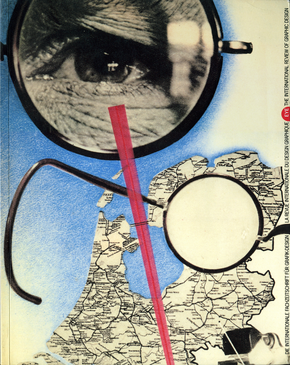
Autumn 1990
Reputations: Bruno Monguzzi
In the first of Eye’s interviews with designers of renown, we talk to the Swiss typographer about perception, perfection and the pitfalls of style
Bruno Monguzzi was born in Tessin, Switzerland, in 1941. He studied in Geneva and London from 1956 to 1961, before joining Studio Boggeri in Milan, where he worked from 1961 to 1963. Since then he has combined commissions for graphic, editorial and exhibition design with teaching positions in Venice, Lugano and New York. In 1971, Monguzzi received the Bodoni prize for his contribution to Italian graphic design and he became a member of the Alliance Graphique Internationale in 1979. He lives in Meride, Switzerland, travelling to Milan to work as art consultant for Abitare magazine. A typographer of the most exacting precision, Monguzzi has developed a graphic language untouched by the passing whims of fashion.
Valentina Boffa: Your childhood seems to have been a struggle for perfection, influenced on the one hand by your Catholic mother and on the other by your Marxist father, a craftsman. Later you went to work with Antonio Boggeri in Milan and learned from him that perfection is never enough. Tell me about your educational journey from the time you left Switzerland to the time you returned.
Bruno Monguzzi: I went to school, got a proper craftsman’s training, was confronted with different private gospels, and found out at my expense that a graphic design course, even in Switzerland, had little to do with communication. My ‘whys’ were not getting enough proper answers and for a kid looking for a universal language this became too frustrating. I left for London where I selected a few courses: Romek Marber’s at St Martin’s, Dennis Bailey’s at Central, photography at the London School of Printing. Thanks to Ken Briggs, whom I had also met at St Martin’s and who tried to answer my many questions, I discovered Gestalt psychology and became very involved in the study of visual perception. It is at that point, in 1961, that I started to believe in graphic design as a problem-solving profession rather than a problem-making one and that I slowly began to push away my hidden dream to became another Werner Bischof. It was also at the time that I began to understand and to love the American school: Gene Federico, Herb Lubalin, Lou Dorfsman, Lou Danziger, Charles and Ray Eames.
VB: How did your study in psychology and perception influence your approach to graphic design?
BM: The study of perception provided the key to a less subjective reading of my own work. Most of what we get from looking at our own projects is in our mind to start with, not on the paper itself. The study of perception enabled me to construct a more objective, natural, direct view of communication – more objective because it is built up according to laws of perception that you can share without being a designer.
VB: What made you go to Milan?
BM: In the second issue of Neue Grafik I discovered the Milanese pioneers – Studio Boggeri, Max Huber, Franco Grignani – and I decided to fly to Milan to meet Antonio Boggeri. I still remember the tiny elevator of 3 Piazza Duse. On the slow, shaky journey up to the sixth floor I felt uneasy. And I felt uneasy for the following two years, having fallen in love with the man, his ideas, the designs of Aldo Calabresi and the office with the balcony overlooking the Giardini. After a few weeks of desperate struggle to be good enough to stay there, I was called for. Lifting his lean, long hands – the most beautiful hands I have ever seen – Boggeri shared with me his theory about the spider’s web. Like the spider’s web, he said, Swiss graphic design was perfect, but often of a useless perfection. The web, he stated, was only useful when harmed by the entangled fly. It was then that my vocabulary began to increase. And it was then that my use of type and pictures began to grow towards more expressive solutions.
VB: You always seem to pursue a strong integration between words and images. How do you decide when pictures follow words and when words come second?
BM: When the results of the competition to design the poster for the opening of the new Musee d’Orsay proved to be a failure I was called to Paris. Most projects were showing works of art, or details from works of art. Others were showing the building, or details from the building. The director did not want to see the building. The chief curator did not want to see works of art. So, from a ‘picture followed by words’ poster, we arrived at a ‘words followed by no picture’ concept. The logo and date were all that was needed.
It seemed to be the perfect brief, but after I had played around with these elements for quite some time I realised that a metaphor was missing. I walked over to my bookcase, picked out a book on Lartigue, slowly turned the pages, and when I came to an image of a plane taking off I knew this was the answer.
VB: But how did you arrive at such a shocking use of the Musee d’Orsay ‘M’O’ logo? I know that the poster was four metres wide.
BM: I think that having designed the logo myself, it was probably easier for me to accept it fully and to use it with the right emphasis. As for the cropping, the possibility of using it in fragments was established from the start. I had already used it with a similar trimming in the C6/5 envelope and on the cards.
VB: And what about cases where the words come second to the image?
BM: Heinz Bütler, the Swiss film-maker, asked for the titles and poster for a documentary he had filmed in a Jewish home for the elderly outside Vienna. The title of the film, Was geht mich der Fruhling an … (‘What has Spring got to do with me …’) was taken from a conversation between Bütler and one of the residents, Frau Azderbal. I asked for pictures taken of her during the shooting of the film, and since no close-ups were available, I blew up a small portion of the negative and began to work on the framing of her face. I now had the portrait, but not the poster. What I needed was an image that could tell the story – a picture with the strength of a symbol. I went back to the darkroom, exposed the strong face, laid a narrow strip of cardboard between two film boxes and exposed again without the negative. The diagonal strip of light crossing her face was now telling the story. The words could follow.
VB: In your book designs – for instance in the Mayakovsky catalogue – you seem to visualise the development of the design from page to page in almost cinematic terms. How did you develop this approach: was it by studying the language of film?
BM: A book is a sequence of pages. I never consider a page or a double-page spread as an event in itself, but as part of a discourse. The problem is to solve all the connections that the image is going to build with the previous, following and contiguous images. Studying the language of film has been fundamental. But the book that definitely marked my education is John Szarkowski’s The Photographer’s Eye, published by the Museum of Modern Art, New York, in the 1960s. I still use it with my students to demonstrate how images can interact.
VB: Was working for cultural institutions and education an ethical choice?
BM: I remember in a previous interview talking of ourselves as translators, as actors. There are naturally roles that I am not able to play, and there are plays that I am not willing to interpret.
VB: Do good projects need good clients?
BM: I would prefer to put it the other way around. A good client deserves a good project. But we come to the same point. The point is that our work has to have our client’s face. After the 1980 Irpinian earthquake I was asked by Milan City Council to design overnight a poster to announce the aid policy of the city and to provoke the necessary spontaneous help. I fully agreed that the poster should be strictly typographical and I was left with a poem written by Franco Fortini that same afternoon and a rough of the copy to flank the poem. Before leaving I went upstairs to say hello to a friend who had just arrived from Hamburg and saw a German newspaper he had picked up on the plane with a striking photograph of two mourners. I borrowed the paper and drove back to Switzerland. By the time I got home I knew I was in trouble. The picture was stronger than the poem. I recropped the photograph slightly, blew it up and made a half-size mock-up.
VB: How did you expect the council members to react?
BM: Since all the Milan districts were involved, the presentations concerned over twenty people, all but one unknown to me. How they would react was totally unpredictable, but what I did know is that I had disobeyed the brief. They were expecting a plain black and white diptych and I was bringing a single poster with a subtle grey overlay. They had asked for a typographical solution with a huge poem on the right, but they were confronted with a photographic blow-up and a subdued poem, which I had cut, on the left.
They were all seated round a long table, silent and looking very serious. I was holding the project and saying nothing. Finally someone close enough for me to hear whispered, ‘It’s moving,’ and someone else replied: ‘It reminds me of the Masaccios in the Brancacci Chapel.’ No one realised that the ending of the poem was missing and this proved my argument that it was unnecessary. A worried man walked over with papers in his hands, apologising because the copy in the meantime had grown longer. He was very concerned that this might affect ‘the perfection of the construction’. They were all, except for one, politicians. And surprising as it may seem, they truly deserved their Masaccio.
VB: Since you mention the ‘perfection of the construction’, let’s return to the methods and aims of Swiss typography. April Greiman in the United States and 8vo in Britain – to name only two of the most striking examples – have been decisively influenced by their studies in Switzerland. Do you think the country is still important in the teaching of graphic design?
BM: I would not say that the situation is radically different from the time when April Greiman was at Basle [in 1970-71]. April is intelligent and sensitive and was able to enrich and, to some extent, adapt the vocabulary she had learned from Wolfgang Weingart. This is not always the case and too many students go home from Switzerland having married a style rather than a problem-solving attitude.
VB: Contemporary postmodern graphic design has a density, complexity and confusion which is very different from the clarity of your own work. Are the more experimental graphic designers now behaving too much as though they were expressive artists rather than communicators?
BM: I think the problem is still that graphic design schools seem to be more involved with building or destroying formal dogmas, or aesthetic values, than with content; with the look rather than with the meaning; with the layout rather than with the message. But I doubt that the goal of the ‘more experimental graphic designers’, as you call them, is to communicate with my mother.
VB: Computer systems such as the Macintosh are already having a huge impact on the way that graphic designers are working and thinking. What are your views on these developments?
BM: I do not believe that the use of the computer has really changed the thinking of most graphic designers. Unfortunately, the sclerosis of thinking has increased due to the enormous facility and versatility of the machine, which is, of course, only as intelligent as the person sitting in front of it. Education now has to face an even greater challenge. The machine is fantastic, but not all of the typefaces or programs are as good. The designer has to catch up with the engineer.
VB: Recently you wrote: ‘I persist in believing in education and I amuse myself, as an amateur, with perpetuating those languages which the system of fashion wipes away.’ Given your commitment to education, why did you turn down the opportunity in 1989 to take over Alvin Eisenman’s position at Yale?
BM: There is certainly a selfish reason. The idea of moving permanently to the US doesn’t attract me any more. But there is also another reason. I think each culture has to build its own language. Although visual language is somewhat universal, there are peculiarities that enrich and qualify the language itself. I do not think, for example, that using Akzidenz-Grotesk for the New York subway was such a big conquest. Franklin Gothic could have done the job.
Superficial and stylish graphic designers tend to reduce their syntax to a temporary gospel and spread it everywhere on everything. Good design solutions, however, are probably timeless.
First published in Eye no. 1 vol. 1, 1990
Eye is the world’s most beautiful and collectable graphic design journal, published for professional designers, students and anyone interested in critical, informed writing about graphic design and visual culture. It is available from all good design bookshops and online at the Eye shop, where you can buy subscriptions and single issues.