
Summer 2009
Reputations: Marian Bantjes

‘I’ve come close to working with a couple of agencies for very big brands, but either the money isn’t there or the agency just has a stupid idea that I’m not interested in working on. Like they want type with a bunch of bullshit curlicues coming off it. Yawn. Go away.’
Nobody would describe Canadian illustrator-designer Marian Bantjes as an overnight success, but her career trajectory over the past five or so years has been positively meteoric compared to her first twenty years of professional practice. Bantjes has achieved international prominence as an individual with a recognisable personal signature that shines through all her work, from intensely commercial work for brands anxious to capture the decorative Zeitgeist, to equally intense personal gestures; from collaborations (with Stefan Sagmeister, Pentagram and other celebrated designers) to commissions for magazine and time-consuming pro bono projects.
Marian Bantjes was born in 1963, and grew up in Saskatchewan. She dropped out of art school after a year and in 1983 ‘fell in’ to a job with book publisher Hartley & Marks, where she did general jobs and helped with paste-up at its typesetting sibling, TypeWorks. An aptitude for computer typesetting (on XyWrite) slowly developed into an understanding of typography and design. In 1994, she co-founded Digitopolis in Vancouver, and the design practice grew quickly, producing mainly print-based work. But after eight or so years of this, Bantjes dropped out once more. Her partner bought her out, while retaining her on contract for a further year.
In July 2003, Bantjes struck out on her own, moving to an isolated property on Bowen Island, in Howe Sound off Vancouver. Such a radical change of practice and lifestyle had a cost: after surviving for a year on savings Bantjes was obliged to take out a loan. She sent out posters to editors, writers, designers, potential clients, collaborators and cheerleaders, and spent time on the Speak Up blog (underconsideration.com), where she was made an Author in November 2003.
Eventually, the first paid commissions trickled in. She describes her self-promotional Poster #1 as the turning point, both aesthetically, because it encapsulated the direction she wanted to go in, and in terms of recognition: it caught the attention of designers and art directors (see a detail of it on the back cover of Eye no. 58 vol. 15, Winter 2005).
Since that time she has made work for clients such as Saks Fifth Avenue, Wired, The New York Times, Wallpaper*, Seed, FontShop, Houghton-Mifflin, Knopf Books, Young & Rubicam / Chicago, and in collaboration with designers and art directors such as Sagmeister Inc, Michael Bierut / Pentagram, Winterhouse, Bruce Mau Design and Rick Valicenti. She has also designed a typeface, Restraint, which won a Type Directors’ Club award in 2008, and not-for-profit projects including posters for the educational charity Design Ignites Change. You can read ‘Surface to space’, her feature article about origami, in Eye no. 67 vol. 17.
She is currently taking a year away from commissioned work to complete a book of illuminated essays for Thames & Hudson. Several of her pieces are part of the permanent collection of the Cooper-Hewitt National Design Museum (Smithsonian), New York, and she became a member of the AGI (Alliance Graphique Internationale) in September 2008.
John L. Walters: What’s your earliest graphic memory?
Marian Bantjes: I can remember scribbling on walls … probably when I was two or three. I remember a book with little drawings in the margins, one of which was of some beetles (and this is how I imagined The Beatles, as a band of beetles like the drawings in the book). When my mother died, I reclaimed a package of old drawings and writings, and was overjoyed to see them again.
JLW: When did you first start to make stuff, and when did it occur to you that you could do it as a grown-up?
MB: I’ve drawn for as long as I can remember, and written as long as I could write. My mother was very good at encouraging us to be creative – her favourite thing to do with kids was provide a big roll of paper and some pens / crayons / paints /whatever. We also made a lot of things: out of papier mache, clay, toothpicks and – my favourite – cardboard boxes. Mum really frowned on anything that was a kit or had a prescribed outcome.
I went to art school for a year before dropping out. I did for a while think I could be a “commercial artist” (I’d never heard of a “graphic designer”) though my concept of what that was, was vague – except that it involved earning a living, and was less prestigious. At some point I gave up on this idea of being an Artist. Then I fell into typesetting and my path was laid.
JLW: How did you learn about typography?
MB: At the publisher Hartley & Marks, I helped out with paste-up and they trained me on XyWrite, a word-processing program that was a lot like HTML. I learned typesetting as a set of rules. First I was recreating a pencil-drawn, marked-up layout from the designer, so what I made had to be what was specified; then there were basic rules about typography (how you treat small caps, how you kern, etc.). Then I learned about margins and gutters and balancing pages and avoiding widows and orphans …
My job was to get it right, and I enjoyed this immensely. This is rare now. Most designers leave the “tedious details” to juniors. If my career falls apart, I would love to work as a typesetter again for some really good designer. It’s very satisfying. When I taught introductory typography, this is how I taught: right and wrong.
But I was largely clueless about design, designers, history, theory, all of that. Then in 2004 I was asked to teach a class in typography. I felt it was important to teach it from a historical perspective. I had two weeks to prepare, so I was learning and preparing my notes all at the same time, trying to stay ahead. And some of it I did know. I’d heard these names, I had some sense of the age of various typefaces, but it had been like having half a puzzle, and all the other pieces just fell into place.
However I do like to tell people that I learned from the best – Robert Bringhurst. I typeset at least one of his poetry books, and I worked on promotions for The Elements of Typographic Style. Robert’s mark-up was impeccable, and one of my proudest moments was setting one of his tumble-of-letters pieces, which I was doing “blind” (in XyWrite) and getting it almost perfect on the first setting. He was very impressed. Though, to be fair, I really learned most of what I know about typography from Vic Marks.
JLW: When did you become seriously interested in graphic design?
MB: I think it must have been around the rise of desktop publishing. Also when I became a designer, and I started to need to explain my decisions to clients, I took a lot more notice of what those decisions were and why.
JLW: And when did you become aware of other designers?
MB: I was aware of who else was in Vancouver, and some awareness of the Americans as well, but only the biggest names. When I was learning the history of typography for my class, that helped a lot; being on Speak Up helped a huge amount, because I had to find out who I was talking to; and when I started researching designers I wanted to work with, that was another step as well. At Digitopolis, I had this incredibly distorted view of the “hierarchy” of design – I felt I was about three or four from the top of the Vancouver scene, and I thought there were only a few more steps to the very top of all design in the whole world. The more I learned, the more insignificant I got.
JLW: So how did you move into running your own company, Digitopolis, and was it fun / difficult / interesting / stressful / fulfilling?
MB: Oh, it was all of the above.
Basically, I had a major falling-out with my boss at Hartley & Marks. My typographic skills were exceptional but I had obvious gaps (like never having worked in colour, or with images, or having any idea of the printing process) when I went to look for work. An editor friend suggested we start a design business. We got lucky with a couple of big clients and the first two years were crazy. I was the designer, and my learning curve was through the roof. There was crying, there was elation, there was fear, but mostly a lot of fun – everything was a first.
Then we grew bigger and it became a kind of machine. Computers, offices, employees, clients, more, more, more … and the work was no longer this adventure, it was just work that never ended. I had ideas to do work like I hadn’t seen before (mainly in the vein of what I’m doing now). I’d make these elaborate things, and people loved them but, as my business partner put it to me, “This is all very nice, but nobody wants it.”
JLW: When did you decide to make the break?
MB: I started to have serious trouble with my business partner. We had been very good friends, then only friends, then only partners. I was trying to think of a way of tricking her into buying me out when she offered to! By the time I left, I hated design. I envisioned myself as an illustrator, but it was vague. All I knew was that I had been playing around with ornamental work for five or six years, and I was starting to see hints of it around in design. I knew if I didn’t do it then, I’d end up in the wake of a wave.
JLW: So when you moved to contract work with Digitopolis, did that free up lots of time for your new direction?
MB: No. I have always had difficulty working at a mind-numbing job and finding the energy for true creativity at the same time. It wasn’t until my contract was up that everything just magically burst forth all at once. The fancy vector art in particular… I don’t know where that came from.
JLW: Was Poster # 1 the first serious result of this outpouring?
MB: Yes. It was the “aha” moment for the direction I wanted to go. It was pretty, but also a little edgy and a little weird, which kept it from being too girly. I still like it, six years later.
JLW: Any other major life changes at this time?
MB: Yes and no. I experienced a bona fide midlife crisis: I turned 40 in 2003, and really questioned the direction and meaning of my life. I moved out of Vancouver the same year. My mother became mentally lost to us in early 2005, and died at the end of 2006. I split up with my boyfriend of twelve years in 2007. But professionally I was happier (and, eventually, more successful) than I had ever been. Through Speak Up, I got a whole new set of friends, and the centre of my life shifted from Canada to the United States.
JLW: Was blogging a way of getting involved in the wider world of design? Did it make up for the isolation of working on your own?
MB: In 2003 I started spending a lot of time on Speak Up and was made an Author in November. It was a big surprise, as I thought I hated graphic design. Speak Up taught me that I was passionate about it, and knew a lot.
And yes, this was my social life. My two best friends in the world are Gillian Muir (not in design) who I’ve known since I was three, and Debbie Millman, who I met on Speak Up. It was a really big deal for me socially and professionally.
JLW: So, after you left Digitopolis did you just work at the new, ornamental stuff, and nothing else?
MB: I was sending out packages of this ornamental stuff I was making, but I was getting very little response. But after Poster #1 (2003, see back cover of Eye 58), I started to get notice, and a lot of praise. I lived on praise for over a year because I earned absolutely nothing until late 2004. I had money from the buyout and then I borrowed K and made it through until I started getting paying gigs.
I applied for a couple of jobs, but deliberately blew one interview when it became obvious they wanted to hire me. When I started teaching, I enjoyed it so much I thought maybe that’s what I should do for a living, and then just make stuff, like Ed Fella. It wasn’t until the end of 2005 that I realised I was actually making a living doing what I wanted to do.
JLW: How did you go about promoting your work, and seeking clients and collaborators?
MB: Well, I was sending things (prints, posters) out about four times a year, but without much response. I sent stuff to Paula Scher: no reply (she later read me on Speak Up, then went to see my work on my website). I had sent stuff to Adams Morioka, but it wasn’t until I met Noreen Morioka at a conference and gave her Poster #1 that she paid any attention to me. I did receive a kind response from Rudy VanderLans. But the response rate from the mailouts was poor.
However, I did do unpaid pieces for art and indie-design magazines, and when I started getting work (Details, Wired…) I started to get fan mail from big and small designers alike. People were reading me on Speak Up, and then they put it together with the mailings. Then I met Stefan Sagmeister and we hit it off, and a year later he hired me to do this piece for the Deutsche Guggenheim. I contributed to some of Rick Valicenti’s projects, and I think that helped. I met Michael Bierut on Speak Up, too.
JLW: Did people “get it”?
MB: I’m still not sure anyone really gets it. I’m only starting to understand what I’m doing myself. What people see in my work is one of the great mysteries to me. I know there’s a huge number of people who just see swirlies – I spit on them!
The majority of the Canadian design establishment doesn’t get it at all. I’m terrified of the hordes (of mostly young women) who love unicorns and fairies and hearts and … my work. But there are designers who embrace me and the work completely. For this reason I was overjoyed to be made a member of the Alliance Graphique Internationale [AGI] last year. This was a huge validation to me that there is something to “get” in my work. And my big “fuck you” to the Canadians.
JLW: Which projects have stretched you the most?
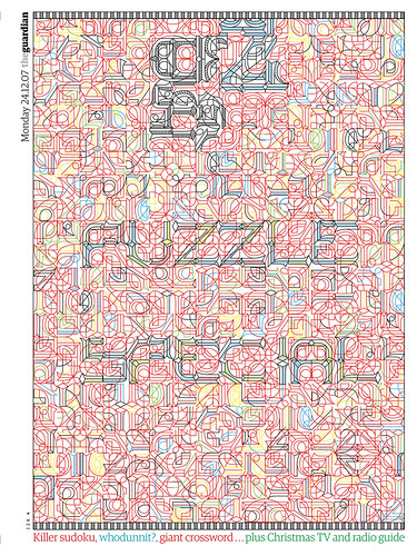
MB: Hmm … well, the Monograph (“Love Stories”) I did for Creative Review was a stretch … I completely underestimated how mentally exhausting the process would be, as well as physically (there were times my drawing hand was hurting so much I wondered if I would be able to finish). Anything that uses a system of parts pushes me mentally: the G2 Puzzle Special cover [The Guardian, 2007] is a very complex little system.
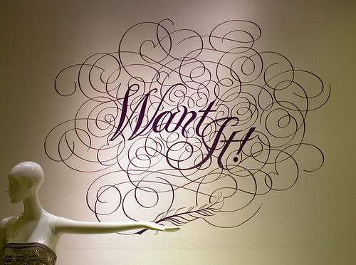
The Saks Fifth Avenue “Want It!” items with the words which look like the things that they are, was very difficult. The one that I pushed myself on the most was the TypeCon 2007 poster, which was just ridiculously difficult.
JLW: Which projects were the most fun?
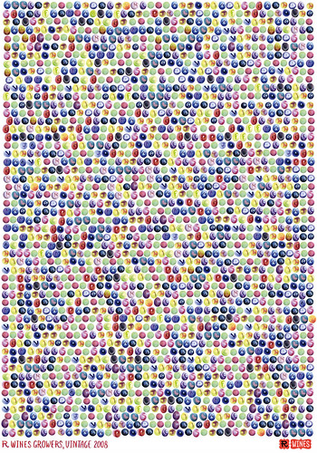
MB: Usually the most challenging are the most fun. But we can certainly add to this the sugar pieces I did for Stefan Sagmeister, an adventure in a medium that was just piles of fun to work with. And the Graphex 06 poster, and also the Grapes poster for R Wines / The Grateful Palate – it seems I enjoy painstakingly placing hundreds of objects in Photoshop! And anything done in ballpoint pen is fun. Actually, most things done by hand: pen and ink, pencil, painting – this is when I’m happiest.
JLW: And the ones that got away?
MB: MoMA [the Museum of Modern Art, New York] asked me to do an invitation for its 2009 “Party in the Garden”, something festive and spring-like. I came up with a rather nice design that included gardeny shapes and drinky shapes but in a sort of semi-abstract way, and could be altered from year to year, to get a different look with the same design. They loved it! Then, at the last minute, someone higher up in the museum asked for something “edgy” and hired Ed Ruscha to do it. (He made something out of fake grass.)
I was upset partly because of the old bait and switch; and if I’d been asked to do edgy, I easily could have; plus I wasn’t paid much and you can bet Ruscha doesn’t go for cheap; but mostly because I love his work! He’s my hero! It was just too heartbreaking. Not that what I did was a work of staggering genius or anything, but neither was his.
JLW: With a commercial client such as Saks, did you get the sense that the stakes were higher?
MB: Only a tiny bit. Yes, it was a big deal: big company, big money (for me), plus a relationship via Michael Bierut at Pentagram and I always want to do good work for him. On the other hand, the size of the job or client doesn’t usually limit the effort I will make or the time I will spend. I will often spend more time and energy on smaller jobs or pro bono work. What I’m motivated by is being interested. I work worst with a lot of art direction. And I also respond very well to praise.
However, I will not do pro bono or cheap work for big, rich clients in exchange for freedom and “exposure”. I love working for Saks because they pay me well, they respect my work, and [art director] Terron Schaefer praises the everloving shit out of me. We have trust. Same with Michael Bierut, and Richard Turley at The Guardian and Scott Dadich at Wired. It’s always about relationships.
JLW: How do you charge clients for your work? Do you do the negotiating yourself?
MB: People often ask me for a quote, and I tell them: “Pay me as much money as you possibly can.”
I think that’s fair. I hate it when you have to do this fucking dance where they say they don’t know the budget, so I come up with some number and then they say they don’t have that much, so I say forget it, and then they say, well maybe they do have that much. That’s bullshit. If they want something really great from me, dig to the bottom of the money barrel, give me the number that hurts, but is still doable, be nice to me, trust me, and I’ll be nice back, and we’ll have a great relationship and do some great work.
I have had very little work with big brands. Saks is really the biggest. I’ve come close to working with a couple of agencies for very big brands, but either the money isn’t there or more often than not the agency just has a stupid idea that I’m not interested in working on. Like they want type with a bunch of bullshit curlicues coming off it. Yawn. Go away.
JLW: So you turn work down?
MB: A couple of times I have had to, because the copy was so bad: a very good agency came to me with a brand I consume and like, but their copy was so corny … I sat there and looked at it, and felt dead. I knew I couldn’t work with these words, but I didn’t know what to do. Finally I wrote back and said, “I’m really sorry, you will probably hate me, but this is the lamest copy I’ve ever read. The only thing that would work for this is if you put this in a speech bubble coming out of the mouth of a cartoon cow.” They were very good about it, and they are still speaking to me, so far.
But I do wonder a little. I look around and there’s all these illustrators and small studios working with really big names, and I feel a little left out. Maybe they’re being hired by agencies, or maybe they work for cheap, or maybe they’re just better than I am. On the other hand, I have to be careful what I wish for, because I am picky, and I’m feeling pickier every day. I don’t want to promote rampant consumerism, I don’t want to promote throwaway gadgets and this increasingly disposable society. And while I would love to get that one big advertising gig that would pay off my mortgage, my window for that may have closed. The ad agencies don’t really get me, and I’m not sure this big work comes without them. But I wish Coca-Cola would contact me because I could fix their entire global marketing with one lengthy letter, and it wouldn’t even involve an iota of my own artwork. (Did I mention I’m a know-it-all?)
JLW: In Eye no. 58 vol 15 (2005) we quote you on the possibility of reconciling ornament with Modernism: “Rationality and emotionality can live together…” How far have you got with this particularly hot potato?
MB: Not too far, but I’m hoping some of it will turn up in my (admittedly baroque) book. I did do this piece for the PopTech conference, which is sort of Mondrian meets the Arabian Nights. And the Grape poster is kind of Modernist, don’t you think? Even the Design Ignites Change poster has this play between these blocky, linear forms and again a decidedly Arabic look.
JLW: Is there a technique, or process, or sequence of tasks that has become the Bantjes way?
MB: I am good at drawing vector curves but I think best in pencil. And I found a nice contrast between the mechanical and the organic. For most work, I envision what I want to do, then start drawing it. I often start on graph paper, which helps keep the structure… I never doodle, and I never sketch multiples of ideas. I draw one single thing that represents what’s inside my head.
So I have a sketch, and if it’s really messy or needs more work, I’ll probably take it to tracing paper and work it up again until it’s right. I might then scan this and if it’s ready to go into vector art, I’ll just trace it, bezier curve by bezier curve, in Illustrator. In this sense the computer is just a finishing tool.
But the sketch may not end up in Illustrator. If it’s going to be in pen and ink, or pencil, or ballpoint pen, or watercolour, it’ll end up on the light table, under a good sheet of watercolour paper. If it’s going to be a pattern, then there is a potentially long back-and-forth process between scanning, arranging in Photoshop, printing, adjusting by more sketching, etc. before it goes wherever it’s going to go for a final version.
Sometimes now I work with objects (sand, sugar, petals, etc.), and these are usually free-form, without sketches.
JLW: Is there an ideal project or client or collaborator (in your mind) that will bring out the best in you?
MB: My standard answer is “architecture”, but lately I really want to work in the promotion of science. I’m a fan of the atheist movement, and I’d like to do something to help, which can be done through science and graphics (as well as building communities, which is very important, because what people really want is to belong). The problem with science is that very little attempt has been made to make it appealing and accessible. I could go on, but let’s just say, “Richard Dawkins, call me.”
I did some patterns for the fabric manufacturers Maharam, and I’d like to do more, provided it’s unpredictable. I did a scarf design for the New York designer Bruno Grizzo that was never made. I think it would have been a beautiful scarf. I’d love to work with a fashion designer but I want more than just slapping graphics on something. I have some brilliant ideas for plates…
And I don’t get enough actual design (my own damned fault for not being a designer any more). But I really do love to handle information. I want more posters, and maybe some books, certainly a magazine – I’d love to design a magazine, perhaps in collaboration with someone else.
JLW: How important is it for you to make material artefacts?
MB: There are things that can only be fully appreciated ‘in person’. The Design Matters Live poster was one, as was the GDC AR and the Design Ignites Change poster. A lot of my work begins and ends as a digital piece, and whether seen in its original context, on the Web, or in a book or a magazine, it makes no real difference. But I welcome the opportunities to make something that is different when you hold it in your hands.
I confess I do now aspire to be collected in museums. And I want it to be a special pleasure to see the piece in person. I have had many a transformative experience with art this way. You see the real thing and you say “Oh! I get it, now.” Or you completely change your mind about the artist! And I want that.
On the other hand, I like working in design and the public realm because I can send my work out to such a wide audience and they can enjoy it for free – but I think it’s nice to have something holding back for that moment when you see the real thing. For this reason, I love making an original: a complete piece that’s done by hand on good paper. You’ve no idea how nice the pen and ink pieces are until you’ve run your hand across one and felt the lines. This is why we love letterpress and embossing so much, because it goes beyond the flat visual. You touch it, you look at it up close, you smell it.
JLW: What difference does it make doing something virtual (like placing grapes in Photoshop?) or physical (pen on paper)?
MB: I much prefer working by hand. It’s more relaxing and ultimately more rewarding. Digital things never seem “real” to me.
JLW: You said there was something quite different about words written online and words in print. Is this issue behind your decision to spend a year of your life making a book?
MB: Well, to answer the second half first, the book came about because Thames & Hudson approached me to do a monograph. I proposed instead an illustrated book of essays, something that could only be a book, not a website or a film. I really want it to be a fully immersive experience. The graphics, the text, they all have to work, and I want the reader to find both comfort and excitement in it. More importantly I want it to trigger ideas. Although the subject matter is design-related, I hope all sorts of people will enjoy the experience of the book.
The words themselves … well, some of the essays could easily be read and enjoyed online, but they would lose nearly 50 per cent of their impact and meaning without the graphics. So yes, I think these two media [print and online] are or can be different; which is not to say that the Web is less, because there are all sorts of experiences you have on the Web that can never be recreated in a book. But to say that print is dead because of the Web is extremely misguided.
JLW: You use words in a very specific and personal way. Was the writing always part of the plan?
MB: Well, there wasn’t that much of a plan…
I say what I think, I abhor jargon. I will never say, “This is a nail. It is made of iron. It is straight.” Nor, “This is an elongated fastening device which represents a society of male domination obsessed with forceful penetration.”
I will say, “The nail is a simple form: a flat head at the top, a smooth shaft, and a point. To use it is to apply swift and direct action. Bang! You hit it on the head, and it pierces and joins two things together. The result is not always elegant, but it gets the job done.” It’s not obscure, you can understand it, but it has certain niceties and an approachable, conversational tone.
JLW: Does the future lie in more self-initiated work?
MB: My problem is I have a self-directed mentality but zero entrepreneurial skills. What am I going to do, make a bunch of shit and then set up a warehouse and pack boxes? One of the things that I am very aware of is appreciating the really great life I have right now and not fucking that up by becoming someone who has to fly around the world to inspect manufacturing, or manage teams of people. So I have to find a way to keep doing what I’m doing but constantly changing, and being able to bring interesting wonderful things into the world somehow. This will take thought and planning.
I’m trying to cover so many areas, and I’m trying to push forward with my work without leaving the old stuff behind, plus the writing and constant second-guessing and bouts of insecurity and doubt. I just hope the result lives up to the effort.
JLW: “Second-guessing”?
MB: Oh, you know what it is. I see Rick Poynor hovering in the distance like the hound at the gates to hell. I have this huge fear that when the book comes out he, or someone else (maybe you!) will say, “It’s pretty, but it’s too bad Marian spent so much time on such drivel.” Or maybe he will say nothing at all.
Many of the pieces in my book were written originally for Speak Up, and when the time came to edit them for the book I was surprised how un-bookish they felt. Some survived with a hard edit, but others I had to completely rewrite. There is a seriousness to books, to the way they are written, and I’m glad of that. You’re making a commitment: ink to paper, thousands of dollars in printing, and a fixed piece that stands for many years. You really have to work it – ergo my aforementioned fears. Riiiiick Pooooynorrrrrr …
First published in Eye no. 72 vol. 18.
Eye is the world’s most beautiful and collectable graphic design journal, published quarterly for professional designers, students and anyone interested in critical, informed writing about graphic design and visual culture. It is available from all good design bookshops and online at the Eye shop, where you can buy subscriptions, back issues and single copies of the latest issue. You can also browse visual samples of recent issues at Eye before You Buy.