Summer 2007
Safe houses
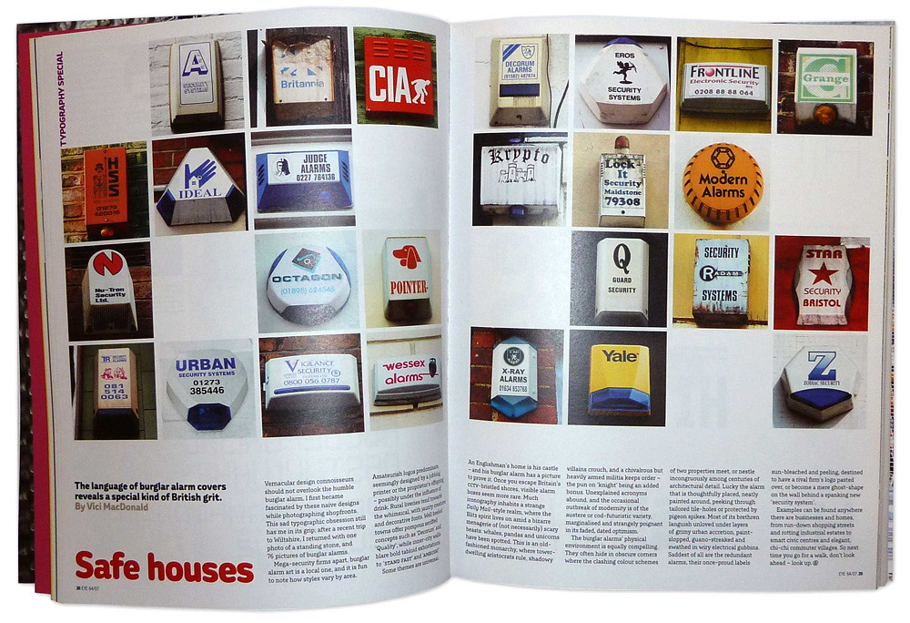
The language of burglar alarm covers reveals a special kind of British grit
Vernacular design connoisseurs should not overlook the humble burglar alarm. I first became fascinated by these naive designs while photographing shopfronts. This sad typographic obsession still has me in its grip; after a recent trip to Wiltshire, I returned with one photo of a standing stone, and 76 pictures of burglar alarms.
Mega-security firms apart, burglar alarm art is a local one, and it is fun to note how styles vary by area. Amateurish logos predominate, seemingly designed by a jobbing printer or the proprietor’s offspring – possibly under the influence of drink. Rural liveries tend towards the whimsical, with jaunty creatures and decorative fonts. Well heeled towns offer pompous seriffed concepts such as ‘Decorum’ and ‘Quality’, while inner-city walls blare bold tabloid exhortations to ‘stand fast’ and ‘ambush!’
Some themes are universal. An Englishman’s home is his castle – and his burglar alarm has a picture to prove it. Once you escape Britain’s CCTV-bristled shores, visible alarm boxes seem more rare. Much iconography inhabits a strange Daily Mail-style realm, where the Blitz spirit lives on amid a bizarre menagerie of (not necessarily) scary beasts: whales, pandas and unicorns have been spotted. This is an old-fashioned monarchy, where tower-dwelling aristocrats rule, shadowy villains crouch, and a chivalrous but heavily armed militia keeps order – the pun on ‘knight’ being an added bonus.
Unexplained acronyms abound, and the occasional outbreak of modernity is of the austere or cod-futuristic variety, marginalised and strangely poignant in its faded, dated optimism.
The burglar alarms’ physical environment is equally compelling. They often hide in obscure corners where the clashing colour schemes of two properties meet, or nestle incongruously among centuries of architectural detail. Lucky the alarm that is thoughtfully placed, neatly painted around, peeking through tailored tile-holes or protected by pigeon spikes. Most of its brethren languish unloved under layers of grimy urban accretion, paint-slopped, guano-streaked and swathed in wiry electrical gubbins. Saddest of all are the redundant alarms, their once-proud labels sun-bleached and peeling, destined to have a rival firm’s logo pasted over, or become a mere ghost-shape on the wall behind a spanking new ‘security system’.
Examples can be found anywhere there are businesses and homes, from run-down shopping streets and rotting industrial estates to smart civic centres and elegant, chi-chi commuter villages. So next time you go for a walk, don’t look ahead – look up.
Vici MacDonald, designer, writer, London
First published in Eye no. 64 vol. 16 2007
Eye is the world’s most beautiful and collectable graphic design journal, published quarterly for professional designers, students and anyone interested in critical, informed writing about graphic design and visual culture. It is available from all good design bookshops and online at the Eye shop, where you can buy subscriptions and single issues.