Spring 2009
Scale and spirit
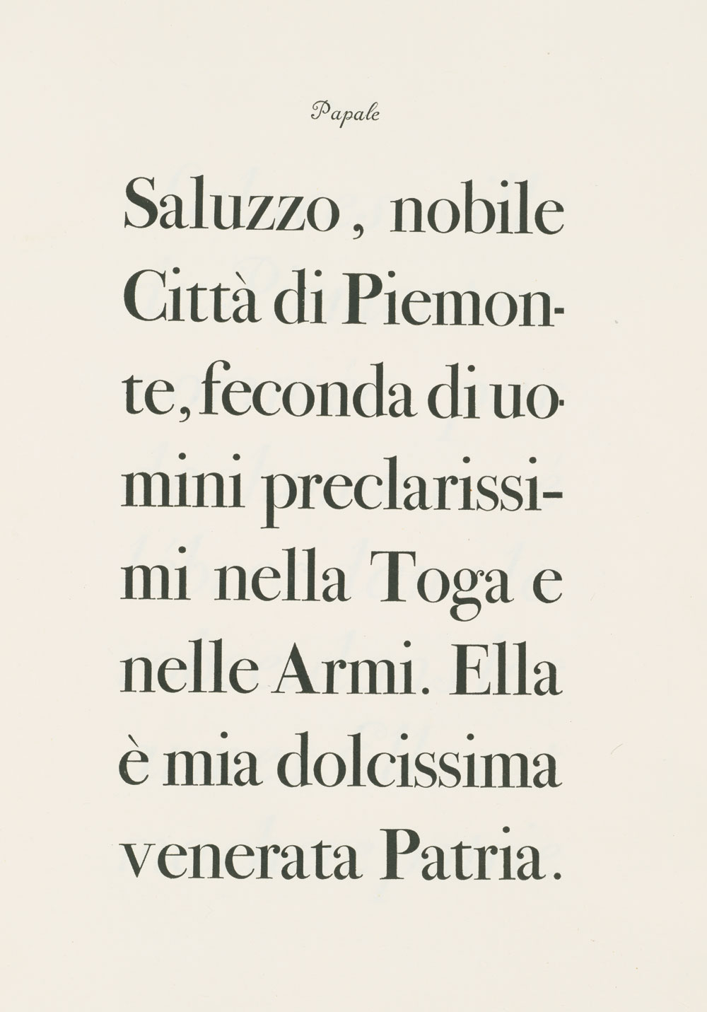
Optically sized fonts are the ‘slow food’ trend of typography, appreciated by a minority but with far-reaching influence

Whether we are aware of it or not, we are in the midst of a ‘Golden Age’ of typography, one that not only rivals the period between 1890 and 1940 but threatens to surpass it. There are faces designed for specific sizes and applications; with extended glyphs that are functional rather than aesthetic; typefaces that are not copies but have the spirit of the past.
As with that earlier age, not all is typographic perfection. ‘From the point of view of design quality, the results are mixed,’ notes Sumner Stone, former director of typography (1984-89) at Adobe Systems, writing about contemporary type design. ‘Many silly, naive, and even visually toxic products are being produced. At the same time there are examples of very thoughtful, skilfully made typefaces which equal or exceed traditional metal faces in the areas of clarity, legibility and beauty.’ American book designer Scott-Martin Kosofsky tends to agree: ‘These are often the best of times and only occasionally the worst of times.’ There will always be proportionally more dross than there is gold, but it is the latter that endures.
There are several reasons for the optimism of Stone, Kosofsky and others, who have from the beginning welcomed the digital revolution yet remained apart from the digital avant-garde, regarding the state of type design today . . .
Read the full version in Eye no. 71 vol. 18 2009
Eye is the world’s most beautiful and collectable graphic design journal, published quarterly for professional designers, students and anyone interested in critical, informed writing about graphic design and visual culture. It is available from all good design bookshops and online at the Eye shop, where you can buy subscriptions and single issues.

