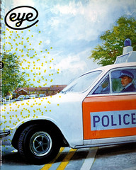
Summer 2004
Social vision
Tom Eckersley
Leonard Cusden
Abram Games
Jan Le Witt
George Him
G. R. Morris
Manfred Reiss
H. A. Rothholz
Pat Keely
Arthur Mills
Desmond Moore
Harry Rowntree
Peter Mendoza
F. Kenwood Giles
RoSPA’s Second World War safety posters challenge orthodox views of British Modernism
During the Second World War, the Royal Society for the Prevention of Accidents (RoSPA) produced a series of accident prevention posters aimed at workers in the industrial factories and workshops supplying the British war effort. These safety posters challenge several orthodox opinions about propaganda and Modernism in Britain. One is that propaganda images necessarily conform to a rhetoric of aggression, masculinity and nationalism and that the content of propaganda is always duplicitous. The posters reveal an embrace of Modernist design practice that is at odds with the prevailing conservatism and banal realism of much war propaganda. They are also proof of a willingness, not always acknowledged in Britain, to engage with Modernism to promote progressive social policies and worker welfare. The RoSPA posters are the first of their type anywhere in the world, and offer a marked contrast to other industrial propaganda, produced elsewhere, that address issues of productivity only by reference to effort and output.
Such safety posters give visual expression to the hopes expressed by Walter Benjamin for a socially progressive, politically engaged, mass-produced and widely distributed form of graphic communication as a significant evolution of the Modernist project. Their messages recognise the radical potential of ordinary people to effect social change – something that was identified by Antonio Gramsci during the 1920s and 30s, and then espoused by George Orwell in 1941 as a necessary, but insufficient, condition of victory.
The origins of RoSPA are to be found at the end of the First World War when metropolitan areas came under air attack and a blackout was enforced. The changed environment immediately caused an increase in accidents between motor vehicles and pedestrians, so the London Safety First Association (LSFA) was formed to remedy this through education. Other metropolitan areas formed their own safety associations and these were merged to form the National Safety First Association (NSFA).
The efforts of the NSFA were directed, during the 1930s, into three areas of accident prevention. The first was road safety, the second home safety and the third was industrial safety. The models for the effective propagandising of these activities were based around a week of safety awareness events. These comprised flag days, exhibitions and safety stories fed to the local press. The co-ordination of these public relations exercises allowed for the NSFA to communicate effectively with its metropolitan and provincial audiences, but there was little use of visual propaganda, there being no structured environment for its display.
The outbreak of the Second World War in September 1939 altered the context irrevocably. Safety became part of a discourse of national survival, and industrial safety was the issue at which issues of war production, efficiency and victory converged. Lord McGowan, President of the NSFA, expressed the importance of safety work by observing that, ‘an accident in the works is as much a gain to the enemy as a casualty in the armed forces’.
Before long, all industrial safety activity was co-opted within the Ministry of Labour and National Service (MOL). The Ministry had been placed, in May 1940, under the leadership of trades unionist Ernest Bevin who recognised the potential of the safety association, now re-named RoSPA, in addressing the problem of safety and of advancing issues of worker welfare decisively. The circumstances of war and of industrial expansion (required to meet the requirements of the military) brought an influx of new workers, including women, into the factories. Bevin understood that their inexperience, together with the urgency of the task and the conditions of war would make safety a primary concern of employment.
Bevin had become aware of the potential of graphic propaganda through a friendship with Frank Pick of London Transport. Pick is credited with creating a wholly integrated and coherent environment comprising architecture, engineering, posters and typography to project the corporate values of the new organisation: his achievements at London Transport established new benchmarks for corporate identity. Now Bevin realised that if he could establish a similar projection through his Welfare Division, this time based on the idea of a safe and civilised working environment, he could effect a permanent change in the relations between capital and labour in Britain. The circumstances of war gave him an opportunity to accelerate his project and to cement worker welfare as a primary responsibility of capital. Bevin understood that, politically, any postwar settlement would be unable to return to the dark days of labour relations during the 1930s.
Bevin and Pick (both from Nonconformist backgrounds) shared a belief in the utopian potential of industry, labour and socialism. Bevin’s character was less austere than Pick’s and was always quick to acknowledge effort with praise. The RoSPA leadership shared this view: Lord McGowan urged his membership to remember that, ‘a smile will often get more done than a threat or scowl.’
Tom Eckersley. A dramatic and economical design, using photography and overprinting to create a powerful image. Near the centre of the design, the registration marks, which show traces of mechanical tint, draw attention to the image’s industrialised origins. From the collection of Lynn Trickett.
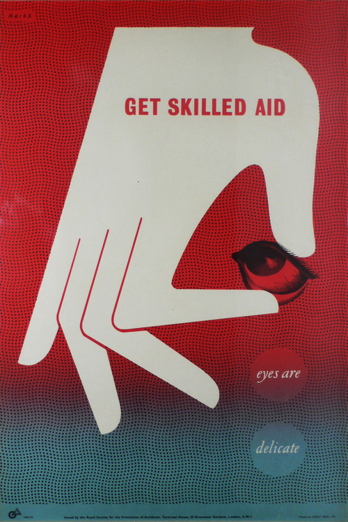
Top: Manfred Reiss. This poster, printed in a single pass through a two-colour offset litho machine, shows the design possibilities determined by the technical constraints of RoSPA’s printers. The red and blue background colours are printed by the first roller using the ‘split-duct’ process. The hand and text are defined by the ‘white’ background paper stock and the mechanical benday tint. The stock image of the eye completes the design through the second roller’s black printing. The entire design is assembled using a process of technical specification itemised by the designer: design and print are combined in a single process of mechanical reproduction. All the posters in this essay date from 1939-45, and come from the collection of Paul and Karen Rennie, except where otherwise noted.
Modernism mobilised
RoSPA’s accident prevention posters were produced during the Second World War, under severe financial and time pressures. The posters were part of a package of propaganda material sent out to the member factories and workshops. The ‘Industrial Service’ was delivered on a subscription basis, and comprised pamphlets and educational notes along with three types of poster. The posters were of the slogan, the comic-strip and the message varieties. It was this last category that provided the most interesting scope for designers. RoSPA recognised that their propaganda would remain ineffective without a safety structure in place among the management and workforce of client firms. Accordingly, they suggested that safety representatives should be chosen to initiate new workers and that, in addition to a tour of the factory, the initiation should include demonstrations and talks. These would obviously be more effective if carried out in a designated ‘classroom’ space, and it was suggested that a permanent poster display environment should be maintained within this space. Other designated display sites should also be established in the workspace and in the social areas. RoSPA suggested that their poster material should be displayed so as to alternate slogan posters with visual material. The displays should be maintained, RoSPA suggested, so as not to become stale and to engage the workforce with a regularly changing series of messages.
This achievement of the RoSPA posters needs to be placed in context. In Britain, before the Second World War, the poster industry was carefully controlled. Outdoor poster display sites were limited and expensive. The indoor display of notices and posters was not a significant requirement before the [postwar] advent of the welfare state. The printing of large-scale colour poster images had evolved as a specialised branch of the colour lithographic printing industry. This had been the main process for industrial jobs such as packaging, point-of-sale and advertising work since about 1860. The craft traditions and specialist plant associated with this kind of litho work made access to poster printing beyond all but the largest regional printers. (A quick look at, say, railway advertising from the 1930s will confirm that all the posters are printed by a very small number of firms.) In consequence, the absence in Britain of typo-photo and other process work associated with Modernist graphic design is as much due to conservative industrialists and craftsmen as with any aesthetic or political hostility to design. When the opportunity arose, the forces of Modernism were rapidly and decisively mobilised to serve the war effort.
After 1941, the designer Leonard Cusden was retained as creative advisor to guide designers through the difficulties of the process. In addition to the technical expertise of Cusden and RoSPA technical director Sidney Grummitt, the campaign was strengthened within the RoSPA administration by the presence of Ashley Havinden and Tom Eckersley on the Publicity committee. Havinden was a pioneer advertising executive in Britain who had worked in Berlin during the 1920s where he had helped to establish an international office for the Crawford agency. In consequence he became one of a relatively small number of English business people with any knowledge of German, Russian and Dutch experimentation in the graphic arts. Accordingly, when the political climate in Germany became hostile to this form of Modernism, Havinden was able to help Gropius, Moholy-Nagy and Herbert Bayer as they passed through Britain during the 1930s.
The mythology of Modernism suggests a narrative that connects Moscow, Berlin, Paris and New York while ignoring Britain. The movement of the stellar Bauhaus names to America might be taken to confirm this narrative. In fact, many other designers arrived in Britain and stayed. Havinden was well placed through his role of creative director at Crawford’s and as a member of the RoSPA publicity committee to help these designers by providing a steady flow of jobs.
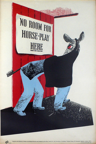
Poster by H. A. Rothholz, from the Rothholz archive. Many accidents were caused through pranks, jokes and initiations that went wrong.
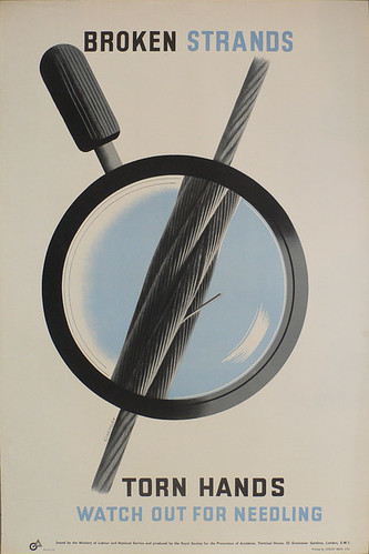
Tom Eckersley. The magnified portion of the rope, revealing thin sharp strands of metal ready to catch the unwary, is reproduced photographically. From the Eckersley Archive, London College of Communication.
Havinden’s Creative Recruitment
By the advent of the Second World War, Tom Eckersley and his colleague Eric Lombers (with whom he had worked since 1934) were acknowledged as two of the foremost poster designers in Britain. By 1939 the former had already produced work for London Transport under the patronage of Frank Pick and for Jack Beddington at Shell-Mex and BP. The advent of war split Eckersley’s partnership with Lombers as both entered the Services. Eckersley joined the RAF where he was employed in the cartographic section. Remarkably, he became RoSPA’s most prolific designer for the duration. He was able, through a process of visualising, to imagine a solution to a particular RoSPA brief while working on his RAF maps. Immediately he was home he would rush to the studio and complete the artwork for submission.
RoSPA’s resources were fewer than those available to the Ministry of Information, who were able to recruit the best of London’s creative talent. Both Pick and Beddington, for example, found roles at MOI where they were able to direct the production of intelligent propaganda. Accordingly, Havinden’s experience as creative director was put to use in the creation of a roster of designers and illustrators, including Robin Day, Abram Games, Pat Keely, Jan Lewitt and George Him, Arthur Mills, Desmond Moore, G. R. Morris, Manfred Reiss and Arnold Rothholz among others. The list is notable for the inclusion of many young émigré talents who might reasonably be identified as ‘outsiders’. RoSPA’s use of humour to communicate its message also gave an opportunity for illustrators such as Harry Rowntree, Peter Mendoza and F. Kenwood Giles to find work.
The wartime difficulties faced by these designers should not be underestimated. Arnold Rothholz, for example, had come to Britain from Germany at the beginning of the 1930s. He had studied art to prepare for a career in commercial art and design. At the outbreak of war he was deported to Canada as an enemy alien before being allowed to return and resume his work. Hans Schleger was so appalled by the advent of war that he became seriously depressed and was unable to work. The lifeline offered to designers by Havinden and RoSPA was significant.
The administrators of the RoSPA campaign decided that the use of shocking and disturbing images was unlikely to change behaviour. They concentrated their efforts in creating a coherent framework, for the visual expression of a threat that could be minimised through education, collective and individual responsibility and by the observation of simple, common-sense rules. The visual language used to express these ideas drew effectively on that of Surrealism and of the international left to create a wide-ranging, sophisticated visual language that reached beyond the workplace and established a sense of community unencumbered by traditional class distinctions. Capital and labour are held in relation to each other by rights and responsibilities on both sides.
G. A. Rothholz. The use of wooden models is a reference to the Surrealists’ use of such figures, particularly Man Ray’s famous series of photographs.
Envisaging Community
The effectiveness of the RoSPA campaign during the Second World War is easily judged by its great success in reducing the number of workplace accidents. After the war, industry remained RoSPA’s largest area of activity. Yet when British manufacturing went into decline, the sector seemed to disappear. Today, RoSPA’s activities are focused on home safety, road safety and what is now called occupational health, the white-collar equivalent of industrial health and safety.
The significance of the RoSPA campaign can be understood by contrasting it to the prevailing tone of industrial messages elsewhere during the Second World War. US propaganda was all about output and productivity. Worker welfare is associated with the benefits – expressed as earning power and higher levels of consumption – of working harder and longer. Historians Bird and Rubenstein have argued that the economic miracle of American war production was expressed as the consequence of US managerial expertise, planning and efficiency. [1] This allowed for the rehabilitation of corporate interests tarnished by the 1930s slump. After the war, the productive power of the United States was recognised as a decisive element in victory, and corporate America took the plaudits ahead of organised labour. The propaganda images of the Second World War anticipate, suggest Bird and Rubenstein, the alignment of corporate interests and of Madison Avenue so that American graphic design evolves to serve the interests of consumer capitalism.
In postwar Britain, the creation of the welfare state offered an opportunity for the projection of what Stuart Hall has called ‘Social Vision’. [2] This offered the possibility of a Utopian society based around the idea of individuals configured by values as much as consumption. By the 1960s, the pressures of consumer culture began to erode the platform of class solidarity and community that had supported the project. Hall has identified the social realist photographic essays of Picture Post (1938-57) as the exemplar of this type of discourse, which can also be seen in the documentary films of Humphrey Jennings and the Crown Film Unit. The wartime safety posters of RoSPA are an equally powerful projection of this ‘social vision’.
1. W. L. Bird and H. R. Rubenstein, Design For Victory. New York, Princeton Architectural Press, 1998
2. Stuart Hall, ‘The Social Eye of Picture Post’, Working Paper in Cultural Studies, no. 2, 1972, pp.71-120
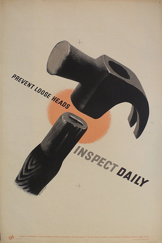
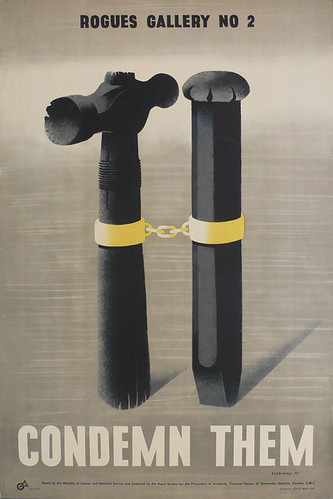
Tom Eckersley. The damaged hammer and cold chisel are identified as safety hazards awaiting return to the quartermaster. RoSPA identified ‘mushroom tools’ as a too frequent cause of eye injury through metal splinters. The wearing of safety glasses, along with efficient quartermastering, was an inexpensive and effective prevention of this type of injury. From the collection of Lynn Trickett.
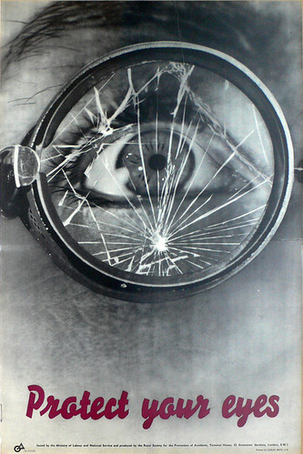
G. R. Morris. The photographic image evokes a documentary realism as well as alluding, through the symbolism of the cracked glass, to the left-wing iconography of class solidarity of Eisenstein’s Battleship Potemkin. Courtesy Imperial War Museum.
Paul Rennie, collector, writer, London
First published in Eye no. 52 vol. 13 2004
Eye is the world’s most beautiful and collectable graphic design journal, published quarterly for professional designers, students and anyone interested in critical, informed writing about graphic design and visual culture. It is available from all good design bookshops and online at the Eye shop, where you can buy subscriptions and single issues.