Autumn 2008
Sticks in the mind

various designers
Anette Lenz
Shepard Fairey
Martin Woodtli
Grapus
Vincent Perrottet
Atelier Bundi
Catherine Zask
Paula Scher
Niklaus Troxler
Henryk Tomaszewski
Does anyone care about posters, or are they just an ego-trip for the designers who still make them?
‘We don’t use glue!’ exclaims Albert Asseraf, an interesting admission from the French strategy director of JCDecaux, a media provider that owns close to a million advertising display structures worldwide. Glue is simply not part of his company’s equation. It’s too tacky, too sticky, too gooey. It also presupposes walls on which to affix posters. But walls belong to people, and people are irrational and greedy. So JCDecaux came up with an alternative: specially designed props euphemistically called ‘urban furniture’. And you wouldn’t want glue all over furniture, would you?
Most posters today don’t require glue because, metaphorically speaking, they no longer need to stick in our mind. Whether digital images or backlit transparencies, framed playbills or rolling advertisements, they act only as mnemonic devices. Egging us on as we go, these giant ‘flash cards’ prompt us to stay involved so that we can contribute to the economy. Vincent Perrottet, who is one of the organisers of the international Chaumont poster competition, compares this proliferating display of advertising messages to ‘an occupying army taking possession of the urban environment’. His metaphor is not inaccurate. JCDecaux, like its competitors Cemusa, CBS Outdoor and Clear Channel, negotiates aggressively with local authorities, shopping malls and airports to implant its products in as many locations as possible. JCDecaux has been given a ten-year exclusivity on urban furniture in Paris, in exchange for installing and operating Vélib’, the citywide bike rental system. Bus shelters, public toilets, information kiosks, public announcement monitors, waste bins and park benches are among the other freebies media entrepreneurs offer willing town halls.
Perrottet complains that ‘we find our way among the thousand of signs around town, without seeing them, without “reading” them’; Asseraf applauds this situation. According to studies sponsored by JCDecaux, ‘there does not seem to be a big difference in terms of impact between fixed posters and rotating images.’ In other words, in a given display window, it is just as efficient to show a rolling sequence of three posters than to showcase a ‘glued’ picture. Why rent the space to one client when you could maximise it, and charge the same amount to three advertisers?
Self-indulgent exercises
Poster designers have got into the habit of showing their work ‘unglued’ too. On their websites, they display their posters hand-held, like precious trophies rather than useful surfaces. The artwork is shot on location, in a studio, a backyard, or a living room, seldom in a public space or in front of walls. As three-dimensional objects, these broadsheets cast a shadow on the person acting as their easel, whose visible body parts – fingers, forearms, sometimes legs – give a sense of scale. Like the sandwich-boards worn by peddlers in the nineteenth century, the loose posters feel remarkably accessible and their message is humanised by the comforting presence of their author.
Yet, detached from the walls that used to be their raison d’être, posters singled out on websites and design blogs, or selected for international competitions, can seem self-indulgent. At least that was how an American illustrator friend reacted when I dragged her to the nineteenth Chaumont Poster Festival last spring to look at the latest crop of jury-selected international posters, 127 handsome specimens displayed in a former military installation tucked behind the Chaumont train station. She could not have been less enthusiastic: ‘They look like limited-edition prints designed primarily to celebrate the talent of their authors.’ In particular, she objected to the fact that nowhere in the show was the commercial dimension of the posters ever mentioned. ‘It’s too easy,’ she said. ‘Anyone can design a great-looking poster. But what about a great-looking poster that also sells? Now, that’s an art.’
Attributing her pro-business bias to the fact that she was American, I smugly declared that, in Europe at least, commercial success was not the only criteria to measure the merit of a work of art. And so it may be, she said, but held her ground. By the end of the three-hour ride back to Paris by rail, she almost had me convinced that no one cares about posters any more, save for the people designing them.
The poster’s last hurrah
There is apparently no shortage of people eager to invest time and talent on a 60 cm x 90 cm surface. Worldwide, poster competitions are more popular than ever. ‘It’s almost obscene,’ says Perrottet. ‘We received more than 2000 posters last year. It feels like the last hurrah, as if artists and printers, aware that posters are about to become anachronistic, are taking advantage of their know-how and equipment while they still can.’
Poster for a dance performance, France, 2005. Design: Catherine Zask.
Top: poster for an operetta production in Switzerland, 2007. Designed by Atelier Bundi.

The world over, posters competitions are used routinely to raise money, promote causes and draw attention to issues. They are held by design organisations, like the AIGA’s ‘Get Out the Vote’ initiative, but also by the likes of the American National Organization for Women Foundation, with its ‘Love Your Body’ poster competition; the World Summit’s ‘Agenda 21’ competition aimed at school children; or the ‘Don’t Panic’ competition sponsored by the eponymous online publication.
As catalysts for action, posters are still relevant, it seems. Shepard Fairey’s Barack Obama posters make a not so subtle reference to the Che Guevara ones, capturing the public imagination. Co-opted by the supporters of the us presidential candidate, they have acquired a life of their own. Fairey’s images transcend their original purpose by being fixed to walls, taped to windows, stuck on containers, pasted on pilings, or nailed to the sides of barns. Because of their omnipresence, the Obama posters have become a vehicle for much more than the messages of Change, Hope, or Progress. They have become the expression of an unspecified collective ideal.
Brian Collins, formerly chief creative officer of Ogilvy’s Brand Integration Group, and a frequent speaker on the topic of branding, measures the effectiveness of a poster by whether or not people steal it. Proving his point, the posters announcing his talk in one art school had been ripped off bulletin boards by the time he showed up. ‘I knew that to attract my audience, my posters had to be provocative,’ he says, ‘so I instructed the youngest intern on my staff to design something he would love but I would hate. That was my brief! I assured him that we would print it as long as my name and the time of my talk were readable.’ One of the few posters selected by the I.D. Annual Design Review, it was indeed remarkably unlike anything anyone from a brand agency would endorse for a client. ‘People love it or despise it. Which was precisely the point of my talk.’ In designing a poster, he says, you must ask yourself to what end. The answer should probably be ‘to disrupt expectations, to create street energy, and to telegraph your thought – instantly.’
Creating street energy is what the ‘occupying armies’ of posters deployed by companies such as JCDecaux are intent on doing. It is not a new idea. Photographs of London, Berlin and Paris at the beginning of the twentieth century show the omnipresence of advertising images on the walls of these cities. Back then, the rule of thumb was that posters publicising products should be displayed repetitiously, to suggest abundance, while posters promoting concerts or theatrical productions should be presented as unique specimens, to emphasise the exclusive character of their offering. One could argue that one of the reasons my American friend felt that the Chaumont posters were self-indulgent was that they were presented out of context, disconnected from the urban environment that is, historically, an integral part of their identity. Had she experienced the same posters in situ, pasted on walls, she might have been less disparaging.
Great posters are as rare as great clients
A nagging question remained: why do people care about some posters and not others? Is it just a matter of circumstances? I decided to study the selection of posters from the past five years of the Chaumont Festival. What made them special? Could I identify what these winning posters had in common?
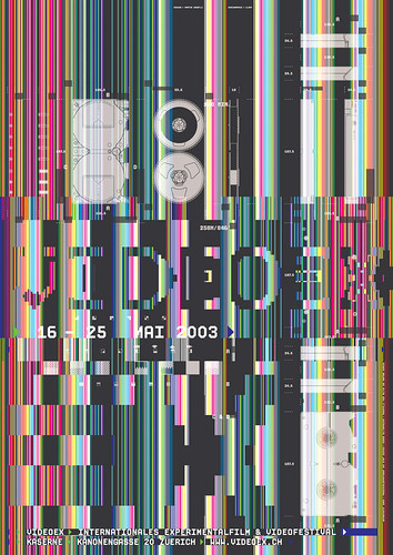
Poster by Swiss designer Martin Woodtli, a participant in the ‘Cervelatica’ exhibition of ‘Swiss Graphic Design 2.0’ at Chaumont, 2008.
I do not speak Polish, Dutch, Flemish, German, Czech, Hungarian, Turkish, Portuguese, Japanese, Korean or Russian. Neither did the editors of the Chaumont catalogues, whose captions did not translate any of the information on the posters. Scrutinising the reproductions with a magnifying glass, I spotted the same words over and over: teatro, teater, teatru, teatr … about as often as muzej, museo, musen, or muzeum. Adding up all the entries for theatres, concerts, museums, conferences and festivals, I calculated that more than three-quarters of the posters selected had been made for cultural institutions. The number of posters addressing a public interest issue or supporting a social cause would vary from year to year. Work by advertising agencies was sorely missing, revealing the bias of the festival organisers.
Deciphering the content of the posters was strenuous at first, but after about 300 posters, I got the hang of it and was able to tell, at a glance, without scrutinising the small type, what was going on. It was easy: as a rule, theatre playbills were about ten times more interesting, more gripping and more moving than posters promoting festivals, conferences, museum exhibitions or gallery shows. It was shocking. I had assumed that all cultural institutions were essentially the same – that they all brought out the best in graphic designers – and suddenly I had to challenge this notion.
I perused the website of the Warsaw Poster Biennale going back all the way to 1966, to see if I could spot a similar trend, and sure enough, the majority of gold medals in the culture and arts category were awarded for theatre posters, with Jan Lenica, Henryk Tomaszewski, Waldemar Swierzy, Paula Scher, Gerhard Lienemeyer, Wiktor Sadowski and Ikko Tanaka among the stars. In fact, the playbills were closer in spirit to the ideological posters addressing social issues than to other cultural posters in their category. Under close inspection, museums and festivals posters, though engaging, were hard to tell apart from the advertising posters rewarded by the Warsaw jury.
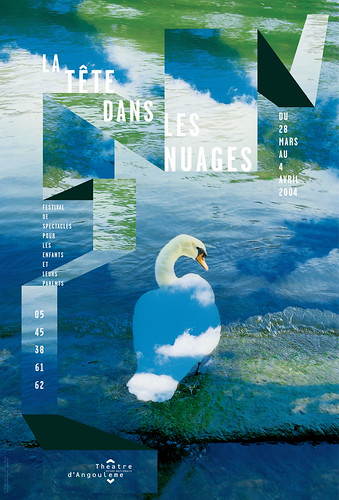
Poster for a French family theatre festival, 2004. Design: Anette Lenz in collaboration with Vincent Perrottet.
Something Vincent Perrottet had told me came back to mind. ‘It is extremely difficult to design a good poster, one of the reasons being that it’s rare to have a great client. The best clients are small theatres – that’s why French graphic designers do their best work for theatrical institutions.’ The operative word here is ‘small’. Small theatre and dance companies, with looser chains of command, are more likely to treat graphic designers as artists and give them a free hand. Whatever the reason, there seem to be enough artistically minded theatre directors in France to maintain a tradition of excellence in this domain. But it is more than a local phenomenon. The work of the Beggarstaff Brothers, Aubrey Beardsley and Frederick Walker in England, Jules Chéret and Alphonse Mucha in France, and Adolfo Hohenstein in Italy show that live performances have always stimulated the audacity of poster artists. Paul Colin’s cabaret posters in Paris, the Polish Cyrk (circus) posters of the 1960s by Lenica, Tomaszewski and Cieslewicz, and the San Francisco psychedelic concert posters of Victor Moscoso, just to name a few, support this hypothesis.
Theatre posters reflect thespian culture and use similar means of communication. They relate to viewers the way stage actors and live performers relate to their audience. Spectators watching a play are not simply entertained, they participate by witnessing the drama as it enfolds, in real time, in front of their very eyes. Likewise, theatre posters, for the most part, speak to the conscience of viewers, acknowledging the humanity in all of us. The best of them can bring about an emotional release comparable to a catharsis. Examples abound: Grapus’s 1977 Un cœur sous une soutane, for the Théâtre de la Salamandre, in Tourcoing, featuring the back of a priest’s head, his ears coloured red by shame; Niklaus Troxler’s purple and yellow 1978 jazz concert poster for the Don Pullen Quartet, which ran the keyboard into an American flag, the hands of the black pianist tickling the ivories with such soulful intensity, you can almost hear the melody; Paula Scher’s 2002 playbill for Fucking A, Suzan-Lori Parks’ play about abortion, a graphic translation of a rage and pain women seldom dare to share.
Such posters, if you look at them carefully, will ‘stick’ to you, becoming part of your visual memory forever. When viewed by many people, they provide a social ‘glue’ that transforms the urban environment into the setting for a collective cultural experience, one that can be an antidote to the boredom and the alienation generated by an excess of bland advertising.
First published in Eye no. 69 vol. 18 2009
Eye is the world’s most beautiful and collectable graphic design journal, published for professional designers, students and anyone interested in critical, informed writing about graphic design and visual culture. It is available from all good design bookshops and online at the Eye shop, where you can buy subscriptions and single issues.