Autumn 2011
Symbols and survival
In their forthcoming book, the partners tell some of the stories behind their work for clients such as Chase Manhattan, Mobil, Pan Am, Time Warner and the Smithsonian
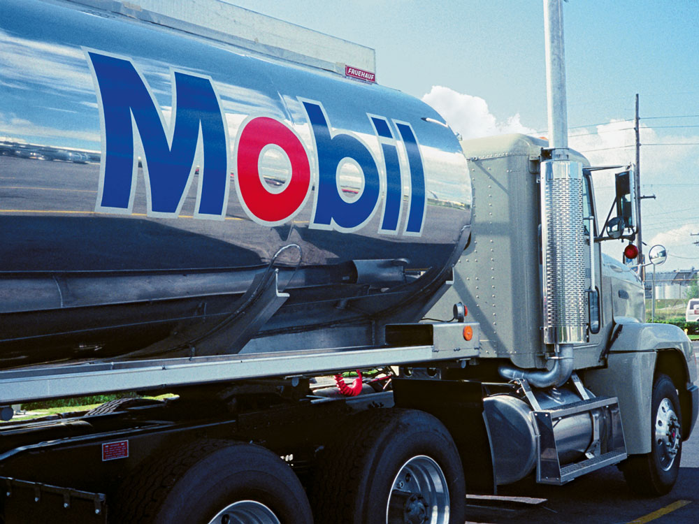
Mobil
Starting in 1964, Chermayeff & Geismar’s graphic identity for Mobil Oil was implemented in tandem with architect Eliot Noyes’ modernisation of the company’s service stations.
In their new book Identify (Print Publishing, 2011), the partners write: ‘Together the two firms undertook a comprehensive design programme, initially focusing on developing a radically cleaner, more modern and attractive service station, and related signs and packaging that would help Mobil become the service station of choice for newly developing countries.’
They note with pride that, for more than three decades, ‘the graphics programme remained consistent, based on four basic ideas that we first expressed in our initial presentation to Mobil management.’
These are the Mobil trademark: the red flying horse symbol (redrawn from an earlier logo); the single-weight Mobil Alphabet; and the red-blue colour palette.

Pan Am
Chermayeff & Geismar’s contribution to Pan American World Airlines in the early 1970s was both verbal and visual: they edited the airline’s cumbersome name down to two snappy syllables.
‘Ticket offices had the full corporate name on the façade, but almost everyone referred to the company simply as Pan Am,’ write Chermayeff and Geismar in Identify. ‘We convinced them to shorten the name for advertising purposes and designed a very simple wordmark for Pan Am.
This was joined with the world globe symbol to form a clear, concise identity.’
The globe symbol dates from the airline’s 1955 identity design by architects Edward Larabee Barnes and Charles Foberg. Chermayeff, then on Barnes and Foberg’s staff, drew the original symbol, which was revised by Chermayeff & Geismar in 1971.
The partnership’s promotional posters for Pan Am during 1971-72 were more short-lived, though six of them are in the permanent collection of New York’s Museum of Modern Art. (See ‘Flight of the imagination’ by Frederico Duarte in Eye 73.)
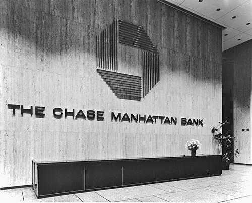
Chase
The blue, octagonal symbol, devoid of typographic or figurative elements, that Chermayeff & Geismar designed for the Chase Manhattan Bank was a breakthrough for the young practice – and for identity design.
In Identify, the partners recall the difficulty in persuading the board to accept their proposal: ‘Two of the top three executives resisted the very idea of an abstract symbol, which wasn’t surprising – at the time, no major American company used an abstract symbol to identify itself.’
Eventually, David Rockefeller, an enthusiastic art collector, persuaded the board to accept the octagonal logo in 1960. ‘Within months, the same executives who had opposed the mark were proudly wearing it on cufflinks and tie tacks,’ the partners write.
‘This experience has become an important touchstone for us: people can transfer their positive associations with a company onto the most simple and abstract of designs, even if it’s utterly foreign at first.’
Despite many changes in the bank’s ownership, the blue octagonal symbol is still going strong.
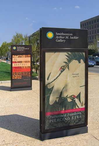
Smithsonian
When the Smithsonian Institution approached Chermayeff & Geismar to update and unify their identity in 1999, the challenge was to bring together many different divisions, including nineteen museums, the Folkways record label and many different research institutes and products.
Though several of the museums used a ‘sun’ logo, there were at least thirteen different versions in use, and many segments of the Smithsonian used completely unrelated marks.
Settling on one redrawn version of the Smithsonian sun was straightforward. Negotiating the approval of the Smithsonian bureaucracy required nerves of steel. ‘To avoid squabbling,’ recall the partners in Identify, ‘Mike Heyman [the Smithsonian’s chief executive] conspired with us to reach a consensus by arranging for each individual museum director to meet with us privately, two on one, never as a group…
‘By meeting the directors individually, we treated them as feudal lords over their domains.’
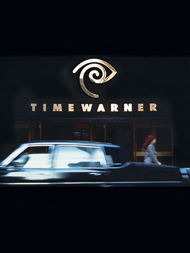
Time Warner
In 1989, Chermayeff & Geismar was approached to design a logo for the merger of publisher Time Inc. and movie / music conglomerate Warner Communications. When CEO Steve Ross asked them to develop a mark that could be used throughout the organisation, partner Steff Geissbuhler (since 2005 a principal at separate, spin-off company C&G Partners) devised a single-colour hieroglyphic. ‘Combining images of an eye and an ear seemed a perfect way to identify this company …whose projects ranged from films and magazines to music and concerts.’
Management changes in subsequent years meant that Time Warner dropped the logo for the overall company, but the eye / ear logo was then shuffled sideways for its then subdivision Time Warner Cable, now an independent company, and is still in use today.
Identify: Problems of Identity Design and Chermayeff & Geismar’s Timeless Approach to Solving Them, by Ivan Chermayeff, Tom Geismar and Sagi Haviv (Print Publishing, £34.99, ). Designed by Chermayeff & Geismar, 2011.
First published in Eye no. 81 vol. 20 2011
Eye is the world’s most beautiful and collectable graphic design journal, published quarterly for professional designers, students and anyone interested in critical, informed writing about graphic design and visual culture. It is available from all good design bookshops and online at the Eye shop, where you can buy subscriptions and single issues.