
Spring 2019
The business of type design
The challenges of earning a living from type design, with honest, thoughtful responses from foundries worldwide
The challenges of selling type are nothing new; while foundries in the early twentieth century had to ship heavy fonts of type across borders and seas to compete in an industry dominated by a small number of large sellers, foundries of all sizes are now faced with navigating digital sales.

Competition remains tough, and the need to rigorously promote while explaining a font’s core features – through specimens, and written descriptions, supported and disseminated by the design press – is relatively unchanged. To help us understand the current climate, eighteen foundries from around the world were happy to contribute some fascinating and candid insights about the business of type design.
Kris Sowersby (see Eye 79) of New Zealand’s Klim Type Foundry said: ‘For years I assumed that all a foundry needed was good quality typefaces and things would take care of themselves. This, however, is an unsustainable and myopic craft-based attitude. We now have a dual focus: making fonts and selling fonts.’
But business may not be every designer’s strong suit. As Andreu Balius of Type Republic in Spain stated: ‘Honestly, I am not a businessman. My work has to talk for me.’ What these voices reveal is that there is no single business model for selling type; rather there are myriad approaches and methods used to take a font to market.
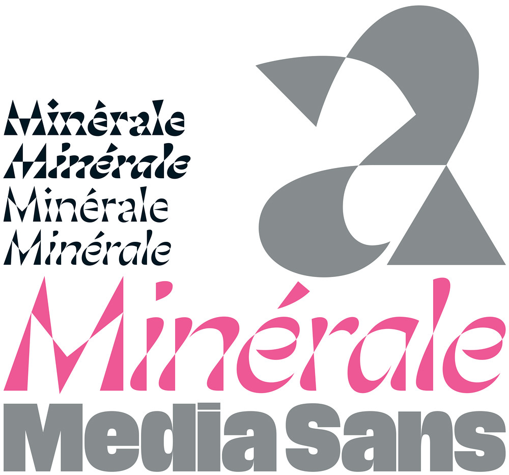
Valnera released by CAST. Design: Riccardo De Franceschi, 2019. Top: Minérale, released by 205TF. Design: Thomas Huot-Marchand.

Competitive edge
Originality, quality, expertise, exposure and reputation are common factors in several models for foundry success, as is a digital font library that includes a wealth of stylistic options or, conversely, targets a specific clientele. Damien Gautier of 205TF in France said: ‘There is no future for approximate designs or commonplace typefaces. There are many talented foundries but not so many in France.
We decided to promote a kind of French taste in typography with revivals and original designs.’
In contrast to a national focus, there are foundries, such as Peter Biľak’s Typotheque in the Netherlands, that look beyond pan-European Latin, Cyrillic and Greek fonts. Biľak sees strength in making multilingual typefaces, irrespective of the time and higher cost required for their production. This opinion is shared by Lebanon-based 29LT’s Pascal Zoghbi: ‘We are growing our families into super families covering a vast array of typographic styles that enable our type families to be superior to other Arabic / Latin fonts.’
In the battle to compete, a popular opinion is to ‘stay small’ and be wary of devaluing the work with ‘stack ’em high & sell ’em cheap’ discounting – as described by Jeremy Tankard of Jeremy Tankard Typography in the UK: ‘It still takes time to create, design and bring a type to market. It costs time and money.’ Customers are paying for everything that has been invested in a font, and the presumption is that the work produced using those fonts will benefit from their maker’s expertise. Tankard’s pragmatism speaks volumes: ‘A type deemed to be of poor quality could still function well and become popular. Fashion is fickle. Success is about more than quality and expertise.’
Market volatility is a challenge the world over – and was the factor which shaped and reshaped 29LT’s business model in response to economic shifts in the Middle East. There are no guarantees that an exceptional font will sell exceptionally well. Alejandro Paul of Sudtipos in Argentina said: ‘To be noticed on some distributors’ sites, a font needs to be in their ‘Hot New Fonts’ list in its first 45 days. If not, it will not be included in the newsletter and [its] profits might not cover the time and money you have invested in it.’ But the power of trust and therefore, return custom, cannot be underestimated.
‘Quality will make graphic designers trust you and license more of your type,’ said Rui Abreu of R-Typography in Portugal. R-Typography advertises in printed magazines and on social media (mostly Instagram) but also sponsors conferences and events. Printed specimens are also part of their promotional strategy, but for many, print has become something of a luxury. Tankard explained the dilemma of cost versus return on investment: ‘I strongly believe in the printed specimen,’ he said, ‘but production costs are high and people seem less bothered nowadays because they rely so much on the internet and less on the tactile physical item. Recently we’ve produced high cost items that are sold at a loss and also given away. Not a good model, but it all comes out of the general typeface development budget.’
Hawkland released by Jeremy Tankard Typography. Design: Jeremy Tankard, 2018.

At Village (United States), Chester Jenkins and Tracey Jenkins have produced printed specimens for each new release for the past two years: ‘We try to keep the design simple and stark in order to allow the types to be the star,’ said Chester Jenkins. ‘We never want to show our types in a “prescriptive” way. We work to combine each new release with an appropriate design, paper and printing process (digital Indigo, letterpress, offset printing, foil stamping, engraving) to show it in all its glory and then let our website, social media and the beautiful and inventive work we see from our clients be our follow-on marketing.’
Jason Smith of Fontsmith in the UK also reveres the printed specimen: ‘You still can’t beat a piece of quality print to show off great typography in my opinion.’ Fontsmith and collectively run foundry CAST in Italy both produce publications; Fontsmith makes the type and graphics magazine TypeNotes and CAST is working on the third edition of its ‘literary specimen’ in addition to the inaugural issue of magazine TypeZest, both due for release in autumn 2019.
In addition to the high cost of print, there is also postage, and the disadvantage of being at a distance from your customers. Paul of Sudtipos said that ‘99.9 per cent of my sales are for international customers. There is no type market in Argentina. And while I love specimens, it would be more expensive to send a print specimen [from Buenos Aires] to a customer than the money they would pay for the fonts.’
Paul instead puts his energies into social media, digital galleries and speaking engagements, though he admits that the effectiveness of talks depends upon the nature of the audience; a graphic designer is far more likely to buy his fonts than a type designer or educator, for example.
‘We drive new business by keeping visible,’ said Sowersby, ‘advertising, a steady stream of releases and an active social media presence.’ 205TF invests time and energy in posting on social networks, as well as advertising in international magazines, but Gautier lamented the time-consuming nature of such activities. Jeremy Tankard was the most frank: ‘Social media is what it is – quite limited, vitriolic and flippant.’
Empirica released by Frere-Jones Type. Design: Tobias Frere-Jones and Nina Stössinger, with contributions by Fred Shallcrass, 2018.

Distribution and licensing
Tankard continued, ‘The trick is getting your work in front of those that could potentially license it. The downside is that one company has bought up all the main distributors and distribution channels, retaining their brand names, so if you don’t conform you’ve got a massive struggle to gain market space.’
Some feel distributors bring their work to bigger audiences, while others see them as underperforming middle men to be avoided when possible; a third group maintains that sales should come exclusively from the foundry’s own website. The distributor that gets the most favourable mention is Fontstand – used by at least seven of the foundries we contacted – which is described as a collaborator or partner rather than a distributor and praised for its testing capabilities and time-restricted font rentals that differ from what foundries are offering on their own dedicated sites. Other distributors mentioned favourably include Typekit (now Adobe Fonts), FontShop, Fonts.com, Type Network, MyFonts, Future Fonts, Adobe Fonts, Village, Fontspring and Fontown. But for every foundry using distributors there are also those committed to driving business to their own shopping carts – coupled with a robust website. This is the overwhelmingly popular plan in each foundry’s future-proofing strategy.
Licensing is yet another complex challenge that requires careful crafting on one hand and unwavering militancy on the other. Tobias Frere-Jones (see Eye 54) of Frere-Jones Type in the US said that the issues surrounding licensing are ‘often overlooked or misunderstood by designers starting out in the industry’, especially those without the resources to engage a lawyer. Piracy is a constant concern with an exclusively digital product.
Tankard sets aside time to ‘actively remove illegal fonts from the internet.’ He explained: ‘The type industry is quite small and friendly, and many designers know each other and give a heads up about potential issues around the world. But it takes time to track the illegal download sites, write legal letters, supply links and DMCA [Digital Millennium Copyright Act] notices to the correct people and have software removed. One sad upside is that it’s increasingly easy to track unlicensed use on the internet, with the result that revenue can be made from correcting unlicensed use – a new revenue stream.’
Gliko Modern released R-Typography. Design: Rui Abreu, 2018.

Collaborators, staff and the next generation
Many apparently big foundries employ very few in-house staff, plus a small support network of freelancers. And although many type designers (turned business owners) are self-confessed control freaks and workaholics, they nonetheless strive to support emerging type designers and further their careers, which also invigorates the foundry library with fresh approaches.
Veronika Burian’s TypeTogether (Spain and Argentina) has an international team, half of whom do PR, sales and administrative work. Burian said: ‘We try to encourage junior designers, give them feedback and provide opportunities to help them develop and grow.’ TypeTogether now offers the Gerard Unger Scholarship, which supports a selected designer in publishing a typeface with the foundry.
Sudtipos, R-Typography and 205TF pride themselves in publishing the first typefaces of emerging type designers and young talents. Gautier said: ‘This is one of the objectives of 205TF: supporting young designers to help them to develop their fonts at a professional level. For a first typeface, we help the designer to make choices on drawings, control the glyph set, add glyphs, control OpenType functions, spacing, kerning and product final files.’
Abreu is currently collaborating with a young designer. ‘It is not only about co-designing. I also share my workflow methods and knowledge, so that their designs stay within our criteria.’
Village, run by the aforementioned Chester Jenkins and Tracy Jenkins, stands somewhere between a distributor and a cooperative – eleven type foundries form a union including the Jenkins’ own foundry Constellation. Chester Jenkins said: ‘We built Village to be a place where type designers knew their work would be shown in the best light, and where they would receive the fairest percentage of sales. We set up Village to be the club we would want to join.’
Brushland released Type-Ø-Tones. Design: Laura Meseguer, Joan Carles Cassasín (programming), 2018.

In CAST’s cooperative foundry model, it means that even young designers are being prepared for partnership. As Riccardo Olocco said, ‘We involve them in our working community and share our ideas with them. Now is a time of expansion.’
But there is strength, too, in collaborating with international experts whose work can be done remotely; both Type-Ø-Tones and Klim Type Foundry use Spanish font engineer Noe Blanco. Laura Meseguer of Type-Ø-Tones in Spain hires Joan Carles Cassasín for production; Typotheque outsources development and programming on a daily basis.
For Fontsmith, collaboration is less frequent. Smith said, ‘We rarely take on anything unless Phil Garnham or I are really blown away by something. A recent example of this is FS Meridian by a talented young designer called Kristina Jandová. We helped her to nurture and craft the design so it would fit as part of the FS family. It launched mid-Feb and Made.com is already using it as its secondary font.’
This sentiment is echoed by Frere-Jones Type, which releases Inga Plönnigs’ Magnet, its first font from an external designer, later this year. Frere-Jones plans to publish more ‘outside’ work in the future.
While Andreu Balius hires advisory experts for non-Latin scripts, Pascal Zoghbi handles the Arabic himself, and collaborates with independent professionals to handle the Latin. ‘I only collaborate with professional type designer friends or colleagues to ensure a high quality end result. I believe in a free working environment without any hierarchy.’
To overcome the expense of sending printed specimens, Alejandro Paul collaborates with an array of Latin American practitioners such as Tomás Garcia, Cinco and Amuki to create dynamic digital galleries: ‘I like to invite artists, animators, virtual reality designers, illustrators, writers and photographers to collaborate for the specimens; this way I do something that I enjoy more. I show the fonts in a different way than a normal print specimen and I can inspire potential customers to use a font in a way they didn’t imagine it could be used. I think the possibilities of the digital world expand the possibilities of your font much more than print. Print is just print.’
Media Sans released Production Type. Design: Jean-Baptiste Levée, Yorgo Tloupas (art direction), 2018.

Future proofing and research
Klim Type has been overhauling its website, as has Type-Ø-Tones and 29LT. Sudtipos and Jeremy Tankard Typography have also recently completed significant website developments and Tankard commissioned a developer to create the Font Builder web app to watermark a percentage of characters to allow customers to test full families.
Future-proofing for Typotheque means maintaining a constant dialogue with customers about how they use the fonts: ‘This conversation has triggered a lot of ideas and innovation,’ said Biľak, which points to the value of a continued dedication to research and development.
Nearly every foundry cited the importance of their rich personal library, as well as visiting archives and libraries in their home countries and abroad. Frere-Jones has a renowned collection which he described as ‘the principal source of in-house research and development … that contains plenty of old foundry specimens, but also examples of use, both rarefied and commonplace.’
With career portfolios that extend beyond type design, Riccardo Olocco and Luciano Perondi of CAST also work as researchers. Olocco is a PhD candidate at Reading, where he is researching fifteenth-century Venetian roman types.
Jean-Baptiste Levée of Production Type in France said, ‘Curiosity is an essential trait of the foundry. This translates into museum and collection visits, sometimes in unusual places. Type isn’t all about libraries.’ Fontsmith shares this opinion though it favours popular culture over cultural institutions. ‘It’s our job as type designers to negotiate trends,’ said Smith. ‘We look at what’s happening in music, fashion, car design, art, architecture – all those things inform us as visual designers, classic craftsmanship is all around us.’ But there is also great value placed on international travel. Paul dedicates time to research and development, with tours to places such as New York and the US West Coast.
Cosmica released by Village. Design: Chester Jenkins, 2018.

Designers and their partners and families may relate to Tankard: ‘Holidays are great as I inevitably search out type-related stuff – much to the amusement / annoyance of the family. Even if not relevant at the time, they may be in the future. I’ve always found non-type-related inspiration and sources as important as type-related ones. In fact many ideas begin from responding to something non-typographic.’
The potential of shifting away from type for inspiration is perhaps a product of time. Kris Sowersby travels far from his native New Zealand to see type collections in places such as the Letterform Archive (San Francisco) and St Bride Library (London). Yet in recent years his inspiration has come from elsewhere: ‘I’m finding outside disciplines like art and philosophy more sustaining.’
With thanks to 29LT (Lebanon), 205TF (France), CAST (Italy), EMType (Spain), Fontsmith (UK), Frere-Jones Type (US), Jeremy Tankard Typography (UK), Klim Type (New Zealand), Production Type (France), R-Typography (Portugal), Sudtipos (Argentina), The Northern Block (UK), Type-Ø-Tones (Spain), Type Republic (Spain), Type Together (Spain and Argentina), Typotheque (Netherlands) and Village (US).
FS Brabo released by Fontsmith. Design: Fernando Mello, 2018.

Sarah Snaith, design writer, editor and tutor, RCA, London
First published in Eye no. 98 vol. 25, 2019
Eye is the world’s most beautiful and collectable graphic design journal, published quarterly for professional designers, students and anyone interested in critical, informed writing about graphic design and visual culture. It is available from all good design bookshops and online at the Eye shop, where you can buy subscriptions and single issues. You can see what Eye 98 looks like at Eye Before You Buy on Vimeo.