
Spring 2018
The cover
Great magazine covers are built on a sense of fearlessness, says Ian Birch
Part one of the eight-part feature ‘Anatomy of a magazine’.
The old industry adage is correct: there is no such thing as a good magazine with a bad cover. A good cover should distil the title’s voice, look and purpose. It should entice, inform, surprise and entertain. It should flatter, making the reader feel part of a clever community.
So it follows that a successful cover is one that sells as many as it can to its intended audience. The publishing industry has spent millions on research over the decades, trying to find the magic ‘cover formula’. Some titles have come very close, such as People, whose covers have been calibrated with forensic brilliance since its launch in March 1974. Readers loved it immediately. That autumn, the Cambridge Marketing Group told the team that, in 25 years of research, they had ever ‘seen a product with greater consumer acceptance that People’.
But even People can trip up. It had a policy of never putting dead people on the cover, so when Elvis Presley died on 16 August 1977 editor Dick Stolley relegated the news to a 27-line item on the ‘Star Tracks’ page inside. He put Ann-Margret and Marty Feldman on the cover instead, and still regrets it. ‘To compensate,’ he told me, laughing, ‘I put him on the cover five times in the next year.’ When John Lennon was killed three years later, Stolley didn’t make the same mistake. ‘It was the best-selling cover for People for the next twenty years.’
Industry-wide cover rules emerged and the received thinking, certainly for mainstream magazines, goes something like this: it should be instantly recognisable in the 5/5 rule (we make our choice within five seconds from five feet away); it should have an accessible photograph with strong eye contact (we read the picture before the text, and we prefer photography to illustration or pure type because they take more time and effort to decode); it should have an easily digestible and relatable mix of cover lines that pepper the expected with the odd surprise (anything depressing, such as a tragedy, should be wrapped in empathy); it should have a tone of warm, light banter (somewhere between a pun and a punch line); one of the dominant colours should be buy-me red.
The key is to refresh and re-imagine these commercial strictures every issue. The same, yet different. It is a huge challenge, and even more so now magazines have been replaced by the internet as the engine of popular culture which, in the process, has wrought havoc on the print business model.
Not surprisingly, many covers today smell of fear. Fear of not being able to staunch the decline in sales. Fear of experimenting. Fear of managements who have lost interest in print. Fear that the focus is entirely short-term because long-term strategy means how best to sell or close the title – also known as going ‘digital first’. And fear of everything digital.
There are exceptions. The current-affairs category has seen a resurgence, driven by the tumultuous and divisive news cycles of Brexit and Trumpism. Private Eye, Time, The Week, The Economist and Der Spiegel have jumped into these choppy waters and are producing electrifying, adversarial covers (using illustrators such as Edel Rodrigues) that are also selling.
And, in contrast, there is the booming independent sector that unashamedly treats the cover like a blank wall in an art gallery. Hang the most stylish photograph or illustration there, keep the text to a minimum, and you will hopefully attract the appropriate specialist audience and advertiser.
Great covers are built on a sense of fearlessness, which starts with the editor who encourages his or her team to break the rules and throws a protective shield around them when they do. The team – art director, photo director, photographer, illustrator, stylist, writer and publisher – then feels a sense of responsibility for, pride in, and ownership of the cover. But the relationship between editor and art director is paramount. Bloomberg Businessweek editor Josh Tyrangiel and art director Richard Turley (see ‘Taking care of business’, Eye 80) won a Yellow Pencil at the D&AD Awards for a series of five covers in 2013, each of which had the immediacy, wit and provocative succinctness of a killer Tweet.
‘It was a fertile time,’ Turley told me. ‘We had the wind beneath our wings. It was all about collaboration. Josh and I sat so close to each other that it was like a copywriter and art director relationship – very yin-yang. We managed to finish each other’s sentences.’
Esquire’s feted covers happened because, in 1962, editor Harold Hayes asked hot-shot advertising art director George Lois (see Reputations, Eye 29) for big, uncompromising and instantly memorable statements. And, for the next eleven years Lois delivered just that, with the likes of boxer Sonny Liston as a black Santa in December 1963, and another boxer, Muhammad Ali, portrayed as a martyred Saint Sebastian in April 1968.
Lois said: ‘People would say to me, “You got some balls doing those covers.”
‘I would say, “No, it’s Harold [Hayes] who has the balls.” There’s no editor in the world who would do that now.’
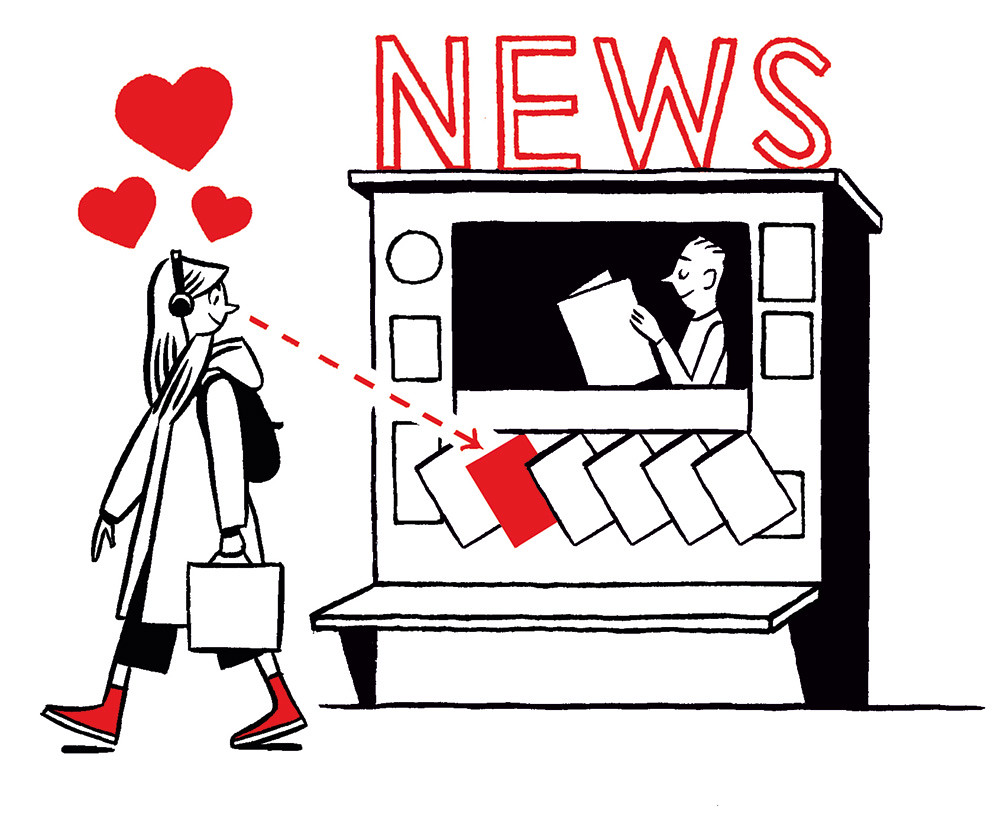
Top: Illustration by Jason Ford.
Ian Birch is the former Director of Editorial Development at Hearst in London and New York. His book UNCOVERED: Revolutionary Magazine Covers, The Inside Stories Told By The People Who Made Them will be published on 4 October 2018 (Octopus, £30)
First published in Eye no. 96 vol. 24, 2018
Eye is the world’s most beautiful and collectable graphic design journal, published quarterly for professional designers, students and anyone interested in critical, informed writing about graphic design and visual culture. It is available from all good design bookshops and online at the Eye shop, where you can buy subscriptions and single issues. You can see what Eye 96 looks like at Eye Before You Buy on Vimeo.