Summer 2008
The digital essence
Lexicon, by Bram de Does, is a type designer’s type design, par excellence.
Lexicon, designed by Bram de Does, is the perfect merging of the classical and the most contemporary principles applicable to the design of text faces. Yet its reputation belies its fame among designers, perhaps because of its high price, but perhaps also because of its nuanced perfection, which perhaps makes it – like the obscure ‘musicians’ musician’, the archetypal ‘type designer’s type design.’
The typeface shows a perfect understanding of the digital media, its limitations and potential. The treatment of thicks and thins through all its six weights shows that De Does understands the essence of digital type design.
De Does designed only two typefaces: Trinité, designed for the Swiss company Bobst Graphic (then taken over by Autologic) in August 1981; and Lexicon. He spent most of his career as a book designer and typesetter, first at printing house J. H. de Bussy in Amsterdam, and later at Joh. Enschedé en Zonen in Haarlem.
Lexicon came into being more or less spontaneously. In 1989 after being asked by Bernard van Bercum for a Medium Condensed version of its Trinité to be used on the twelfth edition of Van Dale’s dictionary Groot Woordenbock der Nederlandse Taal, Bram suggested that he could make something specially for the purpose. At that time, the availability of digital fonts for text setting was limited.
Working with Peter Matthias Noordzij of The Enschedé Font Foundry (TEFF), Bram de Does quickly produced a new design. The first proofs were made in 1991 and the publisher soon decided to use Lexicon for the Van Dale dictionary which came out the following year. This version has short extenders – ascenders and descenders – designed for the small text. The family was ready for publication in 1995 as part of the TEFF library.
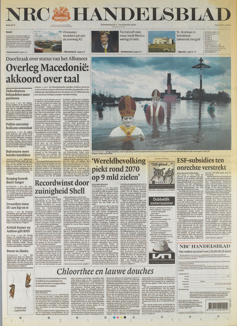
More recently De Does added a Bold Condensed Headline for the redesign of the Dutch evening paper NRC Handelsblad, making Lexicon an even more versatile typeface. Jan Middendorp observes (in Dutch Type) that ‘Lexicon’s elegance… makes the highbrow NRC Handelsblad stand out from the other dailies.’
De Does says that with Lexicon, ‘I tried to obtain what seemed to me the greatest possible legibility and utility, while naturally retaining proper harmony.’
What else one should expect from a typeface designer? If I were obliged to work with just one typeface, I would without a doubt choose Lexicon.
Top: front page of NRC Handelsblad, 2 August 2001.
First published in Eye no. 68 vol. 17 2008
Eye is the world’s most beautiful and collectable graphic design journal, published quarterly for professional designers, students and anyone interested in critical, informed writing about graphic design and visual culture. It is available from all good design bookshops and online at the Eye shop, where you can buy subscriptions and single issues.