
Spring 2018
The front matter
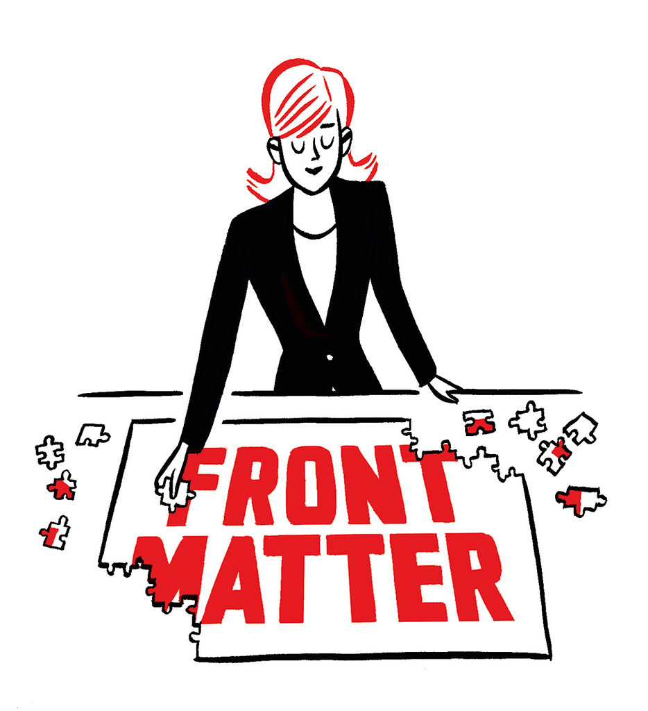
This ‘bitty section’ requires a jigsaw of design and writing skills, says Vici MacDonald
It is a format that most readers will recognise, but few will have a name for – the collage of pictures and short texts often found at the beginning of a magazine section, or even the entire publication. Whatever its official page title, the editorial team will probably refer to it as ‘front matter’, the round-up, short cuts, nibs (news in brief) or just ‘that bitty section’.
There are three basic design approaches to this section: carpet-fitting, marquetry or mosaic. The first can be found in newsy gazettes such as The Economist, whose nibs are screeds of text with a few pictures plonked down like rugs – visually dull, but quick to lay out. Showbiz mags, with their dense jigsaws of cut-out celebs and tiny captions, are strongholds of the marquetry technique. This requires skill and effort, but the result can look overwhelming.
The sweet spot is the classic mosaic-style round-up, where attractive images and extended captions are harmoniously arranged, with plenty of room to breathe. Such layouts typically display the specialist wares of ‘enthusiast’ periodicals: cosmetics, clothes, furniture, gadgets, objets d’art and events.
The recipe for a good bitty section includes a thoughtful selection of inviting images, including some that can be cut out or cropped. The texts will be brief and of similar length, with permission to have them subbed to fit. Simply anchor the page with a striking lead pic and vignette, add intermediate images to taste, earmark a sacrificial shot that can be used tiny to fill the last stubborn gap – et voilà.
The starting point for bad bittiness is a mass of photos that you are not allowed to crop or put text over (fine art is a culprit here), plus overlong copy in which, as an editor used to say to me, ‘We’ve reached page ten and Adam and Eve still haven’t met’. Desperate scenarios like this call for the emergency ‘anno’ (annotation) option, where images and text are corralled into separate areas, then cross-referenced with numbers. This can look impressive – for instance, by making a feature of huge numerals – and it is simpler for subs to cut.
Round-ups do not translate well online, so as printed periodicals wither and die, the format is getting harder to find. For instance, The Guardian’s Saturday magazine once had enjoyable object mosaics in the interiors and fashion sections, but these seem to have been cast into oblivion by the recent (Jan 2018) tabloid redesign.
Fortunately, there is still life in the niche and independent sectors, where titles as diverse as The Oldie and The New Yorker still practise the art. Ultimate kudos must go to Monocle, whose every issue is a miracle of meticulously assembled short cuts. Like so much that is labour-intensive and craft-driven, perhaps such front matter skills are best appreciated at the bespoke high end – the letterpress of magazine layouts.
Top: Illustration by Jason Ford.
Vici MacDonald is a designer, editor and co-founder of Hercules Editions
First published in Eye no. 96 vol. 24, 2018
Eye is the world’s most beautiful and collectable graphic design journal, published quarterly for professional designers, students and anyone interested in critical, informed writing about graphic design and visual culture. It is available from all good design bookshops and online at the Eye shop, where you can buy subscriptions and single issues. You can see what Eye 96 looks like at Eye Before You Buy on Vimeo.