Summer 2008
The test of time
After 90 years, Ishihara’s colour deficiency plates have proved their effectiveness as a diagnostic tool – and they are still beautiful.
The Ishihara test is used to diagnose colour deficient vision (or ‘colour blindness’). It is based on the optical phenomenon of pseudo-isochromatism, where colours that appear alike (isochromatic) are in fact different (pseudo). The ‘Ishihara’ exploits this effect in test plates whose colour configurations elicit variant readings from subjects and so reveal their colour perceptions. The test is indirect: while subjects react to colour, the simple tasks they complete – identifying numerals, tracing a path – are not straightforwardly about it. Yet task responses are categorical and thus easy to interpret, the more so because they avoid the linguistic ambiguities that can come with attempts to articulate what colours are seen, and how.
Ishihara’s Tests For Colour Deficiency (its present title) is more than 90 years old. In this time it has become the basic colour vision test for mass screening in schools and among industrial workers. Its idiosyncratic plates are well known, and not infrequently riffed by designers. (See ‘Ishihara’, Eye no. 56 vol. 14). While the test itself has emerged from ophthalmology and psychology, its visual and print-object features make it unequivocally graphic design.
The origins of the Ishihara test lie in the nineteenth century. When the test was introduced in 1917 by Shinobu Ishihara (1879-1963), it followed another designed along similar lines by Jakob Stilling (1842-1915). Stilling’s 1878 Pseudo-isochromatische Tafeln was the original pseudo-isochromatic test and, by 1918, had reached its fifteenth edition. Though popular, the ‘Stilling’ retained a distinctly nineteenth-century flavour, more treatise-like and less diagnostically incisive.
To improve on Stilling’s shortcomings, Ishihara developed plates that employed four different colour strategies. The range of responses they elicited supported diagnoses of increased reliability. Plate designs were refined through shrewder disintegrations of contour and figure-ground within the field of dots, decisively isolating colour factors. Colours themselves were more exactingly keyed to commonly mis-perceived parts of the spectrum. A compact portfolio was devised to carry the plates, which, in turn, were ordered into a sequence that included both numerate and innumerate (or path) designs. Plates were placed against a black background and held loosely in slots, allowing them to be re-ordered to discourage cheating.
When published, Ishihara’s test marked a step change from its predecessor. Its publication also compelled Ishihara to improve successive editions, work that continued for more than 40 years until his death (and since assumed by a foundation he endowed). Many improvements resulted from relentless performance evaluations.
In the Ishihara test we find distinctive design growing out of clear functional demands; its plates are at once visually and measurably right. The test is iconic but it is also intelligent, exacting, useful, improvable and borne up by long sustained effort. Not all that is canonical need share these qualities, but they must surely bulk large in whatever body of authoritative work and best practice designers care to assemble.
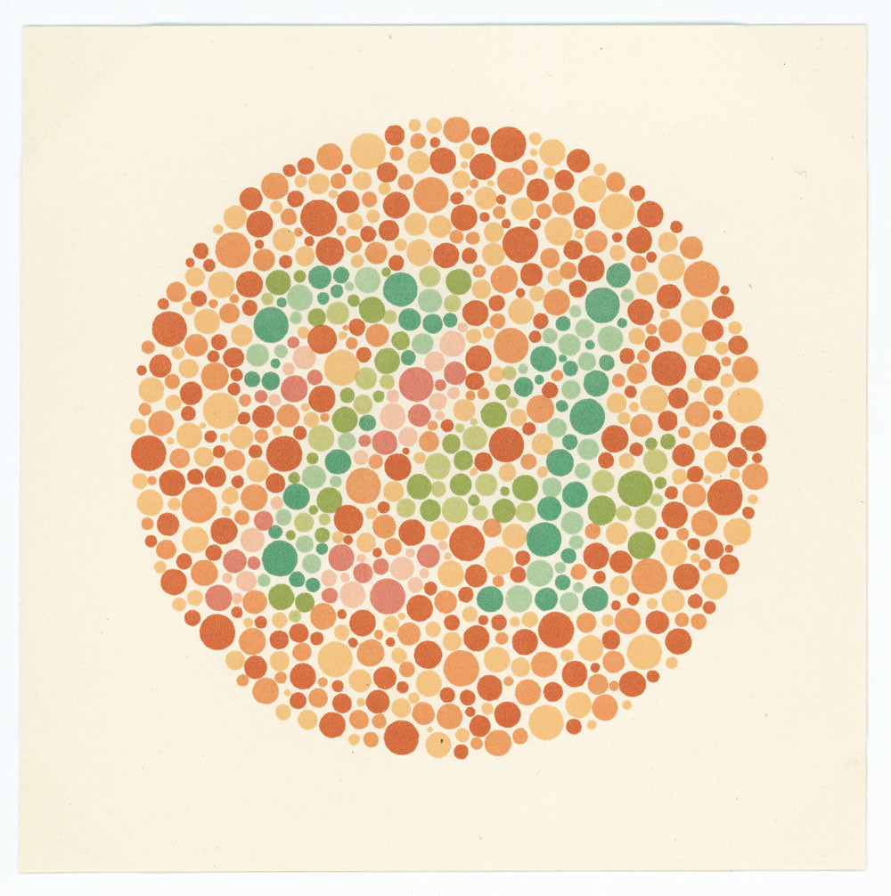
Test plate 2.1 (one of 60) from Stilling’s Pseudo-isochromatische Tafeln by Jakob Stilling, 1918 (fifteenth edition).
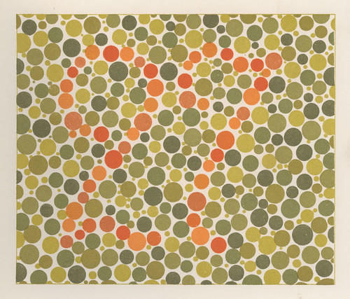
Top: Test plate 5 (of 16) from The Series Of Plates Designed As Tests For Colour Blindness by Dr Shinobu Ishihara, 1917. Printed in nine colours.
Eric Kindel, designer, writer, lecturer, Reading
First published in Eye no. 68 vol. 17 2008
Eye is the world’s most beautiful and collectable graphic design journal, published quarterly for professional designers, students and anyone interested in critical, informed writing about graphic design and visual culture. It is available from all good design bookshops and online at the Eye shop, where you can buy subscriptions and single issues.