Autumn 1994
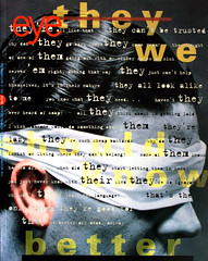
Underground matriarchy
Women who have shaped the profession by their own work and by enabling those around them
The role of women in graphic design is consistently marginalised or overlooked. This dialogue, written across fax lines between New York and Minneapolis, in two distinct and personal voices, focuses on American women who have had a profound impact on the profession, not only through the projects which bear their own signatures, but through the creativity of others, women and men, working in their midst. They represent not a closed canon of matriarchs but an open set.
Laurie Haycock Makela: During a pivotal period in the mid 1980s, the insistence on something called ‘subjectivity’ forced an opening in the tight rightness of ‘good’ design. The radical efforts of renegade Modernists such as April Greiman, Sheila de Bretteville, Lorraine Wild and Katherine McCoy, however different from one another, added up to a powerful underground matriarchy that upended formal constraints and validated personal content and gesture. Ten years ago, ‘good’ design meant objectivity, obedience, cleanliness and correctness; into that impossible Modernist environment, these women placed subjectivity. Messy, permissive, full of idiosyncratic logic and essentially feminist in nature, subjectivity is at the heart of the explosive avant-garde in American graphic design today.
Ellen Lupton: Important design emerges from contexts that encourage innovation and experiment. Good design is not simply the product of individuals graced with a miraculous talent – designers are stimulated by schools, clients, companies, studios, colleagues, competitors and other social networks. The danger in mapping out an underground matriarchy is that we will replace the old boys’ network – which for so long has excluded women, younger designers and people working at the margins of the professional mainstream – with an equally exclusive new girls’ network, defined by its own personal ties and ideological biases. For me, to chart the family tree of an underground matriarchy is not to recast the traditional pantheon of individual genius with a new set of shining stars but to shift the focus of design journalism from the individual as creator ex nihilo to the individual as actor in a social context.
The word ‘matriarchy’ invokes the values associated with feminine culture – gathering as opposed to hunting, cultivating as opposed to conquering, nurturing rather than self-promotion. These values are not strictly tied to sexual identity, but have been linked in our society to women. As the design profession – and public life in general – becomes more inclusive, these values are increasingly shared by both sexes. Sheila de Bretteville, Muriel Cooper, Carol Devine Carson and Mildred Friedman have contributed to the evolution of contemporary design both by producing their own work and by creating contexts in which innovation can flourish.
LHM: When I was in high school, Sheila de Bretteville created a poster called ‘Taste and Style Aren’t Enough’ for the then-new CalArts in Valencia. Its low-tech, vernacular look was a deliberate commentary on the high-finish corporate aesthetic celebrated by most of her colleagues. In 1980 at the University of California at Berkeley, I was a student in her senior studio, where we were given projects in which design served only as a formal language for expressing personal values.
De Bretteville’s encouragement of self-reflective subject matter connects the student to the content, and the content to the form. From the early 1970s she has consistently conveyed to her students the sense that their content is worthy, with the result that their forms resonate with personal choice. She has increased the value of plurality, interpretation and collaboration in design, values that inspire my current role as design director at the Walker Art Center, Minneapolis.
EL: De Bretteville became chair of the graphic design programme at the Yale School of Art in 1990. In addition to encouraging her students to draw on their own experiences, she believes that designers should interact with their audience and should consider the social consequences of their practice. According to De Bretteville, producing design in collaboration with one’s audience is a feminist act, because it makes use of values of intimacy and co-operation associated with women’s culture. She and her students have studied the ways the media marginalises groups with certain sexual, ethnic, racial and class identities, and have produced projects with communities in New Haven, the harsh urban setting from which Yale has traditionally stood aloof as a bastion of privilege.
LHM: The success of her approach depends on keeping a distance from style-related design trends. Her students shun competitions as irrelevant beauty pageants. She distrusts pure form-making without commitment to a larger issue.
But for some designers, the bigger issues can only be expressed in abstract, formal terms. April Greiman – often criticised for creating an ‘empty’ kind of beauty – wraps her talent around global themes: the overlapping of science, technology and spirituality. Greiman exhibited her Space Mats (designed with Jayme Odgers) at our design gallery at Berkeley at a time when I was doing a typographic poem about my menstrual cycle for an assignment for Sheila. The place mats were produced without a client, and captured an erotic and exotic hyper-dimensional vision. Greiman found a glamorous, funhouse, Zen-like centre to the practice of design; she threw the Swiss grid on its back and lovingly fucked it with colour and wild imagery. This was a galactic brothel compared with a retentive, methodological aesthetic of corporate design.
To this day, Greiman will tell you she is not a feminist. But I believe her visual seductions are motivated in part by an emotional freedom undiscovered by her male colleagues at the time. Katherine McCoy has said that ‘the Modernist design paradigms of objective rationalism are typical of a male sensibility, safely disengaged from emotional involvement.’ Greiman’s work depicted volumes of passion; when that passion turned to technology, she gave the future a beautiful, sensual and bright new aesthetic.
EL: Greiman’s work is a painterly and personalised response to digital technology. As the progenitor of a distinctive signature style that has been widely imitated, she is a legendary star who has helped fuel – inadvertently or not – the cult of personality cherished by many graphic designers. Her work is an exquisite revision of the formal languages of Modernism; her approach to technology is often suggestive and metaphorical rather than structural, engaging the mythology of the machine rather than the revolutionary potential of electronic media.
A very different exploration of technology is found in the career of Muriel Cooper, who in 1975 founded the Visible Language Workshop, part of MIT’s Media Lab. While Cooper’s untimely death on 26 May 1994 is a profound loss to designers, her work will be carried forward by the institution she created and the people she inspired.
The VLW has treated digital typography not as a tool for designing printed graphics, but as a unique medium with its own properties and possibilities. Most graduate programmes concentrate on the making of complete, self-contained works: books, posters, installations and other objects whose ‘signature’ status is modelled on the products of painting, sculpture and photography departments. The VLW’s focus has been different: Cooper worked to build an electronic language that will support the work of future designers, helping them to make complex, malleable documents in real time and three-dimensional space. Cooper gave concrete functions to such principles as layered information, simultaneous texts and typographic texture – visual structures that are familiar as expressive, personal gestures from the ‘New Typography’ of the 1970s and 1980s. While many designers working at the stylistic edges of contemporary typography have approached technology in terms of impressionistic imagery – the territory traditionally reserved for graphic design – Cooper aimed to restructure the language of design in four dimensions.
Many women today are excelling in the fields of interface design and electronic publishing, including Red Burns, Jessica Helfand, and Loretta Staples. While men are the visible mouthpieces and economic leaders of such companies are Voyager, Microsoft, Apple and Whittle Communications, women are playing important roles in crafting environments for the new design media. Perhaps ‘interface’ is an electronic counterpart to realms of culture that have traditionally been feminised – an interface, like a housewife or a secretary, provides a gracious, comfortable setting for the performances of others. Many tasks known as ‘women’s work’ in the twentieth-century office involve mediating technologies. From answering phones, transferring calls and taking messages to typing letters and making copies, female office workers have formed a human link between male managers and their machines. Women have served as bodily extensions of communications equipment. The contemporary ideal of the user-friendly electronic environment reflects the continued desire to humanise technology.
LHM: An interface is also like a teacher. As co-chair of the Cranbrook Academy of Arts’s design programme, Katherine McCoy shepherded dozens of students through the school’s now notorious formal experiments. In the mid 1980s she allowed some of the first debates about deconstruction to surface in critiques of graphic design. I use the word ‘allowed’ because though she may pursue a more conservative course in her own work, her critiques were a free zone for new thinking about design. She was willing to take the heat and the glory for staking out the potentially unbeautiful aesthetic manifestations of literary deconstruction, or, if you will, postmodernism.
Women seemed particularly well equipped to grapple with the decentring of the time, or at least to be a centre for decentred thinking. McCoy found her students aggressively rejecting traditional approaches to visual communication and encouraged their private dialogues, their strange and cultish works. The intellectual comfort of the formal exercises that teach abstraction was abandoned at Cranbrook. This new turn in design education was psychoanalytic and difficult to control, but it was a perfect antidote to the depersonalised endpoint of Modernism that many young designers of the time experienced. Cranbrook became such a powerful cult because people came for refuge, and the McCoys ran a foster home for design addicts. They have recently decided to retire after twenty years, now that those weird Midwestern lab experiments have grown to be a powerful influence on international design trends.
EL: The exemplary matriarchs we have discussed so far have come mostly from the academic world, a place where women have found visible and influential positions over the last twenty years. Perhaps the institutional support and clear structures for advancement that schools offer have made academic settings more penetrable by women than large-scale design studios, where vast numbers continue to hover in mid-level positions. The academic world can put designers in the ambiguous position of producing both marginal and official culture: marginal because academia provides a place outside commercial practice where experiment and opposition can be safely expressed, and official because schools are charged with articulating principles that young designers will take with them into the marketplace and which inform much of the professional community’s dialogue.
Carol Devine Carson has had a tremendous impact on contemporary design, working not from an academic post but from a major publishing house. Arriving in New York from Nashville, Tennessee in 1973, she was an outsider to both the city’s design establishment and to the academic / Modernist vanguard. Since she became art director at Alfred A. Knopf in 1987, she and her design staff have transformed bookstore shelves with their strange and sinister jackets. The principal designers in the Knopf Group have been with Carson from the beginning: Chip Kidd, Barbara de Wilde and Archie Ferguson. The fact that this amazingly productive (and now widely imitated) team has stayed together for so long reflects the strength of the imprint’s management. Knopf has brought visually challenging graphics to a broad public – these are not esoteric art catalogues or posters for design events, but mainstream consumer products displayed in shopping malls across the country.
Like colleges and universities, major publishing houses are large, bureaucratic institutions with defined hierarchies; for most employees, the field’s cultural prestige is countered by relatively low wages. According to Carson, the book business traditionally has made a place for women: ‘We have always done a lot of the real work in this industry. The difference in the past fifteen years is that it’s more common for women to be rewarded for the work they do.’
Before Carson’s arrival, art director Bob Scudelari was corporate vice president of Random House and design administrator for all the company’s imprints, including Knopf and some dozen others. Carson became vice president, art director in charge of the Knopf Group in 1991, and now directly controls design within the imprint and supervises work at Pantheon and Vintage. In the old system, Scudelari was the chief spokesman and the art directors were kept relatively cloistered from editors and authors. Now Carson has direct contact with these forces (as well as with the meddlesome marketing department), giving her more control over the process.
LHM: I was teaching at CalArts when Lorraine Wild arrived from Houston in 1985 as the new chair of the visual communications programme. Soon afterwards, two more Cranbrook graduates – Jeffrey Keedy and Edward Fella – joined the faculty. Within a year, the fires were set. The four of us taught a graduate seminar whose students included Barry Deck, Barbara Glauber and Somi Kim. Informed by theory and history, Wild set a tough standard for critiques that often mocked conventional notions of meta-perfection and problem-solving. The students’ formal and critical skills developed within an authentic and radical contemporary art environment. The rigorous exchange between Cranbrook and CalArts and the emerging influence of Emigre magazine (and Zuzana Licko’s typefaces) all helped to create a dizzying centrifugal force, a virtual supernova in design evolution.
In this extreme environment, Wild attempted to respond to brutally incongruous demands: in addition to directing the programme, she wrote articles, gave lectures, maintained international contacts, designed books and taught a design history course that kept the interest of even the most informed. Sharing an office with her for several years, I witnessed countless moments between a student’s tears and an emergency faculty meeting when she would look up with a pained smile and say, ‘Why are we doing this?’
The answer, of course, is that if we are to make a difference in the design field, we need to reinvent the setting for design education. For Wild, there was an element of disgust at what she had been exposed to in the New York studios, so she approached the CalArts programme with a furious intensity, which she has recently redirected towards creating ReVerb, through which she has launched a constructively angry response to the objectivity and patriarchy which pervaded her training. Her design work speaks for many cultural institutions of our time in alternating fits of elegance and anarchy.
But men still dominate the profession – even at its avant-garde fringes. Women seem to spend more time underground, gaining collective recognition and regenerating the field in intangible ways. Simply put, the efforts of this matriarchy has made possible the kind of permissive, wild, personal and pluralistic form language that so many men are becoming famous for. As our ‘fathers’ stood at the front door, firmly protecting the rules of the house, our ‘mothers’ quietly unlocked the back door, freeing the children to act upon their natural impulse to personalise what they make.
EL: The Modernist design establishment has never been a solid edifice – it was always threatened from without by consumerism and mass culture and pressured from within by the vanguardist obsession with individualism and novelty. In recounting the rise of subjectivity in design, it is important to remember that men as well as women opened the back doors of the discipline. Wolfgang Weingart, Dan Friedman and Gert Dumbar fuelled the unleashing of typographic form in the 1970s and 1980s, often working side by side with the matriarchs heralded here. The current fascination with radical personalities (male and female) continues a long line of avant-garde confrontations led traditionally by men.
My primary identity is as a curator and writer, working for Cooper-Hewitt, National Museum of Design in New York. Because I am a curator first and a designer second, I feel obliged to look beyond my immediate circle of mentors. But I have ‘mothers’ too. Mildred (Mickey) Friedman has been a role model and colleague. As design director at the Walker Art Center from 1970 to 1991 she set an international standard for exhibitions and publications. In 1989 she curated the first large-scale museum survey of graphic design in the US; while her strong vision provoked anger from designers, the exhibition probably did more to raise public knowledge of graphic design than any event in history.
LHM: In my first few months as design director at the Walker, I discovered that I had inherited unbelievable resources in the form of curators who embraced quality design and publishing and audiences who had come to expect design to be part of contemporary arts programming. These attitudes were nurtured by Friedman during the twenty years that she edited Design Quarterly and produced exhibitions at the Walker, creating a place for educated dialogue about design when few existed.
‘Masculinity’ and ‘femininity’ are cultural constructions historically tied to the biological differences between the sexes. An important goal of feminism is to make the values traditionally associated with the world of women into values recognised across the social and sexual spectrum: to nurture, to include, to respond, to support, to enable. As the influence of women continues to grow in the coming decades, such skills may no longer be regarded as distinctly feminine or as the exceptional product of women’s achievement. Design competitions must begin to include new categories – such as lectures organised or given, exhibitions curated, new curriculum planning and special research in areas such as cultural iconography. In this way, we will be in a better position to acknowledge all levels of accomplishment – from the surface of the page to the underground of the community.
Ellen Lupton, curator of design, Cooper-Hewitt Museum, New York
Laurie Haycock Makela, design director, Walker Art Center, Minneapolis
First published in Eye no. 14 vol. 4 1994
Eye is the world’s most beautiful and collectable graphic design journal, published quarterly for professional designers, students and anyone interested in critical, informed writing about graphic design and visual culture. It is available from all good design bookshops and online at the Eye shop, where you can buy subscriptions and single issues.