Summer 2008
Voice control
The title sequence for this Truffaut movie heralds brilliantly a world where the written word is forbidden.
The title sequence for François Truffaut’s Fahrenheit 451 contains no moving images, no animation and no typography, yet it is one of the most marvellous film titles ever.
Released in 1966, the film is based on Ray Bradbury’s science-fiction novel of the same name, set in a totalitarian future where the government has banned books and the job of firemen is to burn all literature (451 degrees Fahrenheit being the temperature at which paper bursts into flame). The populace receives all their information and entertainment through giant television screens, and the printed word is outlawed. This axiom is applied to the film’s title sequence in a manner that is both visually striking and conceptually impeccable.
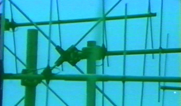
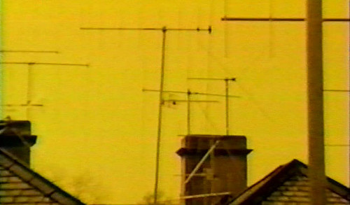
Top and below: frames from the uncredited title sequence for Fahrenheit 451 (1966), which has no text - just still images of television antennas.
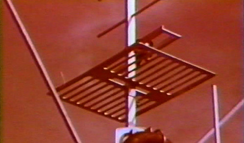
A series of still images of television antennas appear on the screen. These are black-and-white images coloured with a variety of flat colour fields, a printing technique reminiscent of many early 1960s Penguin book jackets. The palette of motion-design moves is restricted: the camera’s single repetitive movement is to zoom into each image and then momentarily hold on a static frame before cutting to the next shot; variations in the speed of the zoom are subtle; and shifts in composition and colour are the only other variables. As the camera zooms into each antenna image there is an implication that someone is listening, watching and controlling the viewer, rather than the viewer receiving any kind of worthwhile message: the media is watching you, rather than you watching the media.
The credits do not appear typographically; instead they are read aloud in an authoritative and factual manner, the stern tone of the voice standing in for the governmental sans serif that cannot be made visible, since under this totalitarian regime no printed matter can exist . . . so films cannot have film titles with typography in them! So logical. So simple. So perfect. So antithetical to the essence of film titles, so absurd, that it sets the tone for the fableistic theme of the film.
The title sequence is an integral part of Fahrenheit 451, it immediately introduces the viewer to the central construct of the film’s narrative. There is no credit line for the design of the title sequence in the end credits, though it may well have been a collaboration between the director of photography, Nicholas Roeg (who went on to direct the visually rich films Performance and The Man Who Fell To Earth), and the production designer, Syd Cain (art director of From Russia With Love and Dr No). The Fahrenheit 451 titles are a reminder of the power of simple yet clever conceptual solutions.
These film titles stand out as a contrast to the formally complex titles of the late 1990s, which still inform many title designs of today – a reminder that simple form can work perfectly to communicate multi-levelled ideas when the content is allowed to drive the conceptual direction.
Fahrenheit 451 is scheduled to be remade for release in 2010. It will be interesting to see whether a contemporary version of the titles can retain the simplicity, poetry and appropriateness of the original.
First published in Eye no. 68 vol. 17 2008
Eye is the world’s most beautiful and collectable graphic design journal, published quarterly for professional designers, students and anyone interested in critical, informed writing about graphic design and visual culture. It is available from all good design bookshops and online at the Eye shop, where you can buy subscriptions and single issues.