
Spring 2016
Wit, bad taste and loud type
The photos of legendary graphic designer Robert Brownjohn show an outsider’s view of 1960s London
Robert Brownjohn had a short but glittering career in 1950s and 60s graphic design, which included some pioneering advertising and corporate identity work in New York City, and the famous title sequences for the Bond movies From Russia with Love and Goldfinger in London. But on a single day in 1960 Brownjohn also assured himself a place in the history of photography.
His ‘Street Level’ photographic series – 137 black-and-white images which he claimed to have captured on one trip around London by taxi – has found a permanent home in the Victoria and Albert Museum (V&A) since 2012, and warrants a fresh look. Some of these pictures are familiar
to graphic designers from their appearance, heavily cropped, in Typographica New Series no. 4 in December 1961.*
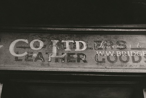
The series reflects London’s vernacular lettering and typography as seen on shopfront signs; painted on pavements, roads and on panes of glass; imprinted on scraps of metal; inside shops and offices; and myriad locations typical of gritty, early 1960s London. These images exemplify Brownjohn’s distinctive way of seeing and they embody his outsider-ness. Through his 1957 Pentax lens, Bj (as he preferred to be called) captured the city a few years before it became ‘Swinging London’. As Katy Homans wrote in Eye no. 4 vol. 1: ‘Brownjohn lived what he preached; his London flat was full of typographic junk: broken signs, individual letters, torn paper with unusual printing.’ The ‘Street Level’ pictures show his obsessive passion for signs and letters.
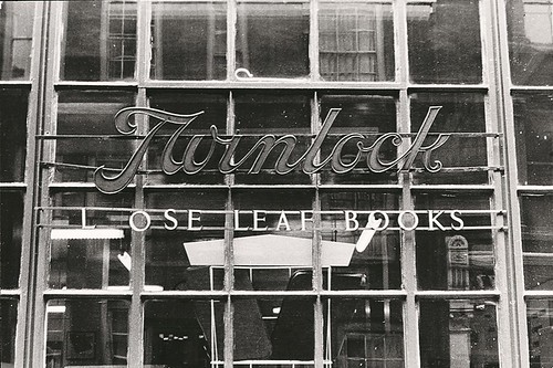
Bj records the unconscious humour of the lost ‘O’ in this shop window sign for ledger manufacturers Twinlock, a brand still familiar to accountants and office managers.
Top: Robert Brownjohn, 1961.
All images © Collection: Victoria and Albert Museum / Robert Brownjohn, 1961.
Bj was born in Newark, New Jersey in 1925. He attended the Pratt Institute in 1943, followed by the Chicago Institute of Design, where he studied under and assisted László Moholy-Nagy and Serge Chermayeff. He went to New York in the early 1950s and in the late 1950s worked with Ivan Chermayeff (son of Serge) and Tom Geismar as Brownjohn, Chermayeff & Geismar Associates (BCG).
A whirlwind trip spent photographing vernacular signs was nothing new for Bj. In New York it had been common practice for BCG’s partners, along with designer friends such as Tony Palladino, George Tscherny and Bob Gill, to go out and capture the visual language of Coney Island and other NYC locations on film as a way of inspiring their client work.
The introductory text to the Typographica feature read: ‘The things they show have very little to do with Design, apart from achieving its object. They show what weather, wit, accident, lack of judgment, bad taste, bad spelling, necessity and good loud repetition can do to put a sort of music into the streets where we walk’.
Bj was an avid jazz fan and friend of musicians Charlie Parker and Miles Davis; his approach to life and work often emulated this liberated yet drug-infused and self-destructive scene. But in London – on his own, and yet to start a job as creative director at J. Walter Thompson – Bj created something beyond a portrait of London’s typographic environment.
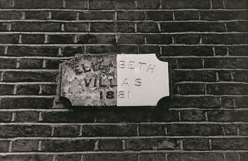
‘Fresh paint draws a sharp line between neighbours.’ The Typographica caption compares this sign with a book whose jacket is divided horizontally between sans serif and sans type. ‘Eliza’ is also the name of Brownjohn’s daughter.
Bj’s use of happy accident, vernacular type and letters in three-dimensional space informed his best regarded work, including the Bond title sequences, his cover for The Rolling Stones’ Let It Bleed (1969) and the poster for Dick Davison’s New York Peace campaign. This shows an ace of spades playing card modified by handwriting to read ‘Peace?’.
Since it was purchased by the V&A, the collection of Brownjohn’s photographs has been displayed both in the V&A Museum, and as part of the ‘Beneath the Surface’ exhibition at Somerset House in 2015.
A selection of the ‘Street Level’ series can also be viewed by the public, by appointment only, in the V&A’s Prints & Drawings Study Room. V&A’s curator of photographs Susanna Brown says: ‘These unique vintage prints are valuable in terms of their potential design applications and their link to many key V&A collection areas in architecture, typography, publishing and calligraphy. The images form part of the wonderful history of street photography, connecting with the work of photographers such as Benjamin Stone, Eugène Atget, Walker Evans and William Klein.’
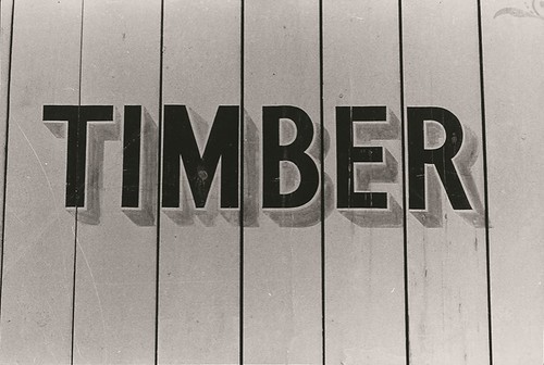
A highly literal sign in shaded sans capitals for a London timber yard. Another image not used in the Typographica essay.
In his Design Observer post ‘Robert Brownjohn: Photos at Street Level’, Rick Poynor wrote: ‘It’s only now that we can take their measure as photographs rather than as adroitly selected and organised typographic details pressed into editorial use … What [they show] is that Brownjohn tended to include enough of the setting to give a strong sense of the look and atmosphere of the place where he found the lettering or graffiti. The British capital’s dour postwar street texture was fascinating and meaningful to him. Brownjohn shows the bricks, the stone, the doorways and window frames, the railings, the adjacent fixtures, the surrounding structure.’
Brownjohn, a long-term heroin addict, died of a heart attack in 1970, at the age of 44. The ‘Street Level’ series is an element of his legacy that demonstrates his lasting contribution to the practice of street photography.
*See Eye no. 31 vol. 8; Rick Poynor’s book Typographica (2001); and Emily King’s Robert Brownjohn: Sex and Typography (2005).
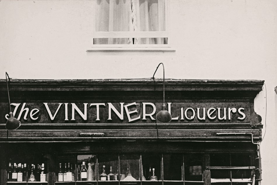
‘Destitute shopkeepers make chaos for London.’ In the Typographica captions, Bj and Spencer compare such overlapping shop signs to deliberately distressed typography by David Enock, Bob Gill and Colin Forbes.
Sarah Snaith, design writer, London
First published in Eye no. 91 vol. 23, 2016
Eye is the world’s most beautiful and collectable graphic design journal, published quarterly for professional designers, students and anyone interested in critical, informed writing about graphic design and visual culture. It is available from all good design bookshops and online at the Eye shop, where you can buy subscriptions, back issues and single copies of the latest issue.You can see what Eye 91 looks like at Eye before You Buy on Vimeo.