Summer 2008
Woman at the edge of technology
Jacqueline Casey’s posters used wit, invention and the grid to reach the essence of each subject.
There are many women designers who deserve to be recognised for their immense contributions to the field of graphic design, but few so deserving as Jacqueline Casey (1927-92).
A 1949 graduate of the Massachusetts College of Art [now known as Massachusetts College of Art and Design], Casey joined the Office of Publications at the Massachusetts Institute of Technology (MIT) in 1955, serving under director John Mattill and staffer (and fellow alumna) Muriel Cooper.
In 1972, Casey took over as director of the renamed Design Services Office, where she created a series of iconic posters to publicise MIT events and exhibitions along with fellow designers Ralph Coburn and Dietmar Winkler. She was a woman in a man’s world, not only in the publications office, but also in the MIT community that served as her clientele.
Casey’s visual language style was strongly influenced by the Swiss designers Karl Gerstner, Armin Hofmann and Josef Müller-Brockmann and the International Style. Thérèse Moll, a young Swiss designer who had been an assistant in Karl Gerstner’s Basel office and who briefly worked in the MIT publications office in 1959, is the one person Casey credited with her introduction to the grid and its design philosophy: ‘She introduced the office to European typography … This use of proportions in designing publications series became a useful tool for developing MIT’s image.’
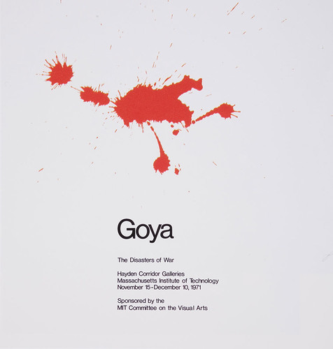
Above: poster for ‘Goya: The Disaster of War’, an exhibition of Goya’s aquatint prints from the 1810s, 450 x 450mm, 1971. This makes masterful use of Casey’s metaphorical touch.
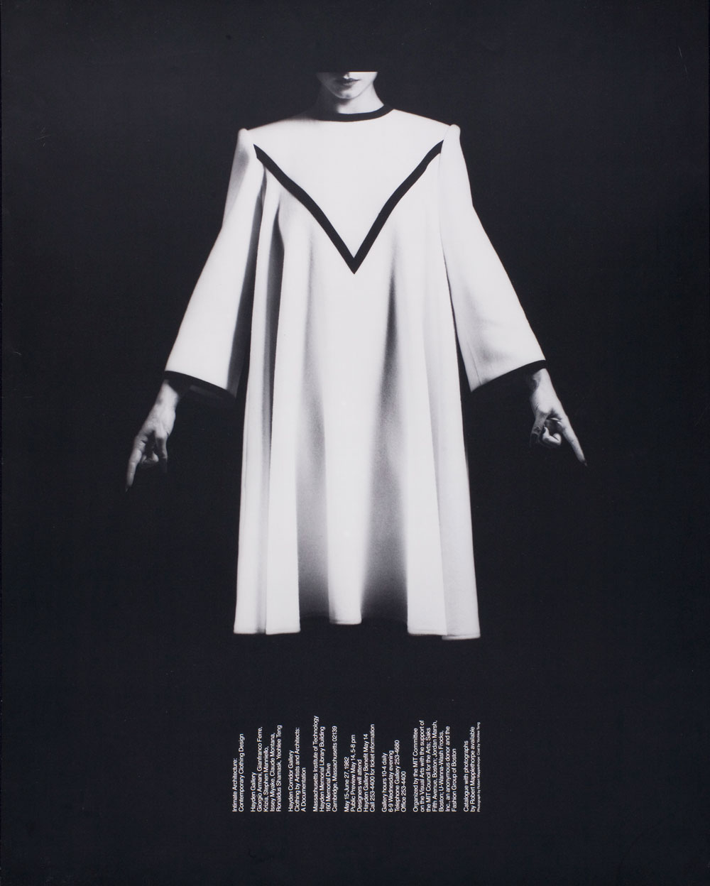
Top: poster for ‘Intimate Architecture: Contemporary Clothing Design’, 590 x 740mm, 1982. Photograph: Robert Mapplethorpe. Poster design: Jacqueline Casey.
Typography plays a fundamental role in Casey’s posters: a complete visual image can be created entirely from the message content and the image becomes the message. ‘My job is to stop anyone I can with an arresting or puzzling image, and entice the viewer to read the message in small type and above all to attend the exhibition,’ she told Liz McQuiston in Women In Design (Trefoil, 1988).
In each of Casey’s posters, a visual element attracts the viewer and the text provides information. She is at her best when she employs a visual metaphor, as she does so brilliantly with the use of a ‘blood splat’ as the solitary image for her exhibition poster ‘Goya: The Disasters of War’, where the interplay of visual and verbal ignites our imagination and encourages a more profound understanding of its subject.
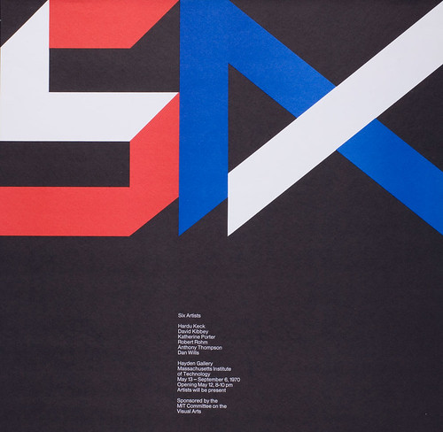
Above: ‘Six Artists’, 520 x 530mm, 1970. Poster design: Jacqueline Casey.
In another astonishing visual statement for a poster announcing the exhibition ‘Intimate Architecture: Contemporary Clothing Design’, Casey, working with Robert Mapplethorpe images, places the typography without interfering with the striking photograph. Her concept incorporated the text by gently following the folds of the dress in a manner that achieved seamless integration between type and image.
Casey was also known for her word play and inventiveness while using the highly ‘rational’ Swiss design methodology. ‘Russia, USA Peace, 1985’ is a poster commissioned by the Shoshin Society (also known as the Hiroshima Appeals peace campaign) to commemorate the 40th anniversary of the bombing of Hiroshima.
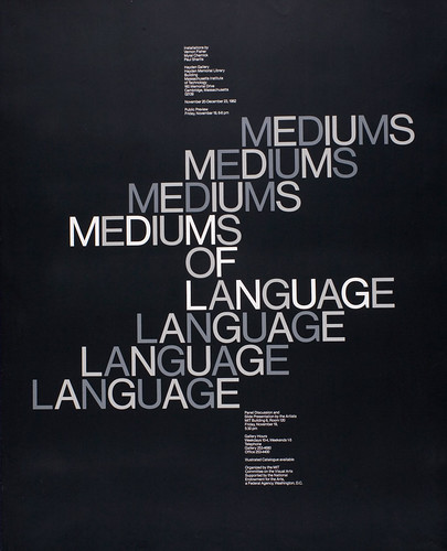
Above: ‘Mediums of Language’, 760 x 610mm, 1977. Poster design: Jacqueline Casey.
Using a predominantly black poster with a clear varnished image of the planet Earth in the upper right-hand corner, Casey discovers the word USA nestled within the word ‘Russia’ and uses colour (red and white) to separate the two superpowers, visually suggesting that they were inextricably linked in their quest for peace.
MIT is renowned for teaching and research in science and technology. Casey’s work for its academic community engaged the intellect of her audience by its ability to identify and reveal the ‘essence’ of each subject in a profound yet human form.
Elizabeth Resnick, design educator, MassArt, Boston
First published in Eye no. 68 vol. 17 2008
[This online version includes small factual revisions in the first three paragraphs.]
Eye is the world’s most beautiful and collectable graphic design journal, published quarterly for professional designers, students and anyone interested in critical, informed writing about graphic design and visual culture. It is available from all good design bookshops and online at the Eye shop, where you can buy subscriptions and single issues.