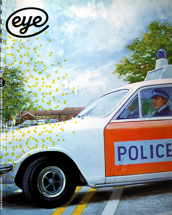
Summer 2004
Worlds of moiré
Effect, defect, accident or design – moiré has a vital place in printing
‘Moiré’ is the name commonly given to a group of visual effects that most designers know well, at least by sight. The word itself originates in the domain of textiles and derives from the early French mouaire, in English ‘mohair’, and in particular mohair with wavy, glossy surface markings, an effect also known as ‘watered’. Watered effects are commonly associated with paper or silk and are applied by calendering – pressing either material between hot cylinders. In Europe, watered silk is found at least as far back as the seventeenth century, used in dresses and waistcoats (Samuel Pepys had one), and was then called ‘moire antique’, or simply ‘moire’. In each case, ‘moire’ was spelt without the ‘é’ we now include and thus pronounced ‘mwar’; the acute appeared in the early nineteenth century, an affectation perhaps of a French association some had with the word or the effect. After 1800, both moiré papers and silk were used in bookbindings, the silk variety especially popular in the middle decades of the nineteenth century.
But it is another species of moiré that graphic designers may find more familiar: that made by superimposing regular patterns or screens to create second-order figures. It may have a textiles origin, too, created by layering semi-transparent fabrics of a loose but even weave; when the fabrics move, moiré is brought to life. While its visual analogy to watered fabric is readily apparent, moiré of this kind correlates directly with effects frequently encountered by graphic designers, many of whose materials and technologies contain regular structures. Whether from palettes of line or dot patterns in software applications, or as rasters in printers, scanners and monitors, such structures are the raw ingredients of moiré that need only be ‘overlaid’ in specific ways to create it. With moiré never far away, it is tempting to argue that graphic designers are more alert than most to its occurrence, intended or otherwise …
[…]
… Whether or not the humble mechanical halftone dot and its manipulation can still build worlds (and some will regard this idea as altogether passé), interest in moiré remains. Recent work such as Gareth Hague’s design for the book Star Culture (Phaidon, 2000) demonstrates that beyond the decorative, figurative, symbolic, abstract or philosophical qualities already ascribed to it, moiré and the broader sphere of screen effects seem ever capable of appearing new (a point made repeatedly by commentators over the decades), entertaining the eye and mind with configurations of pattern and colour in endless variety. But as an unintended artefact that has long concerned process engravers and reprographic technicians, moiré’s days may be few in number. With increasingly sophisticated sampling methods, scanning and image editing software detect conflicts in original images and calculate effective resolutions. And apart from efforts to neutralise regular structures in the digital domain, unintended moiré in print may also eventually disappear. As random ‘dot’ (aka stochastic) halftones like those now used in Eye replace the familiar mechanical halftone screen, moiré accidents become less likely (and images such as those in this article become easier to reproduce). Random dot halftones are the successors of the defunct natural grain screens of an earlier age, and with their ‘return’ our vigilance for moiré may once more relax a little.
Readers wishing to sample a wider variety of moiré effects than those shown here should visit www.epfl.ch, a website compiled by Isaac Amidror, Peripheral Systems Laboratory, Ecole Polytechnique Fédérale de Lausanne.
Eric Kindel, editor and associate professor, University of Reading
Eye is the world’s most beautiful and collectable graphic design journal, published for professional designers, students and anyone interested in critical, informed writing about graphic design and visual culture. It is available from all good design bookshops and online at the Eye shop, where you can buy subscriptions and single issues.

