Summer 2015
Writing the city
Signwriter Pete Hardwicke has left his mark on a significant area of London

In East London, the only constant is change. Buildings are torn down and converted. New housing developments are squeezed into every patch of wasteland, every gap between houses. And money – from the city, from Old Street’s ‘Silicon Roundabout’, from Russia – is flooding in. But odd patches of tradition flourish. On fashionable streets such as Columbia Road and Broadway Market, both with bustling weekend markets and an upwardly mobile, design-conscious demographic, the visual landscape is dominated by old-fashioned shop signs, painted with a craftsmanship that seems almost antediluvian.
Many of these are the work of signwriter Pete Hardwicke. His brushed creations create visual harmony across the shopfronts of myriad independent traders, making them contemporary and ‘unbranded’ while referencing the traditions of past masters. While his work is anonymous and unsigned, it has played a prominent role in the redevelopment of this part of London. The perfumer Angela Flanders, a regular client, was one of the first to set up shop on Columbia Road before gentrification set in, and Hardwicke has been working for her, and the businesses that followed her, ever since.
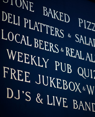
Hardwicke’s lettering and miniature ampersands for a long list of food, drinks and entertainment on offer at The Lauriston public house in Hackney, London E9.
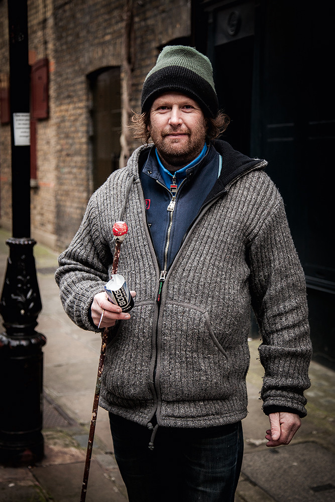
Top: London signwriter Pete Hardwicke with the tools of his trade: brush, mahl stick and improvised paint container. All photographs by Gus Palmer.
Signwriting has its roots as a distinct area of practice in the latter half of the nineteenth century. As improvements in public education increased literacy among the poor, words began to play a more important part in pub and shop signs, and advertisements. From the 1870s the term signwriter, as opposed to sign painter, gained widespread usage, reflecting this shift in the sort of work being undertaken. The letterforms of this era were often highly decorated and ornamental, featuring lots of shadowing effects, colour blends, outlines and Tuscan-esque alphabets.
Hardwicke’s own lettering education began on weekends and during school holidays in the early 1980s. His father John used to restore motorbikes and cars; Hardwicke helped him with coach lining, and painting number plates. John made use of Ted Ambridge’s local signwriting firm and Hardwicke got some work there. After he left school at sixteen, this developed into a trainee position.
Ambridge had set out on his own in 1959, aged 24, after returning from national service to find there was no longer a job for him at his previous exhibition sign company. He was renowned for his speed, which Hardwicke describes as ‘the speed of a ticket writer, with signwritten quality.’
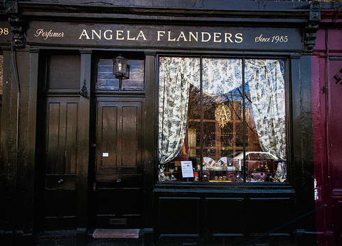
Gilded letters on the shopfront of perfumer Angela Flanders on Columbia Road, London E8. The sign uses a combination of script and roman lettering.
The business grew rapidly – Ambridge Signs had the accounts for several major breweries, including Charringtons, Watneys and Truman’s. In this fast-paced business it was often ‘all hands on deck’, and Hardwicke was regularly exposed to the wide range of work undertaken. Ambridge Signs was turning out decorative work and pictures for hanging signs, as well as ornate gilded lettering, glasswork and cut letters.
Ambridge Signs was then based in De Beauvoir Town in North London, only a couple of miles from Hardwicke’s current stomping ground, an area once home to a number of signwriting companies, including Silver Signs on Buckingham Road and Reynolds Displays on New North Road.
What Hardwicke learned at Ambridge Signs was guided by Paul Gurney, who in turn learned from Ted Ambridge himself. Ambridge was trained by Ken Murphy, and so Hardwicke often talks about his professional lineage ‘going back three generations’. Many signwriters talk about their heritage in similar terms, reflecting the apprenticeship approach to learning that persists in this and other traditional crafts such as printing and bookbinding.
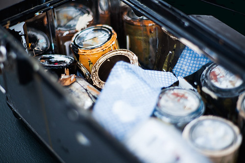
Some of the contents of Hardwicke’s signwriting box, including a variety of shades of oil-based paints and a cloth for wiping down brushes after use. Though all his work is made with traditional tools, Hardwicke sometimes uses his smartphone to reference artwork – when copying a client’s logo, for example.
Although technological change has threatened the economic viability of signwriting, Hardwicke has shunned the shift to vinyl letters and computer-aided design. And business has never been better. His clients range from institutions such as the Church of England (Christ Church in Spitalfields), to fashionable retail outlets like Tracey Emin’s shop (also in Spitalfields), to a Norse-themed pub – The Kenton in Homerton, East London.
Hardwicke shies away from corporate projects, despairing of decision-making by committee and a lack of clarity in briefs. He prefers it when he can deal directly with the ultimate decision-maker, and when clients bring him in because they have seen his work elsewhere. An open brief that allows him to use his skill and experience is always welcome – such as the one he received recently from Fink’s Salt and Sweet, a delicatessen in Highbury: ‘I want a sans serif, but put your stamp on it.’ In other cases, such as S. Jones (Dairy), an upmarket café-cum-grocery just off Columbia Road, Hardwicke will conduct research using archival photographs to ensure that the work reflects the heritage of the shop.
All his clients value the timeless humanity of hand-made lettering, whatever their aspirations to visual sophistication. Hardwicke, who rejects the ‘perfection’ that working with a computer-generated template might bring to the creative and production processes, says: ‘I think the end result looks more pleasing to the eye, even if it is technically flawed.’ In this, his thoughts are akin to those of Alan Bartram, who in his 1978 book Fascia Lettering in the British Isles wrote: ‘The forms are far from perfect, but they are living, and they are local.’
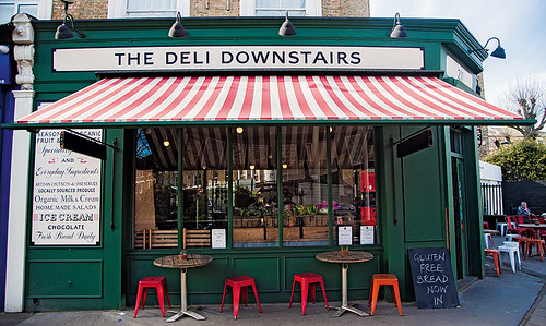
In addition to the simple sans serif on the main fascia, Hardwicke drew a variety of letterforms on the vertical panel of this deli in Victoria Park Road, London E9.
But it would be unfair to call Hardwicke’s current output ‘flawed’. His work is not about mechanical replication, but the human touch that comes from his methods. Hardwicke works only by eye and by hand, directly onto the substrate, usually wood, glass or brick. A thumbnail sketch of the wording is used to judge the centre point; the rest is built out from there using loose chalk or pencil lines to guide the brush. The result is work that is distinctive, eye-catching and sympathetic to the wider architectural and local context.
Hardwicke is not the only signwriter in London, but his work dominates certain streets and areas, such as Columbia Road, where there are something like 30 examples of his signs including furniture shop H. M. Jones, Laxeiro, a tapas bar, secondhand clothes shop Future Vintage, Val’s Sandwich Bar, Start Space coffee, jeweller Simon Rees and interiors shop Nordhem, as well as Angela Flanders.
Different signwriters have different styles which, because the trade has historically operated at the local level, lend character to an area. The apprentice writer first has to learn their master’s style, but as they set out on their own they will make modifications, developing their own ‘signature’. This results in a natural, but slow, evolution, retaining traditional elements while developing these for changing tastes.
Hardwicke’s most usual style is a bold roman with personal flourishes. It can be identified by the downward spike on the crossbar of the A; on Columbia Road, a leafy crossbar on the E is a nod to the road’s regular flower market – examples are Angela Flanders (with pointed serifs) and H. M. Jones (with footed serifs). Less frequently, Hardwicke employs a distinctive ‘U’ with a pair of ‘heels’ at its base. This adaptation was inspired by a mid-nineteenth-century shop fascia, Murrells, salvaged from a building site a couple of miles away on Homerton High Street. Hardwicke is constantly finding inspiration in lettering he discovers elsewhere, and his own forms evolve as a result of these influences.
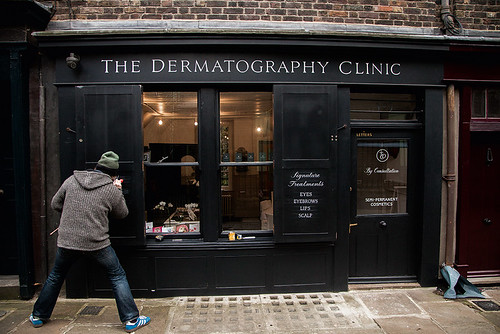
Legs akimbo to get the mahl stick and brush at the right height, Hardwicke applies paint to the sketched layout. The resulting lettering will mirror that of the opposite shutter on this monochrome shop front in East London’s Spitalfields area.
When required, Hardwicke can reproduce several typefaces from memory. These embrace nearly every era of type and lettering and include: Times New Roman, Johnston, Baskerville, Clarendon, Arnold Böcklin and Edwardian (e.g. the hairdresser Taylor Taylor on Commercial Street). He can also turn out Flash (or Casual), but only under duress.
The memory required to reproduce these typefaces works in two ways – there is the ability to visualise the letterforms, and the muscle memory that allows the brush to flow effortlessly through well practised lines, curves and terminals. Most signwriters describe entering a meditative state when they write, only partly disrupted by the all-too-familiar heckle of ‘You spelled it wrong’.
Hardwicke’s creations build on a tradition that has endured despite various threats. In a part of London undergoing rapid change, he is finding that his clients are getting younger. But usually they insist on everything being handcrafted, and they are relieved when Hardwicke reassures them that he never uses computers in his work. Yet many people first come across him on a computer, via the Gentle Author’s popular blog Spitalfields Life, or through social media – Hardwicke often uses his iPhone to photograph and share his work.
While Hardwicke does not have an apprentice in any formal sense, he passes on his knowledge to young signwriters who he feels have some talent – the graphic designers Alex May Hughes and Tom Wood have benefited recently from his tutoring. He is optimistic about the future, and knows that signwriting skills will always be in demand by someone. This time, he says, ‘it’s back for good’, but perhaps the truth is that it never went away.
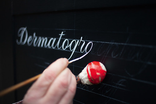
Using the mahl stick to rest his hand, Hardwicke applies the paint to this script lettering with a pointed brush. The stick steadies the hand while also ensuring that no smudging occurs through contact with paint already laid down.
Lara Cécile Krüper graphic designer, Cologne, Germany
Sam Roberts writer, researcher, founder of Better Letters and Ghostsigns, London
First published in Eye no. 90 vol. 23, 2015
Eye is the world’s most beautiful and collectable graphic design journal, published quarterly for professional designers, students and anyone interested in critical, informed writing about graphic design and visual culture. It is available from all good design bookshops and online at the Eye shop, where you can buy subscriptions, back issues and single copies of the latest issue. You can see what Eye 90 looks like at Eye before You Buy on Vimeo.

