
Opinion
John L. Walters
Many designers and design writers have talked about the \'new simplicity\', an approach characterised by straightforward…
New media,
Typography,
Screen,
Jessica Helfand
Website choreography lets characters sing, dance and roll over, but you can learn several lessons from the routine revelations of daytime TV soap operas.
Rick Poynor
After 40 years of use and abuse, Alberto Korda’s picture of Che retains its symbolic power and presence. Critique by Rick Poynor
Features
John L. Walters
‘Papers have all kinds of information on the same page; very distressing and very joyful; gossip and facts. I wanted to bring that variety, that liveliness into the typeface design.’
Chris Vermaas
The design of The New Yorker has nearly always taken the approach that ‘if it ain’t broke, don’t fix it’, with a familiar layout and masthead. Does a face-lift jeopardise its relationship with its readers? Time to call in the Type Police
Emily King
The sound and fury of ‘radical’ typeface design associated with the early days of PostScript have quietened into a purposeful, prolific hum. There’s a new order of craft and and invention, driven by corporate culture, nostalgia and the demands of the screen.
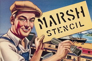
Eric Kindel
Two catalogues reveal much about stencil-making in Germany and the US in the mid-twentieth century, while offering clues to the industry's future in the decades following their publication.
Phil Baines
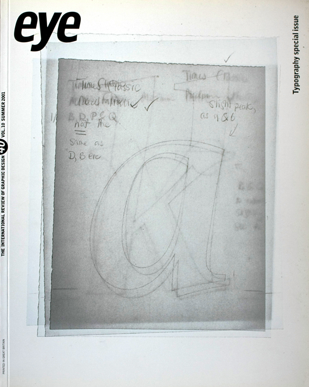
When technological developments at The Times demanded a change in the newspaper’s typography, a brand new typeface was commissioned, prompting a new analysis of the font’s long and complex history
David Jury
Despite the changes provoked by the digital ‘revolution’, designing a typeface for serious reading remains a time-consuming task. For the designer, choosing and setting a body text font can be equally daunting, resulting in some inspired, eccentric and provocative choices
Paul Elliman
LED and LCD display texts intensify our image of the modern city as an electrical field. New technologies allow these letterforms to appear on almost any surface, from billboards to the windows and walls of buildings to the sides of buses and even clothing. What kind of writing is this? Is this typography?