
Opinion
Typography,
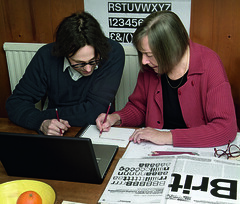
Education,
Jan Middendorp
Formulaic, modular approaches threaten the chemistry of the master-apprentice model.
the editor, John L. Walters
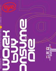
This issue of Eye, a ‘type special’, celebrates a great era for the art, craft…
Book design,
Typography,
Letters to the editor 1,
Rick Poynor
A letter from Rick Poynor

Critique / illustration,
Rick Poynor
Anne Harild’s work offers a challenge to the unthreatening norms of British illustration
Features
Jessica Jenkins
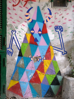
The walls of Naples are a canvas for the crimes, passions and contradictions of the city’s inhabitants

Anthony Oliver
These tractor badges survive as relics of a more heroic age: for them, the earth still moves
Liz Farrelly
‘When I took a back seat to allow TDR to grow beyond me, it died; its creative spark was crushed . . . the more I took myself out of the equation to see if it could do better without me, the more obvious it became that Ian Anderson and The Designers Republic were inseparable.’
Rick Poynor
Metahaven makes visual proposals that suggest a new role for graphic design in public life
Deborah Littlejohn
The digital revolution still fuels a creative explosion in the way type is made and sold. Twelve practitioners take stock of the Zeitgeist
John L. Walters
Margaret Calvert signed the UK – from road to rail to air. Now Henrik Kubel has digitised her Rail Alphabet
Sofie Beier
Multifunctional font families, crafted for every eventuality, are doing away with the need to seek out complementary faces
Rian Hughes
Expressive, explosive and sometimes beautiful, this hand-drawn magazine lettering defies categorisation [EXTRACT]

Paul Shaw
Optically sized fonts are the ‘slow food’ trend of typography, appreciated by a minority but with far-reaching influence