Monday, 12:00am
18 August 2008
A persuasive chancer
On the basis of its first issue The Happy Hypocrite is small, quietly experimental and just a bit passive aggressive. Critique by Rick Poynor
Web-only Critique written exclusively for eyemagazine.com
What is it about the size and weight of the journal format that makes it seem so right just now? There was a time maybe ten years ago when a collective dissatisfaction with ponderously big books led some designers and publishers to start making smaller books with more pages. In the trendier design circles, the same thing seems to have happened, on a more modest scale, with the magazine page.
The idea is to take what might appear to be an unpromisingly limited or stuffy medium – journals are inherently academic and literary – and twist it around, in all kinds of knowing but not too brash ways, until it exudes the essence of cool.
The undoubted leader here, for a certain kind of designer, is Dot Dot Dot. The magazine’s journal-like accoutrements made an implicit claim to seriousness: this was not going to be another slick but empty design magazine. In an incontinently graphic culture, Dot Dot Dot’s careful covering of its own design tracks, seeming not to worry too much about visual considerations while maintaining a tight grip on them, proved irresistibly attractive. The magazine embodied a growing feeling among fastidious and thoughtful designers that graphic design’s rampant visuality was leading in all the wrong directions. To proceed with honour, to make design count again, designers would have to curb and contain their visual tendencies. This didn’t mean they couldn’t also have fun – but it would be a subtle, underplayed kind of fun.
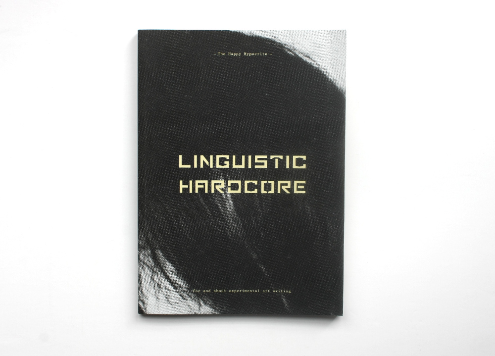
Main: cover of The Happy Hypocrite, no. 1.
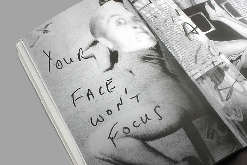
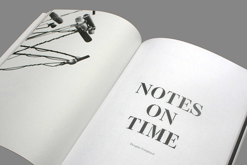
Below/bottom: spreads from The Happy Hypocrite.
The Happy Hypocrite, a biannual Book Works publication devoted to experimental art writing, performs the journal manoeuvre with aplomb. If you enjoy Dot Dot Dot, you are very likely to appreciate the subdued visual rhetoric of the first issue, ‘Linguistic Hardcore’, designed by A Practice for Everyday Life (APFEL), the studio founded by Kirsty Carter and Emma Thomas. Edited by Maria Fusco, co-editor of a volume about independent publishing (designed by Dot Dot Dot’s Stuart Bailey), the cover offers a blend of curious signifiers that instantly locate The Happy Hypocrite for its intended readership: a tiny masthead that feels no pressure to shout; an awkward typeface, die-stamped in pale yellow, to bring out the title’s passive-aggression; and a close-up of someone’s hair.
If the issue title seems to promise some radical disruption and remaking of language in the avant-garde tradition of Joyce or Burroughs, The Happy Hypocrite proves to be gentler fare. Douglas Coupland conducts a pleasant ramble around the theme of time in his usual genial style, while artist Andrea Mason turns in a droll but slight yarn about a film researcher gassing her colleagues with devastating flatulence. There is an intriguing extract from a novel by Michèle Bernstein (once married to Guy Debord), which is nicely demystified when the translator, Lisa Robinson, cuts in to discuss it. Fusco contributes a welcome interview with the musician Cosey Fanni Tutti, formerly of Throbbing Gristle – who really were hardcore experimentalists – and Chris and Cosey. The explicit photographs of Tutti, dating from her time as an artist / sex industry worker and reprinted with her gallery’s permission, are the most confrontational contributions to the issue.
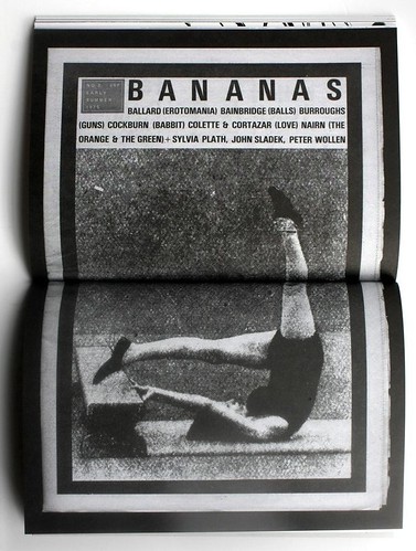
APFEL move deftly between the sections, alternating Baskerville, used for most of the text, with more script-like mono-spaced setting and pictorial features. I especially liked the perfect placement of six drawings from Paolo Arao’s ‘Make Them Love You’: a series of microphones positioned as if in front of a celebrity. The rest of the page is empty. Mixing two paper stocks adds to the journal’s pleasure to handle and the bursts of colour are adroitly timed. The stencil titles have the same designed-but-not-making-a-fuss-about-it feel, subtly referencing the typographic history of ‘little magazines’. Fusco makes the debt explicit by reprinting nine pages from Bananas, a 1970s literary magazine designed by Julian Rothenstein (now of Redstone Press) and edited by novelist Emma Tennant. This section includes an entire J. G. Ballard short story. Fusco plans to salute other avant-garde literary predecessors in the same way.
No publication can be judged on the basis of a first issue alone. Almost any magazine is likely to improve; those that don’t probably won’t last. Not much of The Happy Hypocrite – named after a moral tale by Max Beerbohm about a dandy who wears a mask to hide his true nature – feels like essential reading yet. Nevertheless, thanks to APFEL’s skilfully fashioned mask, this hypocrite is certainly persuasive, a chancer to keep an eye on, with the potential to grow into a figure of consequence.
Rick Poynor, writer, founder of Eye, London
Eye is the world’s most beautiful and collectable graphic design journal, published quarterly for professional designers, students and anyone interested in critical, informed writing about graphic design and visual culture. It is available from all good design bookshops and online at the Eye shop, where you can buy subscriptions and single issues.