Friday, 12:00am
3 June 2011
Commitment to content
Criterion’s DVD covers show that seduction by packaging remains a fiendishly irresistible (and difficult) art. Critique by Rick Poynor
Web-only Critique written exclusively for eyemagazine.com
Being a British film lover has one very obvious frustration. The Criterion Collection of films is unavailable in Britain. It’s always possible, of course, assuming one has a universal player, to buy these Region 1 DVDs from Amazon, sight unseen. But there is no prospect of going to a shop in the UK and viewing the merchandise first because other companies hold the rights to these films.
Maybe this is just as well. Criterion has developed seduction by packaging and extras into a fiendishly irresistible art. The DVDs are expensive, but this hasn’t held Criterion back because it offers a lot for the money. It feels indecent in 2011 to enthuse about luxury objects and elaborate packaging, cultural or not. Surely, treating the film-viewing experience as an intangible, relatively footprint-free download is the only way to go? I see that, but I can’t deny that when I have splashed out on a Criterion product, usually because a film isn’t available in the UK, the satisfaction when it emerges from the parcel has been intense.
The closest comparisons here are the British Film Institute’s DVDs, which sometimes come with booklets and books, and Eureka!’s Masters of Cinema series, which also has booklets. Both labels rely on tastefully chosen visual material associated with a film’s first release, or other closely related imagery. Their visual presentation is fine, especially when compared to the coarse, formulaic campaigns of mainstream releases, but there are clear limits when it comes to the graphic interpretation of the films. The BFI, as befits its national status, maintains a worthy, institutional look: reliable, underpinned by proper film scholarship, but rarely that exciting. The Masters booklets often have amateurish and slightly dated typography and layout, as if they have been assembled by an earlier generation of film buffs not fully clued-up about graphic design.
Criterion releases are more like book covers than DVD covers and display a visual freedom and variety of graphic style seen in no other film collection. The label has a strong identity – a C treated as a partial circle – designed in 2006 by Paula Scher and Julia Hoffmann at Pentagram. This device, combined with a vertical panel saying ‘THE CRITERION COLLECTION’, is exactly as assertive as it needs to be and not a whit more, and plays beautifully against any kind of image that Criterion’s art director, Sarah Habibi, and designer, Eric Skillman, place around it. They design some of the packages in-house and commission other designers to do the rest.
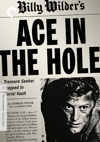
Ace in the Hole, United States, 1951, director Billy Wilder. Art direction: Sarah Habibi. Design: F. Ron Miller.
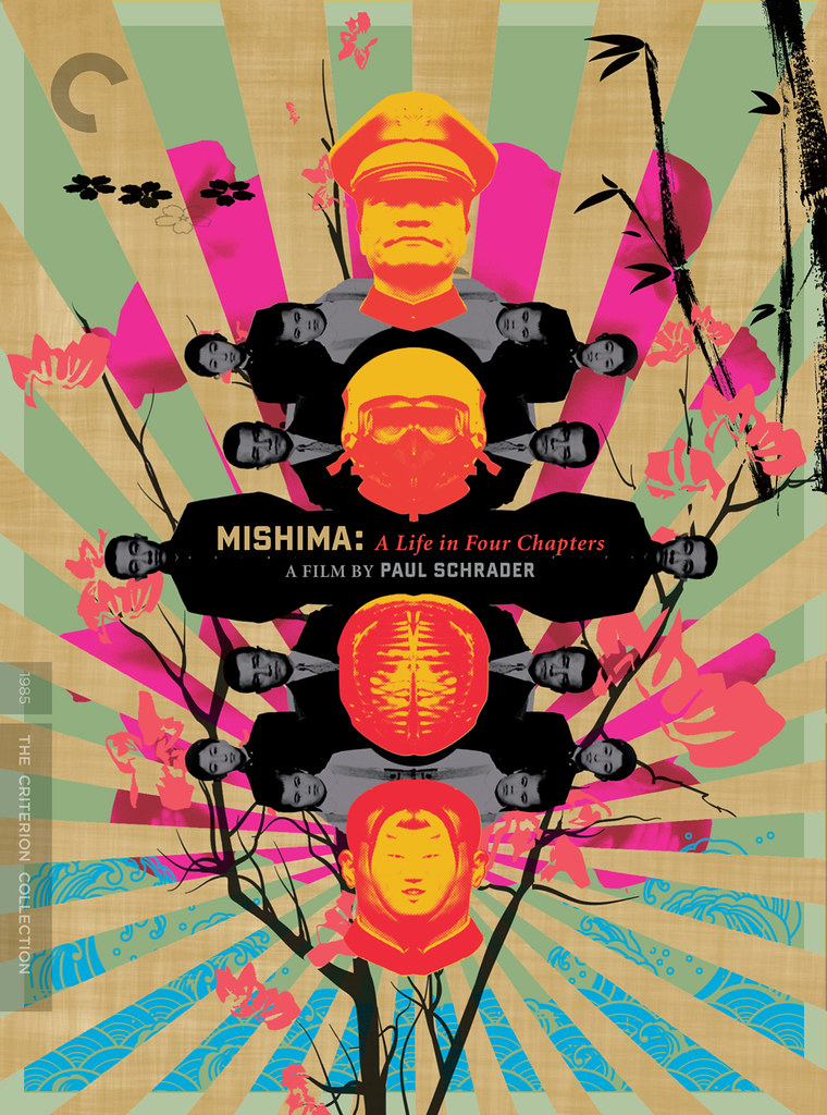
Top: Mishima: A Life in Four Chapters, United States, 1985, director Paul Schrader. Art direction: Sarah Habibi, Neil Kellerhouse. Design: Neil Kellerhouse.
The problem with highly systematic approaches to cover design is that sooner or later the absolute predictability becomes dull. This happened with Artificial Eye’s Penguin-like identity (now more relaxed) and it will happen with the similarly conceived Second Run label. Strictly enforced typographic identities dominate the films, disallowing the possibility that type, too, can be illustrative.
Criterion’s visual method is more confident of its own identity and much more expressive (expressiveness has become its identity), allowing a film’s themes, atmosphere, style and period to determine a fitting treatment. The covers can be illustrative, photographic, or inventively graphic, and the art directors are never too proud to take existing material, such as film stills and details from posters, and develop it, often improving on the sources, as in the lustrous turquoise painting of Rock Hudson and Jane Wyman used for Douglas Sirk’s Magnificent Obsession. Anyone who appreciates this lush 1950s weepie – the intended buyer – will see playful irony and affection in the matching of type and image.
Turning to another American film from the same era is the best way of illustrating Criterion’s catholic approach. In Billy Wilder’s scathing Ace in the Hole, corrupt reporter Chuck Tatum (Kirk Douglas) ruthlessly exploits a man trapped in a collapsed mineshaft. Art director Sarah Habibi and designer F. Ron Miller retro-style the black-and-white cover like a hard-hitting fragment of a newspaper front page. The booklet inside becomes a four-page paper, with pictures of the stars and essays on the film handled as news stories, while the disc menus receive the same tough newsprint aesthetic. The lovingly curated graphics, which deftly sidestep pastiche, express a commitment to content that runs through every diligently considered detail of the presentation. The film has been fully restored and comes with many extras.
Inevitably, there are concepts that work less well. Fish Tank is bland, Last Year at Marienbad is a missed opportunity, and the Powell and Pressburger designs are curiously lacklustre for such intensely visual movie experiences. The disparate cover styles can appear uneven when a director’s films are viewed as a group. But take a look for yourself: the Criterion website is both a graphic gallery and a valuable resource. RP
Read (and see) more about the Criterion Collection DVD covers on the Eye blog.
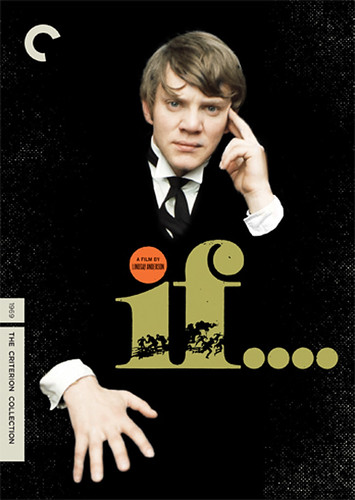
If.... , United Kingdom, 1968, director Lindsay Anderson.
Art direction: Sarah Habibi. Design: Aesthetic Apparatus.
Rick Poynor, writer, founder of Eye, London
Eye is the world’s most beautiful and collectable graphic design journal, published quarterly for professional designers, students and anyone interested in critical, informed writing about graphic design and visual culture. It is available from all good design bookshops and online at the Eye shop, where you can buy subscriptions and single issues.