Summer 2003
Cooper Black
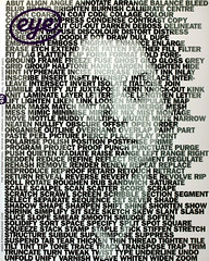
Armin Vit admires the Cooper Black typeface
Admiring Cooper Black is like being the most popular kid in school and falling in love with the ugliest person in the class. Sharing this secret, telling people – your friends – about it is hard, and must be done gradually, little by little, until you are comfortable enough to be seen in public together – holding hands, laughing, kissing, using Cooper Black.
At the beginning there will be guilt and shame. Some mockery is to be expected, but the rewards will be many and the pleasures enormous. The first step in fully understanding Cooper Black is to accept the fact that it is ugly: sexy ugly. There is no reason to feel attracted to it at first glance. The proportions are bizarre, the serifs are some crossbreed of whale and polar bear, its weight is too heavy at minimum and the ‘o’ is tilted beyond belief.
How then, can a typeface with so much against it be so popular? So coveted and desired? That’s easy to answer. Cooper Black has personality, charisma, love. It’s jovial, good-natured, approachable. It is surprising, turning up in the strangest places: dentists’ offices, laundromats, restaurants, markets, gift shops. Everywhere. Everyday. In our lives. It’s Cooper Black.
Cooper Black typeface, designed by Oswald Bruce Cooper of Bertsch & Cooper, Chicago. First released by Barnhart Brothers & Spindler Type Founders in 1922.
With help from Herman: www.underconsideration.com/cooper
Armin Vit, designer, New York
First published in Eye no. 48 vol. 12 2003
Eye is the world’s most beautiful and collectable graphic design journal, published quarterly for professional designers, students and anyone interested in critical, informed writing about graphic design and visual culture. It is available from all good design bookshops and online at the Eye shop, where you can buy subscriptions, back issues and single copies of the latest issue. You can also browse visual samples of recent issues at Eye before You Buy.