
Autumn 2001
Editorial Eye 41
Eye’s second redesign in its ten-year history
This issue features Eye’s second redesign in its ten-year history – there hasn’t been a change in fonts and logo since the redesign for Eye no. 21 vol. 5. Some decisions have been influenced by our work on the forthcoming website – and our plans for the future – rather than any dissatisfaction with the old design. The old design was reliable, readable and remarkably flexible as a vehicle for all kinds of content, though we felt that the display face Bell Gothic, originally chosen for its ‘quirkiness’, had lost its charm.
Yet it felt like a good time to change: to get our hands dirty with new fonts and lettering; to have some fun with new colours; to devise a friendly new logo that would signal the change. The revised grid is a tight system within which we can improvise. New editorial structures will provide opportunities to make discoveries, to commission new kinds of features and to enjoy the materials we handle, examine, scan and photograph for each piece. And there will be plenty of opportunity to make new mistakes – as Samuel Beckett wrote: ‘No matter. Try again. Fail again. Fail better!’
The use of Anna Gerber’s term mistake-ism for the chance and accident-provoked work in this issue provoked varying reactions: most people don’t like to be thought mistaken, though they are quick to pin the word on others. Just about every decision, from a political campaign to a choice of typeface, can be described as a mistake by someone who disagrees. So we used the piece as a starting point for a collection of work that uses chance, happenstance and other arbitrary factors as a means to an end.
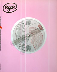
Jessica Helfand’s collection of wheel charts were a pleasure to deal with, from the big metal ones used in farmers’ markets to the more delicate ones displaying essential information about cooking or nuclear fallout. In each case, a jumble of information on the lower dial is brought into order by the diecuts in the top one – Jessica uses this as a launch pad for some thoughts about the relationship of circles to computer-based interface design. Steven Heller’s was a more unpleasant collection, reflecting an ambiguous glory on the largely anonymous designers and illustrators recruited to beat both aggressors and the oppressed alike with the power of the pen, brush and paper.
Neville Garrick, the subject of this issue’s Reputations, is a great case history for designers who yearn to become more fully involved with the content of their work. Starting with album covers for the great Bob Marley, his remit eventually included illustration, photography, jamming with the band on stage and lighting the live shows. Garrick studied at UCLA at the time of the student unrest documented in Right On! Michael Worthington’s Archive feature for this issue shows this little-known paperback, another fascinating integration of form and content that is politically more subtle and ambiguous than it first appears.
The Inspiration page, at the front of our expanded Uncoated section, is the first of a new regular feature in Eye, in which we ask a designer to select an example of graphics, art or visual culture with particular meaning for them, something that was genuinely ‘inspiring’ rather than merely ‘interesting’, ‘clever’ or ‘cool’. And we are delighted to continue the regular Critique feature, by Eye’s founding editor Rick Poynor, in a new position near the front of the magazine. We hope you enjoy the look and feel and content of the new Eye, and look forward to your support, criticism and observations in the years ahead. JLW
First published in Eye no. 41 vol. 11, 2001
Eye is the world’s most beautiful and collectable graphic design journal, published quarterly for professional designers, students and anyone interested in critical, informed writing about graphic design and visual culture. It is available from all good design bookshops and online at the Eye shop, where you can buy subscriptions and single issues.