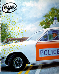
Summer 2004
Editorial Eye 52

‘Social vision’, Paul Rennie’s account of wartime industrial safety posters, many taken from his own collection, delivers an interesting variation on the mantra that ‘good design is good business’. These dramatic posters, by talented designers such as Tom Eckersley, Pat Keely, Manfred Reiss and H. A. Rothholz, are examples of everyday designs that unapologetically put first things first. There’s a unity of purpose in the objective, brief, conception and completion of each poster.
The difficulty of achieving such objectives in the present day is underlined by the multiplicity of work shown in Sean O’Toole’s article about AIDS / HIV campaigns in South Africa. Here we see design and communication initiatives that include glossy branding, agitprop, funky info-toons, kitsch fundraising, street billboards, photography and fine art. Meanwhile, cold hard statistics continue to show the enormity of the challenge. Whatever the power of design, there are some briefs that can’t be set until the political and scientific issues have been tackled head-on.
Many designers now shy away from design with a didactic purpose – projects that are meant to change behaviour. It can seem uncool, or attract accusations of ‘nannying’. Yet if we have accepted design’s role in commerce, where a poster, package or advertisement can have a powerful effect on the way we consume, perhaps there’s a greater challenge in making design that can add to the quality of life – whether that’s by improving literacy, stemming obesity, preventing accidents or defeating AIDS / HIV.
The Ladybird series of children’s books had a ‘social vision’ of its own: the contents, lettering, structure and illustrations of each title were essentially focused on the task of teaching children to read. Adrian Shaughnessy’s ‘Mystery and clarity’ considers the way certain illustrations by John Berry and Martin Aitchison also depicted a country on the cusp of cultural change – as the world became ‘modern’.
Eric Kindel’s carefully researched essay deals with the phenomenon of moiré in printing, in aspects both technical and aesthetic. This is the latest in an occasional series of essays from Eric: earlier examples have included stencil-making in Germany and the us (Eye no. 40 vol. 10); the eccentric Hoofdletters (Eye no. 47 vol. 12); and an overview of overprinting (Eye no. 43 vol. 11). Continuing with the theme of design ‘process’, Steve Rigley, in his article about India shows how quickly the tools of digital production are changing the everyday physical reality of Indian cities such as Mumbai. The Typocity project of Kurnal Rawat and Vishal Rawlley is an original and creative response to the visual turmoil. Rigley quotes Marshall Berman’s observation that ‘To be modern is to live a life of paradox and contradiction.’
Kevin Larson’s Monitor article about legibility presents yet another role for the scientist-technician in design: research into the way people read has benefited from radical improvements in fast eye trackers and computers. Kevin’s talk at last year’s atypi conference excited a great deal of interest among designers and typographers, and we are thrilled to publish his research for the first time.
First published in Eye no. 52 vol. 13 2004
Eye is the world’s most beautiful and collectable graphic design journal, published quarterly for professional designers, students and anyone interested in critical, informed writing about graphic design and visual culture. It is available from all good design bookshops and online at the Eye shop, where you can buy subscriptions and single issues.
