
Autumn 2013
Incisive vision
Eduardo Paolozzi’s gifts as a collagist have been neglected by the worlds of both art and design. Critique by Rick Poynor
Since Eduardo Paolozzi died in 2005 after several years of illness, a reassessment of his work has been gathering momentum. It’s a welcome development. For admirers of the Scottish artist, born to Italian parents, it sometimes seemed that, despite his knighthood in 1988 – or maybe, in some way, because of the establishment’s embrace – Paolozzi had become a critically neglected figure, his many achievements as sculptor, designer and printmaker overlooked. Conceptual art and its later offshoots monopolised critical attention, while easy to appreciate painters such as David Hockney and Lucian Freud received the publicity and accolades.
A few months ago, Firstsite in Colchester mounted an exhibition about Hammer Prints, the venture Paolozzi initiated in 1954 with the artist Nigel Henderson – there is an excellent book edited by Michelle Cotton, the show’s curator. Now we have a substantial retrospective, ‘Eduardo Paolozzi: Collaging Culture’, with about 150 works, at the Pallant House Gallery in Chichester, also accompanied by a book. A Southbank Centre exhibition devoted to his General Dynamic F.U.N. screenprints (1965-70) is on tour, and David Brittain will this autumn publish a study of Paolozzi in relation to art, science fiction and New Worlds magazine – a follow-up to The Jet Age Compendium: Paolozzi at Ambit (see Eye no. 65 vol. 17) – for which I have written the introduction. Lund Humphries has a monograph planned for next year.
Paolozzi’s work is germane for designers and applied image-makers on several levels. He was fascinated by popular culture and, from the late 1940s, was one of the first artists to collect everyday imagery such as ads, packaging and science fiction pulp magazines, which he stuck together as collages in his scrapbooks. His presentation of this material to members of the Independent Group at the ICA in London, in 1952, was a defining moment in the evolution of what would later be named Pop Art. Paolozzi spent time in Paris at the end of the 1940s, meeting figures such as the Dadaist Tristan Tzara and the sculptor Alberto Giacometti; he said he regarded his activities as an ‘extension of radical Surrealism’. At a time when collage is thriving, his brilliant body of work offers lessons in how to use collage thinking and techniques as a form of penetrating cultural inquiry.
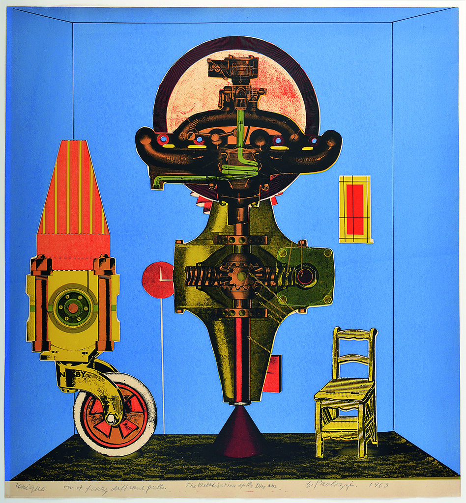
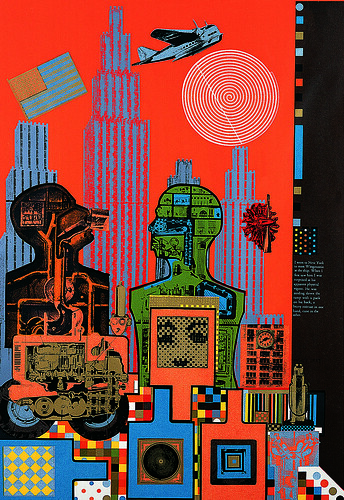
Metallization of a Dream (1963) was the first screenprint Paolozzi made – with the help of the commercial screenprinter Chris Prater at Kelpra Studio – based on a specially assembled collage. It was to be a spectacularly fruitful collaboration. Together they pushed the medium to new heights of aesthetic complexity and expression, using up to sixteen colours on a print and adjusting the colours of individual prints within the edition to create startling permutations. The twelve-print series ‘As is When’ (1964-65) about the life and writings of the philosopher Ludwig Wittgenstein – displayed in its entirety at Pallant House – is a masterpiece. Wittgenstein in New York, an electrifying vision of science, technology and the city, still vibrates with a sensation of enveloping modernity. There is nothing else quite like this print in 1960s art, apart from other pieces by Paolozzi, and the image has been pressed into service as an emblematic book cover illustration for both a history of the Independent Group and a cultural history of science fiction.
In Moonstrips Empire News (1967), another innovative landmark in the history of the art screenprint, 101 sheets stored in a magenta Perspex box can be shuffled into any order. Marcel Duchamp’s Green Box, a set of loose-leaf notes in facsimile form, was an influence and Paolozzi also drew on his reading of James Joyce, William Burroughs and the Surrealist writer Raymond Roussel. Moonstrips features found texts printed in psychedelic colours and an encyclopedic sweep of images. As cool today as it was nearly five decades ago, the project suggests a new kind of visual literature. The artist applied the same experimental methods to writing.
Paolozzi had a phenomenally free graphic imagination and a design sense that spanned both objects and images. His collage-based art depended on processes highly familiar to designers: research, collecting, classification, the fabrication of pre-existing parts, collaboration with skilful specialists, and a willingness to allow accidents to play a role and then to capitalise on them. Along the way, he created patterns for fabrics, wallpaper and tiles, designed tapestries, mosaics and ceramics, undertook typography when needed, and occasionally turned out a book cover. A reassessment by designers would be especially timely now when there is a restrictive belief that design and illustration’s mission is to simplify, denying the elaboration of form that often makes communication compelling.
Paolozzi attests in work after work that fabulous complexity can also be lucid. I have been looking at him for many years. The visual intelligence still floors me.
‘Eduardo Paolozzi: Collaging Culture’, curated by Simon Martin, continues at Pallant House Gallery, Chichester until 13 October 2013.
Eduardo Paolozzi, Wittgenstein in New York from the series ‘As is When’, 1964-65. Colour screenprint, hand-cut with photo-stencil. Printed by Kelpra Studio and published by Editions Alecto. Collection: Pallant House Gallery.
Top: Eduardo Paolozzi, Metallization of a Dream, 1963. Screenprint on paper. Printed by Kelpra Studio in an edition of 40, each with a unique colourway. Collection: Pallant House Gallery.
Rick Poynor, writer, Eye founder, London
First published in Eye no. 86 vol. 22 2013

Eye is the world’s most beautiful and collectable graphic design journal, published quarterly for professional designers, students and anyone interested in critical, informed writing about graphic design and visual culture. It is available from all good design bookshops and online at the Eye shop, where you can buy subscriptions, back issues and single copies of the latest issue. You can see what Eye 86 looks like at Eye before You Buy on Vimeo.