Friday, 11:25am
16 November 2012
Look south
In the first of a new series of Photo Critiques, Rick Poynor examines The Latin American Photobook by Horacio Fernández. Critique by Rick Poynor
Photo Critique by Rick Poynor, written exclusively for eyemagazine.com.
As Horacio Fernández points out in The Latin American Photobook, the growing wave of interest in the photobook has existed for barely a decade.
Crucial in directing attention to the overlooked genre were Martin Parr and Gerry Badger’s two volumes, The Photobook: A History, which appeared in 2004 and 2006 – a third instalment is due next year. Published by Phaidon and therefore widely available, they have become inspirational points of reference and have somewhat overshadowed an earlier survey, The Book of 101 Books: Seminal Photographic Books of the Twentieth Century (PPP Editions, 2001), edited by Andrew Roth. Roth’s beautifully designed overview likewise devotes longish caption-essays to each photobook, but has the advantage of bigger images, better printing and a more expansive treatment of its smaller selection of masterworks.
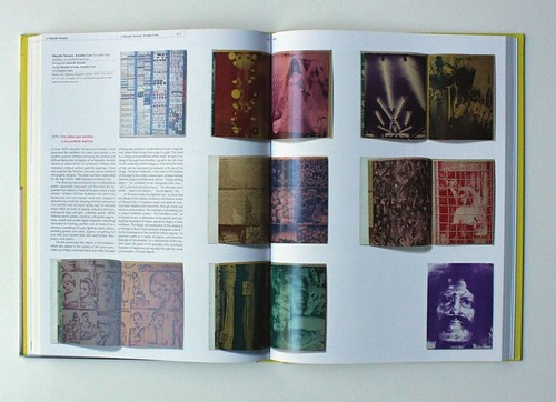
Spreads from Sistema nerviosa, 1975 by Barbara Brändli. Design: John Lange. Text: Román Chalbaud.
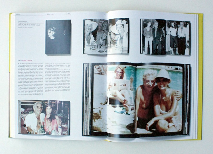
Top: Miguel Calderón (2007) was conceived by Miguel Calderón, the subject’s grandson, who shares his grandfather’s name. Design: Vanessa Enríquez.
The obvious next step was for researchers to investigate national cultures of the photobook in more detail. There have been collections devoted to the Japanese photobook of the 1960s and 1970s and Swiss photobooks from 1927 to the present. The most recent arrivals are Frits Gierstberg and Rik Suermondt’s The Dutch Photobook (NAi Publishers), which I have commended elsewhere, and Fernández’s volume (Aperture Foundation / Fundación Televisa), which won the history book award at this year’s Rencontres d’Arles photography festival. Where the Dutch book collects many projects familiar to anyone with a close acquaintance with Dutch design, photography and visual culture (which isn’t to play down its value as a survey available in English), The Latin American Photobook is a revelation not only for English-speaking readers but even, it seems, for the countries whose hidden photographic histories it documents.
Martin Parr was on the book’s advisory committee and in a conversation about photobooks in the latest issue of Tate Etc he notes that booksellers asked about Latin American photobooks had no idea what was available. ‘The search began almost from zero …’ writes Hernández, ‘there were no maps other than a hodge-podge of books, catalogs, portfolios, monographs, annuals, anthologies’, and so on. The photobooks the committee discovered and acquired during the four-year project – sometimes on the strength of a rumour rather than a confirmed sighting – come from Mexico, Brazil, Argentina, Cuba, Venezuela, Chile, Colombia, and Peru.
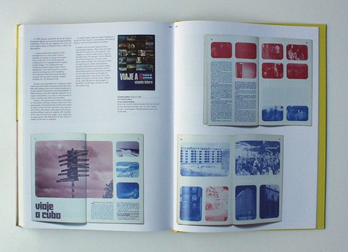
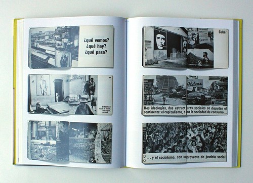
The spread features Vicente Leñero’s Viaje a Cuba, published by Fondo de Cultura in Mexico 1974.
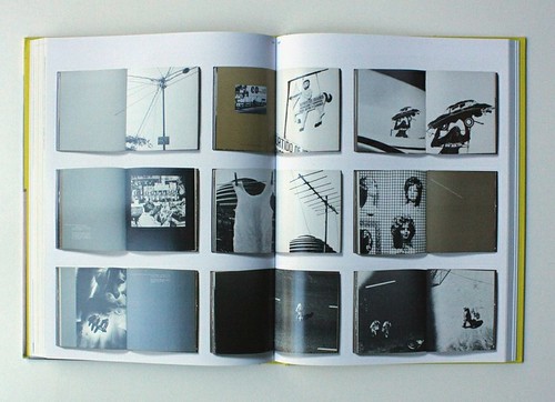
Entre (1974), featuring São Paulo, contains photos by Stefania Bril. Design: Stefania Bril and Olney Krüse. Text: Olney Krüse and Boris Kossey.
A photobook is not simply a book containing photos. With only rare exceptions, the photographer who took the pictures will be closely involved in the creation of the book. There will be a theme that links the images, and their sequence and relationships will be a vital part of what the book has to say. Catalogue-style collections of unconnected photos don’t qualify as photobooks, no matter how strong the individual shots might be. In a fully realised photobook, every part of the book will come into play, including design. ‘We sought out thoughtfully created arrangements of photographs, texts, and other visual materials, in which a graphic designer had played a significant role,’ writes Hernández. His survey underlines the importance of graphic design with an appendix spotlighting the work of six designers – Attilio Rossi, Vicente Rojo, John Lange, Raúl Martínez, Marcos Kurtycz, Álvaro Sotillo – who have made a decisive contribution to the Latin American photobook.
Sin saber que existías y sin poderte explicar, 1975 by Eduardo Terrazas and Arnaldo Coen. Text: Gustavo Sainz.
Hernández, his advisers and the book’s designer, José Luis Lugo, have done a stunningly good job. The selection is superb, rapidly proving the point that these unseen books equal the vision, innovation and interest of photobooks from Europe, America and Japan. The texts bestowed on each book are substantial, thoroughly researched and deeply illuminating. The Badger and Parr photobook histories, designed by HDR Visual Communication, use more white space than is necessary and the images are often smaller than they could be. In addition, their tiny text is too pale for comfortable reading. Lugo steers clear of these faults. Many of the Latin American photobooks receive a generous double-page spread – in some cases two – and every photobook feels vibrantly communicated in layouts that effortlessly adjust to suit each book’s format, visual style and viewing needs.
As the spreads reproduced here show, the books vary hugely in subject matter and approach. New Mexican Grandeur (1967) focuses on the modernity of life in a fast-changing city, while Entre (1974) responds lyrically to urban experience in São Paulo. Para verte major, América latina (The Better to See You, Latin America, 1972) mixes images from different countries to convey an integrated vision of the entire region. Artists’ photobooks are well represented and Sin saber que existías y sin poderte explicar (Without Knowing You Existed and Without Being Able to Explain, 1975) communicates the unique aesthetic quality of Mexico City’s shop window displays in heavily inked, clashing colours. In a project that bears comparison with Erik Kessels’ found-picture photobooks, Miguel Calderón (2007) shows 255 portraits of a beaming industrialist posing with many women companions after his retirement. His grandson, an artist, published the collection of pictures, taken by many photographers, after inheriting them when the man died.
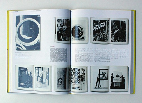
para verte mejor, américa latina (1975) by Paolo Gasparini. Design: Umberto Peña. Text: Edmundo Desnoes.
Groundbreaking surveys such as The Latin American Photobook are driving a reassessment of photographic history, which has for too long concentrated on the idea of the isolated masterpiece displayed on a gallery wall. Parr is now taking part in a similar project to uncover the history of Chinese photobooks. He argues that the exhibition, as a medium for exploring photography, offers a curator’s view of history, but that it is photobooks that excite photographers. ‘That’s why, in a sense, we are really taking back our own history by making the book a much more central player in our understanding of photographic history,’ Parr observes in Tate Etc. The challenge now for museums and galleries is to find ways of articulating the sequential graphic power of photobooks within the gallery space.
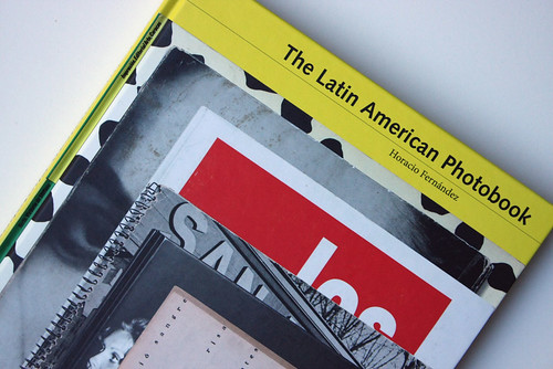
The Latin American Photobook by Horacio Fernandez is published by Aperture Foundation and Fundación Televisa.
Rick Poynor, writer, founding editor of Eye, London
Eye is the world’s most beautiful and collectable graphic design journal, published quarterly for professional designers, students and anyone interested in critical, informed writing about graphic design and visual culture. It is available from all good design bookshops and online at the Eye shop, where you can buy subscriptions, back issues and single copies of the latest issue. You can also browse visual samples of recent issues at Eye before You Buy.